Thursday, March 31, 2022

Janet's Feb envelope (LATE today - oops)

Oooops - 

I forgot to schedule a March 31st envelope -- and woke up to snow on the ground. 

****

Janet went with a winter theme in February. As I type this on March 13 we still have a little snow. By April 21, when this pops up, I bet we're all counting on it being full blown spring. This is the last of the Feb exchange envelopes.

My new method of scheduling posts seems to work very well. Twelve years to figure this out. Yay. Seems like I should set a new goal.

****

LOL - it works -- except for me not remembering how many days are in each month. Grrrrr. 


Winter is all downhill -- is black paper cut and glued onto a red card.


Vintage valentines - just a bit suggestive. The one on the left is captioned, MAKING HAY and the verse on the other one is: Here I sit - So sad and piney - Feeling very Valentiney - If YOU were only by my side - I'd let my conscience be my guide.


Dear Ruth:-
Well how is Ruth? I have a headache tonight. I suppose Aunt Ola told you about our accident down here. I like my work fine but I don't get my $10 yet. Hope I will soon. Where are you working now? Is Mary still there? Tell her "Hello" if she is. Now ans soon and I will try to. Florence 901 6th Ave.

Postmarked Nov 3 - 1910 from Des Moines


Wednesday, March 30, 2022

Janet's postal theme to Hunter

I was so happy to be at Hunter's house when he got home from work and pulled this one out of his mailbox. It's from Janet - and we are wondering where she found that image. It's soooo Hunter. Especially the long hair. He never wears his hair down at work - but -- he has a hat just like that. 

I made it a goal to never impose my wishes or desires on my kids regarding careers or how they wanted to spend their time. And I think I did a good job of not nudging them in any direction. But, this whole postal thing is like an obsession with me. At first, I was just obsessed with the writing and calligraphy (obsessed with the alphabet and writing from the time I could hold a pencil through art degree and then calligraphy classes as an adult ) - but then catching the mail art bug 25 years ago -- that tipped things into a whole different world. 

Now, with my insider at the PO - there is an additional layer to learning all about it. I might have to read that book about the history of the PO again. 

***

Warning: for the next 4 weeks, the posts are a little chaotic. Although, that might not be any different from what they have been the past 9 months (or 12 years).

Tuesday, March 29, 2022

Irene's birthday mail for Hunter.


This one, from Irene, is really lovely. I've done a few envelopes with similar writing, but mine is always loose and sketchy. I call it ribbon-writing. I really like how carefully Irene's is drawn and filled in. And that cake looks good enough to eat. So pretty.

And then on the inside -- lovely brush lettering. I wonder how many styles Irene does? That would actually be a fun project. For the next exchange, I could get the list of names and then start doing each name - assembly line style - in every style of lettering that I know. I actually love this idea. Will I remember it when I get back to Iowa?

Where am I? It's tax time - so I generally spend the first two weeks of April in Chicago because my daughter is a CPA. So, as I fill up the blog (it's Feb 25th) I can talk about where I think I will be - and fingers crossed, nothing happens to interfere with the plan. 

And now it is March 28 - and looks like I leave Thur for Chicago. It's crazy how fast the time is going. A quarter of 2022 is gone already.


Monday, March 28, 2022

Donated birthday cards


An idea straight off Pinterest. I did a search for birthday cards and there were lots. My flowers are a lot different from the ones that inspired this design. I liked it enough to do the second one and I can't say that I like one better than the other.

I tried some more complicated flowers - and these are deeply regrettable. But, I imagine there is a granny who will be very happy to get this card.


Real time comment: I check the blog every morning - and I usually check the one for the following day to make sure it's halfway interesting. I assumed that I would have Hunter's birthday present posted today and instead I found a very skimpy post and no envelope - so - the present does not appear until April 7. 

Here is something fun - I Googled mail art. It's done by Elina Stromberg - using Viva Las Vegas rubber stamps and probably colored pencils. 


from there - you can click on the current date and see what they are up to - OK - I checked -- they have mostly cards - and a lot of them are in the direction of goth or camp or punk - I'm not sure what to call it - they have some Banksy stamps -- and I wonder how Banksy feels about that.....


Sunday, March 27, 2022

Hunter's b'day - from Ming


Hunter's name appeared on some of the exchange list in February, instead of my name and this adorable card and envelope arrived - from Ming. As usual, I was thinking I'd get my nibs and ink out - and it didn't happen.
Hunter enjoyed all his mail - and I thought I would toss in a few recycled cards from MrW and MeanJean.


What kind of person does not open their birthday cards? My son. He could tell these were from me, because I used cancelled stamps and left them on his dining room table. I like that kid a lot, but I do not understand him. Next year, I hope I remember to put some dollar bills inside and then write on the outside that there is money inside and see if he opens it. 

I do like the idea of the BIG address and ZIP code. That 1234 - is covering up his address -- I did it with the computer after I forgot to cover it up before I took the picture. It should have been more colorful. And those monster stamps are endless fun.

He was thrilled with the present that I came up with. After college, he and a buddy ran Des Moines first trendy food truck. Then they morphed it into an actual restaurant - and as we know - Hunter has bounced over to the USPS. But, he will always have a very soft spot in his heart for The Spot food truck.

Details to follow.

Saturday, March 26, 2022

Two to Sydney in Feb


I had so much fun playing around with this stamp again. I should probably go buy some more. Although, in the final-final-final step of getting every single bit of blog *stuff* into one drawer - I discovered a total of 4 folders of stamps. So - all those times I said I was very close to using up the hoard - I was dreaming. 

Sydney got two envelopes - because I got confused. It doesn't really bother me to do two - but, I only put a real stamp on the outer one. I do photocopies to put on the inner envelopes. 

We might be heading into a phase with shorter posts. This will be good news for those of us who are trying to cut down on our screen time. 

Here is Sydney's other envelope. I sometimes use cancelled stamps on the inner envelopes when I send two.


Friday, March 25, 2022

Feb to Kathleen - alternate words to lunatic


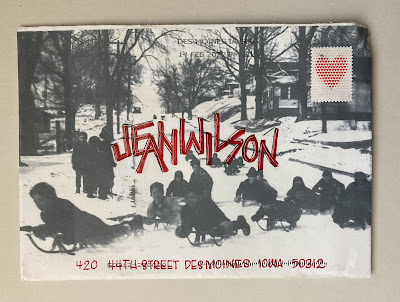
This isn't a new idea and I meant for this to appear with the other ones that were similar - but I don't think it is there. My frustration with how I take groups of photos - and then put them into folders - and then post them WAS getting to me. But, as a devotee of creative problem solving - I have a new plan for organizing and posting. In the mean time (or is it meantime) I really liked the way this one turned out. I also, had no recollection of sending it - so, I think I sent a second one to Kathleen - with a note inside saying I couldn't find a photo of one that I had sent - and then it popped up. Half-a-grrrr. I'm actually pleased with my new method of photographing and posting.

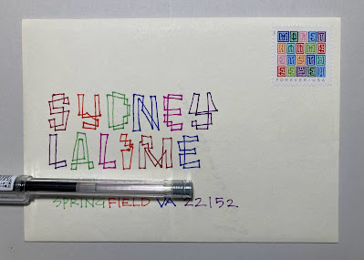
I like the two stacked Es - because one is the curvy one and the other is the squarish one.

***
When I used the word lunatic yesterday, did I cross a line and use a word that is no longer OK to use?

Is it even possible to keep up with which words we can use and which words are deemed offensive? I don't want to offend anyone - but, with my own *impacted* brain situation - I am still struggling with memory/focus issues. So --  because I love to search - here is a list of 120 alternatives to lunatic/lunacy. Sadly, I did not keep track of the source.

There are many words that I do not think should be on the list - but, it is not a good use of my time to ponder which ones to delete. It does, however, give me some very nice options - if only I knew how to remember them. Some of the terms from bygone eras are interesting. 

Words for mental illness: 


depression, 

hysteria, 

melancholia, 

nervousness, 

neurosis, 

neurasthenia, 

madness, 

lunacy, 

insanity, 

delirium, 

10

derangement, 

demonic possession, 

black humors, 

black bile, 

yellow bile, 

the black dog, 

the blues, 

the blue devils, 

a brown study, 

the vapors, 

20

a funk, 

a storm, 

the abyss, 

an inferno, 

hell, 

a pain syndrome, 

stress, 

an anxiety disorder, 

lack of affect, 

an affective disorder, 

30

a mood disorder, 

panic, 

loneliness, 

bad wiring, 

a screw loose, 

a mercurial temperament, 

irritability, 

schizophrenia, 

unipolar disorder, 

bipolar disorder, 

40

post-traumatic stress disorder, 

obsessive-compulsive disorder, 

attention-deficit disorder, 

borderline personality disorder, 

laziness, 

pain, 

rumination, 

grief, 

mourning, 

malingering, 

50

unhappiness, 

hopelessness, 

sadness, 

low spirits, 

invalidism, 

despondency, 

dysthymia, 

detachment, 

disassociation, 

dementia praecox, 

60

neuralgia, 

fibromyalgia, 

oversensitivity, 

hypersensitivity, 

idiocy, 

an unsound mind, 

cowardice, 

obstinacy, 

apathy, 

recalcitrance, 

70

spleen, 

a broken heart, 

battle fatigue, 

shell shock, 

self-pity, 

self-indulgence, 

self-centeredness, 

weakness, 

withdrawal, 

distraction, 

80

distemper, 

a turn in the barrel, 

a break in a life narrative, 

bad thoughts, 

bad feelings, 

coming undone, 

coming apart, 

falling apart, 

falling to pieces, 

willfulness, 

90

defiance, 

thoughts of hurting oneself or others, 

the thousand-yard stare, 

craziness, 

rage, 

misery, 

mania, 

morbidity, 

genius, --- OK, I really have to object to this one -- sometimes - but not always

suicidality, 

100

suicidal ideation, 

aggression, 

regression, 

decompensation, 

drama, --- and let's not lump all the theater majors into this group

breakdown, 

crackup, 

catatonia, 

losing one’s mind, 

losing one’s shit, 

110

losing one’s way, 

wasting away, 

psychic disorganization, 

spiritual despair, 

raving, 

the furies, 

an enigma, --- sorry - this one is just picking on people who might be just a little *out there*

a tragedy, 

a curse, 

and, of course, 

psychosis.

120

Thursday, March 24, 2022

Copic WIDE to Debbie - Anthropomorphizing brush markers


I was not going to even post this one - but Debbie actually emailed to tell me she had already appropriated an idea that I had sent in the Feb exchange and ask what kind of marker this is. It is a Copic WIDE marker. I LOVE it - although I thought this was a dud - and was not going to post it. 

I added copper lettering over the top and I think the effect complemented the stamp. I'm guessing I sent another envelope with faux-postage - probably something with the MoreThanMeetsTheEye - Maze stamp. I can't make out all of what I wrote on top of the black - it starts out - "some gold or copper on this would maybe improve it but I'm not sure it is going to.... " Whatever it says after that is just the usual drivel.

***

Did I sound like a lunatic when I wrote this on March 19th?

THE SECRET TO BRUSH MARKERS:
Try different styles. You never know which style will work with which marker. You just have to keep trying until you find something you like -- and then be prepared for getting 2 or 3 envelopes done before the tip goes mushy on you. Sometimes you can get 20-30. But it is highly unpredictable. Don't get mad at your markers. They have feelings and they are very sneaky. They will find out a way to get revenge if you think mean thoughts about them.

***

It does seem to anthropomorphize brush markers. Technically, they do not specifically do things. But, when you have bad thoughts while you are writing, the bad thoughts ooze through your hand into the tool and make the writing less-than-what-you-were-hoping for. 

If you are addressing an envelope to Debra and you think to yourself, "My D's are always terrible," then you are guaranteeing that you make a terrible D. Or if you are thinking something bad about brush markers - you will make some bad marks. It is rare to create work where you are shocked at how it is better than anything you have ever done. 

I was thinking I had this rant organized - but it has gotten away from me. Maybe we'll circle back on this topic someday.

***
Here is what Debbie's looked like before I added the second layer. Maybe it was better before I added the copper? I do not like the heavier D. I would have liked the name to fill the width and have the stamp be the dot on the i.


Wednesday, March 23, 2022

Mistakes - Stealworthy idea from Kathleen


I don't talk about mistakes much anymore. They used to be a big part of my life. Not that they upset me. Mistakes are inevitable - so my deal was pouncing on them and making them into something wonderful. 

This IG post caught my eye and if you do much serious calligraphy, you might want to check it out. There are 4 photos - including a video of his face when he sees the mistake he made. But, I think that was staged because how often do we video ourselves looking at our work. The mistake is not just a misspelling. He repeated a phrase. 

I was going to post a link - but, it says it is broken. Maybe he took this image down. You can try going to:  https://www.instagram.com/uniqueobliques/. You will have to scroll until you see this piece.

Try to remember - making a mistake is just an opportunity to figure out a clever save. Or as some people call them - happy accidents. To me - an accident is when you spill ink, or in the case of Patty - I think her cat jumped on her desk and spilled ink and then maybe the dog got involved. It's a great story. A mistake is when you did not do that thing that you should have done to avoid something that you do not intend. It's not like we can maintain focus 100% of the time. Or can we? 

***

Kathleen is heeding my advice to make the address very legible for the USPS. The steal worthy portion of the envelope is the shape on the left which coordinates with the stamp. I'm thinking of that drug-free star stamp - it's red-white-blue. It's fun and unexpected to run the shape off the side of the envelope.

Kathleen's bouncy little script is so fun - and I always like no-caps. Interesting cancel - way off to the left with nothing touching the stamp. 

If anyone received their Feb exchange envelope from me - and found an envelope inside that had a very bold all cap KATHLEEN - with the KATH on top of the LEEN - would you please let me know. I remember making the envelope - and couldn't figure out how to improve it - so I was going to just stick it inside another envelope. But, I can't find a picture of any envelope TO Kathleen in my folder. So confusing. 


Tuesday, March 22, 2022

From Kate in Feb - Casual-plate (Pete Beard channel)


Every single time I get a kraft paper envelope with pointed pen and ink writing - I long to get out my nibs and either kraft envelopes or colored envelopes - but I never do. 

I love the style of writing - and while it has a copperplate flavor to it - I don't think we should call it copperplate. How about casual-plate. I wonder if that name is taken by anyone. I'm resisting the temptation to go look - because I need get a bunch of posts scheduled. It is currently Feb 23 - and I need to get things filled up through the middle of April.

Kathleen left a very cute comment about one of my links to something off topic - about being lured into more screen time than she preferred. I, too, need to monitor my screen time. But what do I do when I have found something that is so wonderful I feel guilty if I don't mention it?

I guess I should just warn you that this is one of the deepest rabbit holes I've ever found. I didn't find it. The BigHelpfulBrother found it. Thank you BHB. And HB, too.

Here it is. A channel with a ton of videos about illustrators from the golden age of illustrating.
So far I have only watched Maxfield Parrish and Alphonse Mucha -- but I'm going to watch one or two every day - until I get through all of them.

Maybe Kathleen has no interest in the golden age of illustration. Now I have to decide if I am going to mention a couple other channels I found all on my own. Decisions, decisions.


Monday, March 21, 2022

Donated birthday cards


This is my second batch of birthday cards that I have donated to the people who live at the place that is providing a pathway to life beyond the shelters. Any of these could be inspiration for an envelope. Just put the greeting on the left half of the envelope.

The one on the left was the first one and I was not crazy about the A in DAY - but, I liked the idea well enough to do a second one. On the second one, the H in BiRtH does not please me. But, I like the colors better.

Below is a shot of the second one when I had it penciled and just a few colors. The concept was to have it penciled and then take one color and sprinkle that color around. I much prefer minimizing the amount of time spent putting one marker down and picking up another one.


Then I did another one. I do not like the border at all - but it's not awful. I just don't think it adds anything. My hope was that I could do a marker border so that I did not have to erase a pencil line. I did not mess up on any of the letters - so that's good. I did not like all 3 Y's in red - but maybe nobody noticed that until I pointed it out.


Sunday, March 20, 2022

Troy's Feb envelope (Sheila Waters)


 Troy did something similar to this. It intrigues me and I keep wondering how it works for names with descenders. It seems like my name is really perfect for the style. I can't picture how it would work to have something intruding into the *atmosphere* above the second name.

***

The following information is for the calligraphers who read the blog. Sheila Waters has passed away. I was fortunate to be the hostess for the two workshops that she gave here in Des Moines. Her son, also a calligrapher, has done a beautiful job of describing what a lovely person she was.

Sheila Waters

13 March 1929 - 18 March 2022


I am very sad to share that five days after our family gathering for her 93rd birthday, my dear mother Sheila passed away. 


She died peacefully in her bed, as she had always wished to. Cathy and I have lived with and cared for Sheila for the past five years. Cathy has been an angel with Sheila. Our living together allowed Sheila to stay in this house and live exactly how she wanted. We shared and discussed everything every day and she never lost her sharp mind, nor her strong opinions! Over my whole long career she and I helped each other in our writing and giving feedback on each other’s work. This was something very fulfilling and unique, really. I am blessed. 


For our family it feels devastating and we didn’t imagine it would happen without warning. We are all rather in shock, as some of you must be too. Sheila was so mentally vital and active that it seemed she would go on for many more years. But her doctor thinks her heart just gave out in the end. 


Sheila was very gratified that her book “Foundations of Calligraphy” became an essential staple for every serious calligrapher’s library. Sheila made a huge impact, thrived on personal contact, loved teaching and sharing her great knowledge and skills, in person and online. She described herself first as a “designer calligrapher” for real world applications, not an artist per se, although she was very skilled at drawing and painting. She was tireless and driven, putting so much into her beautiful work and her writings. 


For me my mother Sheila Waters was so much more than I can ever articulate. She will be with me every day for the rest of my life. 


Julian Waters

851 Boyle Road

Fairfield, PA 17320


Yukimi has some nice photos of Sheila on her IG


Saturday, March 19, 2022

Js to Irene and Nanski


I  liked the feel of the green marker. I did the blue one first, but thought it was a little clunky when it went around the curves. The space between Irene and Blumenthal bothers me. And it probably would have been better to do the b, h, and l like the k in nanski. 

I did this lettering with a brush marker -- and I need to warn everyone that brush markers are super flaky. You might find one that works - but it might get mushy really fast. Even finding a brand that you think you like will not guarantee that all of the markers will behave the same. Expect inconsistency - if you decide to start buying them.

The green marker was a Tombo and the blue marker was a ZIG Clean Color -- but, I am in no way recommending those markers. If you buy them -- they might work or they might not.

THE SECRET TO BRUSH MARKERS:
Try different styles. You never know which style will work with which marker. You just have to keep trying until you find something you like -- and then be prepared for getting 2 or 3 envelopes done before the tip goes mushy on you. Sometimes you can get 20-30. But it is highly unpredictable. Don't get mad at your markers. They have feelings and they are very sneaky. They will find out a way to get revenge if you think mean thoughts about them.

Here is the inspiration piece. There are about 6 things I can see that I should have done differently. I did not pull the inspiration piece up when I did the envelopes - I just remembered the concept. Grrrrr at myself. I'm also really annoyed that I cut off the name of the IG account -- hopefully this style will pop up again. If anyone recognizes whose work it is - please let me know. Thanks.


Who wants to know the 6 things I should have looked at?
1
shorter ascenders
2
shorter descenders 
3
no loops on ascenders or descenders
4
no up and then down on the t
5
tiny crossbar on the t
skinnier counters
7
taller counter on the e
8
very cool connection of the b into e on better
better s

I do think I will give this another try. Does anyone want an exemplar?


Friday, March 18, 2022

J's Feb to Rachael & Ming - (regrets)

 This just in - Daniel Pink has written a book about regrets. We've all seen the *No Regrets* blurb all over the place - suggesting that we should not regret anything. He decided to delve into that idea and interviewed lots of people about their regrets.

Link to the World Regret Survey There is a survey you can take and then read lists of anonymous regrets that people have. If my library gets the book, I'll probably read it and see what it says. I do have some regrets - but nothing that causes me to lose sleep. I'm satisfied that I accomplished things that I set out to do and I also accomplished things that I had no idea I was going to do.

Rachaels comment about deeply regretting a detail on one of her envelopes - is something I repeat and will continue to repeat. Continued gratitude to Rachael.

I did read through some of the regrets posted at the website. People regretting lack-of-focus during their  early years is pretty common. And more than a couple regretted that they did not pursue something creative. One of the topics I've been beating into the ground: it's never too late to be creative.

And here is my Feb exchange envelope to Rachael - it needed something in that space. In addition to deeply regretting the a's, I deeply regret that I was not careful to get the x-height on both names the same.

I have not decided how to finish Ming's. This style of lettering popped up on Pinterest. I'll run it tomorrow with some other attempts. The birthday stamp is the only one I have found that goes with that green marker. 

***
I guess I remembered to photograph Ming's after I added some dots.


Thursday, March 17, 2022

Origami knight - J's Feb to Janet


Blogger won't let me put the photo of the envelope at the top. Grrrr

41 hours of folding - 1 sheet of paper. 

 This caught my eye because I am a big fan of origami. If you have not watched Between the Folds, I highly recommend it. The video of this guy folding the knight has 41 hours sped up - to 20 minutes and it is NOT WATCHABLE - unless you are a hummingbird or had a big bowl of meth for breakfast. It's just a blur. So, I do not recommend the video. If you slide way over to the end you can see the finished piece. You can see it from different directions at normal speed and get an idea of the size.

The artist has some other videos. I did not look at any of them - but noted that he is into medieval knights and samurais. At first, I was pondering - What is it with people who are so patient and make such amazing things - and then their subject matter is guys who are intent on killing or maming other guys? What's with that?  And then I remembered all those hours watching sports. Why in the world do people want to form teams to fling things back and forth and score points. Why? I.Don't.Get.It. 

Oh, wait. I do get it. We don't all like the same things. They cannot fathom why I do the things I do. Whew. Glad I remembered that. 

Juha Konkkola's videos

Juha's medieval knight

Between the Folds - documentary

***

I did a rough of Janet's name on notebook paper and thought it would be very easy to transfer it to the envelope and even make improvements - but something went wrong and the rough looks better. But, this is the first idea for this stamp - so, it's not surprising that it needs some work. I love the stamp and was very happy with the colors I found to go with it. 

I'm pretty sure that if there were some dark twigs with leaves - from the stamp - added to the envelope - it would be better - but, I wasn't sure where to put them. Or maybe it just needed some of the dark without it being anything specific.

For the Feb exchange - several people received the rough drafts because I liked them better. I often spend more time on roughs than on the final. So the final looks quick and easy -- but it wasn't.


Wednesday, March 16, 2022

Js Feb to Kate, Lauren, Lynne - Rest of the story


This one was posted previously without a stamp. 


Then I tried a couple more without stacking. I pretty much ditched the whole concept of keeping your pen on the paper. So they are starting to just look like versals. But, I wanted to do a little more with the black border thing. I love the Day of the Dead stamps - and now I am tempted to do more. 

Ohhhh nooooooo. This one doesn't have anything going for it. What was I thinking. I owe Lynne something better....


***

Off-topic - I am storing some family stories here on the blog - so that I can find them when I get around to the family blog. And if that doesn't happen, I can just let the kids know that they need to sift through the blog and find the family stories.

Here is the rest of the story on my lack of attendance at my kids sporting events. One time I did show up for a game and Hunter's team lost, so he thought I was a jinx and asked me to not show up. This was roller hockey which is not nearly as intense as ice hockey. By intense - I am talking about parents. 

After being banned from the roller rink, I did show up at some of the ice hockey games - especially if the older kid was playing out of town and Hunter needed a ride to the ice arena. One time I was watching a game during a local tournament - seated near other parents. Hunter's team was down by 2 or 3 points. I stood up and said -- "Well, maybe if I leave, there will be a miracle - and they will win -- and I will miss it." And started to walk out. 

The other parents were aghast that a parent would just walk out of a game - but I did. You guessed it. There was a miracle and they did win - and they got into the championship. So, when I arrived -- to watch the championship game - all the parents were swarming around -- asking me if I was going to stay if the other team pulled ahead. I don't remember what I said - and I don't remember what happened. I think I stayed and I think they lost. Maybe Hunter remembers. 

The whole point of this topic when it started was me pondering non-generic items to put in my obituary. How's this: In addition to fine penmanship, Jean was very creative in her avoidance of sporting events. 

Tuesday, March 15, 2022

J's Feb to JeanR - Lego Totems


This idea should look familiar. It must have been January when I tried stacking the continuous *MikeGold* line lettering. Does he have a name for it. I wrote all the names that were on my exchange lists for Feb and  thought that would warm me up for the envelopes. As usual, I liked some of my roughs better than what I did on the envelopes.

As I get to the end of the shimmer envelopes, I'm finding things I enjoy about them. I'm glad we got to be friends.


***

 I have a thing about taking all the Legos that are just one color and building something. I'm not a 3D person at all although I did have some fun the last time I visited my grandkids. I hope I am not repeating myself - if I am - then I owe you a new post. 


I can't decide if I like them better as a group or if they look better individually. This is the order in which I constructed them. I think the black one is my favorite - although this was just the first run. Next time I visit, I might make a new set. No - I like the white one and the green one as much as the black one.

We have discussed Legos previously and there are readers who agree with me that Lego has ruined some of the play value by making so many specialized pieces - although, the specialized pieces really grew on me when I started making these.


I could have fun photographing them and creating interesting shadows.


Now I want to make an entire tableau.
The white one is my favorite when I look at them all together.


Monday, March 14, 2022

J's Feb to Maggie - Penmanship link


This is the first envelope I've done with the new birthday stamp. The colors seem fine at first - but they are actually a bit difficult. They are somewhat muted. I'm not a super picky person when it comes to colors -- but picky enough that I can't use just any old green. This one needed to be in the olive direction. It is also hard when the red and orange are so close. Although reds and oranges are more forgiving when you are looking for markers that coordinate with the stamp.

For a first attempt  - it's not too bad. The streamers could be better. And the fluff on the tip of the hat got carried away. 

***

On Feb 7th, Cappuccinomarie left a link in the comment to Bored Panda. There are 40 examples of penmanship. I'm wondering who Cappuccinomarie is? I met one *marie* here in DSM - and wonder if it is her. 

Link to Bored Panda Penmanship

There might be some that will inspire you to work on your everyday penmanship. Some of these are IMHO calligraphy - and not penmanship. But - that's more nit-picky than we need to be. I can't choose a favorite - but, I do want to note that when tiny little printing hovers over the line instead of sitting on the line, it is very cool.

I also like the tiny bit of extra spacing between the letters on the top sample.


There is another BoredPanda article with 50 examples - so, maybe they added 10?
No time to research.

Thank you Cappucchinomarie.


Sunday, March 13, 2022

J's Feb to Chuck - Letterboxing puzzle


I spent a ridiculous amount of time looking for a gnome-ish cupid - or a cupid-ish gnome. The ones I found were a little creepy. I'll add them to the end of the post. Realizing that my mail would arrive after V-day, I decided to put my gnome inside something larger - which I forgot to photograph with the stamp. So, imagine it with a stamp and address. I do love that style. Back in 2019, I tried to track down the originator and came up with five names. Lynn Slavinsky, Sylvia Kowal, Ruth Booth, Marci Dinkey, and DeAnn Singh.  


****

Some of us play a few online puzzles. On July 21, 2021 my blog post mentioned that I had found a new puzzle that I was really enjoying, Letter Boxed. You have to make words by jumping around on the letters provided. I could usually use up all the letters in 4 or 5 words - but was never able to figure out how to use all the letters in just two words. Until Feb 6th. It was so much fun to find the two words. I had to wait until the following day to see if my two words were the same ones they had in mind - and they were.

I rationalize my time spent on puzzles by thinking it might be helping restore my brain cells and synapses. Although, I need to think about doing the puzzles later in the day. There might be better things to do early in the day when the brain is all perky from sleeping.


***

Ideas and my rough sketches trying to figure something out. I meant to enclose the sketches in the envelope - but that didn't happen. On a few of the exchange envelopes, I sent my rough idea pages so that people would maybe give me credit for the time spent on layouts. The final designs sometimes look a bit *simple.*

This one (above) is actually pretty cute - the one below is super creepy.


I tried to make a cuter pants-free guy.
Somehow, the wings-hat-beard just ended up being too much - so - once again, I'm dumb-founded at how I spend my time.


Well, wha-da-ya-know - I did take a picture of Chuck's envelope with address and stamp.