Showing posts with label keith. Show all posts

Tuesday, December 27, 2011

keith 17/50


i was trying to make this look child-like. i used my non-dominant hand.

another one from my stack of scheduled posts, that were in the draft file. i don't think it was ever posted.

Wednesday, March 23, 2011

don't ever ever ever ever do this


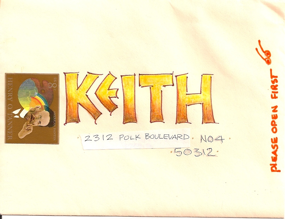
don't ever ever ever ever do all caps with a big fancy cap. never. don't do it. it should be against the law to do it. so why did i do it? because every once in a while i'm a rebel.

clearly kathy chose the right stamp. a true likeness of me in my rebel mode.

Tuesday, March 15, 2011

keith


should have penciled first. had to stretch that d
and the g should have been round to reflect the magnifying glass.

Monday, March 14, 2011

keith


love the stamp, love the colors, love neuland. ok with the layout...might be improvable.

Sunday, March 13, 2011

keith


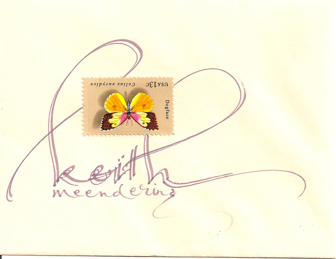
i only know about three flourish moves. used all of them on this envelope.

Friday, March 11, 2011

keith


this looks like kathy's lettering. i wonder if kathy remembers?
i don't think i ever get my letters that straight. maybe when we enlarge this we can see her pencil lines.

Thursday, March 10, 2011

keith


kathy appears to have a thing for putting the stamps on upside down :-)

Wednesday, March 9, 2011

keith


i believe i wrote KEITH on 50 envelopes and then passed them along to kathy to apply stamps and the address. on some she did not add the address. i like where she put the stamp. i think i pondered earlier...whether or not to finish the addresses...it probably won't get done

Tuesday, March 8, 2011

keith


very easy, but i like the way the lettering almost looks like it was done with a big wide paint brush

Monday, March 7, 2011

keith


i'm not always happy with the keith series.
i think i crashed it out a little too fast and i think i tend to do *girly* envelopes better than *guy* envelopes. so, look at these keith envelopes as experiments. maybe when they pop open each morning, i'll have something constructive to say about them

Friday, March 4, 2011

keith


i was surprised to see that there were only 17 keith envelopes up. so, i'll do a few more from that collection. this one is for non-lettering people. if you can make little block letters and if you have any sets of multiple colored tools, you can have fun with a checkerboard pattern. as always, pencil lines would have been a good idea...

Tuesday, September 28, 2010

keith 23/50


there were some beads posted a week ago or so. these are deluxe beads. they have a shadow and a highlight. i did them with dotta-rific markers. i only had three colors. they have a sponge tip, so you can make really big dots. lots of fun.

Friday, September 17, 2010

keith 22/50


when in doubt, scribble. yes, i like to build up names. when you write one name 50 times, eventually you need to do a few like these.

i just figured out how to post every single scan on the blog to picasa, so now i can set it on slide-show and watch them flip by, one per second. even though i have seen all of these envelopes a gazillion times, and even though i think it is usually magnifying flaws to enlarge envelopes, there is something very cool about flipping through all of them on the screen.

i can't decide how to organize them. i have no idea if picasa is like flickr where anyone can enter the site and view the photos. if it is, you are all welcome to browse. i am inspired to scan some more. i have a few hundred, still in boxes. and probably a hundred scanned and waiting to be posted.

or, i could do all those things that NEED to be done.

Thursday, September 16, 2010

keith 21/50


one of my favorite ways to play with fonts on the computer is to make words using many different fonts. there are people who mix up styles of lettering in hand lettering. this is just tossed off quickly. it takes a lot of trial and error to find good combinations. looks like i had a crisp new marker.

Wednesday, September 15, 2010

keith 20/50


i believe i had a new zig gold marker when i did this one. the fine flourishing would be a gel pen. would have been prettier with a white envelope because of the white background of the stamp.

Tuesday, September 14, 2010

keith 19/50


i like this one a lot. i like the way the information is not in the standard order.
i always like to see the zip at the very bottom. i call this kind of lettering *two-wrongs-do-make-a-right* i am sure it makes some traditionalist cringe. but, it's fun and it goes nicely with some of the stamps. maybe it is ok to bust out of the rules and regulations once in a while.

Monday, September 13, 2010

keith 18/50


there is some akim happening and some loose and loopy script. not really any particular style. inspired by flower petals.

Sunday, September 12, 2010

keith 16/50


not the best lettering. i was thinking of what we learned in first grade, if we were in school in the 50s or 60s. would have been better with some penciling to get it all fit before i went to ink. but, if you don't have time, it is a style that is ok if it looks childlike. i covered up the address. it is under some post-it tape.

Saturday, September 11, 2010

keith 15/50


i covered up some of the address...but you get the idea. we are back to the keith series which did not actually go through the mail.
this idea would work, if you generally had the info close enough for the p.o. to read

Tuesday, August 31, 2010

keith 14/50


yikes. this one really needs some more layers. this is like a naked skeleton. maybe i should print off copies and finish them. what a great idea. i'll just run finish all my other chores and get right on it. hahaha.

kathy..great stamp choice and placement. sometimes that upper right corner is the right place to be....love that stamp