Monday, September 30, 2013

directional address - bonus post today

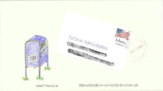
this address gives the directions to the house, without giving the actual house number and street - or mentioning des moines, iowa specifically.
and best of all....no ZIP code. 

it arrived at the correct house. although, i put the actual address on the back as the return address to insure that it would get to the intended destination. but they did not rubber stamp it with the *Insufficient Address - Return to Sender* rubber stamp.

i sent it because jim collects *covers,* which are envelopes with stamps and postmarks. he had shown me a new one in his collection that was addressed in a similar fashion - although it was a very old envelope. below is a scan of a photocopy. you can see that it says:
Mr David McCroy
Missourie Territory
Cape Giarradeau County
Near Jackson Village
Missispie River
        ^sp
Near the mouth of the Ohio River

the flip side says
Scufflton, S.C.
 to 13th Aug. 1820.

no mention of a volleyball court, guess they didn't have time for sports


i guess we are all very curious what the letter talks about.
maybe jim will transcribe it for us.
:-)

smash weathervane


this could have gone with the shishkabob series.
from the postmark, we see that this was an early one in her series to herself.

if this is a blog about lettering...those are romans. the romans came up with some basic letters and many people think that the proportions of those letters are quite lovely. they are classics. personally, i prefer art deco, art nouveau and frank lloyd wright...but that's just me. the romans are harder to learn, so i gravitate towards the quick and easy.

Sunday, September 29, 2013

ruth walnut flourish

i was playing around with some walnut ink
and had fun. this is very sketchy. i also had to put a background behind the envelope to make the scanner work, then i wished i would have cropped it. carol, if you still check my blog, i would have to say that i think this stamp is a very good example of a stamp that would look better on ivory paper. as i recall you are not fond of ivory envelopes.hopefully i will remember to try these stamps on ivory before i run out of them.

Saturday, September 28, 2013

paper post

http://www.allthingspaper.net/search/label/fashion

this is a bit offtopic - because it is about paper, not mail
but, i am posting it because finnbadger made a comment about project runway and their fabric design challenge. i have always wanted project runway to do a *paper challenge*

check out the link above for some amazing dresses, shoes and jewelry made out of paper.

another challenge for project runway would be to have them design a dress inspired by a postage stamp. maybe i should send them a letter with the suggestion.

i wonder if they get a lot of suggestions for challenges. of all the competition shows, i think it does the best of illustrating something valuable - design lessons. much of what they discuss applies to all kinds of design, not just fashion. and they have had two dresses this season where the designers *wrote* on the fabric. both received high marks.

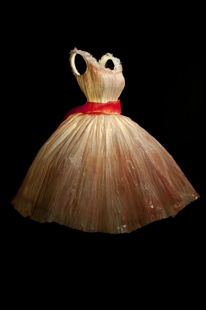
this dress is by Georgia Karanika-Karaindrou of athens greece

sculpted-paper-dress

guest artist jackie

i have had this one for a while and thought i posted it, but can't find it in the archive. it is another one that is a tri-fold with rectangles of color. i think jackie is a secret mathematician. she can make everything work out perfectly. and she knows a lot about color. i bet she took a color theory class. maybe not. some people have *perfect hue.* that's a lot like perfect pitch, only with colors. i encourage people to take color theory classes. i wish i had.

Friday, September 27, 2013

miss cathy + lady bird stamp

once again, i am not afraid of white space. i ended up liking these stamps more than i would have expected. and if i have not mentioned it lately. i love G-Tecs.

quick note

quick note to all the people who sent mail this week
(cathy, chuck, ruth, jeri,snd you-too, if i forgot someone)
thank you so much. it's an overbooked week, so i have not had time to email you personally...
hope to get to that..
or i might send snail mail.

i love this idea
but DO NOT draw a ribbon over the top of stamps. the p.o. will not accept stamps that have anything written or stamped on them.

this is such a great idea

Thursday, September 26, 2013

cathy green daisy

i tried that big sharpie daisy design one more time and i just had to add some dots. while i like the symmetry of the whole project - at a certain point i just have to put in something that does not fit with the pattern.
i hope i don't mess it up when i put in the real address. i'm going to actually mail this one. you can see the faint mississississississippi across the petal
the name will go above and the street and zip below.

i will be curious to hear from alyce on whether she is late to another appointment because she is mesmerized by the flower. it does have sort of a hypnotic quality to it.

Wednesday, September 25, 2013

smash patchwork w letters

i do not recall why i have such a mishmash of numbers covering up her address. it might have been done in a semi-circle. i think she was using up a bunch of practice paper. the stamp blends in very nicely. that series of stamps is so nice. there are tons of good ideas on this envelope. steal away.

Tuesday, September 24, 2013

cathy 3 pink dot

this one isn't finished. there will be a third pink dot in the zip code. cathy sent me some of these stamps, so i was just having fun thinking of ideas to go with them. i will be really sad when the rates go up. these are not forever stamps. the p.o. issues one design at the current rate for bulk mailing. you can order ten at a time online.

i used a chisel sharpie. i really like them for neuland-esque style writing. the tip is not crisp at all, but, you can easily square off the strokes with a white gel pen.


Monday, September 23, 2013

jan inktense

the third one from the day jan brought her assortment of things you write with and then add water. i already knew i loved inktense. i could sit and draw inktense-garden-of-love-stamped envelopes all day.

Sunday, September 22, 2013

candy scribble

one of the first envelopes to candy. she is my oregon rep. the first layer was the green CAN with DY below. it was a miscalculation caused by poor planning. of course, being frugal, i did not want to throw the envelope away. the more i added to it, the more i disliked it. the more time i invested, the less i wanted to throw it away. it was really close to getting tossed...then i saw the stamp and added the flowers. and i added more details and shadows after i did the scan, so it ended up being even better than this. sorry, i don't have time to keep rescanning. at a certain point, i just have to toss this stuff in the mail.

Saturday, September 21, 2013

pink trees


above is my first scan. i was not liking it at all.
it started with navy zig, then i added scribbles. i wanted to do something to go with that stamp. when i finally added the address and put the stamp on, i could see that the stamp had some green and thought it might help to add green. then i decided to beef up the tree trunks a bit. and finally, although it took some time, i squared off all the navy lettering. i don't know what it is about squaring things off that appeals to my eye. this series of stamps has been interesting to work with. the style of the images is rather traditional for me. as i have said before, sometimes when i don't really love the stamp at first glance, i end up liking the ideas that they generate. not always. but, i have learned to at least try.

Friday, September 20, 2013

this just in

smash found some perfect black and white dorthea dix stamps to add to her envelope.
thanks for sending :-)

guest artist

nadia saskia has this on her flickr photostream. i will add the link below, but it is mostly just personal photos. i didn't look at everything...just enough to see that it is not a mail art site. but, i think it is nice to post links to artists when they are linked to the image.


i love how it says... hug mail on one side and mail hug on the other.


this is the link to nadia's flickr page- which, as i mentioned above really doesn't have any more mail art.
http://www.flickr.com/photos/kitschmomma/4221535967/

kathy eames table

i found a page of the eames stamps. wish they had been forevers.
the purple is a super wide copic marker. and it was not new and juicy
so it left some spaces.
i added the name with a white gel pan.
the address will be tiny black caps
but i can't decide if i want them between the two lines or at the top or at the bottom.

Thursday, September 19, 2013

smash pen + penguins

a-dor-able.

if you steal this idea, remember to put the non-horizontal rate of postage on a one ounce envelope. today, it is 66-cents. if you are reading this in the archives, check for a new rate at www.usps.com

nice white space :-)

that black smudge is where i smudged the address...

Wednesday, September 18, 2013

sharpie daisies

the top envelope is one that jan received in an exchange. she brought it for show and tell. she had learned that it was done with sharpies, so, i decided to see if it was fun or not. at first it was a lot of fun. then when i got to the zigzag details, i gave up. i also had the problem that i had used a fuchsia marker where jan's had a darker red violet and i don't have that color, so i decided to send it to candy. it's not one of my finest, but, it was the one at the top of the pile on the day she sent an envelope to me and i was in a clean off my desk mood....so, there you have it.

the white dots are done with gel pen. i like the uniballs, but i also tried some pilot CHOOSE pens - in both white and gold. i like them.

jan and i discussed the quality of paper. mine is william arthur, very heavy. hers is very light weight. there is a difference, but one is not better than the other.

Monday, September 16, 2013

lady bird

this purple outline was the original idea for the red robot head that i posted yesterday. i made it with jan's faber-castell markers. but the overlap lines bothered me, so i tried it in red, being more careful. then, when i ran across this one, i had no recollection of the red one and i tried to fix it. it was fine until i put in the features on the face and then...they were just wretched. but i had already applied the stamp, so i covered up the bad cartoon face with the sticker off the sheet of lady bird stamps. cathy sent me the stamps, so i will send it to her. i'll write around the


Sunday, September 15, 2013

red bot head

i was going to write WI instead of wisconsin, leaving room for a nice zip code
and i was going to actually put her real address in
but once i messed up the zip, i put in a fake address and now...i rather like this one, so i may have to make another one, or a bunch of them. it was fun to make the concentric rows of red.
that's white gel pen over the top.

Saturday, September 14, 2013

smash + stella + birds

smash girl has a lot of patience for drawing. i don't any more. that bird looks like it was walking through ink. i don't see that bird on any of the stamps....wonder where it came from. maybe smash can draw from memory.


and the companion envelope from stella reminds me of the tracks that birdy-feet leave.

 i am curious. what kind of tool did you use? a little pointed brush and watercolor? or is it a trade secret?


Friday, September 13, 2013

megan - hanukka

i will be adding her street address in green and sending it with congratulations for the blue ribbon she won at the fair. the letters were very wonky and misshapen and unpleasant. the black outlines fixed things. sometimes when i try to make things wonky, i can't always unlearn the rules. but this time, it worked out. i like the two different sizes of colons and two different sizes of Os.

and this looks like something i appropriated from either carol or annie. i think carol uses copics...and


Thursday, September 12, 2013

smash + stella

she only sent me this scan so i can't see if that white rectangle, that is a letter, is a sticker or piece of paper adhered to the envelope. i love the idea of doing that.....
and i love the grass growing around the legs on the mailbox. i wonder if there are any mailboxes left that are on grass. seems like they are all bolted to concrete theses days.

is it concrete or cement? i do not recall the difference. i could google, but, it will be more fun to see if anyone answers me in the comment section.

 and a fun envelope from stella.  i like all the variations on the template.
thanks stella :-) my favorite part of your penmanship is that you keep your capital letters nearly the same height as the lower case. Very nice proportions.

Wednesday, September 11, 2013

lines

i already posted one that is similar to this one, but it was addressed to me. the whole postmark theme is so much fun. there is a font at dafont.com that is just postmarks.

http://www.dafont.com/dead-letter-office.font


and here is one that is old seals
http://www.dafont.com/old-seals-tfb.font

there are lots more
but, i'll let you all surf on your own

and here is one from stella :-) [kudos on your penmanship, stella]

 both of these envelopes use lines as the main design element. they are good examples of how much fun you can have with just one or two elements....lines and color. the top one has some shapes, too.


Tuesday, September 10, 2013

191 hoefnagel ideas

a couple off-topic topics
and then, if you want to Read more, there are 3 envelope ideas.

Mira calligraphiae monumenta   (search that after you go to the link)

http://search.getty.edu/gateway/landing

here is just one of the 191 images of work done by Joris Hoefnagel, the hungarian scribe who died in 1575.

lots of good envelope ideas.

i'm sticking this in case i don't get my scanner issue figured out.

i think john neal sells the book, not the actual book, a facsimile :-)
wow, would that be a fun project. buy the book of prints of the pages and then make your own actual *copy*


http://mentalfloss.com/article/52186/10-miniature-books-we-covet

a very cool article about miniature books. many are at the u of iowa special collection. i have been to that library and it is fabulous.


Monday, September 9, 2013

the width of romans

cathy left a comment on the envelope with the overlapping romans
and it made me remember a question i have about the grouping of letters by width

i see width groupings
but J and K are not always in the same group.

MW -wider than a square
OQ -fit in a square
CDG - slightly narrower than OQ
HAUNT VXYZ - slightly narrower than the above line, do you put K here?
SELF PBR - halfish width, or do you put K here?
I-narrow - do you put J with I or with PBR?

are their any mnemonic devices or songs to help remember these letter groups?


this is going to be on an envelope.

clouds


the colored pencil does not show up very well. and the address is covered up....but, i have only 40 envelopes lined up and am worried about getting behind. no design lesson today. i just thought i would try drawing clouds. i think it's probably better to just go outside and look at the real thing. or take a picture. or devote some serious time to learning how to render them. my cartoon stuff is fine for some things, but not serious clouds. most envelopes aren't exactly serious.

Sunday, September 8, 2013

kathy - adobe

even though they don't have cactus that towers over the houses in santa fe, i liked the idea. this was fun as a first draft. might come back and work on some variations if i don't get distracted. i like the way the g-tecs smeared when i added the colored pencil.

Saturday, September 7, 2013

cathy tennis gold

i was having fun with the idea of these layered letters. i penciled them. then i went over them with a gold gel pen. i did my thing where i do three lines (sometimes more) and build up some thickness.  the trick is to follow the line, keep it smooth, but don't worry when it is a little off.
three layers of a-little-off = fine.

then i realized that if you erase gel pen, you remove all the sparkle. so if you enlarge this you will see the pencil lines. i might go ahead and erase the sparkles. the gold picks up the color of the tennis racquet. i didn't follow the rules about how to build perfect roman caps. i was looking at interesting places to overlap and connect and cozy-up-without-touching.

Friday, September 6, 2013

jan's tennis letters


i invented this style for jan because she confided in me that she likes envelope art but she really doesn't have a huge interest in calligraphy or lettering. i completely understand. lettering can be frustrating. so, i thought i would just take random colors and make her name really big and add enough black to pull it all together.

it's hard to imagine what it looked like before the black was added. It was UG-leeee.  so i did another envelope and made three scans to show the progress.

you have to click on the Read more, to see the steps:


Thursday, September 5, 2013

2 guest artists - smash gator A & stella mixed media

very fun alligator by smash
and a lovely abstract by her talented grandaughter, stella - this is more recent than the envelope i posted a few days ago from stella and shows that she spent some time working on her penmanship this summer.

thank you ladies!

guest artist - smash gators

two gator themed envelopes from smash girl and they are postmarked from south carolina....


if anyone missed annie's comment yesterday, go back and read it and then go to the link and oh-my-goodness...there is an endless stream of ideas....


a fun idea i saw. thought i had the link, can't find it at the moment.


Wednesday, September 4, 2013

sophie

ooops, i spelled her name wrong. i'll get it right and send her an envelope for her birthday...which is coming up 10-11-12. isn't that a great birthdate? and her brother was born on 90210 - 9-02-10 - two birth dates that are easy to remember.

and, if carol still checks the blog, she will see that i have been stealing ideas off her blog.

maybe she will tell us if she thought of her idea on her own
or if it came from somewhere.

blue zig writer
outlined with g-tec
took some time.
small writing is uni-ball

Tuesday, September 3, 2013

guest artist jeri

i think jeri said she saw this idea on a book cover. then she said that my name did not have enough ascenders (or descenders) to really do justice to the design. but, when you don't see the original, it looks just fine and it is highly stealworthy. i feel an elizabeth coming on.

Monday, September 2, 2013

a favorite


i love this idea. it is not original. i saw an envelope with 9 rectangles and some envelope details. it was my idea to address all of the envelopes.

i made the stamps out of the margins on the Modern Art in America sheet of stamps.


guest artist stella

i neeeeeeeeeeeeeeeeed to steal this idea.
i neeeeeeeeeeeeeeeeed more time.

thank you stella
:-)

Sunday, September 1, 2013

guest artist sunday

is this a repeat? i thought i had posted it, but did not see it in my uber-file.

it is so pretty, you really need to see it in person. so stop over. you have my address.

also, it is a tri-fold. i'll find a camera some day and show you the innards.

sorry it took me so long to post it.

smash - hand made envelope

this is a very pretty handmade envelope. i can't tell if the page was a practice page and i can't make out the words. it was scanned on the old scanner - the one that chose to do some wacky cropping. so far the new scanner seems to be cooperating. the puffing stamp looks great.