Wednesday, August 31, 2011

jeri's winning entry


here is the winning envelope in the graceful envelope contest for 2011. maybe it was honorable mention and maybe someone else was declared best in show. but, this one really is the best.

Tuesday, August 30, 2011

critique

a couple days ago, my mom was reading the blog. she made two observations. first, she thinks that i am *too hard on myself.* other people have made the same comment. it is really hard to find the balance between being too critical and too accepting. when you make things, when you are responsible for how they turn out, you are entitled to evaluate and decide if the result was exactly what you had in mind or if you would like it to be different.

notice how i did not say *better*...i said different. frequently, when the maker is evaluating, they see things they would change and it is easy to make critical remarks. viewers are quick to defend the art that i make when i am being critical. please note the difference between critique and critical.

if you are in culinary school and nobody ever tastes the food and tells you whether or not it could be better, how would you improve as a cook? that's all i am doing when i critique my own work. clearly, if any beginning culinary student came to my house and cooked every day, i would rave about how delicious the food was. the fact that i did not have to cook would cloud my judgment into thinking that every morsel of food was delicious.

mom thinks all of my work is lovely, because she is not a lettering artist. on the other hand, if i am working on something and ask her...does this look OK...there are times when her new set of eyes will make a quick reply, suggesting an improvement.

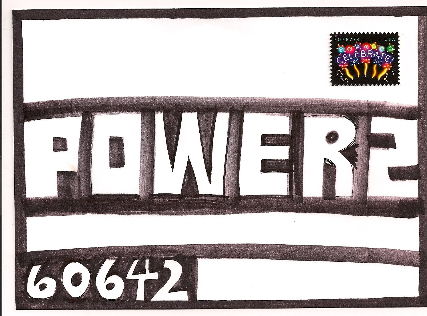
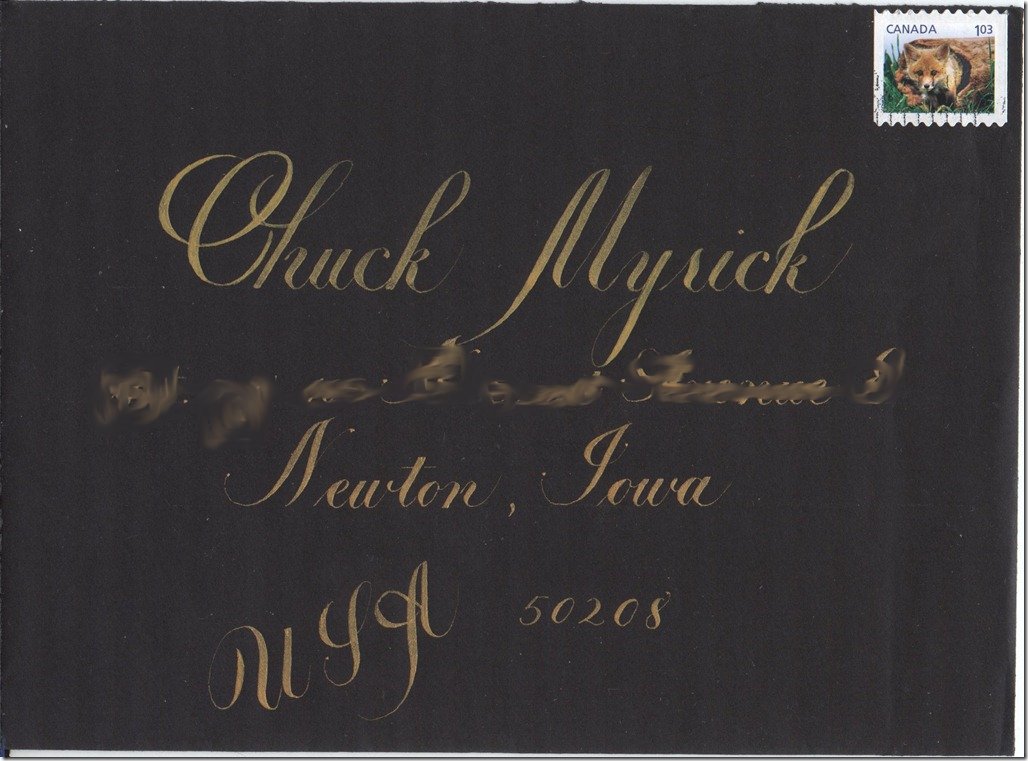
so here is a piece of lovely artwork that is perfect. it's not my art. it is jackie's. i do not see anything about it i would change. let's see if jackie feels the same way. comments?

this is what she said about the art...[this was made] during one of my color studies phases from last fall. w/n perm rose and perm green middle gouache, on rives lightweight paper. the background monoline was masked before painting it green, the white letters of the name were sketched in and painted around.

oh, i guess i *can* think of an improvement. it would look better if it said *jean wilson*


Monday, August 29, 2011

graceful - kid's entry


this was an entry in the kids category. i thought the kids this year had some really good ideas.

i have not been able to get my scanner to work. i'll try again today and keep you posted.

Sunday, August 28, 2011

graceful


i keep forgetting to buy these stamps. they are the new postcard stamps.

Saturday, August 27, 2011

more graceful


another envelope from the graceful envelope contest. i had to include this one because it looks like she started writing the word celebrate and after CELEBR
she realized she was running out of room and then got creative on the A and te. maybe not. maybe this was her plan. either way, it is a good example of inserting some alternatives into words.

i like the stamp in the lower left, but, i would have positioned it a little lower and a little to the right so that it did not cover up so much of the CE. i hope i don't sound critical. it is fine the way it is. but, i get feedback from people who appreciate comments and the *lessons* that i try to include. it is much easier to rip into my own envelopes. but, then i get people telling me to not be so hard on myself.

trust me....when i get picky, it is not about perfection...it is just something that some people are born with. they have a need to arrange things. other people have a need to keep colors in correct balance. it is hard to describe. if someone has a name for this *condition* please post it in the comment section. i think it can apply to music, and food. clothes. people tend to have certain rules about the clothing they wear. i enjoy watching people debate the rules. there is no right or wrong. it's just this *thing* that seems to be hard wired into our brains. in classes, i call it a design sense. and from what i see, everyone has one...whether they are aware of it or not


i do not know who wrote that comment in the box. i would change the word art to design. maybe art and design are the same thing. art covers music and dance. design is associated with the visual arts. the quote gets into behavior, words, actions, feelings. way too much to talk about here. but more fun than pondering the chores of the day, eh?

Friday, August 26, 2011

graceful


this is a great idea. to fill larger letters with smaller items. they can be words, or other letters or images. even dots. i suppose you have to figure out how to get those big letters on the page. if you are not comfortable drawing the outline of letters, you could print something out in a large point size on your computer and then trace. or you can set words on the computer in large point sizes and change the setting to an outline, instead of a solid and change from black to 10% black. that would give you a pale gray outline and it would not show up after you filled it in. or pale blue is good too. or pale yellow. i guess it depends on the paper.

Thursday, August 25, 2011

graceful nan


here is nan's entry in the graceful envelope contest. i believe this is the first time she has entered and she received an honorable mention. there will be a few days of graceful envelopes while i try to make friends with my scanner. when i try to scan, all i get is the little pinwheel that just goes around and tells me to wait..

Wednesday, August 24, 2011

IUOMA


i can't remember if i have ever mentioned the international union of mail artists. i am a member and never get around to exchanging with any of them. but, from time to time, i see things that are worth storing in my virtual file of images. this one is adorable...although it is not an actual envelope, but the idea would be perfect on an envelope. you'd want to put 64-cents on the envelope if you wanted to put the address wrapped around the edge like that. for 44-cents, you would want to put the address in an easy to read orientation.

if you would like to join, search for them through yahoo groups

Tuesday, August 23, 2011

turtle time

christine is having a turtle themed baby shower for a friend. she found these cute turtle stamps online as well as a darling invitation (not shown). it was fun drawing the turtles on the envelope to mimic the stamp. it was a challenge to squeeze the addresses in, in traditional format, after i took up so much space with the turtle. luckily, i have the tiny .25 G-Tec pens from John Neal Bookseller.


Monday, August 22, 2011

amelia's outer


need to redo this one. or at the very least glue a better address over the top
i was not using lines, and then drew the label border, and that made the non-straight lines unacceptable. i like the stamps....which is why i can't ditch it.

Sunday, August 21, 2011

red ink experiment


so, while the red ink was out, i tried this. i saw the idea somewhere. i think it was on betsy dunlap's site. and the new love stamp that is coming in 2012 would look great with this layout. although, i think the p.o. would require extra postage for non-conformance to their regulations. or is that non-compliance. maybe someone will research and get back to me.

they don't live on halstead. this is a fake address.

Saturday, August 20, 2011

amelia's amelia


this is why i even pulled out the icky red ink. i had the red stamp and i could not think of a single color to use with that stamp, other than red. any suggestions?

Friday, August 19, 2011

baby-lope experiment


trying to decide if i can work with the icky ink. i pondered outlining pointed pen that seemed like a completely idiotic thing to do. but, sometimes, you just have to try things that are idiotic. i'm not saying it was a roaring success. but, it was better than i imagined it would be. i'll have to wait and see what it looks like when it pops open on the 19th. today is the 9th. it is always a good idea to take your ideas and bury them for a week or so. when you go back, you might see something you like. or you might file it in the circular file. or you can mail it to a baby. what do they know? they are so self absorbed. (i'm kidding. babies are little bundles of joy)

Thursday, August 18, 2011

more baby-lopes


this isn't her real address. this will be an inner. or maybe a not at all....have not decided. better ones for amelia coming up. oh, wait, i spelled her name wrong. must think of something better. just pondering that quirky writing and pondering whether or not to throw that icky ink away.

Wednesday, August 17, 2011

scouts inner


this is the envelope that went in the envelope from yesterday. i did enclose a little note to let scout know who sent it. she probably gets tons of mail and might not have recognized my handwriting.

Tuesday, August 16, 2011

scout


there has been a bumper crop of babies this year. i finally have some mail ready. this one was born in april so she gets her mail first. as i have mentioned, i am not good at thinking up things to put in the envelopes, so, i am going to start inserting envelopes into the envelopes i mail. this is her outer envelope. tomorrow we will see her inner envelope

Monday, August 15, 2011

stamp edges


i like to use the leftover bits on the pages of stamps. it is never my most inspired work. just goofy little things i do when i am tired. it would be fun to have a formal workshop on using up stamp edges and invite some of the other envelope artists...

i'll put the unit no after the dot
and then the street and zip on a line underneath. i'm thinking of leaving the city state off entirely and see if it gets there.

Sunday, August 14, 2011

ladies hand


a month ago, i found my spencerian ladies hand exemplar and had fun with it. i have not yet mailed the envelope to kathy....i'm trying...but, i like it. on sat, our letterhead group is meeting, so i will try to do another one and send this one along. dontcha love it that platt rogers spencer created a style just for the ladies.

and the other envelope is from kathy. i like the idea of posting pairs. but this will make the cataloging more complicated....

Saturday, August 13, 2011

demo


this was a quick demo in a class. i was talking, made the S backwards. it is hard to throw envelopes in the waste basket. i prefer to finish them, so, this one will eventually have an address and be mailed. the lesson in class was to think of how to make the letters by taking away space. since i made this scan, i have added a lot to the black parts. but today, the scanner is not cooperating, so i will try again tomorrow.

Friday, August 12, 2011

old guild b'day card

this was the last bithday card design that our *late* guild produced. the ribbon lettering on the envelope is not mine. the stamp that went on the envelope was the tiffany stained glass window stamp. the lettering on the card is all mine. the green writing that is perpendicular to the name and greeting, is *happy birthday* in many different languages. i always liked this idea and think it could be morphed into other kinds of cards..holiday..anniversary, thank you, whatever...i wonder if there is an expression for *whatever* in all the other languages....

i'm pretty sure, when we sent the cards, the name on the card matched the name on the envelope. i just happen to have some odds and ends left over.

Thursday, August 11, 2011

quick


a fake address done quickly as i needed to drop the idea in the mail. the photo is on a liner. this idea has been sitting around for ages... i think it would be fun and solves the problem of seeing through the envelope. i like vellum, but i don't always want to have a complicated insert.

Wednesday, August 10, 2011

holiday card

this one arrived in 2010. i am not sure who sandra is...i do not recall signing up for an exchange. maybe she follows the blog. if you see this, sandra, leave a comment, and i will send you a real piece of mail.

the dove's wing folds over to cover the greeting and the envelope is translucent. very pretty.

Tuesday, August 9, 2011

bonus post today


the scheduled post for today is not actually an envelope, so i feel like i owe you an envelope. this one appeared a few days ago but you could not see the little man. he was drawn in pencil. i inked him in so he would scan. and added the red part of the address. i have to ponder the stamp. one or two? i have a hard time with stamp proportions and putting a portrait stamp on a landscape envelope. jackie tells me, she too has issues with stamp placement and is leaning towards not using stamps. i, on the other hand, get so much inspiration from the stamps, that i would have trouble ditching them.

hmmmmm. now i am looking at the loops. need to do something with that whole situation.

holiday reminder


hope you are all getting your holiday mailings ready to go. this was the card i did one year. it would have been fun to use this idea on the envelope. the person's name would have been hung on the antlers and the address would have run across the bottom where the greeting is.

Monday, August 8, 2011

strawberry - garden of love


i like this one a little better than some of the others, but it only works with a strawberry shaped letter. i added her street address before i mailed it. now that i am looking at it, i think the tiny lettering should have been round-y rather than point-y. but, it's been mailed...so...maybe i'll do it one more time.

Sunday, August 7, 2011

better love leaves


this is the stamp from the garden of love stamps that i have not yet found a design that pleases me. i think this one is very close to being pleasing. i also can't remember if i already posted it. if i did, i will post a second envelope around noon CST.

i think i did the lettering with a gray zig marker. i know i put the white in with a white gel pen. the gray might be colored pencil. or it might be a regular graphite pencil. i mailed this one. clearly, the image is cropped....i don't know why...but, it is gone, so we'll never know.

Saturday, August 6, 2011

tami from cheryl


this was supposed to be the first post in the *tami series* but the others had to be bumped ahead in line, so now it is the last one.

tami sent me some scans of envelopes in her collection. she has moved, so this is not her current address. she thought i might have done this one, but it is the work of cheryl adams. cheryl was my second calligraphy teacher. the first was stan hess, one of the hess brothers, the one who taught at drake. i learned uncials from him. although he just told us to buy a book and copy the letters. cheryl was my teacher back in the 90's when i started taking classes at the local art museum. cheryl brought notebooks full of decorated envelopes to classes and that is what launched my *thing* with envelopes. don't know what to call it. obsession sounds too much like an illness or disorder. need a word. prizes awarded to people who come up with good words to describe a reasonable (although admittedly excessive) relationship with a paper product.

Friday, August 5, 2011

how'd she do it


i'm wondering how this was done. the shades are so thick. maybe chuck will email me and tell me what he knows about it. i did the blurring back on the day i learned how to blur. sadly, i have forgotten how i did it. pitiful.

Thursday, August 4, 2011

celebrate - yellow


i don't think i have posted this one yet. it was the one that led up to the one that i finally liked after struggling with this stamp. and this one is growing on me. i think it needs to have every square inch filled in and then i would like it. purple marker on yellow envelope = mud. i went over the mud with colored pencil to lighten it up. always remember colored pencil to lighten things. and you need decent colored pencils. prismacolor and not the student grade. there are some that are even better than prismacolor, but, i can't let myself have them...or i would not get anything done.

Wednesday, August 3, 2011

tami silver


this was a holiday card. the envelope is the translucent vellum. the card is too. i punched out snowflakes and glued them onto the strip of paper. was having fun with the silver marker. probably a sharpie. this was a go-to style when i had to crank out a lot of cards as fast as i could. i have a terrible time teaching this style. i think the name has some problems. but, the comment on the card is cute. tami is a very good artist, has a degree and also teaches, so she is aware that accidents are simple invitations to be more creative. it is one of those concepts that is hard to convince beginners that it is true. but once you realize that the accidents are like gifts...then you are freed from the weight of what-if-it-doesn't-turn-out-the-way-i-want-it-to.

some day, i will dig deep enough into my stash to find the cards that i received from tami. they were always gorgeous. and she clearly spent more time on her cards than i did on mine.

Tuesday, August 2, 2011

tami - black envelope


found another scan in my stack of 870 emails. tami sent me some scans of envelopes in her collection. i remember loving this set of stamps. this was back when my gel markers were nice and new.

Monday, August 1, 2011

mail art exhibit

http://mailartmeans.blogspot.com/2009/06/from-jean-wilson.html

a while back (2009) i saw a request for people to send a postcard to someone who needed mail art for an exhibit or class project or something, so i sent one. i forgot all about it. then, today, i was searching images on google and it popped up. i have not looked at any of the other art that is posted. might get around to it s-o-m-e-d-a-y