Saturday, December 31, 2022

Mish-mash - I-T-H-L-F-U -- Block printing no. 5


I think I picked up a regular pencil instead of the wash pencil - so the only option was to color in the spaces. Below is another double mistake. Flipped the UR to RU and then flipped EN to NE -

I like that style of lettering and hope I remember to try some more. I lost any info on whose style that might be.


I've also lost the name of the person who deserves some credit for the style below - maybe Mike Gold? If anyone knows, let me know. It is another style that deserves some more attention.


 And ta-da - today (Dec 21) the filling of this post concludes the filling of 2022 - plus we know that Jan 2023 is full.

Sorry about the lack of continuity in the block printing lessons. I will recap these 6 letters when we get started again in February. It seems odd to add U to the group of least complicated letters - but it relates a bit to the E and the L.

You start with a vertical stroke and then turn the corner and head across the bottom. It can be a sharp turn or it can have some curve. If you want to keep things in a style that reminds us of how architects write - be sure to do a very slight curve on the bottom - not a big U-shape. just enough so that when you pull the final stroke - from top to bottom - it will leave a tiny space that gives the U it's you-ish-ness. That's a phonetical word. I wasn't sure if u-ish-ness would make sense.

And maybe I should mention that the alphabet is a series of symbols. There are many ways to make them and some of us are endlessly amused at different ways to present the symbols that are perfectly clear - although you might have to work at it. 

Again - I apologize that this block printing lesson is going to have a 4 week gap - but we just have to roll with the chaos and maintain a semblance of ...of ...of what? Peace of mind? It is now 4 pm - no more coffee until 5 am - so - we are in the *dull* time of day. Night-night.


Friday, December 30, 2022

To Lauren, Gloria, Mia - I - T - E -- Block printing no. 4


I don't think anyone wants to listen to me complain about all the things that I'm not happy with on this batch. I didn't let them bother me as I was making them or mailing then. Looking at them later, I am still just letting it go -- and looking forward to things that I have planned for 2023.


I was wrong yesterday about having only 2 days left to fill - I had three - but I wasted one. So we will go to plan B on our discussion of block printing. 

I photographed a few examples and we will be looking at some specific letters. As you recall - that first batch started with the capital-i. Somewhere - a ways back - we talked about the choice between putting the cross bars on the I. I usually do not - some people love them. It's personal choice. I won't try to change anyone's mind - I'll just ask you to look at them and see how you feel about them.

Then there is the T - a vertical stroke and we have to decide how long (wide) to make the cross bar. It depends on if you are going for square or wide or narrow.

And let's look at some E's - again - are we going for square, wide, or narrow. And the spacing between the three bars.


Notice the up-tilt to the cross-strokes.
Notice that you can see that the cross-stokes were *flicked* and they are thinner at the end.
Notice that the E was made by dropping down with the vertical stroke and then turning the corner and making the lower cross-bar - as if she wrote an L.
Even though we are not talking about the R - notice that little upturn at the end of the leg.
This was done by someone who has been paying attention to her lettering for a very long time and has studied seriously.


This is done by someone who is new to the arts and has come a very long way by observing and implementing - without any classes whatsoever (as far as I know). This was not on a fancy decorated envelope - probably done very quickly - but with enough care to make it legible.
It might benefit from having actual space between the letters. Some are touching. The J and W are proportionally larger than the D and M. I'd ditch the crossbars on the  i in Wilson - but they look nice on the IA.
Notice - once again - the E starts by making an L. The E in Jean is skimpy on the bottom crossbar. The two Es in DSM are a little better.
This person has done some lovely lettering - so - I hope they are OK with me using this as an example on the blog. I like to show the difference between what we toss off without thinking compared to when we are trying to make things lovely.


This person was definitely going for carefully thought out letters. They might even have drawn guidelines. Notice how the cross bars are low. I can't tell if they picked up the pen on the E - or if they drew an L and paused enough to make that corner very sharp. They might have drawn the three crossbars starting at the top.
Notice how the R has a large bowl at the top - to reflect the low cross bars. The A has a low crossbar as well.
Compare the S in DES and the S in MOINES.
It's very tricky to make an S with a larger *bowl* on the top. And the S is challenging for a few reasons. I'll post some of my favorite alternatives to S - but it will probably be at the very end of our block printing discussion - which will be in February.

Somehow I managed to fill up January -- and I have no idea what's there ---


Thursday, December 29, 2022

J's Poinsettias - Block printing No.3


Way back in November, I did manage to find my triangular brushes and some white paint and try some of these poinsettias. It was fun and I was sad that I did not see adequate time on the horizon to do more than these 3 practice ones. I addressed one to Maggie and I am not pleased with where my script-skills have gone. Half of it is Maggie's fault for the letters in her name. Just kidding, Maggie. In the olden days, I could do any and all names to my liking.

***

We are off to a chaotic start in our block printing tutorial -plus- I have entered the vortex of universal ambiguousness. That's what I am calling the end of year situation where there are random things happening in so many different directions that I don't even know where to focus my attention. 

In all my years of helping people with penmanship - I learned that there is not One Best Way to help people. So, you will have to embrace the chaos. I am going to insert a major rant here about the truly unfortunate way that youngsters are introduced to penmanship.

The exemplars are never done by hand. They are devoid of any natural motions. Those circles and straight lines are nearly impossible for anyone to make - even as an adult. They present perfect circles which are very difficult to draw. Then they built ridiculous letters like this B - which is absurd. Nobody is going to make a B that looks like that. It is a general template for the direction of the strokes - but it is goofy.

Compare it to the perfect roman B and you will see that the proportions are barf-worthy.

Remember the lovely romans from Peter Thornton?
They have a lovely organic quality. There is more volume at the top so that they are like balloons - 


One of the main issues with block printing are letters that *droop* and have more weight/volume towards the bottom of the letter.

I hope this exchanger is OK with me using the D and R as examples of letters that could be improved.
The D is droopy. The way the curved stroke overshoots the vertical stroke is something to ponder.


The bowl on the R is skimpy. Peter's lower leg that kicks out should be noted. I put a lot of kick in my R's for no good reason. It's an impulse. We have discussed putting the crossbars on the I. Sometimes they work. I think these are starting to be distracting. 

To be clear - I chose this example because the S's are very nice. The EET and OINES and OWA are all very nicely spaced. It looks like it was done without guidelines - so - for free-handing - it is excellent. I'm thinking I might be pulling out examples that are already posted. Hopefully nobody freaks out if they see their block printing used as an example of *needs work.* I'm confident that nobody is going to try to figure out who wrote what. I'll be looking for examples of my own work that needs improvement.


Wednesday, December 28, 2022

Mia + DebbieG - Block printing preface - Peter's exemplar


I'm pretty sure I already posted Mia's deep sea diving envelope - but, I don't think I included the card - and I appreciate any and all comments with positive feedback. I spent some time going through the box of *fan mail* that I have saved up over the years and I was overwhelmed. I am undecided about posting more of it - and if I do - it will be to encourage people to keep expressing thanks and appreciation in all directions - not just to me. I know how good it feels to get random comments that one was not expecting.

Below - as I recall, I couldn't remember who wrote that *RUN* and it turns out it was Debbie -  I posted the note she wrote - because she said that she hopes it will inspire someone to break free and run - as she had just done in a Julie Wildman workshop.


Preface to the block printing lessons.
I should have started by describing the 3 main types of block printing. 
The Romans settled on some very specific proportions for the alphabet a reeeeeeally long time ago and anyone who studies lettering marvels at how those proportions are still very beautiful today. I have a handout from Peter Thornton that is not under copyright - in fact - it has his little Y in a circle - which means he encourages people to share it with the hope that more people will be aware of the beauty and it will encourage better lettering.

The second type of block lettering is the type that architects use. That's the one I started with yesterday. It gives (nearly) the same amount of space to the letters - with W and M being a tiny bit wider - I and J being narrower and -- all the rest fit in a box. Often times the box is square - but it can also be a rectangle and it can be portrait or landscape -- and the best part of all - there are a ton of variations that people can choose to make their lettering very expressive and personal. 

The third type of block printing is the most boring. It's the stuff they teach in public school. It's all function. No finesse. It is what we all learned and it is the reason that there is a lot of generic block printing out there - and also really ugly block printing.

So bear with me and we will slog through all my quirky opinions about block lettering - and maybe some of you will be inspired to fix the droopiness and sloppiness that has etched itself into your muscle memory.
 
Here are Peter's romans - after I cover my version of architectural penmanship - we will come back and compare it to romans.

This exemplar shows where you can apply pressure with a pencil to emphasize portions of the strokes.
You can also see some very slight curves and tilts.


There is the little Circle-Y symbol Peter invented that indicates he is happy for people to pass the exemplar along with the hopes that there will be more attractive lettering in the world.


Tuesday, December 27, 2022

Nov 2022 from Mary + Block printing No. 2 + Scrap

This is a very cool parrot - although I do not know if it is a parrot or cockatoo or some other tropical bird. I love-love-love the way the address is in the rectangle.

And there were more birds inside. And more little drawings. I need to interview Mary about her feelings towards lettering and illustration. Remind me to do that, Mary. Should we call them interviews or interrogations? (That is the coffee asking.)


Block printing post No 2


I hope these are legible. I just wrote them really fast - so there are places that are not very exact. Let me know if I need to post larger images of these. There will be some larger images coming up when we talk about individual letters.


With many (many!!) styles - I encourage people to just work on the letters that are all straight strokes. I do put J and U into the mix - because they are mostly straight. The non-straight letters that are either - entirely curved or mostly curved will be discussed later. 

We will go over a variety of options with these letters first.

***

And just because I started a *label* for the random scraps that I am throwing away - here is one that you may ignore - unless you are very disorganized and would like to feel better about being a disorganized person. If you are highly organized - I apologize for the attitude expressed by these words - it's more of a joke than a whatever you call things that are not jokes. I do not remember where I found it ---


It says: Disorganization is merely the sign of a very healthy individual trying t do more in a short period of time than those lazy obsessively tidy types can think of nothing better to do than straighten objects in drawers and stuff like that which only feeds on their own egos and makes them think they are better than those of us who are truly gifted.

I actually love to organize drawers - so, I must be some kind of hybrid. Or mutant? 

Monday, December 26, 2022

2 Leslies + Scrap + Block printing No 1


Leslie has done so many fun envelopes with her coffee stamps. The cup of coffee in the middle of *George* is very clever - and once again - the swoopy g's are lovely.

I have no idea how she did those double stroke letters on my name below. Seems like she would need two different sized broad edge nibs. 


As I recall - I have mentioned that we are going to talk about block printing - during the week between xmas and new years.

I was sifting through my stacks and found this little rough draft (below) - and threw it away - after taking the photo. I still like the sentiment - but my days of doing pretty little sayings are probably over. The only reason I posted it was to announce that I am going to talk about block printing for a few days. Maggie and I had an email conversation about block printing. It is also known as manuscript (as opposed to cursive - and cursive is also know as script). The terms for lettering/writing/penmanship can be confusing - especially the word *printing* - which is why I call it block printing.

The very quickly (carelessly) written saying - was done to figure out the spacing. For me - it is a scrawl - never meant for any eyes - other than my own. I am only posting it because it illustrates that even when I am mindlessly scrawling - I have some *good quirks.* They may not seem *good* to you - but I will be showing what it is about my quirks that I like better than some other quirks. 

These letters are mostly narrower than a square. I do not have any polished exemplars to show *perfect* block printing. I just wrote some things on notebook paper - and will post them tomorrow. The purpose is for you to look at your own block printing and see if you would like to ditch some of your quirks.

This is long enough for today.


It really is an appropriate sentiment for penmanship.
It says: 
What we have once enjoyed we can never lose. All that we love deeply becomes a part of us. Helen Keller

Sunday, December 25, 2022

Nov 2022 from JeanR


This photo ran in 2015-6. It popped up on Pinterest and I was actually very pleased with the little people. Maybe I will delve into the blog and rerun some of my older work that pleases me. As usual - these would not be cute envelopes without those specific stamps. 

It's all about the stamps. 

I'm writing this on the Tuesday before Thanksgiving. I had something else lined up, but it needed some photos and editing and it was easier to bump it into the future. 

Even though the sun is shining and I have no obligations hanging over my head - this seems like a very blah post. I will liven it up with a sneak peek at an exchange envelope that arrived in November. I put my daughter's name on the list - because she has a Nov 27th birthday so I thought it would be fun to send her a big stack of fun mail.

Some of the exchangers went the extra mile and sent an envelope to me as well. And JeanR went 2 extra miles by including cards. Thank you so much. Since I have not opened Ellen's envelopes I do not know if we received the same card. I love mine. The sentiment would be perfect for my daughter, too.

In case it is too small to read, it says: LIFE IS MESSY. You can say that again.  Thank you JeanR! And thanks to the USPS for cancelling at the bottom.


Saturday, December 24, 2022

The Annual Dec 24th Story

 I'm offering an alternative to my annual Dec 24th story - because it's not very good. Here are some very impressive gingerbread houses. Scroll past the first few posts - until you see the first gingerbread house. They are very cool. https://www.instagram.com/omnigrovepark/


I also enjoyed these gingerbread houses from NYC. LINK to NYC gingerbread houses

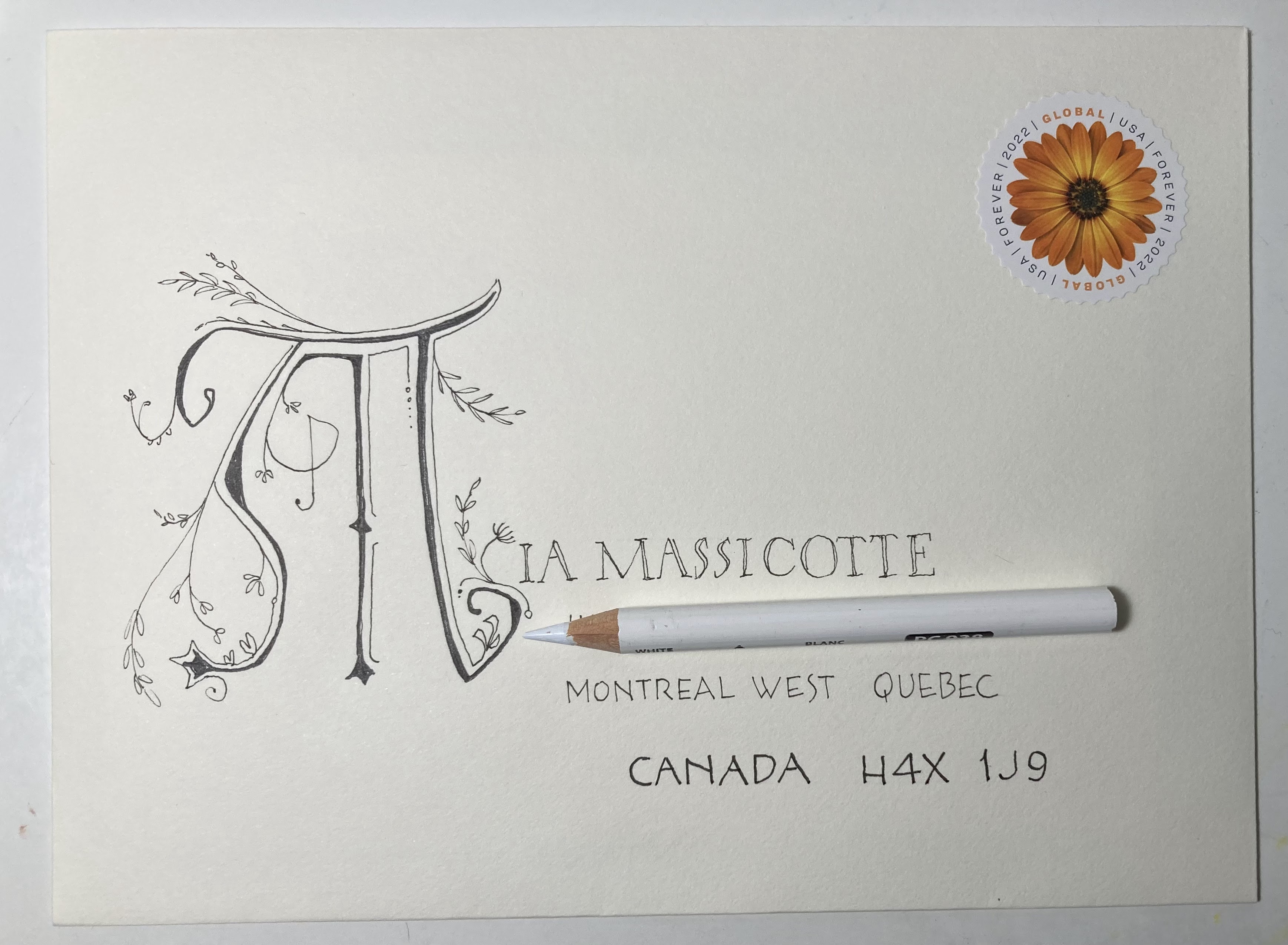
This was the card in Lauren's 2021 mailing.

This year's story started on Dec 23, 2021 when MrW arrived in Chicago. I had flown in on Dec 16th to help with the first week of winter break. I had left a bag of presents for MrW to bring in his vehicle. Sadly, he forgot the bag of presents. My very first thought was: Actually, this will make a wonderful rant for the blog.

I had to decide how to respond to MrWs forgetfulness. My memory is so spotty, that I figured it was probably better for me that he was having his own episodes. Perhaps it makes me look good. It's hard to be annoyed with MrW because he is probably very frazzled at all the things he has to do that I don't do (yet). Healing the brain is not a purely physical thing, where you can restore specific parts, like muscles, bones, etc. Gray matter is a little too *fluid.*

***Inserting this comment in real time. When I wrote that last part - I was just 6 months out from my brain injury and had not even started rehab - so I was in a very weird zone of adapting to the new reality - but very uninformed about the reality of where things might be going.***

Now I am writing on Dec 31, 2021 - we are home from the holiday trip to Chicago - and I have not gotten the presents sent. I've been reflecting on how many miserable things happened in 2021 and then I thought - gee, maybe I could just keep a running list of all the bad stuff that happens in 2022. I could park it in my blog. I have 357 days to decide if this is a good idea or a bad idea.

It been a week since Xmas - and already the forgotten Xmas presents do not seem like such a big deal. Maybe we can start a new tradition where the Wilson presents arrive on Jan 23rd, John Hancock's Birthday.

***

March 13 update. I never bothered sending the presents. I am going to fly in to Chicago at the end of March and MrW will drive in in mid-April. I'll give him the bag of presents and maybe he'll remember them. If not - no big deal. It seems like nothing bothers me any more. As long as WWIII has not started (officially) that's about all anyone cares about these days. 

***

May 29 update. We had to cancel MrWilson's trip to Chicago because those of us in Chicago had covid. New plan. Open the presents when the grandkids are in Iowa in June. Obviously, I forgot all about my good idea to keep a running list of all the bad things that happen in 2022 - which is just fine because it was  not a good idea. Maybe I'll keep a list of all the good things that happen.

***

Oct 30 update. Well, I see that I completely forgot about adding things to the good/bad list for 5 months. May, June, and July were the months I focused on out-patient brain rehab. I learned to ignore things like good and bad. I learned that brain rehab is some kind of abstract adventure. I learned that all those things like proper food and exercise will do more towards rehabbing than anything else - IF you can maintain a mindfully healthy attitude about everything they teach you AND maintain balance so that you do not tip yourself into the overboard side of healthy eating and fitness. Did I mention how abstract it is?

Seriously, it is like being a character in a movie - and they all think it is real life - but you know you can't tell them it's a movie because then you will appear to have lost touch with reality.

***

Blah-blah-blah. I'm disappointed in this Dec 24th story. But, I'm not going to let it bother me. Thanks again to all my pen pals who wander/meander/trek and cross paths with me either in real life or virtually. 

***

Wrapping up the original story. One of the presents for the grandkids was a cake decorating set. I finally got it to Chicago when I was there in the middle of October and we made gingerbread men shaped cookies - and then piped skeletons on them. I did a ton of frosting based activities when my kids were little - and sadly - gave away all my decorating supplies. I was shocked at what a mess it was and regretted the idea of getting back into it. I was reminded that my kids never wanted to do anything that I wanted to do -- so I got to do all my decorating in peace. They would be off doing their own thing.  Sorry I can't show my grandkid's faces -- they're cute-- but - my daughter and I do not post their images on the internet. She did say that she is interested in trying some decorating on her own. I urged her to buy the buckets of pre-made Wilton frosting. I always made my own -- because the buckets were not available back in the olden days. I will encourage her to try the royal icing made with meringue powder. It is much easier than buttercream and reduces the amount of sugar that is ingested. 


So -- that's the Christmas Eve story. I hope everyone is adjusting to (coping with) whatever is going on - and that you all know how much I enjoy my pen pals.

Best wishes to everyone.


Friday, December 23, 2022

Nov 2022 from Chuck and Carolyn - USPS Ft Myers


Chuck sent this a couple weeks ago -- it made my day. 


Once again, it's fun to get such similar envelopes.
I keep forgetting to ask Carolyn if she knows which style of cursive she learned in school. Hers looks more like Palmer than Zaner Bloser. How do you know if you learned Zaner Bloser? I'm not 100% sure about this - but, I think that Zaner Bloser had that white on green *frieze* that was posted above the blackboard. It seems like it was too long for one wall and usually extended beyond the corner. Does anyone else remember?


***

I meant to add this a month ago (or more) when I first saw it -- 
better late than never - as I am guessing that Fort Myers is not 100% restored.
It's a video of postal workers talking about the aftermath of the hurricane.

LINK to USPostalService IG - this is the specific post

LINK to USPostal Service -  and this is the link to the main page

I could have done a better job of labeling those- but, today is International Sloth Day.
I just made that up.

***
I only found one image of the wall chart I remember - and it was for manuscript not cursive - but it did say that it was vintage Zaner Bloser - and it's for sale in Australia - on Etsy.


Thursday, December 22, 2022

Nov 2022 from JeanR - 1843 alphabet book


 This looks like an abstract pumpkin pie. The tiny little detail on my name on the envelope harkens back to medieval styles. Below is a link to a book from 1843 covering a wide range of styles from many different periods.

This link will take you to page 40 of a collection of alphabets - so you may cruise back and forth from there.

It looks like you may download images (or the entire book) although I can't tell what the resolution would be. I'm pretty happy with my screen shots even though they are low res. I'm pretty sure everything is copyright free - but, I could be wrong. 

This is pg 40 - probably not the most enticing example from the book


There are some very old styles and some in colors.
That little flourish at the bottom looks like a lot of fun. There is a second one going in the opposite direction.


***
Turkey neck update.
Chuck had this to say:

When my mom's family got together they almost fought over the neck, the same with chicken necks. they were from Missouri and would eat about anything, even pigs feet. 

Troy sent this, which I intend to research:

I saw your post on turkey necks. If you Google turkey necks in New Orleans, you can get recipes. 

There is a place in Houston called the Turkey Leg Hut. They have lines out the door. Their neighbors have complained about the smoke. Anyway, I don’t think they serve necks, but they have a long menu of legs. 

My son, Hunter, called me from the grocery story. He found turkey necks and wanted to know how many to buy for me. Christmas came early at the 420. And Troy is correct -- there are a gazillion recipes for turkey necks on YT.