
I don't think anyone wants to listen to me complain about all the things that I'm not happy with on this batch. I didn't let them bother me as I was making them or mailing then. Looking at them later, I am still just letting it go -- and looking forward to things that I have planned for 2023.

I photographed a few examples and we will be looking at some specific letters. As you recall - that first batch started with the capital-i. Somewhere - a ways back - we talked about the choice between putting the cross bars on the I. I usually do not - some people love them. It's personal choice. I won't try to change anyone's mind - I'll just ask you to look at them and see how you feel about them.
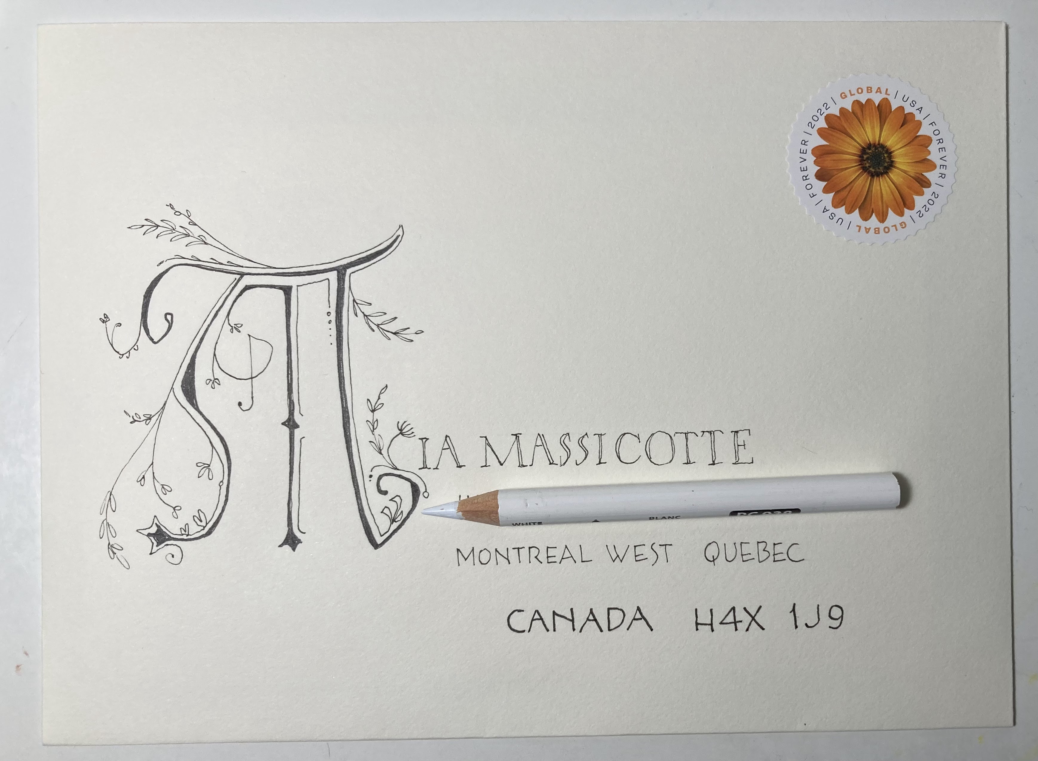
Then there is the T - a vertical stroke and we have to decide how long (wide) to make the cross bar. It depends on if you are going for square or wide or narrow.
And let's look at some E's - again - are we going for square, wide, or narrow. And the spacing between the three bars.

Notice the up-tilt to the cross-strokes.
Notice that you can see that the cross-stokes were *flicked* and they are thinner at the end.
Notice that the E was made by dropping down with the vertical stroke and then turning the corner and making the lower cross-bar - as if she wrote an L.
Even though we are not talking about the R - notice that little upturn at the end of the leg.
This was done by someone who has been paying attention to her lettering for a very long time and has studied seriously.

This is done by someone who is new to the arts and has come a very long way by observing and implementing - without any classes whatsoever (as far as I know). This was not on a fancy decorated envelope - probably done very quickly - but with enough care to make it legible.
It might benefit from having actual space between the letters. Some are touching. The J and W are proportionally larger than the D and M. I'd ditch the crossbars on the i in Wilson - but they look nice on the IA.
Notice - once again - the E starts by making an L. The E in Jean is skimpy on the bottom crossbar. The two Es in DSM are a little better.
This person has done some lovely lettering - so - I hope they are OK with me using this as an example on the blog. I like to show the difference between what we toss off without thinking compared to when we are trying to make things lovely.


This person was definitely going for carefully thought out letters. They might even have drawn guidelines. Notice how the cross bars are low. I can't tell if they picked up the pen on the E - or if they drew an L and paused enough to make that corner very sharp. They might have drawn the three crossbars starting at the top.
Notice how the R has a large bowl at the top - to reflect the low cross bars. The A has a low crossbar as well.
Compare the S in DES and the S in MOINES.
It's very tricky to make an S with a larger *bowl* on the top. And the S is challenging for a few reasons. I'll post some of my favorite alternatives to S - but it will probably be at the very end of our block printing discussion - which will be in February.
Somehow I managed to fill up January -- and I have no idea what's there ---
You know you never need to ask to critique my writing - I'm always happy to gain insight :)
ReplyDeleteYup, no lessons other than what I learn from your blog.
This was written hastily in a cramped space - for some reason IA without the cross bars always looks odd to me, and I added them afterwards to the I in Wilson - and I can see that it was not necessary.
I love the Gloria Dawn envelope, and I love writing her name on envelopes!
ReplyDelete