
I'm pretty sure I already posted Mia's deep sea diving envelope - but, I don't think I included the card - and I appreciate any and all comments with positive feedback. I spent some time going through the box of *fan mail* that I have saved up over the years and I was overwhelmed. I am undecided about posting more of it - and if I do - it will be to encourage people to keep expressing thanks and appreciation in all directions - not just to me. I know how good it feels to get random comments that one was not expecting.
Below - as I recall, I couldn't remember who wrote that *RUN* and it turns out it was Debbie - I posted the note she wrote - because she said that she hopes it will inspire someone to break free and run - as she had just done in a Julie Wildman workshop.


Preface to the block printing lessons.
I should have started by describing the 3 main types of block printing.
The Romans settled on some very specific proportions for the alphabet a reeeeeeally long time ago and anyone who studies lettering marvels at how those proportions are still very beautiful today. I have a handout from Peter Thornton that is not under copyright - in fact - it has his little Y in a circle - which means he encourages people to share it with the hope that more people will be aware of the beauty and it will encourage better lettering.
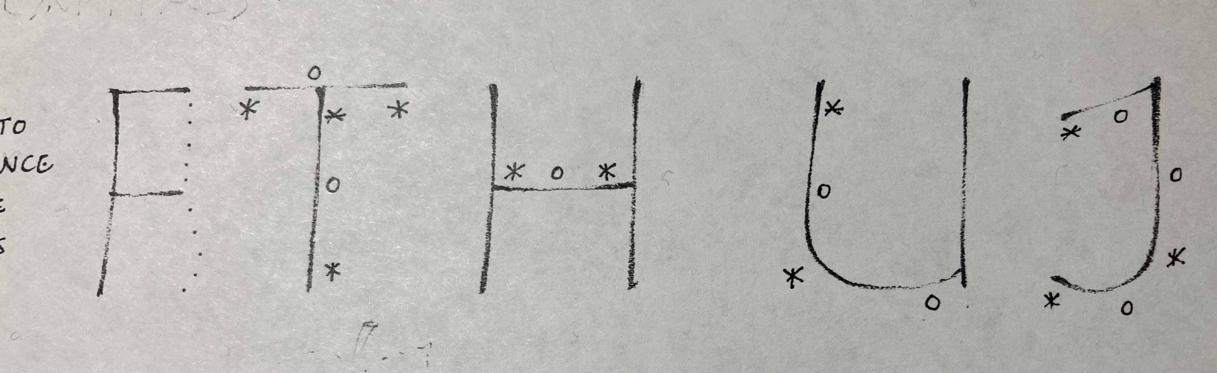
The second type of block lettering is the type that architects use. That's the one I started with yesterday. It gives (nearly) the same amount of space to the letters - with W and M being a tiny bit wider - I and J being narrower and -- all the rest fit in a box. Often times the box is square - but it can also be a rectangle and it can be portrait or landscape -- and the best part of all - there are a ton of variations that people can choose to make their lettering very expressive and personal.
The third type of block printing is the most boring. It's the stuff they teach in public school. It's all function. No finesse. It is what we all learned and it is the reason that there is a lot of generic block printing out there - and also really ugly block printing.
So bear with me and we will slog through all my quirky opinions about block lettering - and maybe some of you will be inspired to fix the droopiness and sloppiness that has etched itself into your muscle memory.
Here are Peter's romans - after I cover my version of architectural penmanship - we will come back and compare it to romans.
This exemplar shows where you can apply pressure with a pencil to emphasize portions of the strokes.
You can also see some very slight curves and tilts.


Those illustrations are excellent!
ReplyDeleteSuch a fun idea! It would go great with the shark lady stamp.
ReplyDelete