Thursday, June 30, 2022

Chuck (5)


This is a design idea worth considering. It won't work on a long name - but it's a very good way to put a shorter name on a longer envelope. There are so many ways to fill the space. I even like the way the stamp fits in with the other elements. And there's that lettering style I like so much. The line-shading in the letters go nicely with the lines in the background.

I guess we should have a little celebration. It is still June 3rd. The over-baked lemon pie is still warm. But, the June blog posts are officially scheduled. By the time I read this the travel and visit with the grandkids will be ancient history. Only a couple more weeks of rehab until we evaluate how the past 3 months have gone. So, time marches on. 

Unless it didn't - and creatures on another planet have been digging through the remnants of our planet and have come across stuff like this and are trying to figure us out. Trust me. Not a good use of your time, visitors from outer space. Things were interesting for a while - but then everything got too complicated - and then it imploded. But it was a very pleasant and peaceful implosion. 

Sorry - my mind wandered. Ignore that last paragraph.
 

Wednesday, June 29, 2022

Two from ChuckM (4) - nudging Karl


Two from ChuckM today because I thought it would be fun to see these side by side.

Only a couple days until sign up for the July exchange. I wonder if we will get any new people. I'm talking to you, Karl. I don't even know if Karl reads the blog. I met him on the Flourish Forum - and he is cut off the same bolt as ChuckS (not to be confused with ChuckM. I've been forgetting to add the M to all the Chuck posts. ChuckS's penmanship progress has been posted in a couple recent posts.

Karl is also working on improved penmanship and while he chose Spencerian - there are things about his methods that remind me of ChuckS. They are both very studious and organized about their process. Amazingly - they both let me boss them around. That's probably because when I give them my gold-standard opinions and they see immediate results - they deduce that I am not some random lunatic on the internet. 

So, Karl, if you are reading this. Please follow the directions on July 1 and sign up for the exchange. You will send 5 envelopes and you will receive 5 envelopes. It will be fun. You have spent enough time practicing - it is time to send something out into the world. 

Actually - I started leaning on him to mail letters to people in early June - so maybe he already has a slew of pen pals. But - the exchange might be fun for him. Maybe he'll let me show his before and after examples. They're impressive.
 

Tuesday, June 28, 2022

Chuck's (3) to John Neal


 I love-love-love this lettering style. I know I have an exemplar in my stash. Now I am wondering if it has a name - or was there one person who came up with it. Now I am wondering about the history of designing fonts and when people started copyrighting them. And how did things work back in the day of lots of hand lettering. <sigh> So many questions. Probably too late to get into educating myself.

By the way, I don't know if I mentioned this - but John Neal has retired. He found people to take over the publishing and other people (Paper & Ink Arts) to take over the business. I sure hope he has an enjoyable retirement. He was instrumental in getting me on board the calligraphy train - the one that goes all over the country and beyond. I wonder if I should write down my *history.* It's not like anyone in my household would ever be interested. They grudgingly put up with my *pass time.* Not that I want to make them look non-supportive. I think they all realized that being left alone was one of my fondest desires. They all found their own *pass times* and seem to be well adjusted people. Well - compared to me they are well adjusted - which might not be all that impressive.

Monday, June 27, 2022

Chuck (2) Real time update

There is one similar to this in my collection - and I'm sure it is somewhere on the blog - and you really need to see these fine-lines-from border-to-border designs in real life to appreciate the work that goes into them. Soooo pretty. The red border is way better than just running the basketweave off the edge. I'm not sure why - but I just know it is.

 ***

Huge thank you to the people who sent mail in June. Some of it was addressed to my grandkids - others to me. The grandkids LOVED their mail. I loved my mail, too. I'd swoon at length - but, my swooning isn't a good use of our time. There will be some jabbering in July about how things unfolded in June. At this moment, it is noon on Sunday (yesterday) and I am enjoying my noon coffee. The weather is so perfect that I am verklempt. Maybe it's better to only have one or two good days per month - because then we appreciate them more. I have dismantled the LEGO structures built during the grandkid visit and sooooo tempted to leave them out so that I can make my own creations. Soooo tempted. I'll have to ask if LEGOs are a good brain-rehab activity. Fingers crossed. It took about three hours to dis-assemble and sort the pieces. It seems like I earned some *play time.*

Sunday, June 26, 2022

Chuck (1) & Susan V Battle


 I was going to do 7 Chuck-alopes this week after our week of Sharon - but this is exchange sign up week. Why would that matter? It doesn't. OK. First of 7 envelopes done by Chuck. Some of them do not have stamps - but it's fun to imagine various planetary stamps or earth stamps that would have worked nicely with this one. 

On a sad note: I parked myself really close to the lemon meringue pie in the oven to avoid spacing off. 


And then I spaced off. And yes, the meringue is overdone. Grrrr. But IMHO the meringue is the least important part of the pie. Although, I could blame it on using that little oven - since the scorch is on the top.


Here is what caused me to space off. A lady who does collage. Itty-bitty collage. And it reminds me of a favorite item I made using itty-bitty bits of used postage stamps. So, I was pondering if maybe I should cultivate my interest in collage.

Here is her IG
https://www.instagram.com/sarahvbattle/

and here is her website

https://www.sarahvbattle.com

It probably helps to look at the photos on a larger screen to appreciate the detail.


Saturday, June 25, 2022

Sharon (7) birthday rainbow


 This concludes *Sharon's Week* - a big thank you to Sharon - and bonus points for adding comments to help me out with the *words.* I can't think of what we call the blurbs that go with the envelopes. Is there a word besides *blurb*? Is that what I am - a blurb writer?

Sharon had this to say about this one:

I thought the “Happy Birthday” stamp was a little tricky to use. Maybe it’s the green? This envelope, like many in the Sophia birthday series, is made from AstroBright paper. I think it goes well with the stamp. The address, city/state, and zip lines were centered under the arc.

Yes, Sharon, I agree - and I think I have mentioned that the muted tones in that stamp are tricky. We seem to have a congruency in our color-meters. 

I don't usually write at 6pm - but here I am. Still working on juggling my activities to re-program my brain. Thank you all for your patience. 

***

neuroplasticity - that's the word that is the focal point of rehab - literally - big and on the wall. Here is a definition:

The ability of the brain to form and reorganize synaptic connections, especially in response to learning or experience or following injury.

I'm curious to know if when a person has formed and reorganized her synaptic connections if the new connections can *discombobulate.* After a week with the grandkids - I've noticed some old weirdness has come back. Nothing concerning -- I imagine I can re-reconnect things. Back to rehab on Monday - after a 2 week break.

Friday, June 24, 2022

Sharon (6) blue LOVE stamp


 Sharon wrote:

I love this calligraphy style from your blog. I used a large calligraphy pen for the thick part of the letters and then used a matching skinny pen for the rest of the letters and the curlicues. I could improve it by planning out the letters so the “t” wasn’t so squished.

I love that style of lettering, too - and had completely forgotten about it -- it's pretty easy - and forgiving. The squished-ness of the t doesn't even bother me. Although, it would have if I had done it. It annoys me when I look back at the left margin and see gobs of space - and then I *if only* myself - because it would have fit beautifully. I guess the only solution is to always do a practice run.

The other thing I like - is a medium tone paper where you can use a dark tone as well as white. The perfect-ness of the paper with the blue in the stamp is a bonus.

Thursday, June 23, 2022

Sharon (5) pink Beatles quote


Sharon wrote:

Who can resist the Beatles? The lyrics to their "Birthday" song going round and round like a record. The enclosure was a piece of mulberry paper adhered to pink card stock. Lettering was a bit rough going with so many particles in the paper, but I thought it looked really nice in person. Fun monster stamp, too!
 

Jean's comments: I like the spiral words that wind around and end up with the name - very clever. My daughter has the Disney channel - so I watched the recent film with previously unseen footage of the Beatles working on their last album. The original film played up some of the friction between band members and made Yoko look like a problem. I agree that the new version didn't show any friction or frustration. The way George *quit the band* did not look like he was serious - just nudging the others to get the album done. Ringo had perfected staring-into-space-while waiting for John and Paul to get 'er done.

They looked like a bunch of artists collaborating. That can be a very tricky process. It also gives an accurate glimpse into just how tedious it is to *make art.* There is the initial idea - and then it just takes time to futz around and get it right.

I do not recommend spending one's time watching it - unless you are a die hard fan - and even then - it's a lot of repetition.

Wednesday, June 22, 2022

Sharon (4) birthday cake


 Sharon wrote: This was a fun one, with shiny gold Finetec ink. The Art Deco lettering style inspired by works of Gemma Black was really fun to do. The street address and city/state lines were right aligned.

I love that stamp -- purple and bright green is such a nice combination.

If I don't add more to this post - it's because I'm in the midst of the 2 week adventure with the grandkids. If the weather stays in the 90s - it's going to be very challenging.

***
Tuesday in real time:
Very challenging indeed. On top of the too-hot-for-anyone to be outside - two of my back-up activities (a bounce house place and Monkey Joe's - a climbing, bouncing, etc place) have closed. They did not take their info down online - so it looked like they were open -- but they are gone - due to covid, I assume.  The grandkids appear to be gross-motor kids and the arty ideas are not holding their attention. But they are not complaining - so hopefully we'll make it to Thursday when mom arrives.

We could/would spend all our time at pools and aquatic centers -- but Ben (who is a swimmer) is mysteriously refusing to join swimming activities and we can't figure out why. Maybe his mom can figure it out.

Tuesday, June 21, 2022

Sharon (3) blue butterfly

The minute this popped up - I knew it was inspired by a white on red envelope I had done for Chuck. Sure enough -- this is what Sharon wrote:

The layout for this envelope was directly copied from your July 7, 2016, post of an envelope to ChuckM. I did use a different lettering style which was prevalent on Yukimi Annand's instagram. I'm not sure if I'd use this layout again, however. While the zip code is easy to read, the address might have been a challenge for the post office. I try to give mail carriers a break, when I can! The card is a watercolor of the California Dogface butterfly, which coordinates with the stamp on the envelope. (The Dogface is also a postage stamp.)

It's so pretty -- I bet the PO was happy to take a little extra time to read it.
 It seems like the butterfly is an homage to the Ukrainian flag - or the flag is an homage to the butterfly and I'm not sure if which color is on top on the flag. I'm 95% sure the blue is on top. Yellow on top would feel bottom heavy. And now I wonder if there is any one-place to learn the stories behind all the flags. Can you imagine the discussions amongst people who needed a flag? Seems like it would be utter chaos. No time to research - if anyone knows of such a book or website - feel free to email me directly - or try to leave a comment - in the less than friendly comment section. It is still working for some people - but not for others (including me) and I have no idea why.

***

Jean's response to Leslie's comment/question below -- I'll have to do some research and find out what exactly works best for the USPS. It seems like some mail can be read by scanners - but I have no idea what kinds of things makes the mail *hard to read - by a scanner.*

Monday, June 20, 2022

Sharon (2) - burgundy birthday


At the end of May - when I put the call out for people to send photos for the blog - Sharon sent this batch and I think it will be fun to see them in order. I'm even going to copy and paste what she wrote about them. Her penmanship is so close to mine that for a second - I thought maybe I had done this one.

Sharon wrote: 

Inspired by your blog, I sent my niece Sophia 20 envelopes with enclosures to celebrate her twentieth birthday. I found it to be quite an undertaking, but lots of fun. If you’re thinking of this type of undertaking, my suggestion is to start early and allow yourself lots of time. Or pick a younger recipient!


When developing my envelopes, I usually have an idea of the lettering style I want to use, then I choose the stamp, and then the envelope. At least I feel that’s how my process works.

This is a shimmery burgundy envelope. I thought it might be problematic with the pen/ink delivery system, but I used a Sakura white gel pen (a number 8, I think) and it worked great. The stamp is from the Sun Series. I got more out of these stamps than I thought I would


Sunday, June 19, 2022

Sharon (1) Dapper USPS mail carrier


This one reminds me of one done by Jackie.  It's the first in a series -- which will be explained tomorrow. Sharon's comment about this one: I believe this envelope was inspired by one of your posts. I like the skinny white lettering over the watercolor band. Among the watercolor is shiny Finetec Coliro gold ink that doesn’t show well in the photo.

****


Dapper mailman Kalani Han in Albany Park. Photo: Monica Eng/Axios

It took massive self control to not bump my June 2nd post and insert this item off the Chicago Axios newsletter. I've been thinking that the USPS should become the next *cool* place to work. Maybe I've already mentioned that too many times -- but it was gratifying to see that someone else is on my wave length. I'll refrain from additional gushing. Here is the article:

Hey, it's Monica! I was driving through Albany Park last week when I spotted a particularly stylish mail carrier walking with a spring in his step. 

  • Naturally, I pulled over to talk to him while my mortified daughter hid in the back seat. 

The city dweller: Kalani Han, a rookie mail carrier who started with the USPS last November and assembles his outfits with an intentional old-school flair. 

Inspiration: "I prefer to have a polished look because I'm proud to represent the mail service," says Han, who didn't seem at all surprised by my sudden request for an interview. 

  • "I admire those 1950s milkman, mailman kind of looks. In fact, the other day I was on eBay looking for some vintage mailman hats with the little brim. You'd be surprised, they are very popular."

Where you can spot him: Walking the 60625 postal code in Albany and North Park.

Saturday, June 18, 2022

Mary's mermaid


This super cute mermaid arrived from Mary. It's part drawn with some extras added on. Nicely coordinated with the stamp. And a cute card - that looks like Mary prints her own work. And also some fun lunch box notes. I'll take them to Chicago and tuck them into the grandkids' lunchboxes. 

Also -- I'm going to add a bit about the PO - and what can happen when the address is in the vertical orientation. Some of the readers who are new to mail art might wonder about addressing an envelope in the vertical orientation. 

This one came through just fine - but some postal workers will tack on the *non-conforming* charge. When I first got into mail art - I would do all kinds of things that were hard to read. And I fielded quite a few questions about what was *OK with the post office.* My impression is that if you just drop it in the mail - it will be fine. I don't think any of the carriers want to stop and fuss with non-conforming addresses.

But -- I would never take something like this in to a post office and hand it to a clerk - unless I had extra postage on it. You might run into someone who loves it -- but you might run into someone who gets very stern with you. It can be awkward.
So that's my 2-cents.

Go to USPS.com for the rates for non-standard. I don't remember what they are - and some rates are changing in July - and it's just too hard to keep up with rates anymore. I depend on Forevers - and then if I want to do something non-conforming - I use 2 Forevers - which is more than necessary - but, I figure it buys a little goodwill.


Clever little *lunch notes.*


Friday, June 17, 2022

Airmail dress - IG ideas


Hussein Chalayan's "Airmail" dress, 1999

It seems like it's been a while since we off-topic-ed in the direction of fashion. This is adorable although that hangy-down thing in the back is odd - the rest of it is almost normal. It also looks like it is made out of Tyvek. I don't have time to do research - even though it is very tempting.

****

An envelope for today - I harvested it off IG.

It is not a mail art blog - but there are tons of easy flowery ideas and flowers always work on envelopes. The link to IG is a video - so you get to see the full envelope. I like the rectangular space for the name and address. Very USPS friendly.


Thursday, June 16, 2022

Maggie's flowers - Torturing trees


Thank you, Maggie, for sending an extra. This is so lovely. I especially like the little lady bug crawling up the leaf. Other details worth noting - a very fine spritz-splatter in the background and some very fine lines in a darker colors to punch up the subtleness of the paint or ink. And the border adds a lot to the composition.

***

The BigHelpfulBrother sent this link to me. My first response was a reaction. Rather than a carefully considered response to the whole concept - my lizard brain freaked out and reacted (OVER-reacted) to the brutality of carving into an innocent tree. It might seem odd that I would be so irrational about carving into a tree - and I do not have any excuse. It might be my silly-billy-brain-cells that anthropomorphize things. Or perhaps I am a highly evolved being who has a connection with trees (plants, rocks, whatever pops up - except not hemlock because I read exactly how you die and it's brutal - but I digress.)

So - decide for yourself what you think of this concept. Or just skip it and go get things done.

https://bjoernkarmann.dk/occlusion-grotesque

At least the guy included *grotesque* in the name of his font. 


Perhaps my revulsion at this has more to do with the way the letters change - as the tree grows. They become very painful looking scars - to my eyes. Maybe some of you think they are lovely. 


Wednesday, June 15, 2022

Patty's heart+earth - 2 birds/1 stone


Good one, Patty! Nice big easy to read address - fun lettering - clever way to incorporate the stamp into the design. All the elements are balanced. And the frosting on the cake - you responded to my *call for entries.* Thanks again to those of you who are sending extras.

***
I'm not a fan of killing birds - especially with stones. However, I am a big fan of getting rid of excess stuff. Today (May 23) I found the Rubbermaid tub of bubble wrap. MrWilson insists that we need to keep bubble wrap and styrofoam peanuts. But, I need art projects for the grandkid's visit - and I have always wanted to make life-size bubble wrap people. So, that's what we are going to do. I'm pretty sure he won't object to anything the grandkids are excited about doing.

I'm surprised that there are not more images online. I am surprised that this is not a more popular activity. Maybe the grandkids would have more fun making Grandpa be the *form.* This is not at all what I have in mind - even though it is cute.


Further research came up with something closer to what I have in mind - and it is more packing tape based - rather than bubble wrap. 

https://www.instructables.com/How-to-Make-a-Human-Tape-Sculpture/


Tuesday, June 14, 2022

Ming's wreath - pen caps


When Ming received my May envelope, she might have thought I sent her a wreath because she sent me this wreath - but it was a coincidence. My May mail piled up and I didn't remember any of it until I was jolted out of my fog and realized that there were no images on about 15 posts. I'm trying to figure out if she used a nib or markers. It seems way too crisp to be a marker. The purple looks like ink. The address looks more like marker -- and the leaves are different. It all goes together - which is not always easy with mixing tools.

***


 One of the least helpful things that people say, if they have asked me how I am doing - and if I mention any kind of memory issues - is, "Oh, that's normal. I forget things all the time." I know. I was always forgetting things, too. But, not all forgetfulness or distraction or absent mindedness is the same. I can't put it into words - but I think this illustrates my point.

If you are a person who regularly puts the wrong caps on your markers and pens - and you think that's *normal* - you are entitled to your opinion. It's normal for you. But it's not something that would happen on my desk. It would be like putting on one sneaker and one loafer. It just wouldn't happen. It would feel crazy.

I had addressed some envelopes on Thursday - and then on Saturday, I was back at my desk and saw that tan marker cap - all by itself. I am vigilant about keeping the caps on my markers. I was incredulous that I would have just put a marker down without capping it. That's how vigilant I am. I simply DO NOT put a marker down until I have put the cap on. I frequently hold the cap in my left hand rather than put it down.

So, I said *grrrr* and started shuffling through the papers - looking for the cap-less marker - and figure the marker would have dried up - after sitting, uncapped, for a couple days. And there it was with a G-Tec cap. If anyone wants to get on my wrong side, they can try to dismiss this as an insignificant blip. I'm not freaked out that it happened - just validated that I am not exaggerating about my lingering things-that-aren't-clicking.

Obviously, I will not be sharing this with my rehab tour guides. I'm pretty sure they would think I'm OCD or something. I have a sneaking suspicion that some of you might agree with me that cap-mixing is way, way, way *out there.*

And remember the part where I warned you not to argue with me? (That's the lizard speaking - and we don't want to get her riled up, do we?)

Monday, June 13, 2022

Rachael's chickens - Note to self


Rachael, Rachael, Rachel. You've done it again. Sent me something I need to appropriate. The lettering. The chickens. The border around the address. Thank you. A-dor-a-ble!!!


***

This is a note to myself - that on May 22, I realized that I have been having creepy dreams. Creepy in the sense that they are believable and I wake up thinking that the stuff in the dream actually happened. Is it the lizard? Should I keep track of how often this happens? Did I remember to ask about this at rehab?  What if the rehab tour guides are reading my blog? Oh my gosh. Maybe this is going to become a story or a play or a movie. Maybe the coffee was too strong. If you are a tour guide - you can tell me. I'll be so proud of you for finding me. I'm not that well hidden. I bet they approve of being called tour guides. Maybe not.

And for anyone who is disappointed in the shortness of the posts - these are normal in length. The longer ones were too long. Most of us probably know that we have other things that we should be doing.


Sunday, June 12, 2022

MissCathy's cut paper thing - 18 days to go


What do you call those cut paper things? I'm going to indulge in a bit of whining about all the things that have evaporated from my memory. Grr.
Hope that wasn't too much.

Apologies for my broken record about how lovely MissCathy's italics are and how one of the best parts are caps that are not too tall - and ascenders that are taller than the caps. Of all the things that bug me - too tall italic caps is way up there.

 ***

The Daily Drivel. (my new blog idea that is going absolutely nowhere)

There was some drivel - prior to that line above this one. I deleted it. 

Saturday, June 11, 2022

Fodder

(No picture because I accidentally posted this before I found an envelope to go with it.)

 I'm only two weeks ahead on pre-writing my posts so there might be a flurry of them. I just wrote the one about the LEGOs and wanted to mention a quote that I read earlier this morning from Albert Einstein - but, I can't figure out where I put it. 

Here is the gist: When you are trying to discover something, you don't know what it will be. So, when you are trying to create something, you should also accept that you don't know what it will be.

Let that sink in.

It's everything I keep trying to say about how to have an enjoyable experience when you are taking time to putter at your desk. Or if you are in a bad mood and looking to an art or craft to soothe your frazzled whatevers.

If you have a hankering to make stuff - don't get all wrapped up in the end product. If it does not please you - try again. Contemplate what it might need to be more to your liking. Try again. Maybe the next one will be better. Or maybe you will churn out a bunch of crap. If that happens, do not despair. Sometimes that happens. 

I taught my grandkids the word fodder. They had some work that they did not like at all. I told them it was perfectly good fodder and we would be using it to make something else. I plan to create some specific projects that will delight them.

Mary's Yoda - I meant to add....

Here is another envelope that Mary sent. I think that's Yoda -- I'm not up on Star Wars -- but I do keep one of Yoda's admonishments near the top of the list of quotes I dish out: Do. Or do not. There is no try. I'm not sure I have the punctuation correct. I hardly ever get to say it out loud. I only say it in my head when someone is telling me they are going to *try.* I really have to bite my tongue - if the person is already a repeat offender at some basic rule - and they say they are going to try to remember the rule. Grrr. And these are not complicated rules. Maybe there are too many rules. Maybe people should only be expected to remember one rule. Two, tops.

****

Back when I was deciding to just put my involvement in the exchange on indefinite hold for a while, I intended to explain two things - but I forgot. This might be more than two things. 

(1) I normally thrive on lists and being organized and I do love making up the lists for the exchange each month. So, that part of the exchange has continued to be fun. The part that turned into pure unadulterated stress was actually making the envelopes. Realizing that *something* had changed inspired me to drop the participation part.

(2) I wasn't bothered by the decision to drop out of participating. It was a relief. All I needed to do was announce it - or explain it. How to do the announcing and explaining was in and of itself soooo challenging. It was validation that *the team* that runs my thoughts and activities is/was all messed up. And it was probably a good idea to try/do something wildly different.

Maybe. Maybe not.

Friday, June 10, 2022

Mia's flowers


Mia liked something she saw on the blog that had this style of lettering and asked what it was. I said it was just my own style - and figured we could call it Jean-arian. I might have posted the full alphabet - in a very quickly done exemplar. Or maybe I just did a page of it and sent her a photo? Whichever way that went, she did this version and I think it looks great. 

I love the flowers. They appear to be painted, then cut out and adhered to both the envelope and the card. Some of them loosened a bit on the envelope. The ones on the card are very *stuck.* And I can't see any *thickness* so maybe they were painted on tissue paper? Very intriguing.

I like the colors. The Canadian stamp is very pretty and the only words I can make out are *Give Life* so, if Mia has time, I'd be curious to know what the stamp is commemorating. Organ donating? Surrogacy?

And of course, I love the *that woman* portion of the envelope -- one of my favorite sentiments.

***
No add on today. Other than those four words. 


Thursday, June 9, 2022

Sharon's flowers - how long til we get there?


Happy flowers from Sharon. I'm trying to figure out if she painted the petals and then outlined them or drew the outlines and then painted them in. I think she probably painted first. That's a pretty, new stamp that I do not recall seeing. I wonder when it snuck in. Is it half of a pair that offer coordinating 1-oz and 2-oz? I guess I could surf on over to the USPS website. Nope. I'm on a strict no-surf plan.

***

How long til we get there - is the universal catch phrase for enduring car trips. In our case, we are wondering how long do we have to put up with these ding-dong blog posts. 21 days. Yup. Three full weeks. I'm so sorry. 

It could be worse. Although, I am not going to start brainstorming *worse* things. We are just going to forge ahead, aren't we. Who is she talking to? Is there a mouse in her pocket? Who used to say that?

Wednesday, June 8, 2022

To Ming in May


Since you have endured the jabbering about my May envelopes and my decision to take a sabbatical from envelopes - I might as well post the last batch that went out with the news that I would be taking a break. A couple people received some nicer designs because they were leftovers from December. That magic stamp looked nice with the gold. But then I did a bad job on the cropping of the photograph. Grrrr.

Technically, I could continue to participate - if I didn't decorate the envelopes. Or, I could do rubber stamps. I love how I can make these monumental decisions and then go to sleep and when I wake up I have a completely different idea.   Real time comment: this illustrates how scattered my decision making process is. 

I hope I remember to tell my tour guides at the rehab center that I feel like my brain used to have a *team* of skilled components that worked together. Then, bonk, and now the team isn't working together any more. Some of the team members are working at about 90%. Others are on a secret mission and I don't even know what it is - but, I'm suspicious. Or is that some trick to confuse me.

***

Real time comment. I think I am currently in better shape than when I wrote that previous blurb. I'm tempted to delete it - but then I'd have to come up with something else. And as the saying goes, "I got nuthin'."

Tuesday, June 7, 2022

Lynne's purple flowers - Envelope artist obituary

Writing this on June 6th: I just discovered a whole bunch of comments waiting for me to approve them - half were hiding in the spam folder and the other half were really hiding in the inner sanctum of Blogger - and Blogger won't let me leave comments until I *sign in* - but clearly I am signed in --because I am writing this.

Thank you for the comments -- and my apologies for not responding right now -- I expect to figure this out - at some point.


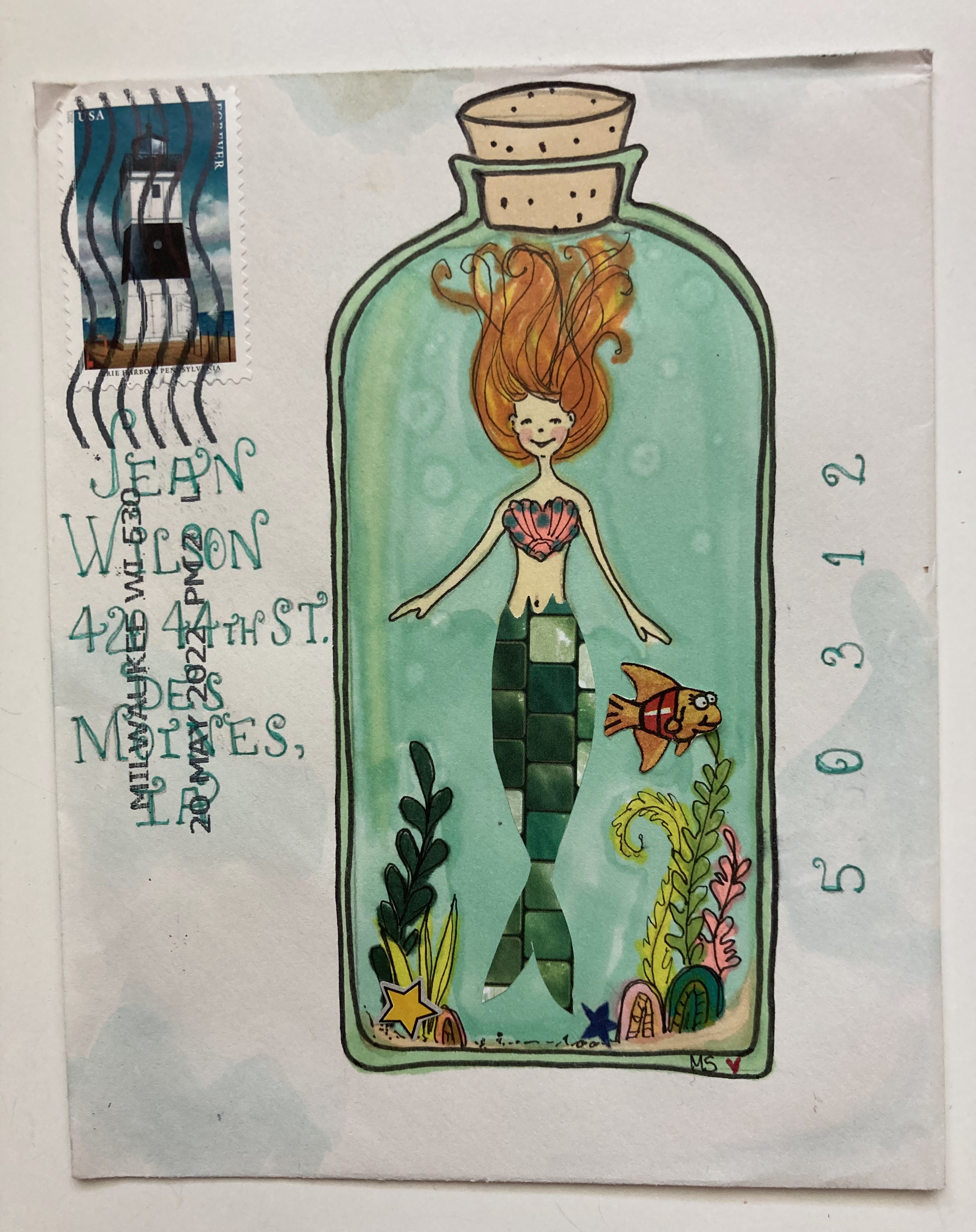
This envelope is slightly over sized - so Lynne put two stamps on it. Below the add-on blurb - I have a photo of the template that they use at the PO - and also a demo of how I smallerize envelopes that are too tall. My technique works for square envelopes, too, when I want to convert them to rectangles so that I do not have to pay extra.

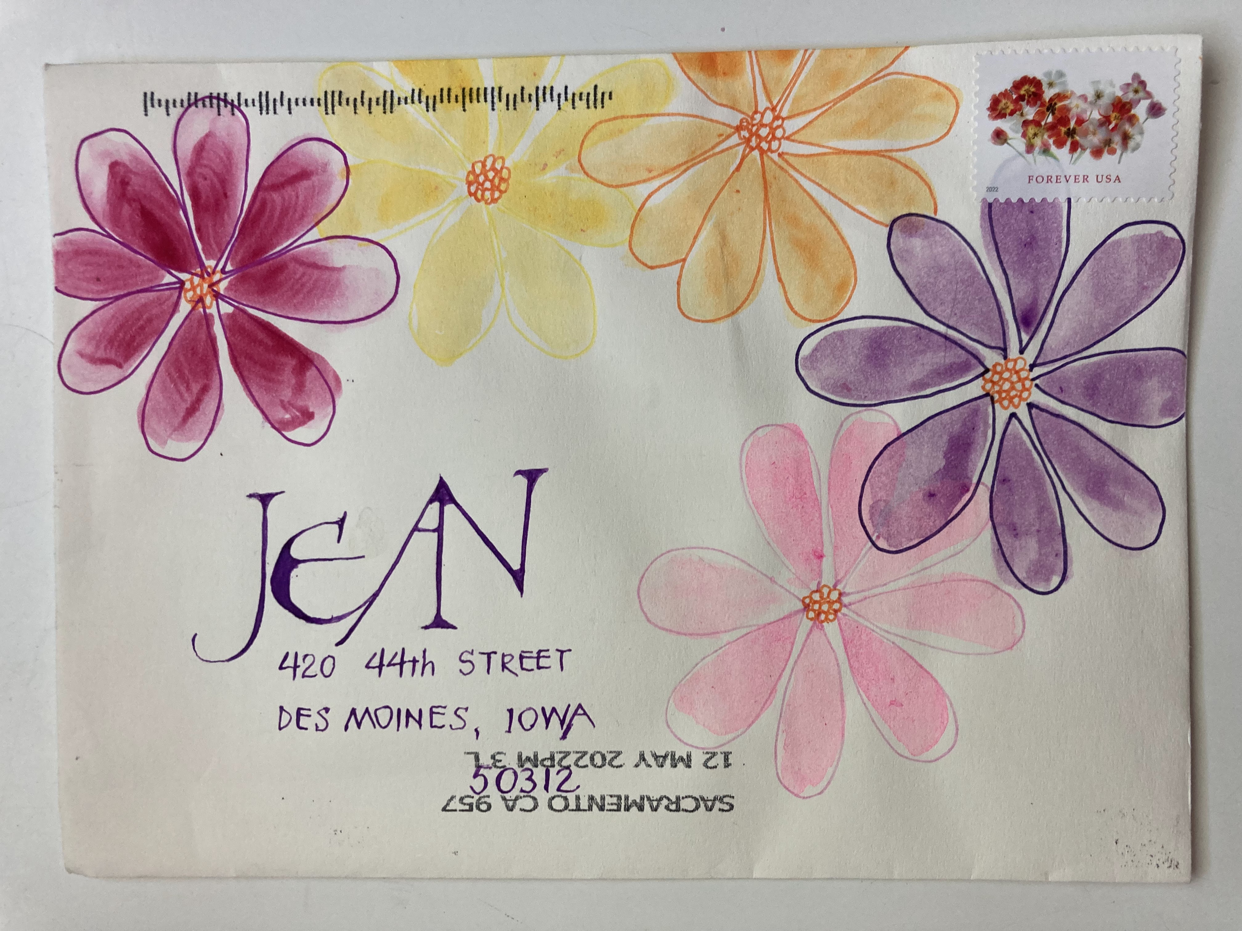
I like Lynne's white space and her WeaverWriting.

***

Here is a welcome break from my fill-up-June series:

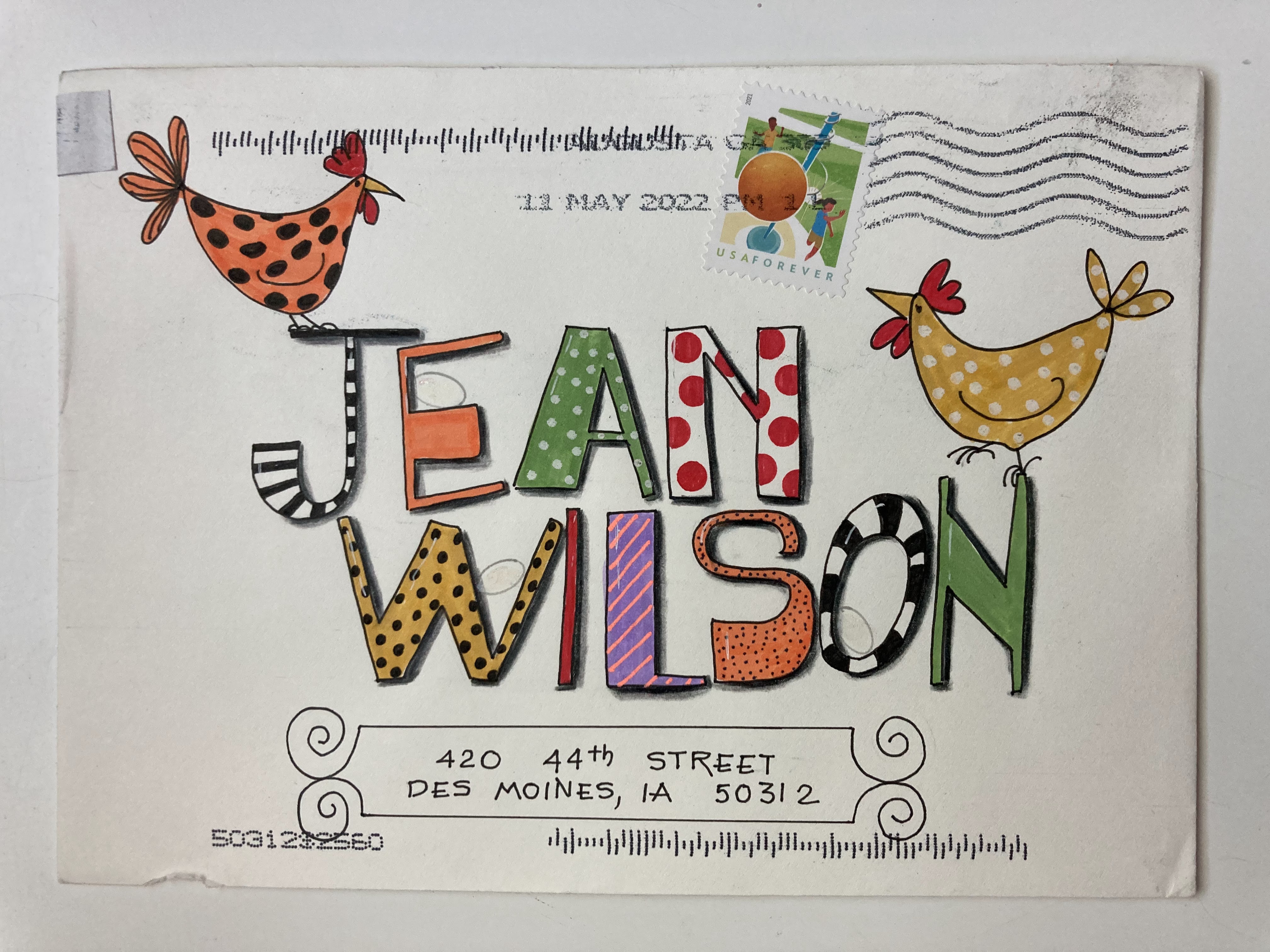
I hope my readers will tolerate the occasional obituary. I'll insert the envelope related part of the obituary below her photo so you don't have to go to the link. Some of my envelopes are in the Smithsonian Postal Museum. I wonder if they will want any more. Just kidding. Muriel's envelopes are surely more museum-worthy than mine.

https://www.desmoinesregister.com/obituaries/dmr121628


Muriel I. Hawkins

West Des Moines - Muriel passed away peacefully Thursday, March 24, 2022 at the age of 99, being able to live in her own home till her final couple of days.

She was born July 12, 1922 in St. Paul, MN to Oliver and Elsie Mix. She grew up at a state fish hatchery and animal reserve in St. Paul. She attended Mills Art College after high school and then began working as a commercial artist at the local newspaper. In June of 1948 she married O.D. Hawkins of Columbia, MO. During their courtship and engagement, she wrote 300 letters to him, painting pictures of pin-up girls or sometimes herself, on every envelope. WWII submariner O.D. saved all of them and the Smithsonian has said they would like them to add to their collection. After they married, Muriel worked as an artist at the University of Missouri. More than 25 years after they moved from Missouri some alumni mail came with a pen and ink drawing of the campus that she thought to be her work. She quickly found the original and was touched to know they still used it.

The full obituary covers other artwork and activities.

***

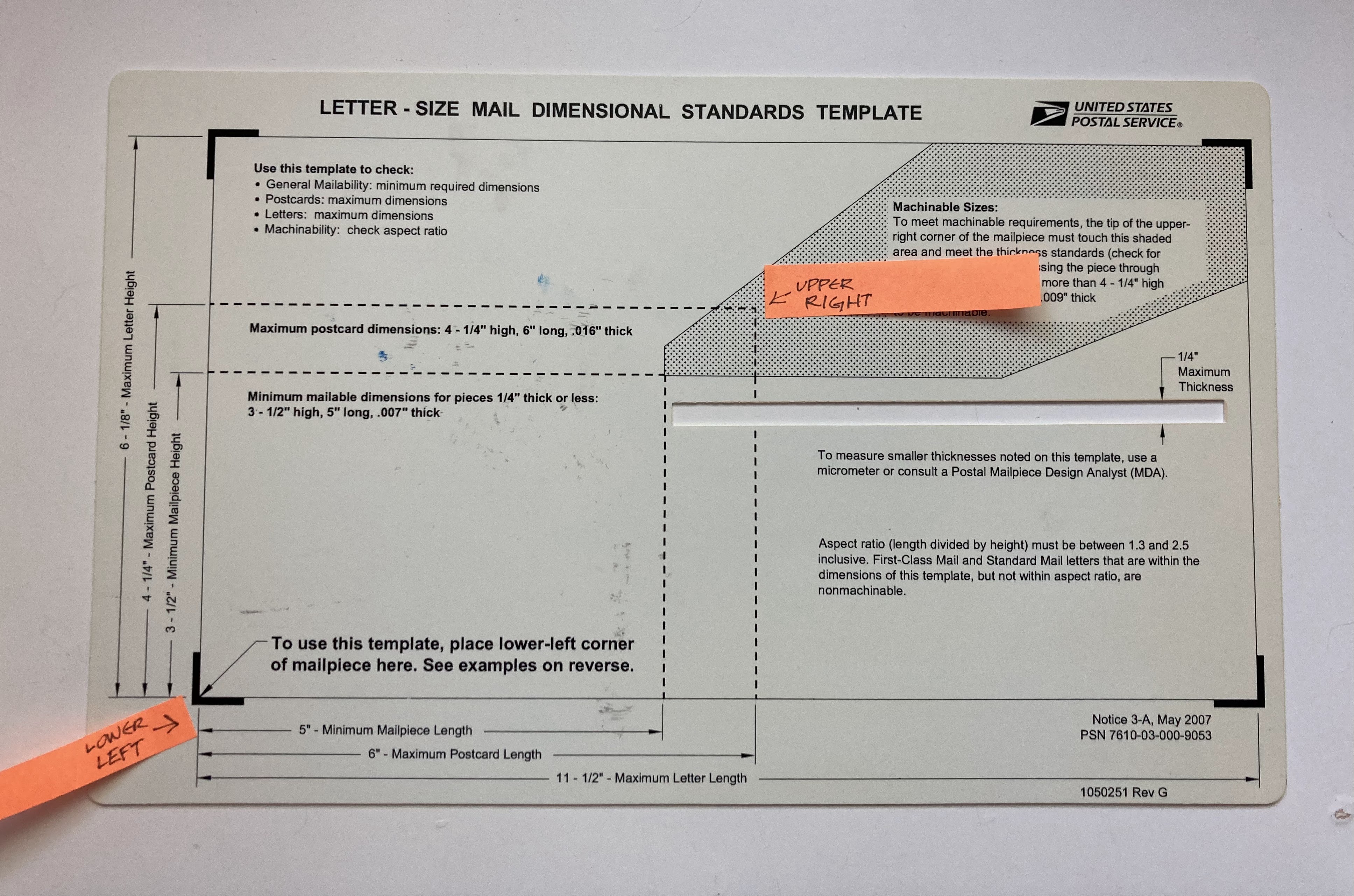
A tip for altering envelopes to fit the USPS size requirements.


Below - shows the smallest size they prefer.
And the orange flag on the right shows that gray area - that will tell you if the envelope falls into an acceptable proportion. They call it aspect ratio. I don't think that is a common expression.


Below is a square envelope that I cut down to fit the template.
It shows the range of heights that would be acceptable.


I use a clear ruler - and position it where I can make a new fold for the new flap.


Maybe you can see where I scored along the ruler with a bone folder.
You can use other bluntly-pointed items to score. 


Then I fold on the new flap-fold-line - and burnish really hard with the bone folder.


The envelope is flipped around - because I am right handed - and it was easier to tear off the original flap. 
You could cut it off - and you might want to make the flap shorter.


This is the new flap. 
I snip a wedge off each end. 
Sometimes I eyeball it.
Sometimes I measure.


Flipped over again -
you see where you need to remove some excess paper?


On this envelope - I did some eyeballed snipping with a pair of scissors.
You can obsess as much or as little as you like on this part.


And then you are done.

That flap looks a little too big - it might get shortened


I like to seal the envelope with this little adhesive applicator. I get them at OfficeMaxDepot. Be sure you get permanent for envelopes. They have reposition-able, too. Not sure what I would use that for. 
They sell refills for the holder - which is slightly less wasteful. I suppose there are better options. 

Glue sticks are fine, too. Although they rely on a bit of moisture, which can introduce some waves - and sometimes we prefer the paper to stay nice and flat.