Sunday, October 31, 2021

Do my Dec mailing in Nov (Lynne's b'day)

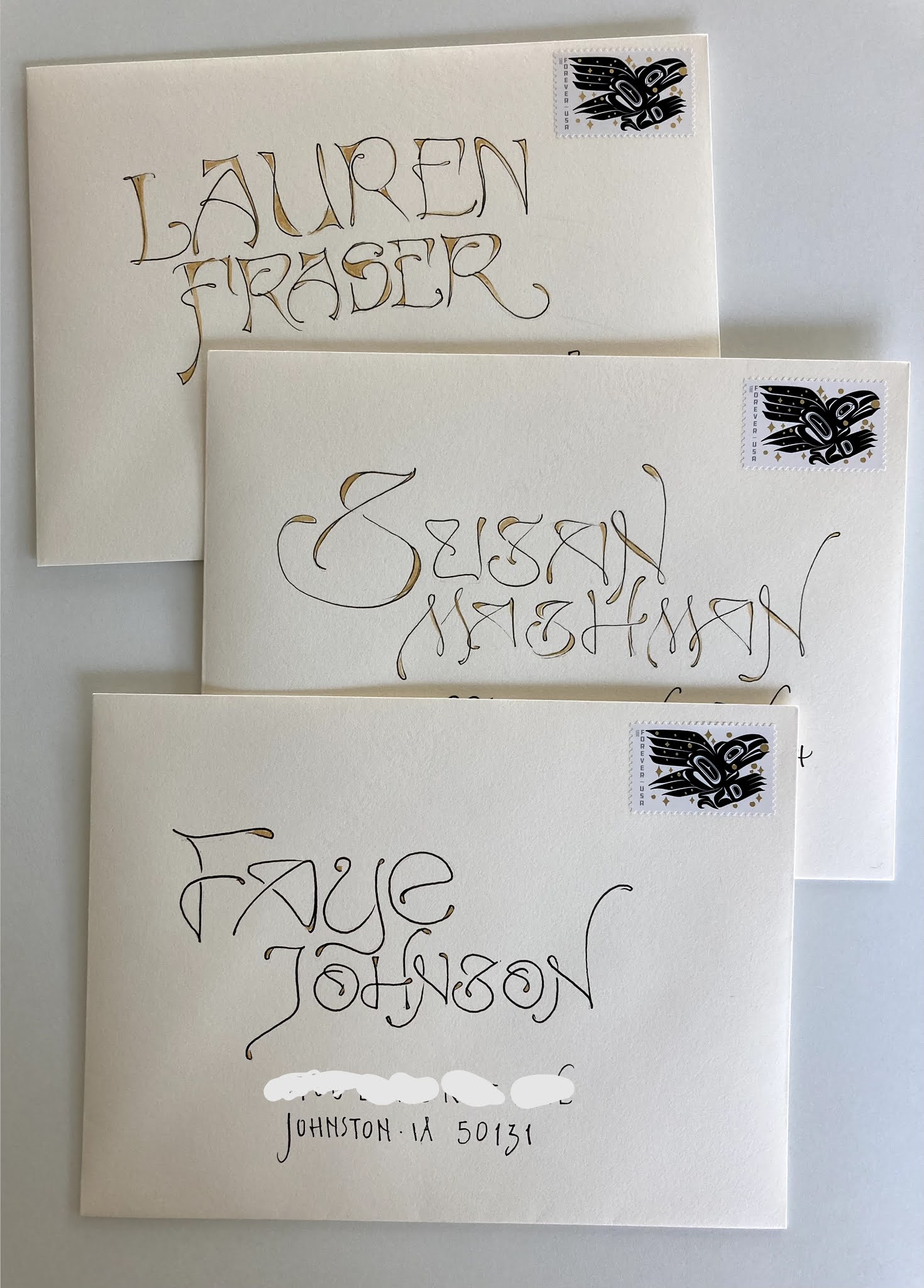
Here is my reminder to get all my December mailings done in November. No exceptions.

This was the photo I posted on Dec 16, 2020. That was our first pandemic holiday season.

I will add a link to Dec 16, in case you have a ton of time to kill. I couldn't even read all of it myself. There is a lot of ranting. At the end, Kathleen left a comment that she enjoyed the rant... which is the only reason I am adding the link. It was helpful for me to see some of the reminders to myself. Maybe others need reminders to not get caught up in too much holiday *stuff.*


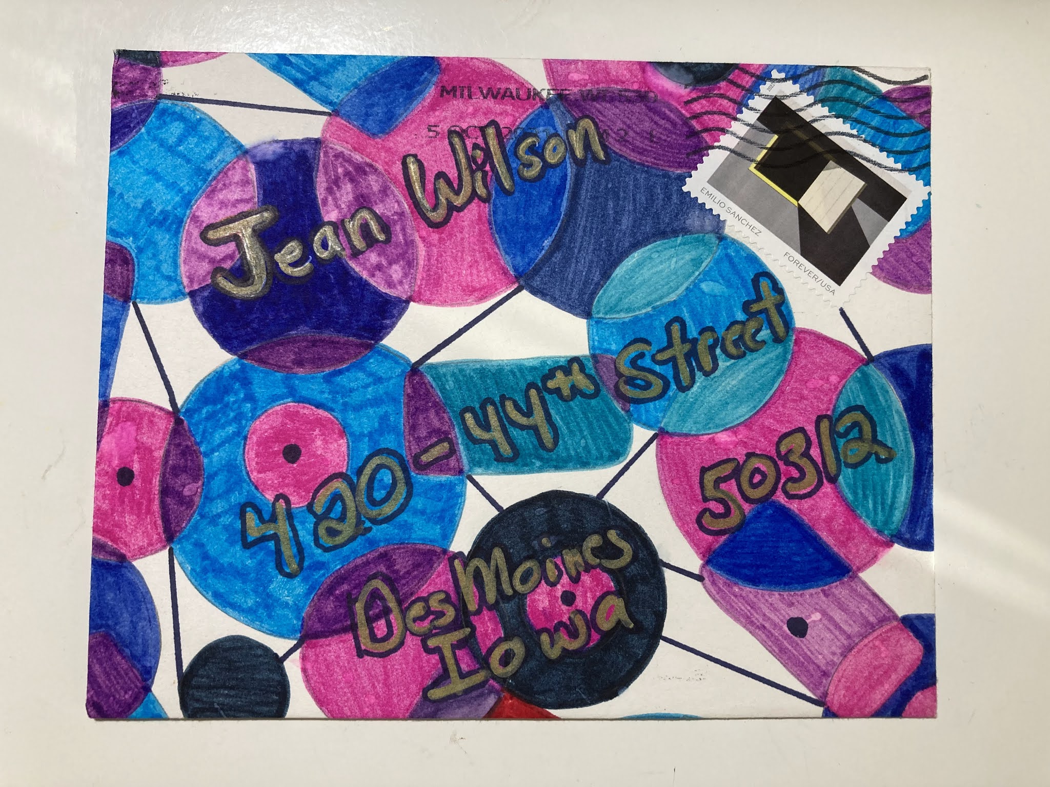
Here is a random envelope because I am vigilant about having an envelope every day.
Lynne got the last 2 Happy Birthday stamps. I need to buy some of the new Happy Birthday Forevers.
I was so disappointed that I did not turn the Y in LYNNE into a happy character. All it needed was a happy head on top of the shoulders (the arms are extended with exuberance) and some simple legs. Grrrrr. 

There will be some more envelopes coming up done with my 1-inch marker. They are all either duds of ho-hums. That marker usually perks me up - but not this time. 


A couple days ago I thought I might not have any more rants in me. Ha! All I had to do was receive some news from ding-dong-Iowa while I am here in Chicago. The community of Chicago has very strict masking rules and people abide by them and there is a sense of camaraderie along with very low case numbers of covid. In ding-dong-Iowa (my apologies for insulting bells - but I am trying to avoid the saltier language that would do a more accurate job of describing the ding-dongs in Iowa) the ding-dongs are complacent and ignorant. A terrible combination. I will not get into specifics. I will just seethe as I dread my return which will be on Nov 1st. 

I hope all y'all are staying safe and not being lulled into complacency.


Saturday, October 30, 2021

From Janet -- (scrambled memories)


Stealworthy. Although I do not have any blue envelopes so I will have to do a different monochromatic design. I also love the photo - perfect for fall. Below the photo is what she wrote on the inside. It looked like she drew it by hand which would have been a fair amount of work. That is not a style I would try in a million years. It reminds me of the font Avant Garde - which came out in the late 70s I believe. Or maybe my memory is playing tricks on me.

When I was doing research into brain rehab, I came across a helpful description of why our memories are so chaotic. We think we remember things. We tend to assume our memories are in a chronological notebook or perhaps a large filing cabinet of chronological notebooks. But our brains have different methods of filing memories. If I call up a memory of my 12th birthday party where I recall what we ate, what I wore, what was fun, what went wrong, etc - the memory center in my brain might store all the parts of my 12th birthday party in many different places. The smells of the food might be in one place, the flavors in another place, the people somewhere else, the sounds, the presents, all in different *folders.* So, when my brain pulls all those components out of the filing cabinet, it might not get the 12th birthday memory every time. So, my memory (as well as yours) is (are) probably a little scrambled.

I love families who have stories where different family members have wildly different memories. There is a classic blurred memory in Mr Wilson's family. They were all in a car, grandma was driving, and one of the back doors flew open and one of the kids was hanging onto the door for dear life. Both Mr Wilson and his sister are convinced that they were the kid hanging onto the door. I think there was a cousin in the car, too. And the story would be really good, if the mom riding shotgun in the front seat thought it was the cousin. 

Feel free to share your own family stories where people have wildly different memories of what actually happened. I have made it a point to be less assured that any of my memories are accurate.


Friday, October 29, 2021

From CathyO


Crunch time. I have six days to fill up about 20 days. Wish me luck - and forgive me if the posts are all drivel.

At least we have splendid artwork from CathyO one of our exchangers who is retired and who also put the pandemic to good use by signing up for online courses. I know she told me who the inspiration was for this one - but, I don't have time to go back and look through the emails. 

Once again, the photo probably does not do the artwork justice. At least the lighting shows that there is some metallic shininess to the -what do you call those things? If they were straight, they would be a rule. I guess we will just have to call them the horizontal design elements. 

The white lines on the chunky black strokes were a genius way to tie in the stamp. A+

****
Yesterday I mentioned being able to track when someone else mentions you or your stuff - and said I do not know how to do that. Ironically, I am still having a terrible time with my patient portal. It all started with having trouble with basic phone communications: ie - *We will call you back, Ms Gullible.* HA!!
They do not call back. So I thought I would send a message through the patient portal. I could sign in and I could click to open up an email - but it would only go to Somebody McCormick. I have no idea who that is and I could not find how to change to a different *provider.*

Provider-schmider.
My new theory is that they are switching to this complicated technological system in order to weed out all the boomers. There are too many of us. There is no way to manage our gray years. So, they will just let us die of frustration. I'm fine with that. That little guy in my head has become very friendly and helpful. The only downside to being so content with everything is that there might not be enough rants to keep those of you who enjoy the rants entertained. Don't worry -- I'm sure I'll figure out something.
 

Thursday, October 28, 2021

From Janet to Leslie (monks turning pages)


 Oh that Janet. She has such range. I can appropriate ideas from her endlessly. And then when it is time for me to make an envelope for her - I choke. It happens all the time. Grrrr. I just did the October envelopes and hers is the absolute worst. At first I thought it was going to be OK - so I put a stamp on it. And then I tried to add some jack-o-lantern details and they looked awful. So I covered them up. 

The only thing I can think of to do at this point is add #$%^&*(#$%^&* -- which is a motif that I have had fun with. But -- grrrrrrr. I don't really want to do that. grrrrrrrr.

I have 3 more posts to fill with this blather and then October will be full.

Oh -- here's something that I can add that I actually love. It's been around for a really long time but I do love it. Medieval monks learning how to turn pages in an actual book.


Remember that Monk's Notebook that I posted a while back? The owner of the company sent me a thank you for mentioning his product. It must have been a robot with a generic thank you - because if he would have read my comments, he might have noticed that I was not recommending the notebook -- once in a while I get a very prompt comment from someone whose blog or product I have mentioned. I think people  can track any mention of their own stuff - but, I have no idea how to do that.

Wednesday, October 27, 2021

Lauren's woo-hoo - Customized Oreos


This is fun design - has a retro flavor to it. I like the abstract idea on the envelope and then more specific elements on the card. It's very happy. I'm eyeing that tree - it could morph into a holiday tree.


I felt a little guilty for posting about custom Oreos - so I am adding this link where you can visit 2,500 museums online. I have not checked all of them - but they seem to be legitimate museums. Not museums of oddities and weirdness.

Link to 2,500 museum tours

*****

I spend too much time surfing and was somewhat incredulous when I saw that you could order customized Oreos. Sometimes I post things that I think are absurd. It does not surprise me that people think of things like this. What surprises me is that they go ahead and produce them. They seem so frivolous. To be clear, I am not against frivolity. It's a nice distraction. I'm just skeptical about a $3 or $4 dollar frivolity when the minimum order is 24 cookies which is $75. For Oreos. 


This was the one I designed. You can choose filling color, two kinds of coatings. Several sprinkle choices. A photo, Words. Then you can choose packaging. Individual or various options for multiples.


It's been a lotta years since I even had an Oreo - and I actually recall that I preferred Hydrox to Oreos. I wonder if Hydrox are even available any more. I wonder if I am going to research that.

Looks like Oreos have edged them out of the market.


Tuesday, October 26, 2021

Leafy envelopes from Debbie and Faye (outdoor school)


Another fun fall design. My favorite part was figuring out the fold. It's pretty easy. I wonder if anyone can figure it out from the unfolded one.


I figured is out on a piece of scratch paper.
Below we have more leaves from Faye.


It's the 8th of October. Perfect fall weather. Zero motivation to get back to my chores.

*****

I had a different story here - but it was whiny, so I deleted it. Instead we will continue the conversation about how boys like to make balls and invent games. I am currently on a 2 week adventure as a household helper with my grandkids. I'm able to walk them to school and pick them up. Oh.My.Gosh. I forgot all about the running, jumping, climbing, etc that is involved with older kids who need to get somewhere. 
Yikes. And then you park them in a public school for 7 hours. When my boys were young, I had an idea for an entirely out-of-doors school. They could learn all the same stuff, they just learned it out doors. 

My daughter has put up with me jabbering about it. And we even heard about an outdoor pre-school here in Chicago. I am also a huge fan of Montessori - and that worked out very well for her kids. But, after the adventure of getting the kids to school on a 15-minute walk. I Googled outdoor schools and found that they are fairly well organized - but only pre-school. Too bad there isn't an option for older kids.


And if you have never heard of the working ranch two-year college for boys -- this school fascinates me.
There is no tuition - but they do a significant amount of work to keep the ranch running. 


Monday, October 25, 2021

From CloverL and Lynne (apple pie)


There were quite a few references to fall in the Sept exchange. October is also solidly a fall month. I keep thinking I will find my October envelopes from 2020, but so far, they seem to be in hiding. 

I like Clover's comment on the inside. Sept had some too-hot days for lots of us. Hopefully October will be a little more of what we expect. 

Hopefully, I will not be talking about the weather. 
<sigh>
Today was errand day. Somewhat challenging. I make one apple pie per year and I prefer to use lots of different kinds of apples. With these new fangled stores, they are phasing out clerks who ring up the purchases and I am trying to stay *current* so, I had to figure out how to do the search for each kind of apple. Oh.My.Gosh. The poor guy who was there to help the inept people is probably sitting in the break room looking at ads for a new job. He was very polite - and I thanked him for putting up with me. If it was not a 15 minute drive to that particular store, I would take him a piece of pie.


And another Kraft envelope arrived in Sept from Lynne.


Sunday, October 24, 2021

From Alison -- Orbs/balls


Alison provided my inspiration for my 2020 holiday envelopes and I can see some ideas in this one that I would happily appropriate. One change I would make would be leaving the bottom half-inch open for the PO. I like the address way down at the edge, but, I'm all about making things easier for the PO.


An Atlas Obscura article about some mysterious stone balls struck me as s little odd. It included this line:

a widely distributed mystery left by the Neolithic inhabitants of the British Isles. More than 500 stone balls like them have been discovered to date.

also this line:

and likely had some deep cultural meaning to the people who made or handled it some 5,000 years ago. 

Link to article about neolithic stone balls

I can't figure out why they need to have some deep cultural meaning. There are endless games played with balls. Humans are drawn to playing so why wouldn't a ball be the most obvious thing to make. If someone found a fairly roundish rock - wouldn't they think about making it symmetrical. They've already been making balls out of mud and other random stuff they find. And then when everyone else saw how much fun it was to roll around the rock-ball, everyone would want one. And voila, Wilson sporting goods is created. I guarantee, there is no deep cultural significance to sports.

Anyone who has boys knows that they turn anything and everything - into balls they can toss around for some kind of game. All socks are wadded into balls and become indoor games. Small boys are a direct link to pre-historic behavior. I may not have a degree in anything related to piecing together pre-historic life, but, I am correct.

Saturday, October 23, 2021

Pre-penciled to Jessica (2 more ho-hum-s)


 I rather like this one. As I mentioned in a fairly recent post, Schwessinger is the longest name that I work with on a monthly basis. Jessica is long enough that it stacks pretty well. This font is definitely better with the raven stamp than those other fonts that were so delicate. The raven needs something chunky or bold.

I guess I should add the last two in the first batch of Sept exchange envelopes since they are ho-hum-s. It is a shame that two very talented calligraphers get ho-hum-s. But, that's how the exchange works. We just do stuff and drop it in the mail. I needed to get myself back in the groove and it wouldn't be healthy to get all worked up about the quality. 

Cathy's was penciled in - so that's my excuse on this one. 


Kate's would have been fine, if the name was larger. The western wear stamps will be fun to use on the October exchange envelopes. It seems like very odd subject matter for stamps. Western wear? Maybe they just wanted some balance after the Oscar de la Renta stamps. Yup. That's it. I'm glad I pondered that and came up with a good reason. I can't imagine any other clothing/fashion topic that will be featured on a stamp. Athleisure? I don't think so.


Friday, October 22, 2021

Pre-penciled to Chuck


 Hmmmmmm. This is one that I found in the stack that I had penciled in a long time ago. It has a bit of Halloween feel to it. Maybe I should use this style for the Oct exchange. This is another post being written on Sept 30.

Normally, I hold all the October envelopes and run them the following year. I have no idea where my 2020 October envelopes are. They will turn up. As I say every year, the October envelopes are usually some of the very best. So many great images. They can be so cute or spooky or macabre or witchy.

If anyone is aware of Jermaine Clement's work - from Flight of the Concords - and if you liked it - you might like What We Do in the Shadows. It's very strange and I almost hesitate to even admit that I watch it. I am not recommending it. Just saying -- if you like really weird stuff -- it's weird - a spoof on vampire entertainment. It's free on Kanopy.

***

As my prewritten posts get closer, I review them - and I have second thoughts about even mentioning the aforementioned film. It's very strange. I don't think I'm that strange at all. But, if I delete that paragraph, the post will be short. Then I run the risk of adding something that is even stranger. We are not going there.

Thursday, October 21, 2021

MTMTE to Sharon


More Than Meets The Eye stamps - I love them and have tried a few different directions. I did some penciling and had a grid that worked with the number of letters in her name. I carefully penciled in the grid on the envelope. Or so I thought. By the time I was on the second line, I knew I had completely goofed it up. But, in my somewhat impaired state, I decided to figure out an alternative.

I'm fine with the alternative. Her full street is in the box that is covered up and it was not too hard to read. But, I will not be sending anything through the USPS that does not have a clear address. So, I added a second address that was very clear.

It might be fun to enlarge the stamp and figure out if there is a very easy and logical way to do the letters by hand. I still have quite a few left. There are so many colors in the stamp, both bright and pastel, that it makes it pretty easy to coordinate colors.
 

Wednesday, October 20, 2021

Non-envelope - faux signs (a JeanW how-hum)


This sign as well as all the other signs at the link caught my eye. During my child rearing years, I spent time gazing out the windows at the squirrels. A memorable scene was one spring when the baby squirrels came down out of the nests for the very first time and experienced running around in the yard. It was almost as cute as my own kids. I wondered how they all got along up in the nest. I wanted to build a little playground for them. Then their scandalous mother got herself into a family way, again, and found a hole in a screen in the eaves on our house and decided it was easier to just move into a space under the roof of an addition to the house. That was the end of thinking that squirrels were cute. Eventually all the trees in the back yard aged out so now we have sunshine. MrW had a new tree planted and it died after a couple years. I'd rather have sunshine. The neighbors have trees - we can just look at theirs.

***
Here is an envelope. Nothing new or interesting. It's in the Sept-ho-hum folder.


Tuesday, October 19, 2021

Even more Sept duds from JeanW (Paper Pondering - Fiona Dempster)


Three more that were penciled in a long time ago. They might not be full duds. Half-duds. Maybe they are fine. I really can't tell. Maybe they needed different stamps.

I'm trying to fill up October - and I'm not feeling wordy - so I'll have to go find some filler.

****

Reminder to put Fiona Dempster's blog, Paper Ponderings in your list of places to look at. You can also sign up to get a weekly email from her. She's very active with both teaching and her own work. This is some student work.

I love that top line.

Note to self -- figure out the letters that are cropped off.


Monday, October 18, 2021

More September duds from JeanW


 Whatever that was that I said yesterday -- ditto on Alison's. 
Below, I was anticipating what I would talk about when I layered those three. Maggie's ran yesterday. After I did three like that, I chose a different marker and did Janet's and switched to those stamps, which I thought I would like a lot. So far, I have not come up with anything that I love. Since they have some shiny gold highlights, I am guessing they want to be on black envelopes with gold ink.

I deeply regret the J on the JeanR envelope. However, I enjoyed that style. Sadly, it was not something that I came up with in real time. I happened to find a stack of maybe 6 or 7 envelopes that I had penciled in and then they got buried in a stack. 

Now I am having a really weird feeling that I have already posted all of my Sept exchange envelope. I remember writing these exact words - "it's like finding a $20-bill in the pocket of a jacket you haven't worn in a long time.* Maybe I wrote that on a note that was inside one of the envelopes. If this is a repeat, let me know

Grrrr

Now that I see Janet's again - I wonder why I didn't do more of those. 


Sunday, October 17, 2021

My September ho-hums and duds (KristineK)


A few of you have reprimanded me when I complain about my own envelopes. I had to take August off because of my brain injury. And Sept was feeling a little iffy. I'm writing this the day before October 1 - and am happy to report that I am looking forward to doing the October exchange. 

The three above are OK. I like the font a lot. And I liked those stamps. But, the playful stamps and playful font needed one more playful element that I just never figured out.

Chuck's August envelope used a font that I was sure I would be able to do to my liking. Surprisingly, it did not work out at all. I only did these two and moved on to some other ideas. I can't even put my finger on what's wrong with them. Maybe they stray too far from the exemplar. Maybe I was just rusty. Maybe they are missing one more playful element.

Maybe I just liked the colors - but the whole idea of backyard games dredged up how pitiful I was at backyard games. My gross motor skills were dismal. I still duck if anyone tosses me a ball. At least I learned how to ride a bike.


***
The fun envelope posted below arrived recently and the end of the envelope was open - and there was nothing inside - so, I just wanted to let KristineK know that if there was important news -- I didn't get it. Feel free to email me jmwilson411-at-yahoo-dot-com

I am on my way to Chicago for two weeks - so I will not be sending any mail - although, I do keep up with the blog whenever I am out of town.

Note to Stella: I have your lovely postcard on the top of the stack of mail that I will be replying to - hopefully in two weeks. Sorry it has taken me so long.


Saturday, October 16, 2021

Multi-Clovers. (Bad day blog)


I struggled with my September envelopes. Normally, I enjoy this idea, but this time it didn't really please me. It is such a fun stamp. At least I found lots of colors to go with it. Maybe I should have looked for more variety in the markers. DUH!!!! I used the double tip writers - but I have scroll tips and chisel tips. Why didn't I pull them out? They are all in the same drawer. 

Maybe Clover will sign up again and I will do a better job on the next one.

***
What's up for our next surprise out of the folder?
Once upon a time, I must have been having a bad day and I did a search for a blog for people having a bad day. And I found one - with only one post 
and nobody had ever left a comment
so I did
and 
the person has not responded.
I do like the idea of a place to whine.
It seems like social media has become a big ol' whine-fest. Maybe it would be better to rein in the whining and just tuck it into folders.

It was also interesting that the person who started the blog had a reference to fonts in their name. Fontmania

Here are screen shots - in case they decide to delete the blog.


Friday, October 15, 2021

International Celebrate stamps. (Shahzia Sikander)


At first, I was expecting to have trouble with Patricia's three names - but stacking them was a perfect solution. This is a variation of the DuBosch Jubilee which I have not done in a long time. I like it enough that I'm guessing I will do more. 

The one below, to Mia was done first and I was not sure how to approach the super short first name with one of the longest of the last names. Massicotte is 10 letters. Schwessinger, (Jessica from the exchange) is the longest name that I have been writing monthly, - and it is 12 letters. But Jessica is long enough that it is easy to feature it and make a small last name. I don't have any regular exchange names with only 3 letters, so this is what I did -- and I'd only give it a C-

Mia's stamps are a little crowded -- I try to make any of the international addresses very clear.  


***
The add-on today is a link to an exhibit at the Morgan Library. It might be too cerebral for some people. But, the add-ons tend to be very unpredictable. There might be some readers who are wildly excited to see what someone does when they explore and layer various themes from various cultures. 

Her work caught my eye because it is influenced by manuscript painting.

Hood's Red Rider No.2


Shahzia Sikander's words:
Cinderella’s prince holds her slipper at center while a powerful veiled heroine takes control above as a reimagined Red Riding Hood. Sikander explains, “European fairy tales, which carry deeply entrenched gender bias, were part of my childhood storybooks in Pakistan. When I started examining manuscript painting as a young adult, the passive depictions of women often perturbed me. I wanted to make female protagonists who were proactive, playful, confident, intelligent, and connected to the past in imaginative ways”

*****

I enjoyed the video. The first link takes you to a page with thumbnails.
The quote above is about Hood's Red Rider No. 2 - and I could not get a full image of the piece so it is cropped a bit on the top and bottom.

Page with thumbnails.

Video

Thursday, October 14, 2021

Neon colors to A&B (Heinrich Envelopes)


Thank you notes to my grandkids because they sent me some Taste of Chicago as a thank you for visiting them in August. Chicago has so.many.great.places.to.eat. Little by little, they are all figuring out ways to send the food to the hinterlands. Yum.

These are neon envelopes off the rack from the office/max/depot.  Ooops. I forgot. I actually found them at Walmart. The white is a PITT white marker and it is time for me to invest in a new one. Instead of something from the folder, today we have something that popped up in the morning obituaries.

***
Over the years as I was involved in various projects involving printing and envelopes, I was very aware of the Heinrich Envelope Company - but didn't pay any attention to where exactly they were located. Today as I scanned through the obits rather quickly, one caught my eye. When I scan, I only see the first couple lines. The photo caught my eye, because the guy was 91 when he died, but the photo was a young man in his Air Force uniform. Duluth, MN always catches my eye and that was his birthplace. So I clicked on the full obit and discovered that after 20 years as a pilot, he spent 30 years in the family business, Heinrich Envelopes. The combination of those two careers is ironic because the expression to *push the envelope* comes from test pilots. (Blurb at the end gives full story)

Of course, that led me to the website where I found a long and interesting (to me) story of the company and how it had grown and split off at times and Jack Nelson ended up with the company in Boone, Iowa. And they sell envelopes by the carton. I checked some prices and they are very reasonable. They are an envelope converter. So if we ever need 5,000 envelopes made out of our favorite paper, that's where we can go. I can save the shipping charge by driving up to Boone. It's only about an hour.

So, if anyone wants to peruse the Heinrich envelope website, here it is. 

I even like their logo. It's old school. I like the vintage image, but it would be fine with me if they updated the font.


The details on *pushing the envelope* if you are interested:

When tracing the phrase’s origin, etymologists typically credit Tom Wolfe’s 1979 book about the U.S. space program, The Right Stuff, with popularizing it. Describing the work of test pilots, Wolfe wrote:

“One of the phrases that kept running through the conversation was ‘pushing the outside of the envelope.’ The ‘envelope’ was a flight-test term referring to the limits of a particular aircraft’s performance, how tight a turn it could make at such-and-such a speed, and so on. ‘Pushing the outside,’ probing the outer limits, of the envelope seemed to be the great challenge and satisfaction of flight test.”

As Wolfe noted, aviators use the term “flight envelope” to refer to a plane’s capabilities for a safe flight ― it’s calculated by examining conditions like speed, altitude, engine power and more. Within this “envelope,” it is theoretically safe to fly. 


Wednesday, October 13, 2021

Not an envelope - Ann Miller (Glen's postcard to Chuck)


It is so annoying that I can't remember where I found these images. It might have been IG. I met Ann Miller at a conference quite some time ago - another lovely calligrapher. These images remind me a tiny bit of Jasper Johns' layered alphabet paintings, but they are so much better (to my eyes) because Jasper used stencils and I'm not a big fan of stencil fonts. Now I am wondering what font I would choose if I could have a stencil cut in a font that I love --- hmmmm. Any suggestions?


The add on from my folder that is providing add ons - made me verklempt today.

It was serendipitous to find this email from Chuck. He shared images of a postcard from Glen Epstien. Glen has passed. He was a beloved calligrapher who taught at the U of Iowa for many years. I met him and have a couple envelopes from him from way back which I did not find when I searched on the blog, so I should find them and post them. I love that block of gestural writing with the dots.

Thanks for sharing, Chuck.


Those flag-y things on the ascenders on Chuck's name are so cool.
That's an old address - which is why it is not blocked out.


Tuesday, October 12, 2021

Leslie - sheet of planets (bulk envelopes)


It has taken many years to get down to my last box of vellum envelopes. I might look into buying another carton if there are enough people who would like to buy them in quantities of 50 or 100. I'll figure out what the shipping would be. 

I was having fun with this one and took a couple of photos of it in progress.


After I got the name on, I regretted putting the last name so large. If I had it to do over, I would make the Leslie a bit larger and put the last name with the address. The sparkle dots were fun to do - but the overall design is blah. The best part was discovering that the page from the USPS stamp catalogue fit perfectly.


So, I did the research on how much it would cost to mail boxes of envelopes to people who might be interested in buying envelopes at the *carton cost.* I always buy my envelopes by the carton which are usually 1,000 envelopes. The last time I bought them, it was $35 for a carton, so 3.5-cents apiece. That's a very good price. Whenever I did a custom job, it would be at least $50 to order 100-200 envelopes (from places like Paper Source) which is what people typically needed. So they would get their envelopes at a bargain - at $35. And then I would get all the extras. It is luxurious to have 100s of envelopes that are a nickel apiece or less.

I had an email conversation with someone a couple weeks ago and we talked about me ordering cartons of envelopes to split with exchangers. I filled the smallest flat rate USPS box and found I could get between 50 and 75 envelopes in the box. Vellum envelopes are much thinner than regular paper. It's $8 to ship it. So, I'm not sure I can get the cost down to anything really attractive. If anyone is interested in buying bulk envelopes (50-100) let me know. I still need to see if they have a small box that is not flat rate and see what the cost would be.

I would mainly be interested in black, white, vellum and kraft paper brown. A6 size fits in the flat rate box. A7 does not. I might look for some other kind of mailer that would work if there are enough people who are interested. Bubble envelopes might work.

Also - in the email conversation - I mentioned my favorite places to buy envelopes.
Paper Source - expensive - but if you buy enough you can get free shipping. I like the quality.
        sometimes they have sale prices on discontinued colors
French Paper - straight from the mill. Great papers, great prices. The shipping cost eliminates the savings.                         
        but I love-love-love their papers.
Reaves Engraving - really nice invitation stock.
LCI - nice, expensive
Envelopes.com - lots of options - wide range of qualities
and
the Mecca of all paper/envelope warehouses
It is in Brunswick Ohio - way off the beaten path. I have been there. The website has photos of their shelves but no individual listings. I have no idea if they even do mail order. I just know it is the equivalent of an opium den to anyone who is addicted to envelopes.