Wednesday, February 28, 2018

Snowflakes (3) - Dec Exchange

One of our newer exchangers who found the exchange through a class I co-taught last fall sent an envelope with snowflakes. It is good for students to participate in group critique and we learn a lot by critiquing all the mail that comes in from exchangers. Nobody hears what we say, so we don't have to worry about hurting any feelings.

Two students in the class had joined the exchange, and they were very good sports about hearing our comments. My first question about her snowflakes was, "Did you turn the paper as you drew the details?" One of my best tips for flowers, snowflakes, or any symmetrical design is to turn the page so that your hand is making the exact same motion - in all six directions. At first, it seems tedious - but as you see the lovely symmetrical image appear you usually enjoy the look and appreciate that it might have taken an extra 60 seconds - but it was worth it.

I work really fast and am not too careful with the strokes. You can see a lot of asymmetry.  The minor differences don't really bother me. I'm pretty emphatic that the gestural portion of the image is what matters. Just my opinion.

Here are a couple more. I think the lavender envelope above is my favorite. But I only had one. The ones below are those truly nasty shimmer envelopes. I have literally hundreds of them left over from a job and will spend the next few months trying to make friends with them. Paint pens are nice. But I struggle with finding something tiny that will stick. Even permanent markers rub right off. I learned that the hard way. Grrrrrr. You may be able to see that I had to resort to strips of clear tape on these to protect the addresses. Grrrrrrrr.


Tuesday, February 27, 2018

Gold Experiment to Chuck

Here is one that did not get much attention after I did the lettering. I guess when I have Grant Wood as my co-pilot, I don't feel the need to add much. I've hoarded these stamps for a long time - and it's like sending my baby off to college.

Morning edit - which means I am editing my blurb in real time. When I checked the blog this morning , the first thing I noticed was that the letters need a little drop shadow. Not a hard line - just a soft smudge....

Monday, February 26, 2018

Patty - First Time Exchanger

I met Patty in one of my classes and she dove right in to the exchange. In September we had 10 people on the waiting list for the next class which would start in January, so I suggested adding a second fall session, which filled and Patty took that one too. I brought this envelope in for show and tell to let the new batch of students know about the exchange. They ooohed and ahhhhed over this one - and then I told them that it was done by a fellow classmate who had only had one 6 week class. They were impressed. I think Patty enjoyed the oohs and ahhs. It's fun to hear unsolicited compliments.

Sunday, February 25, 2018

Anything Goes to Amber

I was mistaken back in January when I said I only did one in this series on gray. I found another one. It was towards the end, after I ran out of Paul Newman stamps. This might have been the very last one. It certainly has the most details layered on the top.

I often say that there is an arc to doing a series. I start out with some ho-hum, then I hit a groove, then I fall off. That did not happen with this series. I remember when I got to this one that I really wanted to just keep going. I didn't - and now I wonder where I would have gone.....

That middle stamp bugs the heck out of me. I should send Amber another lace stamp to cover up the center stamp. I wonder what this one looked like after it went through the cancelling process. I wonder if it would have been better to turn the middle stamp a quarter turn so that it was more symmetrical.

Saturday, February 24, 2018

And the survey says......

I love drawing the pencil letters. For some reason, I had left the crossbar off the A and was going to send it that way. Then, in looking for a stamp, I thought the colors of the Hanukkah stamp were nice and decided to add that little bit of purple. If I had it to do over, I would have put her last name on the crayon.
14 people responded to the survey and it was a treat to read all the things they had to say about their journeys. Link to the survey, in case you don't know what I am talking about:

survey


Rather than posting the responses on this blog, I have started a new blog that will be for conversations about the journey. Whenever I add anything to the new blog, I will link to it here. So, if you are a regular reader, you don't have to keep checking the other blog. I have no idea how often I will post over there.

The new blog will probably not have artwork with every post. It will be for the wordier topics.

Pushing the Envelopes began as a way to stay in touch with my students. The new blog will be a place to post all the funny/interesting/uplifting stories about the students and students may post all their stories about me. Other topics are also welcome....as long as they are art or mail related.

Here is the new blog:
http://jmwilson411.blogspot.com/

And thanks again to the people who responded to the survey.
It was one of my better ideas, if I do say so myself.
Other perspectives are so interesting - and helpful to me as a teacher.

Friday, February 23, 2018

Bonus Post - Follow-up to my rant about scientists


Regular daily post is below this one.

https://www.theverge.com/2018/2/22/17041426/neanderthals-cave-painting-spain-uranium-dating

On Jan 19 of this year, I had a rant about how scientists were very slow to figure out that Neanderthals were not some separate, unrelated branch. It offended my inner Neanderthal because I thought, even as a teenager, that it was obvious we were related. So, I am delighted to share this update about some cave art.

Using a new and improved radioactive dating technique, researchers discovered that paintings in three different caves were created more than 64,800 years ago. That means the paintings were created 20,000 years before modern humans, or Homo sapiens, arrived in Spain, according to a study published today in the journal Science. The discovery makes these the oldest examples of cave paintings in the world and the first to be attributed to Neanderthals.

One of the points I try to make in all of my classes is that the urge to make art is primal. If you take a yard stick and put 2018 at one end and 64,000 years ago at the other end - all of recorded history is in the first two inches on the yard stick. That makes 2-inches where we have some recorded information and then 34-inches where life was fairly primitive. So, think about life in the caves. No supermarkets, no fridge, no Monopoly, no LLBean. But they did manage to decorate the walls. I'm guessing they had some singing and dancing and skits, but they forgot to charge their phones and post any recordings on YouTube - so the only records we have are on the walls. I guess they find a few beads. I just checked and it seems that the oldest beads are 100,000 years old. So, it's safe to assume that the urge to decorate goes back at least 2 yard sticks. [Shout out to MBT: make-up artists probably predate the bead makers and interior designers.]

If you haven't seen it, Cave of Forgotten Dreams is a wonderful film about France's Chauvet Cave.

The point is this - if you are drawn to making art - and we need to include all the arts - embrace it as a primal urge and don't let anyone tell you that it is *just* a hobby or a simple pastime. Enjoy that time you spend puttering and acknowledge that it is an essential part of daily life.
Old beads.

Maggie and Bug - Exchangers

Maggie sent these leaves in October but the envelope does not scream fall. Ginko trees are so different. They turn bright yellow and then drop all their leaves in a couple hours. I am writing this on Nov 5th and the ginko next door just dropped all its leaves before they turned yellow. We had a sudden drop in the temperature and the tree just dropped them green.

Below are some birds sitting in a cartoon tree - from Bug.


Thursday, February 22, 2018

From Lynne or Maggie?

A Westchester postmark means this is from Maggie or Lynne. It is Feb 21st. I can only find the scan. If I find the envelope, before October, I will update this post.

Both Maggie and Lynne do really nice envelopes. I'm guessing one of them will recognize their witch hat and let me know.

Shout out to the Westchester regional airport. It is on my list of top two favorite airports. Santa Fe is my other favorite airport. Maybe I will put O'Hare on the list. Nobody likes O'Hare - and so far, I have not had anything really wretched happen to me at O'Hare.

Bonus Post - Pigeon Mail

The regular daily post is right below.

This article about pigeons delivering mail is worth including. I have a couple other postal related items. I wish I would have had postal history as a weekly or bi-weekly event.

Pigeon Mail

And such a pretty stamp. Technically, they are different from government issued stamps as there were 2 companies who were running the service.

There is a link in the Smithsonian article to a listing of the value of the stamps. I also found this:

This stamp was issued by "The Great Barrier Pigeongram Agency" on 11 July 1899. Catalogue value is put at NZ$300 or about US$220 at today's going rate. They are found on eBay occasionally and sell for much less! but sometimes over US$100. If this stamp was still on its "Flimsy" i.e. the thin piece of paper the letter was written on it would have a catalogue value of NZ$5,000!

The first company to issue stamps (19 November 1898) and run the service was "The Original Great Barrier Pigeongram Service." These stamps were rectangle. The other company was the "Marotiri Copper Mine." 24 August 1899 which had their name overprinted on the first issue and then designed their own stamp. 

Used stamps vary in catalogue value from $300 to $10,000 and flimsies up to $50,000. These are very collectable


To Connie - Odd Snow - Links to Famous Scribes

This is a mishmash.

The snow should have been up in the air.

The mounds of snow on the ground should not have been black.

I must have put this inside another envelope....

I do like the little houses....
and would like to do some better versions of this. And I like the border.

I'm 99% sure this idea came off Pinterest.

******

On Monday I had a story about my brush with a famous calligrapher. Here is another one. At one of the Ohio conferences, there was some confusion about where exactly breakfast was being served. I had driven to one location. Famous Jean Larcher and famous Denis Brown were standing there looking annoyed because they had walked a fair distance. I said, "I have my car here and would be happy to give you a ride." They were happy to pile into my car. Denis had a girl friend along. They were in the back seat. There I was, Jean Larcher riding shotgun. I still get all twitter-pated thinking about it. I couldn't engage in any conversation. I was nervous about making some really dumb driving error.

In case you are new to calligraphy, you should know that most of the rock stars teach and it's pretty easy to spend a week in a class with them. Denis turns 50 this year - so he will be around for a while. He also has online classes. Sadly, Jean passed away in 2015. But there is still a ton of great work on the internet and I have an envelope addressed by him.

Jean Larcher

Denis Brown

Oh.Wow.
I had not surfed around Denis's site for a while.
There is a section about a book project that he was involved in - and the book sold for $1-million dollars. I don't know what kind of dollars....but I'm thinking it wasn't Monopoly money.

The Great Book of Ireland

Wednesday, February 21, 2018

Winter-ish to Rachael

I fully intended to do all of my December exchange envelopes like this - but I did not. Instead I did the most bizarre and random set of envelopes. It had to do with my state-of-mind at the moment. There had been a string of unexpected events.

Lesson for today:
Don't be bothered with adhering to a plan. Everything that is just around the corner has little or no interest in your plans. Better to just wait and see what's going on and have a variety of tools on hand. Then wear a helmet and dive in. Or fling yourself on your back and make snow angels. I suppose you could make dirt angels if you don't have snow. I think I need to open a *help desk.* Like Lucy's.

Seriously, here's a lesson.
Just because some of the letters have a bold stroke, not ALL of the letters need a bold stroke. I guarantee this would not be as pretty if there were 7 bold strokes. Or maybe someone wants to try it and prove me wrong. I'm sure I could prove myself wrong. I guess the lesson is to not be too wedded to same-same-same.

Tuesday, February 20, 2018

Connie & Sara - Canada & Mexico

Adorable script
This one made it all the way from Canada without any postmark.

Below is an envelope from Sara - in Mexico. And below that, another one from Connie.

I will be posting the responses I received to the survey - asking people to reflect on their relationship with lettering and calligraphy. There are some really interesting responses. This will be the last reminder to respond and I will post the responses by the end of the month. I have to decide where to put them so they don't get lost in the daily stack of posts.

Survey
Adorable printing.

Adorable script and printing.

Monday, February 19, 2018

Purple Calligraphy Stamps to Tina + Donald Jackson Video

Super hard to part with these stamps.

Simple colored pencil Romans.

I have not done much study of Romans. They are beautiful....and deserve more attention...maybe someday....if any beginners care to listen to my good advice - it would be to take some time and really learn your Romans.

Also, I ran across these two videos by Donald Jackson. I have not watched them yet - but I'm guessing they are interesting, if you are curious about the history of writing.

My brush with the famous Donald Jackson. We were walking in opposite directions at the international calligraphy conference in St. Louis where he announced his St. John's Bible project. There weren't any other people around. I thought -- oh, oh, oh, this is my one chance to shake his hand - so I could say one day, "I shook Donald Jackson's hand." But, I thought that sounded lame. So I just smiled and nodded and he smiled and nodded. I think I heard his thoughts spilling out of his ear. I think he was thinking, "I'm glad that housewife from Iowa didn't ask me to touch her hand."

History of Writing

above - parts 1 and 2
below - part 3 and 4

History of Writing (second hr)

Sunday, February 18, 2018

Spencerian Envelope Addressing - JFK

This is an example of Kathy Saunders' writing. It'a more copperplate than Spencerian. She's a long time member of IAMPETH. You may see more of her work here:

Kathy's Website

I chose this example to illustrate the link to an article about an envelope addresser who was timed at 20 seconds per envelope.

If you do the math on the claim of doing 10,000 envelopes in 40 days at 18 hours per day -- that would allow 4 minutes per envelope - and she certainly went faster than that.

It comes to 250 envelopes per day - and I know I have done that many. I would not want to do it 40 days in a row. But, I can see how it is possible.

The envelopes were for JFK's inauguration.
Fascinating for those of you who address envelopes.

Spencerian envelopes


*****
So far I have 5 people who have responded to the survey - and the answers are very interesting. There are some strong similarities as well as some differences. I'll wait a bit to see if any more come in and then post all of them.

In case you missed it - the survey is here:
Survey

Saturday, February 17, 2018

hApPy bIRtHdAy to the BLOG - 8 years old

Oh, to be 8. I'll try to dig out a picture of me at 8. That was the year we moved from a little town on the Mississippi River (Winona) to the big city (St. Paul - not to be confused with Minneapolis). I think I was still in a good mood back then.

On this envelope, I wrote INTA. Then, somewhere before I got to SWEET, there was a spelling error, so I turned it into SWEET. I wish I had made the second INTA larger. I think these were really nice envelopes and I did not want to waste any of them. And I figured anyone who lives in the Netherlands must love sweets - and I love to draw candy. Plus, the colorful circular stamps seemed fun. Pretty random.

And HAPPY BIRTHDAY to my third off-spring, Hunter. He turns 30 today. Three kids - all in their 30's. Way better than having 3 teenagers, eh?

Friday, February 16, 2018

Jackie Landscape No. 5 + SURVEY QUESTIONS


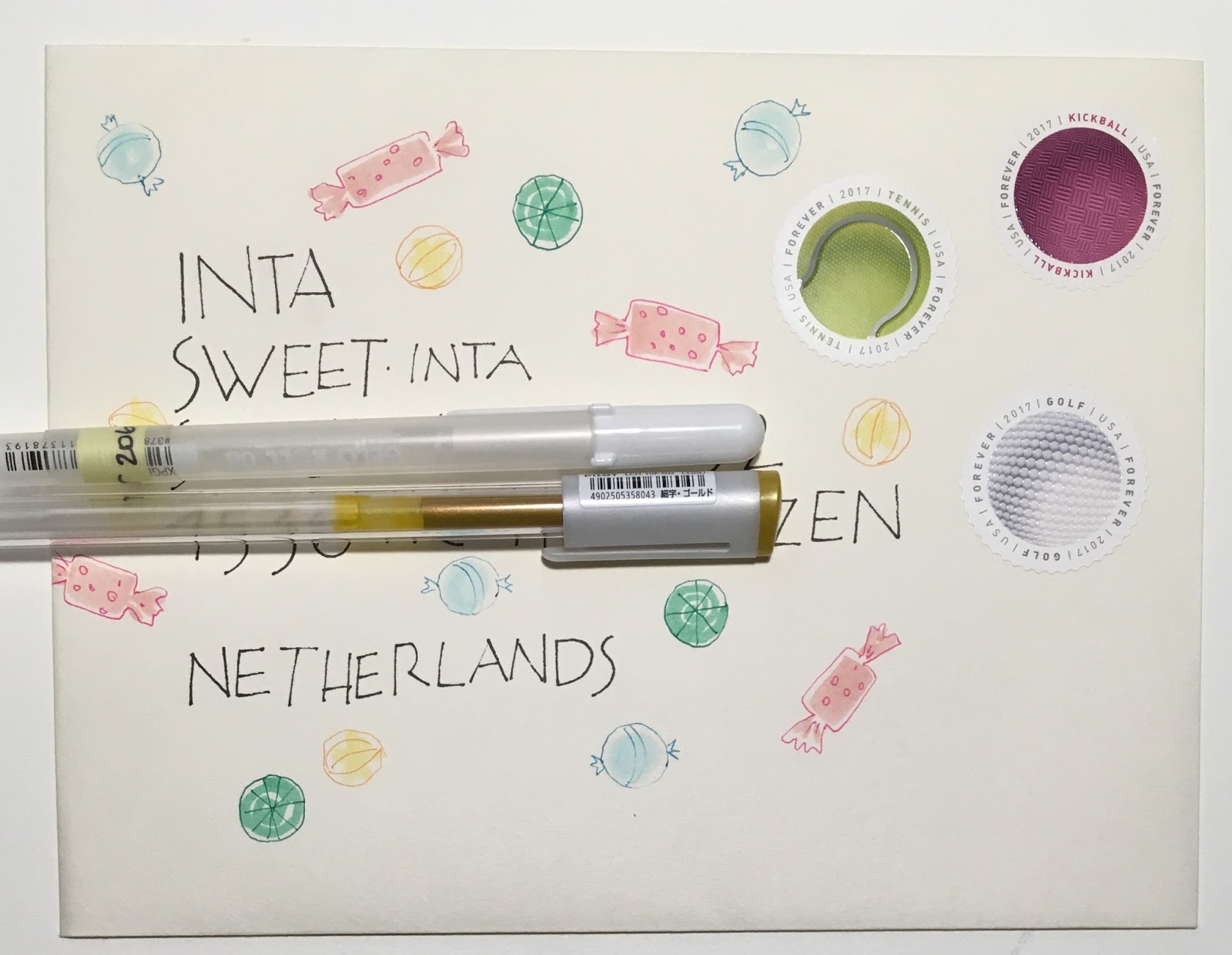
The last 2 envelopes in this series do look like landscapes. I have forgotten to mention Jackie's nicely lettered addresses. I am not sure what style I would call her caps. They are very stylish. Reminder to my students to work on your simple manuscript lettering. Hopefully you can see how the loveliness of the lettering is a huge part of the success of this envelope.


A REQUEST:

If any of my readers have time - please copy and paste this list of questions into an email - and send your responses to me at
jmwilson 411 (at) yahoo [dot] com
Feel free to add details and stories to any question that triggers either the joy or anguish associated with writing. THERE IS NO DEADLINE FOR SENDING IN THE SURVEY. IF IT IS 2025 AND YOU JUST FOUND THE SURVEY - GO AHEAD AND SEND IN YOUR ANSWERS. IF I AM STILL ALIVE, I'LL ADD IT TO THE LIST -

HERE IS A LINK TO THE BLOG THAT HAS ALL THE SURVEY RESPONSES
https://jmwilson411.blogspot.com/

For anyone who is not familiar with my personal definition of penmanship, calligraphy, lettering - for the purposes of this survey, this is my definition:

Penmanship is your printing or script that you use for everyday writing with regular pens or pencils and there is little or no variation in thicks and thins (called mono-line) - unless you use a brush tip.

Calligraphy is when you head into the territory of changing your penmanship to reflect something very specific. It may range from very traditional to very contemporary - but the contemporary has some relationship to a traditional style. While it may be done with a mono-line pen, it is often done with ink and nibs - either broad edge nibs or pointed nibs.

Lettering is everything else. I seldom put scripts into the lettering category. To me lettering is often based on fonts or very unusual ways of constructing an alphabet.

Writing - If those three categories are too confusing - you may just talk about your relationship with writing.

 The questions:

Do you recall being interested in the alphabet at an early age, if so what age?
Do you recall being interested in penmanship at an early age, if so what age?
Do you recall being interested in calligraphy at an early age, if so what age?
Was there a person or a book you ran across that had a big influence on your path?
Did you discover lettering/penmanship/calligraphy at a much later age?

What do you enjoy most about writing?
What do you find most frustrating about writing?
Do you have a specific goal?
Can you describe any ah-ha moment where you discovered something that really helped with your journey?

If you have taken classes, do you recall why you signed up for your first class?
Have your classes met or exceeded your expectations?
Do you think we all start with equal potential?
Why do you think some people catch on faster than others?
Is anyone truly *hopeless* (at improving their penmanship)?


US Postage Rate Went up to 50-cents for 1 oz

Unrelated visual. Unrelated to postage. The comment does relate to my dis-interest in the Olympics. I admire people who are obsessed at that level. I can relate to being obsessed at that level. But, every single activity just looks like increasing your odds of being injured.

Alert pen pal Jeri alerted me to the raise in postal rates.

Some went up Jan 21st.

I think I sent some exchange envelopes with only 49-cents.

This is just another reason to get rid of all my vintage stamps and stick with the forevers.

It looks like international - 1-oz - is still $1.15
Postcards went up to 35-cents.

Thursday, February 15, 2018

Jackie Landscape No. 4

OK - this one is the least landscape-y of the entire group but it is one of my favorites.

Wednesday, February 14, 2018

Thanksgiving to Phillip

I'm a little shocked at my lettering on this one. But, I suspect it was one of the first ones where I was trying to make friends with the huge stack of shimmer envelopes that I can't bring myself to throw away.

That drawing on the bottom was something straight off Pinterest. I liked the way they drew the oak leaves. Sorry I did not save the source. That's really egregious of me. But, when I am in a stealing mode it is because I've let something seep into my central calming zone and if I don't nip it in the bud it can get out of hand and I start doing things I regret.

Tuesday, February 13, 2018

August Exchange from JeanR - music collage

This one was really interesting to examine. I think she adhered some used stamps...and some other rectangles cut from magazines or maps....and then used a rubber stamp over the top. There is a postmark on the back and the bar code on the front and no cancel on the stamp. I usually recognize Jean's envelopes because she does a lot of pointed pen work - so this one was a nice surprise. Nice stamp. Really goes with the craftsman lettering. Or art nouveau? Rennie Mackintosh. What was he?

Monday, February 12, 2018

Black from Kathy

The design reminds me of both flowers as well as fireworks. It might be something else. Something astronomical. These kinds of envelopes really inspire me to get my hoarded vintage stamps out the door so I can justify more Forever stamps.

Sunday, February 11, 2018

Using Up the Indiana Stamps

Great colors.
Tried bold printing with an in-line detail. Inline is the opposite of outline.

Then I switched to script snd layered with gel pens.

And finally - tried colored pencils. They needed some more blending. Sometimes they look OK in person, but not OK in the photo.


Saturday, February 10, 2018

Bonus Post - Alan Blackman

Today's regular post is below.

Miss Cathy sent me the link to a talk given by Alan Blackman. I have not watched it yet but I am sure it is wonderful. I was introduced to Alan's envelopes very early in my calligraphic journey. They inspired me to dive into this world of envelopes.

So...it's Saturday...a day to kick back and kill a hour. Or an hour and 40 minutes.

Alan Blackman

If it turns out that there are no images of his envelope on the video - then you probably need to Google *Alan Blackman envelopes* to get an idea of how spectacular they area.

A startling number of envelopes from this blog show up when you Google Alan.....it's nice to rub elbows with one of the people who inspired me the most.

Carroll & KateR - Last of Sept Exchange Envelopes

Carroll has a big splash of color that looks like some kind of paint. Then she added a house and some flowers.
A nice collection of elements that looks like it might have grown without a lot of pre-planning.

The last envelope (of the Sept exchange) to pair looks like it came from the opposite direction where things were pretty well planned out from the beginning.

It's nice to know how to be able to work both ways. Start spontaneous and then pull it together. Or - start with everything in order and then fling all caution to the wind and do something wild. In the case of Kate's below - her *wild* part is the addition of two white doo-dads. They add just the right amount of *something.*

There is a stray *ear* down by the d in Des Moines. I don't think Kate put that on the envelope. I think that came from somewhere else. But, if Kate did add that - she has some explaining to do. What is it? I can't really figure out what it relates to....

The PO did a good job of putting both the bar code and the cancel up at the top.

Friday, February 9, 2018

Envelope Storage - Archive

The topic of storing envelopes came up on The Flourish Forum. People who are new to envelope exchanges are so excited that they start making big beautiful scrapbooks to house the envelopes they receive. That is exactly what I did more than 20 years ago when I first started exchanging. After a few years, the scrapbooks took up way too much room and I had to pull everything out and come up with a new system. I had to (chose to) edit the collection. There was a request on The Flourish Forum for images of my storage system and it occurred to me that my other pen pals might be interested as well.

My large cabinet for envelopes. Four stackable plastic drawers on top which contain the *top shelf* collection.
One drawer has been pulled down to take a photo so you only see 3 of the 4 drawers. To the right is a book case that has a few notebooks with envelopes in plastic sleeves. You can also see a slender green book sticking out that contains envelopes.
Inner sanctum of the cabinet with a few boxes of incoming mail. Some will graduate to the plastic drawers. Some will not. Editing happens when I need the space. Most of the stuff in the cabinet is blank stock for my own artwork. As I use up the art supplies, I am hoping to have room to store all the archived received mail in the the cabinet and get rid of the plastic drawers. While this may look like a disturbing hoard of art supplies, I assure you there are many people who have larger hoards. I was one of them and am very proud of the amount of excess that has gone out the door.
Plastic drawers have bundles of mail organized by theme, holiday, style of writing. There are dividers with labels. There are also a couple photo albums, pictured below. The bulk of my exchange envelopes are in drawers like this - with labeled dividers. It's easy to pull out a stack and fun to flip through them as if you are going through your mail.
Photo albums with plastic pockets. Easy to switch envelopes as needed. These are nice to take to classes where I prefer that the envelopes are protected from too much handling. Although I do take some of them to classes that are not in plastic. It's nice for students to see the real thing up close. Even the feel of ink on paper is different from markers or pens.
Another inexpensive option for envelopes where I want to display the card or letter that came with the envelope. 
On the right is a letter from Peter Thornton. It might be nice to have the letter and envelope on facing pages, but I prefer to have them both in one plastic sleeve in case I want to pull just a few to take to a class or rearrange them or add a page in the middle. Being able to edit and rearrange is essential to me. I highly recommend building in some flexibility as you figure out which method of archiving works for you. 
On the left you can see the envelope from Peter Thornton. You can also see the bleed through from the letter. It is not ideal to have the business sized envelope turned on end. But a big square 12x12 (30x30) scrapbook (which is what I started with) is so cumbersome.
I much prefer the standard 9x12 (22x30) notebooks.
On the left is a letter from Bob Hurford. The envelope has been grouped with some other Spencerian examples. Envelopes and enclosures do not have to stay together. On the right is an envelope from Sheila Waters. It would not be archived except it came from Sheila. There was a notecard inside which is opened so that it can be read on the flip side. I like how I can see her artwork on this side as well as read the note on the other side. A lot of mail, including envelopes will have things you want to see on both sides, which is another reason that plastic sleeves are so handy. If you commit to gluing things into a scrapbook, you lose the option to see both sides - not to mention losing the option to rearrange easily.
This is my cumbersome 12x12 book of all the mailings I did for my daughter's wedding. I started designing wedding invitations when she was in 5th grade. It was a long haul waiting for her to find Mr. Right. Luckily, Mr. Right had a very good design sense and all three of us had a blast designing a total of 11 mailings as well as a program, menu, table numbers and place cards. Since some of the envelopes were business sized, the book needed to be 12x12 (30x30). This accordion style book works very well for smaller sized scrapbooks.
I left the front cover unattached so that the whole book could be unfurled to display all of the pages. I brought it to Round Robin night at one of the IAMPETH Conferences. 
This shows the pages being unfurled - a top view.
Front view of most of the book.
Close up of a few pages.

And I can hear a couple of you saying - how could you come up with 11 mailings to a wedding.
1
save the date
2
invitation
3
reply card and I wrote in the guests names on all the reply cards because I did not want to see any bad penmanship
4
a small note card letting them know a gift had been received and that a personal note would follow
5
a bridal shower invitation
6
a couples shower invitation
7
a bachelorette party invitation (the bachelor declined the offer of invitations - and sent emails)
8
a rehearsal dinner invitation
9
a Sunday morning brunch invitation
10
a special mailing that went out the week before the wedding that simply said - see U soon
it was just for fun - and it was worth it because so many people came up to me at the reception and said they were going to miss getting mailings from us
11
the actual thank you

on the couples first anniversary, they had moved to Australia. so I made postcards, put stamps on them and sent them to the guests who had been at the wedding and asked them to write a note to the couple and drop it in the mail. my daughter and son-in-law really enjoyed receiving the postcards. so, technically - it was 12 mailings. Fortunately it was not a large wedding. Only 100 invitations went out. and there were about 20% who did not attend. some of the mailings were quite small - like the showers and bachelorette party.


Quick and Easy Valentine Idea from Jeri

There is still time to get some valentines in the mail. Here is a quick and easy idea that would work with any stamp of combination of stamps. Once again, Jeri can make hers come out exactly right. I need to make a road trip and see how she has her stamps organized. It just occurred to me that if they are organized by denomination - that would make it a whole lot easier to come up with the right amount.

Thursday, February 8, 2018

CarolC and Janet - Exchangers

Carol, on top, and Janet, below, sent these two for the September exchange. Both are inspired by growing things, flowers, leaves, etc. The colors are similar and they are both from Utah.


Wednesday, February 7, 2018

Green Copic to Eric

Before and After. I scanned this one and then added some detail before it went in the mail.
I should have added white.
This is what it looked like when Eric received it: