

***
We are off to a chaotic start in our block printing tutorial -plus- I have entered the vortex of universal ambiguousness. That's what I am calling the end of year situation where there are random things happening in so many different directions that I don't even know where to focus my attention.
In all my years of helping people with penmanship - I learned that there is not One Best Way to help people. So, you will have to embrace the chaos. I am going to insert a major rant here about the truly unfortunate way that youngsters are introduced to penmanship.
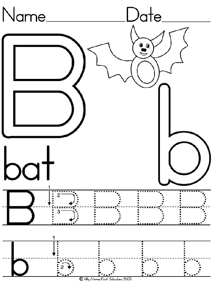
The exemplars are never done by hand. They are devoid of any natural motions. Those circles and straight lines are nearly impossible for anyone to make - even as an adult. They present perfect circles which are very difficult to draw. Then they built ridiculous letters like this B - which is absurd. Nobody is going to make a B that looks like that. It is a general template for the direction of the strokes - but it is goofy.
Compare it to the perfect roman B and you will see that the proportions are barf-worthy.
Remember the lovely romans from Peter Thornton?
They have a lovely organic quality. There is more volume at the top so that they are like balloons -

I hope this exchanger is OK with me using the D and R as examples of letters that could be improved.
The D is droopy. The way the curved stroke overshoots the vertical stroke is something to ponder.

The bowl on the R is skimpy. Peter's lower leg that kicks out should be noted. I put a lot of kick in my R's for no good reason. It's an impulse. We have discussed putting the crossbars on the I. Sometimes they work. I think these are starting to be distracting.
To be clear - I chose this example because the S's are very nice. The EET and OINES and OWA are all very nicely spaced. It looks like it was done without guidelines - so - for free-handing - it is excellent. I'm thinking I might be pulling out examples that are already posted. Hopefully nobody freaks out if they see their block printing used as an example of *needs work.* I'm confident that nobody is going to try to figure out who wrote what. I'll be looking for examples of my own work that needs improvement.
Beautiful poinsettias on black background.
ReplyDelete