During my morning surf, I found this exemplar (link to where I saw it is below - there is a ton of fun lettering stuff at the link)
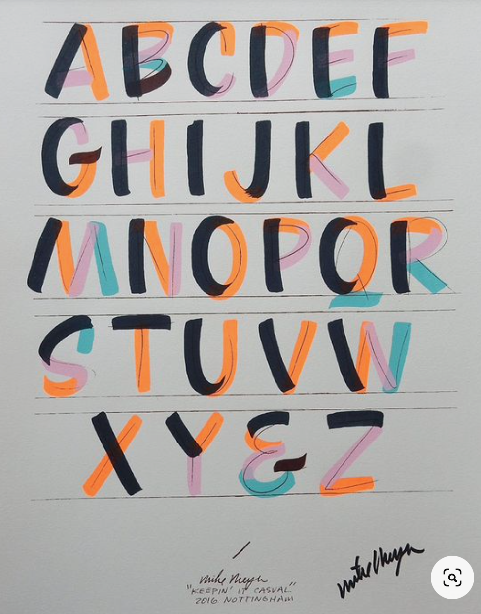
For those of you who want more exemplars, this would be a good one to print out. However, you need to make some adjustments. The F is horrible. The two crossbars should be the same length, as the three on the E are. And the pink crossbar on the F is wimpy and a little too high - the orange is way too long. The M is wonky. The black stroke should not flair so much and it should touch the baseline. The orange and pink strokes should open up and be a little more like the V. The black stroke on the T is a tiny bit too wide for my eye - but it will depend on what letters fall on either side of a T. The pink stroke on the Z is too thin.
I hope Mike ? doesn't mind my harsh words. I get just a tad feisty when people who are soooo good at lettering lapse into the scribbled signature. One would think they cared enough to come up with a lovely signature.
The letters that I did not talk about are all very good and some of them are masterful. Pay attention readers, to the B-C-D-G-J-K-L-O-P-Q and that is a fabulous S. If time permits, I will redo the letters that I think need correction and repost this.
If Mike contacts me, and asks me to delete this, I will.
Here is where I found it:
It's from 2017 - so maybe nobody pays attention to the dusty old pages on the internet.
No comments:
Post a Comment