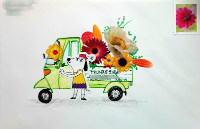
Here is a second one from Mary using the flower stickers. She had a cute dog, too - and created this darling scene - with the lovely white space. The stamp is perfect, too. And if we want to dissect the work some more - the red-green with some yellow is a nice color combination. Red and green (complimentary colors) spice things up. Yellow showed up in the flowers and that made a yellow shirted dog look good. It would not be nearly as cute if the dog was wearing a blue shirt. And then black is a welcome addition to all kinds of compositions. The black wheels echo the centers of the flowers, the dogs nose and eyes.
People who are good at putting things together don't always think about these things specifically. They scan their options and choose things based on their gut feelings. But the gut feelings may have been born with a natural design sense. Or they might have taken some classes. It would not be polite to post examples of clumsy color choices - unless I find examples of my own clumsiness.
I will do that tomorrow. However, when I criticize my own work, I don't want anyone defending it. I'm not being hard on myself. I'm just being honest about decisions. It's been a while since I posted something of my own and then blasted it. So, brace yourselves. And remember -- you may not tell me that I am mistaken.
My exchange envelopes went in the mail on Monday. Apologies to all -- very few of them pleased me. But, I am going to try the ChuckM system - and start my Sept envelopes now - so that they are ready to go and all I have to do is fill in names.

No comments:
Post a Comment