white on kraft paper is one of my favorite combinations. if you have not splurged and bought a bottle of white ink, please do. it's the best. if you are afraid of ink and nibs, just get a white gel pen.
tome's been practicing for years, so her thicks and thins are lovely.
thanks, tome
Wednesday, January 21, 2015
Tuesday, January 20, 2015
jan's grid thing
jan gave me a grid thing a while back and i just thought of a way to use it. so simple. just write one letter in each hole.
this is the grid. the photo does not do the envelope justice. the shoe box full of mail in the background is the stack of unfinished ideas that were on my desk on dec 21st and my goal was to get every single one out the door by the end of the year. who thinks i accomplished the task?
Monday, January 19, 2015
snowflakes
the top card and envelope is from a friend who was not in the exchange. she had her design letterpressed.
the bottom envelope is from my french penpal, eric bruth. he creates digital designs.
thanks sheryl and eric
snowflakes are so pretty. i was just talking to A. Nonnie Mouse about how much we like things found in nature. we did not mention snowflakes, but they would totally be on my list of favorite things in nature that make me wonder why i even bother making things. if you have never taken time to surf through the actual photos of snowflakes that you can find on the internet, i encourage you to take a moment to look at some. they are breathtaking....
i had another conversation with a friend - where we were trying to one-up each other on just exactly how lazy we were. or maybe we were trying to one-down each other. whichever way it is, i'm guessing she is too lazy to surf around for some good snowflake macro-photos. so here's a link:
http://www.huffingtonpost.com/2013/12/03/alexey-kljatov_n_4373888.html
i'm so lazy, i just chose the one at the top of the list.
the bottom envelope is from my french penpal, eric bruth. he creates digital designs.
thanks sheryl and eric
snowflakes are so pretty. i was just talking to A. Nonnie Mouse about how much we like things found in nature. we did not mention snowflakes, but they would totally be on my list of favorite things in nature that make me wonder why i even bother making things. if you have never taken time to surf through the actual photos of snowflakes that you can find on the internet, i encourage you to take a moment to look at some. they are breathtaking....
i had another conversation with a friend - where we were trying to one-up each other on just exactly how lazy we were. or maybe we were trying to one-down each other. whichever way it is, i'm guessing she is too lazy to surf around for some good snowflake macro-photos. so here's a link:
http://www.huffingtonpost.com/2013/12/03/alexey-kljatov_n_4373888.html
i'm so lazy, i just chose the one at the top of the list.
Sunday, January 18, 2015
ok, dr finn.....
...you post backs and innards, which is something i thought i would not be tempted to do, but then as i forged ahead with my purge of all my incomplete envelopes, i had the irresistible urge to post this. it's not even a good design. it would need many more layers to be decent...but, i am also in just-pitch-this-stuff-out-into-the-world mode....so....here it is.....the part where i was sealing the flap and accidentally created the word NOW out of an upsidedown MODERN is just begging for more...but....sorry...i am pitching you out into the cold cruel world. the recipient has my permission to burn this one or shred it or compost it...
Saturday, January 17, 2015
karen's skiers
two problems with this one: i don't like how i have three caps and then two lower case. i like to mix them, but not first one and then the other.
can anyone guess what the second thing is that really bugs me?
i like the idea....but there is a glaring inconsistency.
and no, it is not the ugly sky. i guess that is a third problem.
this is an idea that i think is fine, but it just needs a lotta work.
can anyone guess what the second thing is that really bugs me?
i like the idea....but there is a glaring inconsistency.
and no, it is not the ugly sky. i guess that is a third problem.
this is an idea that i think is fine, but it just needs a lotta work.
Friday, January 16, 2015
cathy's loaves
i pondered making an entire name out of bread. then i came to my senses. not that it couldn't be done...it just wasn't going to be quick enough. so...the C-a connection is very clumsy. but- all together now *it-just-doesn't-matter*
i am a big fan of bread. but, sadly, bread has now become a big debate. i had a long coffee-fueled rant about gluten, but i deleted it and will just rant about how [pause] i couldn't think of anything i wanted to rant about. ominous. do you ever feel like there is someone else in your head over-riding your thoughts? is that question going to get me sent to the office? i'll just wait patiently for dr finn to set me straight. and the tail on the y bothers me a little.
Thursday, January 15, 2015
ho hum
this was one of the earlier ones in the whole series i worked on. it doesn't thrill me and there isn't anything new. but it wasn't bad enough to toss. i know if i carve a little batman logo and rubber stamp them all over the place, i will like it better, but, sadly, the items on my to-do list that are higher than carving stamps are going to stay right where they are and unless some nutty person pays me to send invitations for their batman themed wedding, no rubber stamping. finnbadger: your task for the day is to google *batman themed wedding* and report what you find. yes, my new hobby is thinking of things that finn can't resist researching for me. too bad i already researched DIY brain surgery and found out that it does in fact exist. so, you don't have to research that. unless you think i am pulling your leg....which you know i would never do.
Wednesday, January 14, 2015
does it work?
my gut told me that the wrought iron lettering would never go with the batman stamp. i dunno. i rather like it. anyone care to weigh in?
Tuesday, January 13, 2015
ho hum
this one needs something else. i tried to make batman pointy shapes on the zip, but they don't really work. i might look for something to add today...
Monday, January 12, 2015
sometimes it matters
i hope you enjoyed the it-just-doesn't-matter clip yesterday. it echos something i learned very early on from joan gordon. she has been a faithful attendee of calligraphy workshops and conferences for many years. i was obsessing over the quality of my work and she said something along these lines, "you know, jean, at a certain point, i just decided that i was far enough along on the learning curve to be content with my level and, sure, i could do more work to get better, but i don't feel like working that hard. i feel like creating things and being satisfied with them." if you are reading this blog, you will never be sheila or peter or denis or jake or jean larcher or john stevens - (all rock stars in the world of lettering - who work rather than read blogs) but, it just doesn't matter. anyone who knows their alphabet can benefit from mindless doodling or serious study. what does matter is that you fully appreciate the time you get to spend learning and experimenting. don't compare yourself to others. if you are drawn to envelopes....then make them and send them out into the world and enjoy the feedback.
i had an earlier version of this envelope. i missed the bump on the h and went straight into the y which made it read *catly.* i pondered a fix - but i knew i was looking for a nice, simple, fluid line. so, in this case, it did matter. i did not want any layering or extra stuff. and i boldly threw an envelope in the waste bin without even trying to fix it. then i wrote o'rear and i really don't like the size of it....but it-just-doesn't-matter. i was on a roll, i was not going to let a small disappointment derail the whole envelope. so....i'll resolve the problem of the o-rear when i put in the rest of the address.
and here is a nice interview with one of the rock stars i mentioned above. this kid is practically in diapers and his skill is ree-dik-a-lus.
http://www.artofmanliness.com/2012/11/30/so-you-want-my-job-master-penman/
anyone wondering why i am reading columns on a site called the art of manliness need not worry that i am gender confused. it just popped up when i googled *IAMPETH master penmen* because i wanted to include jake on the list but couldn't remember his name...and then, when i read the interview, i really liked his perspective.
i had an earlier version of this envelope. i missed the bump on the h and went straight into the y which made it read *catly.* i pondered a fix - but i knew i was looking for a nice, simple, fluid line. so, in this case, it did matter. i did not want any layering or extra stuff. and i boldly threw an envelope in the waste bin without even trying to fix it. then i wrote o'rear and i really don't like the size of it....but it-just-doesn't-matter. i was on a roll, i was not going to let a small disappointment derail the whole envelope. so....i'll resolve the problem of the o-rear when i put in the rest of the address.
and here is a nice interview with one of the rock stars i mentioned above. this kid is practically in diapers and his skill is ree-dik-a-lus.
http://www.artofmanliness.com/2012/11/30/so-you-want-my-job-master-penman/
anyone wondering why i am reading columns on a site called the art of manliness need not worry that i am gender confused. it just popped up when i googled *IAMPETH master penmen* because i wanted to include jake on the list but couldn't remember his name...and then, when i read the interview, i really liked his perspective.
Sunday, January 11, 2015
it just doesn't matter
i needed to come up with some ideas for the batman stamps. my first thought was big bold black. there are at least 10 things about the basic lettering that are *wrong.* but i want this to be a lesson in
it-just-doesn't-matter
there is a time for perfection and then there is a time for just frogging around. a time for this a time for that. (that sounds like a song, eh?)
so, instead of me ranting about how i wish people would just toss off more stuff without nitpicking, i will direct you to my favorite rant on film. it is from the movie *meatballs* which takes place at a camp for underdogs. every year, they have a competition with the fancy-schmancy camp across the lake and every year they lose. but, bill murray manages to convince them, that when it comes to winning and losing, it just doesn't matter. [except when it does - which we will cover tomorrow]
enjoy
https://www.youtube.com/watch?v=-TogGxzlfhM
it-just-doesn't-matter
there is a time for perfection and then there is a time for just frogging around. a time for this a time for that. (that sounds like a song, eh?)
so, instead of me ranting about how i wish people would just toss off more stuff without nitpicking, i will direct you to my favorite rant on film. it is from the movie *meatballs* which takes place at a camp for underdogs. every year, they have a competition with the fancy-schmancy camp across the lake and every year they lose. but, bill murray manages to convince them, that when it comes to winning and losing, it just doesn't matter. [except when it does - which we will cover tomorrow]
enjoy
https://www.youtube.com/watch?v=-TogGxzlfhM
Saturday, January 10, 2015
message in a bottle - exchange envelope
once again, i am not sure if this exchanger wants to be identified by name, so i will not include the artist's name unless he or she lets me know that it is ok to do so.
one of my best little mail art grasshoppers was at my house on the day this arrived and it thrilled her to no end. she wanted me to be sure to tell the artist that she has a BIG FAN here in iowa.
make that two. it is always fun to hear from readers. i think this envelope pushes things just the right amount. it is fun, whimsical, and legible. thank you for participating :-)
and this was the fall exchange. it was supposed to show up earlier, but, i had to bump it forward because something needed to be stuck in earlier....blah blah blah....by now, i assume nobody is concerned about the random disorganization of my blog, eh?
you just want one fun thing to pop up every morning.
tomorrow i shall have a humorous rant.
unless it gets bumped....
expect the unexpected
one of my best little mail art grasshoppers was at my house on the day this arrived and it thrilled her to no end. she wanted me to be sure to tell the artist that she has a BIG FAN here in iowa.
make that two. it is always fun to hear from readers. i think this envelope pushes things just the right amount. it is fun, whimsical, and legible. thank you for participating :-)
and this was the fall exchange. it was supposed to show up earlier, but, i had to bump it forward because something needed to be stuck in earlier....blah blah blah....by now, i assume nobody is concerned about the random disorganization of my blog, eh?
you just want one fun thing to pop up every morning.
tomorrow i shall have a humorous rant.
unless it gets bumped....
expect the unexpected
Friday, January 9, 2015
elizabeth - gingerbread
whilst clearing out a very large stack of unfinished envelopes, i found this one, and i was into my white gel over marker binge....and oh-my-gosh...i wish i had an excuse to sit and do ten more of these.
Thursday, January 8, 2015
finn house
very nice. i really like the envelopes that finn makes and he is very talented at finding the perfect stamp.
but, i am also faithful to my readers who come here for lettering, so i hope to find time to show how i would have lettered this particular envelope.....
i may not get this done before this post pops up, but, it is on my to-do list.
nope. i did not get that done. but i did manage to post a new alphabet on the nibs and ink blog.
i have started posting lessons that i use in classes for kids because one of my readers is going to offer a class for kids. grown ups may have fun with these alphabets, too.
http://nibsandink.blogspot.com/
but, i am also faithful to my readers who come here for lettering, so i hope to find time to show how i would have lettered this particular envelope.....
nope. i did not get that done. but i did manage to post a new alphabet on the nibs and ink blog.
i have started posting lessons that i use in classes for kids because one of my readers is going to offer a class for kids. grown ups may have fun with these alphabets, too.
http://nibsandink.blogspot.com/
Wednesday, January 7, 2015
smash - experiment
i was having so much fun writing in white gel over the top of marker, i thought of doing this. there is a cardinal SIN in traditional calligraphy - writing in all caps with a flourished set of caps. it is a popular style in prison tattoos, but the rest of us frown on it.
sometimes i like to experiment with breaking cardinal rules. it's not something i plan on trying again -plus- i did not have a stamp in mind when i started.
after i found the hanukkah stamp, i thought it would work, but then after i adhered it to the envelope, i was wishing i had started over and made the green rectangles more similar to the proportion of the stamps.
but, it was done, so it went in the mail.
and it is at the bottom of the list of ideas to explore further.
sometimes i like to experiment with breaking cardinal rules. it's not something i plan on trying again -plus- i did not have a stamp in mind when i started.
after i found the hanukkah stamp, i thought it would work, but then after i adhered it to the envelope, i was wishing i had started over and made the green rectangles more similar to the proportion of the stamps.
but, it was done, so it went in the mail.
and it is at the bottom of the list of ideas to explore further.
Tuesday, January 6, 2015
still catching up
A. Nonnie Moss sent this one back in october. the p.o. decided it was too cool to cancel.
it is in the category of *fills up all the space* -which i seldom do, so I am not good at explaining why it is successful.
exuberant.
i like that word.
and it has a mysterious story going on. it would be fun to have a bunch of different people write the story....and then compare them.
thanks, nonnie
and thank you to the PO for working so hard to find the address. i'm thinking the PO might forget to scribble on the envelopes if they have to work really hard to even find the address.
it is in the category of *fills up all the space* -which i seldom do, so I am not good at explaining why it is successful.
exuberant.
i like that word.
and it has a mysterious story going on. it would be fun to have a bunch of different people write the story....and then compare them.
thanks, nonnie
and thank you to the PO for working so hard to find the address. i'm thinking the PO might forget to scribble on the envelopes if they have to work really hard to even find the address.
Monday, January 5, 2015
re-run
and this is how i resolved the one from yesterday. how fitting that my director of purging inspired me to part with 6 uber-favorites.
also, there is a history update in the post below that i inserted yesterday.
Sunday, January 4, 2015
correction
http://www.uni-heidelberg.de/presse/news2013/pm20130109_minuskel_en.html
anyone who has taken a class from me might have heard me say that early writing was in *all caps* (or majuscule) and that *lower case* (or minuscule) was *invented* by scribes during the time of Charlemagne. that's what we read in history books.
it looks like the lower case appeared earlier. and in the future, i am going to shy away from any history lessons, since nobody really knows anything for sure.
today's envelope is below this post.
anyone who has taken a class from me might have heard me say that early writing was in *all caps* (or majuscule) and that *lower case* (or minuscule) was *invented* by scribes during the time of Charlemagne. that's what we read in history books.
it looks like the lower case appeared earlier. and in the future, i am going to shy away from any history lessons, since nobody really knows anything for sure.
today's envelope is below this post.
indecision
i'm using up square envelopes and most of the time i refold the top to make it a standard size, but now i like all that white space - but i don't want to put a second stamp on the envelope. rats.
this was done in late november, when i was finishing up my exchange envelopes and i started layering white gel pens over tombo markers.
it was interesting that after doing nearly 20 envelopes, using about 4 or 5 different ideas, i had a tsunami of additional ideas. so, those will be coming up over the next few days.
if i cut this one off, the address will go in the space just above the bird.
this was done in late november, when i was finishing up my exchange envelopes and i started layering white gel pens over tombo markers.
it was interesting that after doing nearly 20 envelopes, using about 4 or 5 different ideas, i had a tsunami of additional ideas. so, those will be coming up over the next few days.
if i cut this one off, the address will go in the space just above the bird.
Saturday, January 3, 2015
bonus post today
be sure to go to eric's blog and see some of his mail from the exchange http://mymailartworld.blogspot.com/
you might have to scroll down
my polka-dot-fiend-personality wants to do a bunch of these
finn's lettering
another sample of finn's wrought iron lettering. i wonder if i will ever come up with another style that he will be compelled to try.
i am also impressed with his bat flying across the moon. that might be the first illustration he has done. maybe there are other examples on his blog....
once again, we are all disappointed in the postal worker with the big fat sharpie. boo.
note: the lettering yesterday on my envelope to christy is what evolved from the style that lured finn into letttering. i eventually added my own lower case. so, the fun of this lettering is that it had some fun details and you can really stretch it and morph it. it seems so orderly on the surface, but, it gets better as it gets looser.
i am also impressed with his bat flying across the moon. that might be the first illustration he has done. maybe there are other examples on his blog....
once again, we are all disappointed in the postal worker with the big fat sharpie. boo.
note: the lettering yesterday on my envelope to christy is what evolved from the style that lured finn into letttering. i eventually added my own lower case. so, the fun of this lettering is that it had some fun details and you can really stretch it and morph it. it seems so orderly on the surface, but, it gets better as it gets looser.
Friday, January 2, 2015
christy - exchange
this is the last one from the winter exchange. i kept running out of stamps and needed to come up with something new. this one is a little scattered, but it's not the worst thing i've ever put out. the name Christy is full of opportunities to fling loops.
those dotta-riffic markers are so much fun. too bad i don't have time to buy a full set and really spend some time experimenting with them.
it bothers me a little that the blues clash. but, i the parts i like outweigh the parts i would change.
those dotta-riffic markers are so much fun. too bad i don't have time to buy a full set and really spend some time experimenting with them.
it bothers me a little that the blues clash. but, i the parts i like outweigh the parts i would change.
Thursday, January 1, 2015
one of the best of 2014
this envelope arrived in september. it was clearly marked *empty* on the back. (see below) i could not make out the postmark, so, it was going to drive me crazy if i did not figure out who sent it. happily, finnbadger responded to my question posted on the blog...
i was surprised to see hand lettering from finnbadger, because if i had time to go read earlier messages, i think finnbadger said that he was going to be making labels on all his envelopes and he would not be into lettering.
so, i'm really happy that at least one person who never had any interest in lettering - actually saw something that looked do-able -tried it - and then actually sent it.
he did a great job for his first try at lettering.
thanks. and congratulations. i hope it inspires others.
i was surprised to see hand lettering from finnbadger, because if i had time to go read earlier messages, i think finnbadger said that he was going to be making labels on all his envelopes and he would not be into lettering.
so, i'm really happy that at least one person who never had any interest in lettering - actually saw something that looked do-able -tried it - and then actually sent it.
he did a great job for his first try at lettering.
thanks. and congratulations. i hope it inspires others.
Wednesday, December 31, 2014
stella's yearly envelope
so, here is stella's yearly envelope to me. i had given up on hearing from her. she was the *winner* of best envelope for 2013. i figured she just wasn't into mail art....and then this showed up and - it really is one of the best envelopes of 2014. there is a large part of me that does not want to declare any *winner.* mail art is not a competition.
but, a while back, i received an envelope that i wanted to honor. i went ahead and scheduled it to pop up as *best of 2013*
so, i will have to change that post to reflect that i am changing *best*
to one-of-the-best
for the ones that i want to mention.
so
considered yourself honored, stella
this is a beautiful envelope and the vandalism by the post office makes me very very sad.
but, a while back, i received an envelope that i wanted to honor. i went ahead and scheduled it to pop up as *best of 2013*
so, i will have to change that post to reflect that i am changing *best*
to one-of-the-best
for the ones that i want to mention.
so
considered yourself honored, stella
this is a beautiful envelope and the vandalism by the post office makes me very very sad.
Tuesday, December 30, 2014
awards season - janet's snowflake
some of you may recall that last year i awarded a *best-of-the-year* award to one of the envelopes that arrived in 2013. you can see it again if you click on the page tab at the top of the blog.
in october, an envelope arrived that knocked my socks off. so i scanned it and scheduled it for jan 1st - as the best envelope of the year.
then in november, another one arrived that deserved an award, so i scanned that one and posted it - for dec 31st
then this one arrived a couple days after i posted here, asking for someone to send me an envelope addressed like this. so, janet, needs to be on the list of honored penpals for taking time to indulge me in my crazy ideas....
thanks janet - i love the card, too.
- everyone else who has written or emailed deserves to be honored. even if you just check the blog regularly, i'm honored - and i honor you back. thanks for a year of fun mail. i hope this isn't getting too mushy. i'm not the mushy type.
in october, an envelope arrived that knocked my socks off. so i scanned it and scheduled it for jan 1st - as the best envelope of the year.
then in november, another one arrived that deserved an award, so i scanned that one and posted it - for dec 31st
then this one arrived a couple days after i posted here, asking for someone to send me an envelope addressed like this. so, janet, needs to be on the list of honored penpals for taking time to indulge me in my crazy ideas....
thanks janet - i love the card, too.
- everyone else who has written or emailed deserves to be honored. even if you just check the blog regularly, i'm honored - and i honor you back. thanks for a year of fun mail. i hope this isn't getting too mushy. i'm not the mushy type.
Monday, December 29, 2014
snowman for the exchange exchange
here is the idea i came up with for the snowman stamps. the first one i did was susan's. i thought the scarves were a little clunky, so i used a different marker on the other three, but i am not sure i like the lighter weight scarves. i have a huge issue with how the hats sit on the heads. i know i could solve that problem, but, i do not have any more stamps and i have turned over a new leaf. i am not going to buy any more stamps. well, that is an absurd statement. i might. but, sometimes i can be pretty rigid and inflexible. maybe dr. finnbadger will explain how i can be both rigid and inflexible and also weak and helpless at trying to get my stamp addiction under control? i hope you have malpractice insurance, dr. finnbadger. my family is starting to lose their patience with me. and there is a lawyer amongst them. perhaps you should turn this case over to nurse ratchet. (actually i have 2 nurse ratchets here in des moines who keep me in line.)
oops. coffee was too strong this morning.
Sunday, December 28, 2014
cardinal exchange envelopes
here are some more envelopes for the december exchange. i had a few cardinal stamps left. they have some green dots and gifts on them, so, i am trying to decide if i am going to add any green to the envelope. my gut tells me no. so, these 5 people will have a surprise in their mailbox, unless i actually mail them promptly. i am writing this blurb on thanksgiving morning, so, in theory, i could dispense with my obsessing and just finish them and mail them.
dec 26th p.s. - i'm pretty sure i added green and liked them a lot better, but i did not take another photo. the camera/phone/scanner/computer gods have been ganging up on me - so, i'm just lucky to get anything posted. lucky for me, i am content to just toss out random-garbled-fuzzy-mish-mash.
Saturday, December 27, 2014
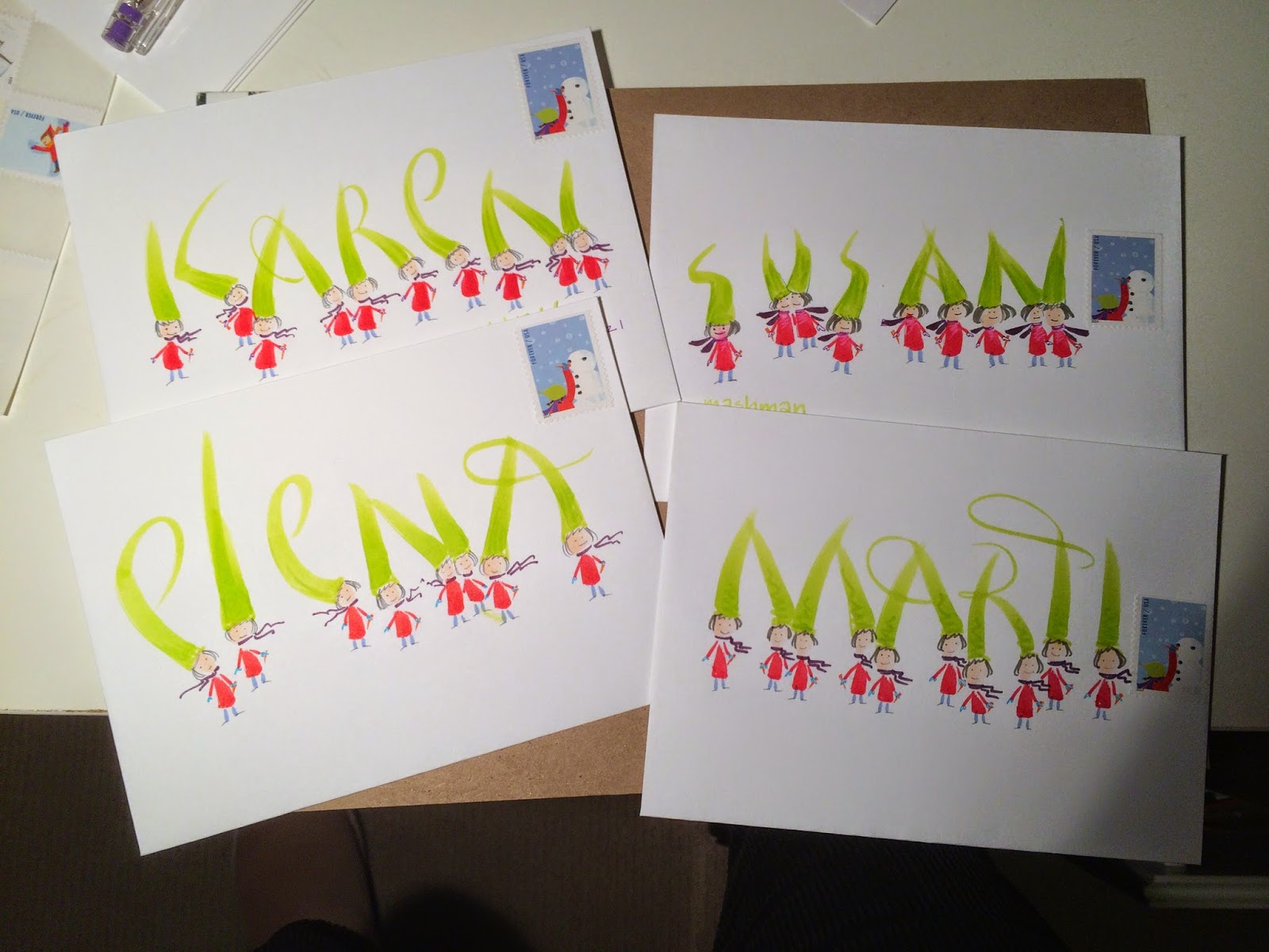
winter exchange - karen
this is resist with watercolor, from karen to jan for the exchange. once again, i never met a polka dot i didn't like.
alert reader jeri sent me an email wondering if i have ever heard of the artist, yayoi kusama. yes, i have seen articles...
you will want to google her...if you have ever liked polka dots.
alert reader jeri sent me an email wondering if i have ever heard of the artist, yayoi kusama. yes, i have seen articles...
you will want to google her...if you have ever liked polka dots.
Friday, December 26, 2014
winter exchange envelopes
here are three of the envelopes i made for the winter envelope exchange. i had four of these stamps left and while this idea has appeared on the blog previously, i decided it was OK to rerun it.
the addresses will be in just a tiny little line that runs across the bottom. not sure how close to the lettering.
the address could also be stacked, tiny and hug the left margin. i like to conform to really traditional format, but then push to the extreme...in this case, the first letter of each line would run off the left side of the envelope.
the addresses will be in just a tiny little line that runs across the bottom. not sure how close to the lettering.
the address could also be stacked, tiny and hug the left margin. i like to conform to really traditional format, but then push to the extreme...in this case, the first letter of each line would run off the left side of the envelope.
Thursday, December 25, 2014
karen's batmen
comics are full of graphicly enhanced words indicating violence. i think i need to change that nasty p.o. blot on the zip code into a comic-inspired element.
i love the layout of this
and
it is my understanding that when you put an envelope and stamp in portrait orientation, you need to put 70-cents on it. so, they were kind to let it go through with just the forever stamp.
thank you karen
i love the layout of this
and
it is my understanding that when you put an envelope and stamp in portrait orientation, you need to put 70-cents on it. so, they were kind to let it go through with just the forever stamp.
thank you karen
Wednesday, December 24, 2014
finn's chef
finn and smash and i have a bird-on-the-head series going. finn morphed it into the head-on-a-bird series. the p.o. decided to vandalize our work of art. dang.
but part of me wants to turn the black line into a fun polka dot bow tie. i could do that using Post-It tape. they sell rolls of Post-It tape which is white, and about an inch wide - and it is great stuff for temporary add-ons.
thanks, finn. i ran out and bought a sheet of chef stamps. i'm looking forward to some free time to see what kinds of ideas i come up with.
but part of me wants to turn the black line into a fun polka dot bow tie. i could do that using Post-It tape. they sell rolls of Post-It tape which is white, and about an inch wide - and it is great stuff for temporary add-ons.
thanks, finn. i ran out and bought a sheet of chef stamps. i'm looking forward to some free time to see what kinds of ideas i come up with.
Tuesday, December 23, 2014
from elizabeth
woo hoo
i love this stamp and i had a blast making similar letters on a return envelope to elizabeth.
i wonder what janis would think of her stamp?
i love this stamp and i had a blast making similar letters on a return envelope to elizabeth.
i wonder what janis would think of her stamp?
Monday, December 22, 2014
susan's holiday envelope
susan k (not to be confused with susan-smash) sent this recently. the ornament is made of two perfect intersecting circles. the photo distorts the shape and makes it look like a pear, which is actually a good idea - make one of these in a pear shape. the words are:
feel some joy
find some peace
share some love
live your dreams
i love the sentiment as well as the delightful, contemporary lettering.
thank you, susan
feel some joy
find some peace
share some love
live your dreams
i love the sentiment as well as the delightful, contemporary lettering.
thank you, susan
Sunday, December 21, 2014
flower favorites
oh.....what a trip down memory lane. flowers are always welcome on stamps. these were favorites, back in the day of 37-cents.
the watercolor (i am guessing) is a nice way to tie the lettering to the stamps and those little details are stealworthy.
thank you smash.
the watercolor (i am guessing) is a nice way to tie the lettering to the stamps and those little details are stealworthy.
thank you smash.
Saturday, December 20, 2014
thank you from tom
tom is very good at pointed pen work. he texted me one day asking if i knew of a place that would do a rush framing order. i think he needed a mat with 7 openings. luckily, i have a very good relationship with a framing shop and had just done an emergency job for them.
the owner of the business next door to their frame shop had let an important wedding anniversary go until the last minute. he had half a good idea and the framer, being acquainted with my work suggested that he pull the idea together by having me write some meaning full words on the mat. in this case, the meaningful words were just the names and dates....
i like doing these types of jobs in pencil. the photos were just snap shots....so it was not super formal. the writing was casual and cheerful. i was very pleased with the results.
i guess i should do another example of what i am talking about and post it....
anyhow, it was very nice of tom to send a thank you.
for anyone who is local...the shop is tandem brick on ingersoll. very nice framers...and sometimes, they can work small miracles with rush jobs.
the owner of the business next door to their frame shop had let an important wedding anniversary go until the last minute. he had half a good idea and the framer, being acquainted with my work suggested that he pull the idea together by having me write some meaning full words on the mat. in this case, the meaningful words were just the names and dates....
i like doing these types of jobs in pencil. the photos were just snap shots....so it was not super formal. the writing was casual and cheerful. i was very pleased with the results.
i guess i should do another example of what i am talking about and post it....
anyhow, it was very nice of tom to send a thank you.
for anyone who is local...the shop is tandem brick on ingersoll. very nice framers...and sometimes, they can work small miracles with rush jobs.
Friday, December 19, 2014
hi, kilroy
my dear penpal, Legend, sent me a scan of this envelope. i believe that it is a self portrait peeping over the fence. maybe not. Legend said he didn't think his graffiti was the best, but the nature of graffiti is to be a little rough. the only way for graffiti to be less than perfect would be to make it perfect...so, this is perfect. it's a wonderful envelope and i really appreciate that he shared it with us. it definitely makes the stealworthy file.
good stamp choices and nice colors.
and i love tacos, too.
good stamp choices and nice colors.
and i love tacos, too.
Thursday, December 18, 2014
miss munster and stu
miss munster collaborated with stuart davis on this one. once again, i am flattered that she shared one of my favorite stamps. i have a couple sheets of these and i still can't make myself use them.
maybe i can make a doll house and use the stamps as the artwork. or make an mini art gallery and hang all my favorite stamps... one more item on my to-do-in-my-dreams list....
and speaking of dreams, the highlights on the letters are D-R-E-A-M-Y
thanks, karen
maybe i can make a doll house and use the stamps as the artwork. or make an mini art gallery and hang all my favorite stamps... one more item on my to-do-in-my-dreams list....
and speaking of dreams, the highlights on the letters are D-R-E-A-M-Y
thanks, karen
Wednesday, December 17, 2014
from chuck
sadly, the scanner will not interpret the neon orange on my name. the neon just makes the whole envelope. i guess i should try a phone shot, but all y'all know how i can't get phone shots to appear in the correct orientations.
this lettering was inspired by the jethro tull poster border from the filmore west poster. chuck used the Pitt artist brushes.
thanks chuck :-)
i guess the secret to making phone photos work is to have a little online conversation with my phone and ask it to be nice. i'm sorry about that background....i suspect if i try to fix it, the phone will cease cooperating.
so, we will just move along to the next envelope.
this lettering was inspired by the jethro tull poster border from the filmore west poster. chuck used the Pitt artist brushes.
thanks chuck :-)
i guess the secret to making phone photos work is to have a little online conversation with my phone and ask it to be nice. i'm sorry about that background....i suspect if i try to fix it, the phone will cease cooperating.
so, we will just move along to the next envelope.
Tuesday, December 16, 2014
inkling of an idea
i'm fine with this concept. but i'll need to spend some time thinking of ways to make it more interesting. i don't care for the gold gel pen with the yellow on the stamp. but i really like these stamps on colored envelopes. i think i need to drag myself to the other room and get some black envelopes. could i get any lazier?
the response to that question is....people who post daily for 5 years and never miss a day are not lazy. the 5th year anniversary is coming up....how shall we celebrate?
don't miss the post below. it is new today. i accidentally scheduled two for today.
the response to that question is....people who post daily for 5 years and never miss a day are not lazy. the 5th year anniversary is coming up....how shall we celebrate?
don't miss the post below. it is new today. i accidentally scheduled two for today.
snail mail
how cute is this?
from miss munster.
i can see a whole series of snails...
plus, she sent me one of the stamps that i have been hoarding.
and i love white space.
from miss munster.
i can see a whole series of snails...
plus, she sent me one of the stamps that i have been hoarding.
and i love white space.
Monday, December 15, 2014
from elena
this one is from elena who signed up for the sept-oct exchange. she has an etsy shop:
https://www.etsy.com/shop/elenaprikhodkoknapp
i like her mandalas. i have made a few and should put them on the to-do list for envelopes as they would be an envelope friendly design.
thanks, elena
i like elena's flowers. and i am guessing they were made with this brush available at John Neal Books [and a whole lot more]
maybe not...if this is not the tool she used, maybe she'll leave a comment.
www.johnnealbooks.com/
BR50. Miracle Wedge 7900 Brush #8
Miracle Wedge 7900 Brush #8.
Pat Blair uses this brush for simple, easy-to-create flowers. The flowers are quick and used to ornament her pointed pen work. Short handle, golden Talkon bristles, unique wedge shape, seamless ferrule. These long-lasting, better quality synthetic brushes have excellent snap, fine points and sharp edges. For watercolor and acrylics. Only one size available.
https://www.etsy.com/shop/elenaprikhodkoknapp
i like her mandalas. i have made a few and should put them on the to-do list for envelopes as they would be an envelope friendly design.
thanks, elena
i like elena's flowers. and i am guessing they were made with this brush available at John Neal Books [and a whole lot more]
maybe not...if this is not the tool she used, maybe she'll leave a comment.
www.johnnealbooks.com/
BR50. Miracle Wedge 7900 Brush #8
Miracle Wedge 7900 Brush #8.
Pat Blair uses this brush for simple, easy-to-create flowers. The flowers are quick and used to ornament her pointed pen work. Short handle, golden Talkon bristles, unique wedge shape, seamless ferrule. These long-lasting, better quality synthetic brushes have excellent snap, fine points and sharp edges. For watercolor and acrylics. Only one size available.
Sunday, December 14, 2014
miss munster - ears
this is a good example of how nice *simple* can be.
of course, having only 4 letters in the name might contribute to the loveliness. it would be fun to have her try a whole bunch of names.
and the way the J is very ear-like makes it particularly suitable for names starting with J.
thanks miss munster
interesting way the p.o. added their design element....
of course, having only 4 letters in the name might contribute to the loveliness. it would be fun to have her try a whole bunch of names.
and the way the J is very ear-like makes it particularly suitable for names starting with J.
thanks miss munster
interesting way the p.o. added their design element....
Saturday, December 13, 2014
finn's security envelope
here is a new twist - finnbadger received this envelope in another exchange, found the most perfect stamp and sent it along to me. it is made out of the security pattern from the inside of security envelopes. i have managed to resist the temptation to recycle security envelopes, although there are some really beautiful things made from them.
nice one, grasshopper.
Subscribe to:
Posts (Atom)


.jpg)