Friday, December 12, 2014

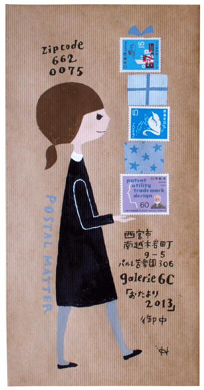
miss munster's elephant

miss munster had a note in one of her envelopes that made a reference to her local post office announcing that they would no longer hand cancel....and she somehow convinced them otherwise. i would really like to hear the whole story. i've received many nice envelopes from karen...and really appreciate all of them. i have many questions for karen...i suppose i could send a questionnaire....

this is from her series done with a cola pen.

you can google cola pen and see what they are. you make them yourself. lots of fun, but i think they are something you need to experience in person. i don't think a video would be enough to launch a beginner on the process.

thanks karen.  stamp placement is so cool.

there is a post below that is an extra post, full of off-topic topics.
ignore it if you have important things to get done.
read it if you want to avoid what you should be doing.

don't fall down - extra post

this is an extra post being wedged in between the regularly scheduled posts - to cover some non-envelope topics.

number one:
https://www.yahoo.com/food/the-woman-behind-the-post-offices-gingerbread-104784842991.html

an article about the lady who created these stamps, which i love, and i will resist the temptation to babble on about all the years i spent making gingerbread houses with my kids and how it might have been the most fun i ever had (outside of envelopes)
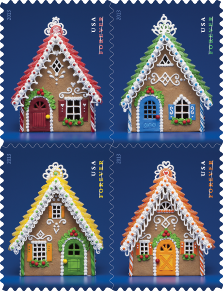
The Woman Behind the Post Office’s Gingerbread Stamps

number two:
mail from the exchange has been pouring in. i am currently scanning and they will appear in my january posts. there is some really great stuff on the way.

number two-and-a-half: one person was excited to find me on the list. i always exchange with everyone. so, if there are others out there who just want to exchange with me, it's easy, you send me an envelope and then i send one back. be sure to use the current address for me which appears on any envelope posted in 2014 (except the ones where people did not write my address correctly, but those still got to me - maybe we should have an exchange where we see how far off you can be with my address and still have it get to me - will someone please send me an envelope that says:
Jean Wilson
400 block of 44th Street
Red brick house that gets all the pretty mail
The carrier on that route will know which one
I know this is asking a lot, but people like us are keeping you in business
so it will be really nice if you go to the trouble of figuring it out.
Thanks. It is the third house on the west side of the street, south of Grand.
Des Moines, Iowa 50312

number three:
if you live in an area with ice and snow, please be careful. so far this winter, (and technically it is not even winter yet) i have had two friends slip and fall on the ice resulting in one broken leg and one arm broken both above and below the elbow. so please be extra careful - and then there is ashley brilliant who fell on a patch of ice, and broke an arm.... ashleigh is not exactly a *friend* but he did come to iowa on a speaking engagement and he did contact me and we did have lunch and he did ask me to write with a dip pen while he watched because he had never seen anyone do that before and i did spell his name *ashley* and he did speak up and i did write it over and mrs guss was my english teacher and i did always get As in her class and i do know that a run-on sentence is not kosher -but- i do drink coffee and i do feel like busting a few rules every once in a while and i do think all y'all look to me for permission to break rules once in a while and this is my official permission to you at this overloaded time of year to just bust some rules if you feel overloaded. period.

number four:
yes, brother, one person is enjoying our conversation about the projects that we are discussing. i might as well clarify that one of my side hobbies is trying to see what i can trick my brother into doing. brace yourself, brother, now that we have an audience, i might have to take this to the next level.

Thursday, December 11, 2014

mary katherine's exchange envelope

mary katherine created a little scene with a poster hanging on the wall in the clown's tent. i'm flattered that i am designated as*greatest.* i'd be lucky to make the top 100. as i always say, it's not a contest. if we calculated *greatest* based on how much fun a particular person had...i'd surely make top ten.

adorable.
thanks mary catherine.

Wednesday, December 10, 2014

(8th) 10th of the month

this is the last of the 8th of the month blogs about mail art links.

this is a very nice blog with some good examples. not a lot of english. but great techniques...like this pin-prick image.

http://www.fishmailart.com/

i think i have posted some work from this site previously....but, they keep adding new work, so it's nice to go back.

Tuesday, December 9, 2014

christy's exchange envelope

christy's been honing her skill with the pointed pen. i really like the moon in the background.

coloring the counters of the letters with a touch of green is very nice.

and the bonus...a fun card was enclosed. thanks so much, christy.

Monday, December 8, 2014

alyce's exchange envelope

i really like the way the flower is touching the top and bottom edge. and the scale of the lettering is just perfect.

design lesson....scale is size and proportion is relative size. in this case, the size of the nib she used on the name is perfect with the amount of black in the stamp and then the super light weight pen she used on the rest of the lettering is perfect. if she would have used the same pen she used on the flower for the address, there would have been too much black. and if the flower was drawn with the super light weight pen, it would have been too wimpy. so the three weights are perfect.

how do you learn how to balance things like the various weights and sizes of elements (your lines and shapes)? by studying the elements and principles of design. the class i taught in design was bar-none, my favorite class to teach. once students learned that they had built in preferences, they were able to use those preferences to arrange the elements on their envelope (or any other work of art) and achieve compositions that were more pleasing to their eye. understanding design is what gives you your own personal point of view.
just ask tim gunn. or rather...just listen to him....pretty much everything he says is a lesson you would hear in my design class...or any other design class.

Sunday, December 7, 2014

miss munster - batman

see that upstroke on the J...
you don't make strokes like that without a lot of practice. this is making me want to get out my ink and BIG NIBS. sadly, since i moved my studio back to my house, i hardly ever (never) get out the big nibs because i don't want to make a mess. maybe next spring i can fix up a work space in the garage. i do have a desk out there that is the kind you hang on a wall. i think my brother reads my blog...so he can be thinking of excuses for not helping me mount the desk on the wall....i probably have some good threats to use to get him to do it....

Saturday, December 6, 2014

miss munster batman

Holy Barcode, Batman!!!!

this is the first time the UGLY barcode actually added to the envelope. i only noticed it when i saw the tiny thumnail size image on the computer. the barcode looked like a little shadow under the lettering, which made the name look 3D, like it was sitting on a landscape. such a wonderful detail.

design lesson for the day.
well, i just wrote a paragraph, but it was too complicated so i deleted it.
design is how you arrange all the elements on your envelope. in this case....karen arranged them beautifully....and someday, when i have time, i will try to prepare a thoughtful and sequential approach to how to arrange your elements on your envelopes....or anywhere else. karen does not need any lessons....but, for those of you who are sometimes stuck on how to arrange things, i can probably come up with some tried and true tips.

Friday, December 5, 2014

miss munster earthscape

thisis the beginning of a mini-series by miss munster. she pulled out her cola pen and made a series of envelopes. i had mentioned in an earlier post that her lettering looked like carl rohrs and she wasn't sure she saw the influence. since i made the comment, i have decided that she probably studied with so many of the rock-star scribes that it would be hard to pin any of her work on the influence of just one scribe.

this is dreamy....all i can say is this...you can have a ton of fun just lettering on your own. a few things are IMHO impossible to learn unless you see someone doing the lettering in person. i don't know if a video would be enough.  i will look for a video of this style of lettering and let you know if i find one.

Thursday, December 4, 2014

from finnbadger

i am so proud of finnbadger for working on his lettering. it is nice and neat and tidy.

i can see that he is paying attention to the simple geometric regularity of any font or style of printing. the letter S appears three times and two of them are just perfect. the cap S on St is a little bottom heavy. but other than that...he did a great job. he didn't ask for a critique, but i figured i'd put in my 2-cents.


 as always, he has a natural design sense and his addition of stamp and address is very complimentary to the found-design on the hand made envelope.

very pretty - thank you!

Wednesday, December 3, 2014

stealworthy from smash-girl

there are previous envelopes on the blog that have a portion of a letter enclosed by a border. this is an uber-stealworthy variation by smash.

she dovetailed the spiral from the stamp and added polka dots because who doesn't love polka dots.

and she knows how to center :-)
always worth the extra time. maybe she can do it by eyeball. i always have to write the line once in pencil, to find the center.

and the cliff hanger from the sunday post....
in a nutshell, thanks to my loyal readers
i have had enough feedbag (hahaha - i love that typo) feedback, that i have figured out how to resolve all my *issues.*
1. am able (happy) to let go of beloved stamps
2. have new *filing system* whereby we will all know everything that i know and we will be able to access it
3. i forgot number three - but i am sure it will come to me.

implementation will be as follows:
1. new improved nibs and ink blog to include every single handout and exemplar in my stash so that we can all find them when we need them.
2. new blog called Art for the Intimidated - which will cover all the other lessons that are not specific to lettering
3. yoga for calligraphers - sadly, publishers clearing house never comes to my house...but a nice yoga instructor did happen to stop by looking for penmanship lessons and voila, we are now trading secrets. i tossed out the idea of us co-teaching penmanship and yoga to resolve all the ailments of too much time at your desk. she didn't recoil in horror....so, that project is on the drawing board and we will keep you posted if it seems feasible.

Tuesday, December 2, 2014

miss munster - houses

i keep making up nicknames for my penpals. karen ness gets to be miss munster. i recently found out that miss munster is a scribe-of-note who has won the purchase prize in the newberry library exhibit in chicago. that is a big deal. it does not surprise me one bit. i could tell from this envelope that she is classically trained.

here are just 2 of many features that separate the classically trained ballerinas from the hokey-pokey dancers.

her capital letters are just a smidgen taller than her lower case letters. her l, in wilson is taller than the W. if you are trying to learn italics from a book, be sure you are looking at a book that has these features. there are plenty of exemplars out there where the caps are just too tall. It is such a small detail, but IMHO, it completely separates the sheep from the goats.

i say sheep and goats so you know that i'm not saying that classically trained is *better* than completely untrained, naive and wonky lettering. i'm just saying that if you looked at this envelope and thought to yourself, "dang, that's really good, i could never write like that"  - i'm here to tell you that you CAN write like that. it is not rocket science. it is doable if you can hold a pen. but there are some subtle little details that you need to know and you need to be studying from the right book. The Speedball Textbook has a proper exemplar. if you reeeeeeeally want to get serious, the book for you is:

B.2769 Sheila Waters' Foundations of Calligraphy
http://www.johnnealbooks.com/prod_detail_list/23

and you get lots more than just italics....it is a treasure trove of the best instruction.
it's the holiday season. if you don't have it - put it on your list.

Monday, December 1, 2014

h.b. jan

tomorrow is jan's birthday. if you have her address on the exhange list, you might drop a bonus belated b-day envelope in the mail.

i added some white highlight to the snail and it looked awful. this was after the stamp was adhered. so i went over the white lines with a ZIG marker and it looks fine. whew.

i'm not crazy about the position of the little envelopes. i thought i needed to pull some of that orange from the stamp.

as always, colored envelopes are challenging.part of me thinks i should add more envelopes in the sky...but then i would be doing that fill-up-the-space thing that doesn't work out very well for me.

Sunday, November 30, 2014

exchange envelopes are done

i finished my envelopes for the exchange and they will go in the mail tomorrow. this one is going to france, so i used an international stamp. the green was a tombo and the white gel pen worked nicely over the top. the red was a tombo, too, but the white seemed to dissolve the red and turned pink. so, i don't know what's up with that.
i added gold dots and thought it looked festive.
the other envelopes used the winter theme stamps which i LOVE. and a few people will get roadsters.
it feels good to have them all done. now on to the uber-chore....the sifting and purging of the studio. all y'all must be ten times as sick of hearing about the sift-purge as i am of talking about it, so the only way to resolve that is to complete the task. i have a new level of resolve to actually finish..... because....cliff hanger....big news.....stay tuned.....

warhol's firecracker

oh, finnbadger. you came really close to having your envelope moved to the section for things i won't post on the regular blog. but, the firecrackers and the firecracker stamp are just perfect.

one suggestion on my address...it is fine to abbreviate Des Moines to DM or DSM. that would make the third line shorter which would be nice.

look at cathy's envelope from yesterday and you'll see what i mean.

on some envelopes, not this one, you could also spell out des moines and then drop the zip code to a 4th line. that would make a nice boxy shape.

interesting how it went through the machine upside-down...

Saturday, November 29, 2014

cathy batman WOW

crazy excited to get some time to steal this idea....

thanks miss cathy!!

Friday, November 28, 2014

from smash

jan and i both ooohed and ahhhed over this one. we can't tell exactly how it was done. it looks a little like a *blotted* image. maybe not. but it is very pretty in person. smash uses high quality paper and ink/paint which makes a difference.

i use a lot of junky cheap stuff...and the results are usually fun, but the fun stuff isn't quite a dreamy as the fine art stuff. but, i do like them equally. the only time i don't like the cheap stuff is when i've put a ton of time into something and realize that it would have been dreamy, if only the materials had been of a better quality.

Thursday, November 27, 2014

snow angel exchange

i did one like this for my son, skip, and those letters are perfect for snow angels. then i tried janet and stella. much harder letters. i really love the idea and wish i had more time to work on this idea, but sadly, i am swamped with matters that are completely out of my control.

another book from austin kleon

some of you may recall that one of my favorite books is *steal like an artist* by austin kleon. we were cut off the same bolt. and somehow, i managed to stumble across his blog and discovered that he has written another book called *show your work*

it's all about sharing and not keeping all your work under wraps. i am so proud of the people who found my blog and then sent an envelope to me. i should ask austin for permission to re-post this from his blog, but i suspect it is just fine with him. he is still young and has many years ahead - to pursue his career. i'm old and just trying to tidy up my desk before i keel over. so, maybe he'll let me post this without going through the whole permission thing.

here it is, an excerpt from his post about his book:

In ten tight chapters, I lay out ways to think about your work as a never-ending process, how to build an audience by sharing that process, and how to deal with the ups and downs of putting yourself and your work out in the world:
  1. You don’t have to be a genius.
  2. Think process, not product.
  3. Share something small every day.
  4. Open up your cabinet of curiosities.
  5. Tell good stories.
  6. Teach what you know.
  7. Don’t turn into human spam.
  8. Learn to take a punch.
  9. Sell out.
  10. Stick around.
This book is not just for “creatives”! Whether you’re an artist or an entrepreneur, a student or a teacher, a hobbyist or a professional, it’s time to stop worrying and start sharing.

end of excerpt.
i was pretty happy to see his list.
i sorta think i've done all those things.
all the punches have been metaphorical. i assume he wasn't asking me to go to the gym.

http://austinkleon.com/show-your-work/

i need an image for this post.... the left part is from dear, sweet grasshopper-finn, it's a postcard he made for a 29-faces exchange (faces/clock face - get it?) and the right side is from karen - who wrote about using envelopes to occupy herself while she was doing time in some waiting rooms.  thanks to both finn and karen and all my other envelope buddies :-)

Wednesday, November 26, 2014

amy's critters

i need amy to do some amateur head-shrinking on me. i keep trying to use up the stamps in my stash, but i flip through them and i just can't. i know that she has a stash, too. maybe because she has the affliction, she can easily identify the origin of my addiction and then i can be fixed. or if anyone else has ever solved their addiction to stamps and would like to share with me how they did it, i'm all ears.

these letters happened when i was very tired and gave myself a reward of surf-time and i found something that looked like this but i did not record the source. actually, i am sure that i recorded the source, but i don't know where i filed the record. i (seriously - i really do) have a big binder that is labeled WTHIAMS. (Where The Heck Is All My Stuff)  there is only one item in it. i can't figure out how to remember to add items. i think there is a similar file on my phone...but, i always forget that it's there .

Tuesday, November 25, 2014

chuck's exchange

once again, chuck wins the prize for the most patience. every single line is drawn by hand. i need to get some scans of some of his other artwork that is made up of a gazillion little lines. and he does some remarkable celtic knot work too.

thanks chuck :-)

i like the hangy-down s
and all the other letters too.

Monday, November 24, 2014

exchange envelope

i'm not sure if this person wishes to be identified. i am really intrigued with the style of writing on the address. it's fun to see unique styles of penmanship and i always wonder how they evolved. were they her own invention or did she see examples of other penmanship and incorporate ideas that she saw into her own penmanship????

thanks for participating in the exchange.

notice the bar code at the top that would normally be at the bottom.

Sunday, November 23, 2014

a new game

i have a new game i play. i do a search for envelopes on pinterest. then i find one i have never seen before and see who pinned it. then i go to that person's pin board to see if they have anything off my blog. so far....i have yet to find anyone with 100 or more envelopes who does not have one from this blog.

here is the link to this one

http://www.pinterest.com/pin/550213279447715105/

and here is the link to the board where i found it
there are 487 more

http://www.pinterest.com/sapphirequill/envelope-envy/


need numbers

here is the alphabet.
i need to add a Q.
the L can be just plain.
i need to add numbers.
this is from the collection that i can no longer find, but, i bet it will turn up somewhere.....

miss cathy

miss cathy - is this sgraffito?
or something else. she mentioned that she used black crayon to layer over colored crayon and it made a mess.

i appreciate that you made a mess -- just to send me a fun envelope. the patriotic military stamps seem rather serious. so this lettering is in keeping with the seriousness. i have not tried to use one of these stamps. i'm inclined to do something wild and crazy.

Saturday, November 22, 2014

more than three - from smash

someday when i have more time i will have more to say about this envelope. i usually have just 3 things going on with a design. it's a tried and true formula. not etched in stone, just something that works for me. this one clearly has more than three things going on and yet, there is a reason that it is not a hot mess. but, it would take time for me to figure out how to talk about it in a way that would be helpful to anyone who wants to try this style. if anyone wants to submit a guest post, i will be happy to insert another post about it.

having guest posts is a really good idea. i hope i get some takers on this idea....i suspect there are some closet teachers out there. send your comments to me at my email if you wish to remain anonymous. jmwilson411 [at] yahoo [dot] com

if you just want to say you like it....go ahead an put that in the comments :-)

Friday, November 21, 2014

jimi-janis birthday

because i had a square card, i needed extra postage and wondered if i could successfully combine these two stamps. they do not share any colors, so the idea i came up with was to use one color from each stamp and then add a color that was not in either stamp and while the lettering is a little fuzzy because of the paper, i like the way it turned out.

i am tempted to put the address under the name - but, i know that will annoy the postal workers, so maybe i should be cooperative and put it in the space to the right of janis.

p.s. orange-green-purple is a nice combo because those are the secondary colors. (red-blue-yellow are the primary colors - when working with crayons, paint and markers...i have to say that because at this moment, my brother, who faithfully reads my blog every day is saying something about the 3 primary colors being red-blue-green -- which is true somewhere else -- like maybe cathode ray tubes??? - i don't remember - something like that)

Thursday, November 20, 2014

farmers market from smash

i love the little asparagus at the bottom. i'm writing this on sept 22nd....and i have some of those stamps and am just beginning to work with them. this ivory paper seems better than white. i'm drawn to the blue and pink in the background. i guess what's throwing me is that there are so many colors....
the red ribbon was a good idea.


Wednesday, November 19, 2014

elizabeth - farmers market

yup. this assortment of letters was much easier. does anyone want the full alphabet?

Tuesday, November 18, 2014

J Panter

back on sept 19th i posted a cool envelope by j panter. it was addressed to jeri. i mentioned that i did not know who JP was. someone (with the screen name Turquoisky, which is a very fun name - but i don't know who that person is) left a comment with the name of JP's site...so, i thought you might like to see some more of JP's work.

http://jpantercalligraphy.com/

she has her address right there on the first page. i was tempted to have all of us send her anonymous envelopes on the same day just for fun. but, i know we are all too bizzy.

click on the portfolio pages to see some very nice work.

so now, is someone else going to leave a comment and tell me who Turquoisky is????

Monday, November 17, 2014

smash - farmers market

i messed up on the first s and had to add a stroke, so i added it on the other two esses. this was my first attempt at this font. i used colored pencil. it was fun to do and i will probably do more. the letters in this name are challenging with this font. three As, three Ss, two Ms, two Ns.
sometimes susan's name is really easy. i think it is the all-caps that throws me for a loop.

do try colored pencils when you aren't sure how things are going to go. they are so forgiving.

Sunday, November 16, 2014

monarch from finn

this is a handmade envelope from finn. he's very skilled at finding the perfect stamp to go with the designs he finds. he started out with address labels and once in a while he does some hand lettering. or maybe this is the first time. if it is....i am glad to see that he is experimenting with hand lettering.

Saturday, November 15, 2014

bird on head

i actually tossed this image and then rescued it from the recycle bin after i attended the talk that tim gunn gave here in des moines. this was mail inviting me to the opening of the halston-warhol exhibit at the des moines art museum. halston is a home-town-guy who made it to the big time. grant wood, halston and jason momoa. the three most famous iowans

i guess i should the three most famous women from iowa:
sister corita kent - designer of the first love stamp, mildred day - inventor of rice krispie treats and
twins (so they count as one) ann landers and abigail van buren, who wrote advice columns.

i'm not even a native of iowa, so, i don't know why i have gone off topic. sorry. and i object to the cigarette. i'll put the address on a sticker and cover up the cigarette.

Friday, November 14, 2014

another exchange

this is an extra post.
today's envelope follows this post.

Jan has offered to organize another envelope exchange.
To participate, please send the following information to Jan
at   janhardt (at) mchsi (dot) com

name
address
city, state, zip
country
your email address

number of envelopes you wish to exchange


Theme - whatever you like, any holiday, new years

Sign up by Nov 23rd
Jan will send lists by Dec 1st
You have until Jan 3rd to mail your envelopes.

Decorated envelopes.
Calligraphy not required.
Computer art is welcome.
Any medium.
No insert necessary.

Thank you Jan for being the organizer.

an old santa stamp. you don't see santa wearing blue very often


from smash - *est* stamps

i'm not sure if smash added the water to the colors or if that happened after she mailed it. in trying to figure out the medium, jan guessed that smash used gelato markers which i had never heard of. they are like chapsticks but they are a paste-like watercolor medium. very versatile. but the way these are in a grid, i think they might be something else. maybe some kind of water based pastel. at any rate it is a fun design and looks great with those stamps. i have a sheet of them and this will inspire me to use them.

thank you, smash-girl

Thursday, November 13, 2014

from alyce to wilma

seriously, postal worker, did you really have to take a grease pencil to this beautiful envelope? no, you did not. i can't figure out why you would cross out the state and zip. it is just fine. it is legible...geesh...

i do see the code is imprinted in very pale red ink near the bottom, and the state and zip is occupying the same space. i guess i will start recommending that we all leave the bottom half-inch to the post office. sometimes i do...but, i think after this, i will try really hard to leave that space open.

that's really cool that you have fern rubber stamps, alyse. plus, i see that those stamps are FOREVER. when did that happen? mine are clearly marked 49-cents. i am so confused......does anyone know when, why, how they made the only 49-cent stamp into a FOREVER?  i'm thrilled they did. i love that stamp.

where can i get them??????

Wednesday, November 12, 2014

what's that shape?

is there a name for that ellipse with pointed ends?
something other than *football*?
i love the whole design and matching lettering on the insert (the top item)

it's from finnbadger, using the uber-popular johnny cash stamp. dang i love that stamp.

i don't know what the writing is. we could wander through his blog and probably find out....but we are vigilant in our efforts to do less surfing.

Tuesday, November 11, 2014

to wilma from jeri

pretty colors and pretty lettering from jeri. i like the sheerness of the lettering. it might be watercolor.

and i wonder what brand of sparkle stuff she used on the counters (counters are the official name for the spaces enclosed by a letter)

it looks like it was applied with a pointed nib and not a clunky gel pen.

very pretty. but, i have to go back and look at all the other envelopes from jeri and see if she always drops the zip code down. i don't think she does. but maybe she does. how many people drop the zip code? i usually don't. should we discuss zip code dropping in depth?

thanks, jeri
i sing wilma's praises because she makes cookies and pies and pudding and pretty much anything i ask for. not sure baking is *valiant.* i suppose she was valiant putting up with me all these years....when her preferred daughter would have been janet weeden. shout out to janet who did not send a card, but took time to take her out for a birthday lunch.

Monday, November 10, 2014

8th-10th of the month

the link on the 8th was not to a mail art site.
this is from rubber stamp madness.
many mail artists like rubber stamping.

not all of the art on this site is mail art, but there are some examples.

i can relate to *madness*  :-)


http://www.rsmadness.com/artwork.html

Sunday, November 9, 2014

to wilma - from cathy


cathy o'rear sent this birthday greeting to my mom. the envelope is tucked behind the card, to fit them both on the scanner at the same time. i wanted to show the italics next to each other. the card is done in colored pencil and the envelope looks like marker with gold gel pen shading. it is nice to know how to do italics - or any other style- in both pencil as well as marker or nib.

and notice the extra space between the all caps in the address. very nice. this is not cathy's first rodeo. is it just me, or is *not the first rodeo* the latest overused expression? or maybe it has just made it to the midwest. i rather like it. wilma and i have been to a rodeo, or two. literally.

the card is a very pretty letterpress card from the thimblepress.com if you want to look at more of their work.

thanks, cathy

Saturday, November 8, 2014

8th of month

this isn't an entire blog or site about mail (which is what i was trying to do on the 8th of each month. it seems to be an illustrator's tumbler. i don't know what tumbler is for. it seems like a linear list of items which frustrates the heck out of me. i prefer flicker, where you can see everything on the page, in thumbnails. but i digress

here is a link - in case you want to wander

http://hiroko-yoshimoto.tumblr.com/post/62894128777

we are nearing the gifty time of year, so i just had to include it rather than surf longer looking for a mail art site.

http://www.kapokcraft.net/

that is a link to her website.
not much english
she probably doesn't want us stealing her idea.
but if we don't scan or photograph our work and it goes without saying that we would not sell anything that looks even remotely like this....but, if we just mail something that looks a little bit like this and tell the recipient that they may not reproduce it, then i suppose we can get away with appropriating the idea.

Friday, November 7, 2014

for wilma - from smash

back in august, i invited my penpals to send a birthday card to my mom. she turned 87 and lives in a building with people who frequently hang out and wait for the mail. i think she had a lot of fun showing everyone the fun mail that arrived that week.

this one, from smash uses two of the stamps from the same series that we saw on the green vertical envelope. this is a good example of making two stamps work.

i also like the organic wavy-ness of the name.

thanks, smash

Thursday, November 6, 2014

from elizabeth

this is a beautiful example of bone lettering. i have not studied bone lettering, you need to have a nice broad edge and then you make slight changes in the angle as you pull from the top to bottom to make it narrower in the middle. it's lovely. but probably a style that is easier to learn in a class than by just looking at it. the part where you write in walnut ink and then drop a little doc martin's copperplate gold into the ink before it dries is something that anyone can do. you just need to buy the materials. so maybe i will try a beginner level style with walnut ink and gold....
thank you elizabeth :-)

Wednesday, November 5, 2014

from finn

i'm 99% sure that this one has not been blogged. i am still working on my stack that built up during august and september and october.  this one has the postmark on the reverse side...strange.

so pretty. finn featured it on his blog a while back. he has some lovely stuff on his blog.

thanks for sending this one my way. perfect stamps to go with the art. if you go to his blog you can find out who the artist is...i have to resist the temptation to look because then i would be tempted to google the artist and i'd be off surfing and i guess we all know that i am cutting back on my surfing.

thanks, finn

Tuesday, November 4, 2014

finn's narwhal + 3D

nice one finn. the shapes and colors are lovely. i even like the words:
beyond the blurb.

there's a lot beyond this particular blurb :-)


also, this arrived in a plain envelope with a printed address label - not a blogworthy envelope. but the innards are cool.
luckily i am not good at computer stuff or printers, so i won't be trying to do this myself....but it looks like finn-wizard has figured out how to make his own 3D images.

Monday, November 3, 2014

bonus post - penmanship


this is so cool. the KC Royals bench coach, Don Wakamatsu,  writes the line up cards using a calligraphy marker.

here is a link to the story:

http://www.kansascity.com/sports/mlb/kansas-city-royals/article3313405.html

scroll down to see today's envelope

from smash

you have to see this one in person to appreciate the cool texture. it's a nice combination of elements and that machine cancel is so perfect.

i also like how she arranged all the elements. when you compare this one to the green one a couple days ago, you see that the green one is more organic and the tilting of the stamps is harmonious with the organic subject matter.

with these stamps, which feature designs that are more graphic (man-made) than organic, the grid layout works well with the stamps.

thanks, smash


Sunday, November 2, 2014

from elizabeth

how dreamy is this?
how distracted from my must-do chores do you think i am...????

and why do you think that shade of green looks good with stamps that don't have that shade of green?

Saturday, November 1, 2014

from smash


this was the design smash used on the exchange. the envelope looks like it might be hand made which would have been a lot of work. either way, it is a very pretty envelope and a good way to use up vintage stamps. it is fun to have an excuse to use three stamps on an envelope. and making this into a vertical layout was a good way to justify using three stamps.

there is another design principle going on here.
the stamp is a *portrait* orientation.
it is pleasing to the eye to echo the portrait shape with the portrait orientation of the envelope. not essential...but just nice to note.

sometimes i'll rotate a stamp so that it echos the shape of the envelope and end up liking it in that position a lot more.

and even though these stamps are tipped, there is a verticality to the arrangement that is harmonious.

spell check does not like the spelling of the word verticality but refuses to give me a better option so i shall stick with verticality.

thanks, smash