Monday, December 11, 2023

Leslie's Oct 2022 envelopes - cartoons


I'm not sure I understand what's going on in the top envelope - but it's very cute. Below -- I feel like that is a well-known witch - is it Broomhilda? I hope I don't let myself wander off and Google Broomhilda. My organizing has been chugging along -- and I'd like to keep it going.

Thank you, Star Exchanger Leslie, for sharing your Oct envelopes. There will be more.

***
As I check these posts a few days before they pop up - I am struck by how strange they sound. Also, rather short - but, I'm going to just let them go. The end of September must have been a weird time - but, not weird enough that I actually recall what was going on.

***
And an even more current comment - there are a lot of people with a lot of health issues - and by *people* I mean exchangers, pen pals, and people I know locally - so, if you are having a miserable season, you are not alone.

I pondered some of those *hang in there* quotes - but they all seem like cliches - except the one that's universal - This too shall pass.

Sunday, December 10, 2023

From Leslie in Oct - Brian Walker


Leslie's Oct envelopes were inspired by movies. No Leslie - I do not like scary movies - although there have been a few that were OK. It was nice of her to let me know that I needed to lift the flap rather than slit the fold - so that I could *enjoy* the scary face on the liner. Is it a skeleton or a ghost or something else? 

I considered posting all the mail from Leslie together - but decided to space them out. I'm not thrilled with posting the October mail in December - but saving the Oct 2022 mail until Oct 2023 turned out to be a level of chaos that I will not be repeating. Nanna learns from her mistakes.


***

Something to look at - Brian Walker's website. He died in 2018 - and I've probably never mentioned him on the blog. I think I have a personal letter from him in my folder of treasured letters -- I hope I remember to look. Many years ago - before *everyone* was on the internet - if you were even vaguely interested in penmanship - people like Brian would correspond. It was a treat to get mail from people who were so far ahead of me on the learning curve.

This is the [Penmanship] tag at his website -- there are other tabs.

https://briangwalkercalligrapher.com/penmanship/ 


It's so hard to choose just one image from the wide range of styles...


Saturday, December 9, 2023

The Quiroz Collection (Oct)


A while back we talked about Neurographic drawings - or at least I think that's the word. Juliana's note used the same word - and whatever the word is - this envelopes makes me want to do it. It goes beautifully with the stamp. These stamps are inspiring some beautiful envelopes. I wonder if they are still available.

By now, you might all be eagerly awaiting the monthly posting from the Quiroz ladies - a mom and daughters who joined the exchange in August. (Mom started in May, I think) For October little sister Abigail wanted to join. She is only 3 and her mom figured she might not do much more than scribbling - but, I love what she did.

First we will look at what older sisters Sarah and Hannah created.


These are so fun. 


I love how they all look together.


Here is Abigail's up close.
It is a postcard that she thought I might want to use - to send to someone.
I assure you, Abigail, this piece is going into my permanent collection.


Friday, December 8, 2023

From Sharon in October - stamps in a cave


Creepy crawlies - and something that I should be able to name but I can't - is it in the lizard family? That's some fine uncial-ing. The *dots* in the middle of the e and o are very cool. That A is not one that I have ever seen and I hope I can remember it. The W is very nice. Sharon also did a good job of making a J that goes with the other letters. J's had not been invented when uncials were in use - so people have to figure out something that complements the other letters. 

Inside was this fun halloween greeting.


***

Ooops. I woke up at 5 am and this post had the same add on as yesterday. So now we do not have an add on for today - but, that's probably a good idea since Dec has enough chaos.

Here's something for the Banksy fans. I think it would cute if the whole things was printed on the shirt. I think this is supposed to be a halloween costume - but, it would be cute as an everyday shirt.


Thursday, December 7, 2023

From Mary in Oct - The Wager (book)


Mary went with a pirate theme for October. There was a fun note on the inside. She hoped that I did not mind the *Ye ol' Jean* since she did not know how old I am. I am 71. I think that's definitely old. I wouldn't call it elderly. I have to remind myself that I am old because I do not feel 70 at all. I feel mid-50s. 

Did I mention the book The Wager by David Grann? It is a true story about a shipwreck, castaways, and the chaos that ensues when guys are marooned on an island in Patagonia during the winter. Here's a little tidbit to keep in mind if you ever ponder signing on to work on a British ship - if the ship goes down and you somehow manage to get back to England, they aren't going to pay you for the days you were not on the ship anymore. So, if you aren't going to get paid - does that mean that the captain of the ship can still boss you around? I'm not recommending the book to everyone - just people who are curious about the wild times during the era that pirates were having their hay day. These were not even pirates and the brutality was ghastly. I can already tell you that if they ever make it into a movie - do not go see it. The author also wrote Killers of the Flower Moon - and that is a book I highly recommend - which has been made into a movie - which I have not seen. 

Apologies if I have already mentioned this book.


***|

You know I live for stuff like this:

The Stamp Fulfillment Service facility, located in Kansas City, MO, is located in a limestone cave 150 feet beneath the ground. It is the Postal Service’s only facility located underground. The consistent, year-round temperatures and humidity levels in the caves allow the stamps to be maintained in mint-quality condition. The underground facility also keeps the inventory and employees safe from snow, flooding, winds and tornadic activity common in the Midwest.

To think that this is just a short drive from my house. I wonder if there would be any way to visit it. If only I had learned of this when I was bit younger and way more adventurous. 

Here is the link to where I found this fun fact:

https://facts.usps.com/stamps/

Wednesday, December 6, 2023

USPS People - Plans and Laughter


OK - I don't know what's going on - I just posted this - and then it disappeared. So, I hope this is not a repeat. I actually like how all of these turned out. Michell's is my favorite - and Barbara's is my second favorite. I hope I can find some stamps that go with these markers. These envelopes are more from the set that were hand delivered with recycled or inadequate postage. 

I think the reason the post disappeared was because I had typed something about accomplishing something that is normally impossible - then I said what it was. Then I retracted it because it is just asking for trouble to say that something has gone well.

As our wise friend reminded me - earlier today -  

Mensch Tracht, un Gott Lacht (Man Plans and God laughs)
 

So, I'm not making any plans. I'm just posting - and hope that nothing disappears.

There has been a tsunami of challenging events and listing them would not change them - so we shall proceed with things that seem like they are going to work out.


Tuesday, December 5, 2023

MishMash - Sharyn's example - USPS people


This is from Sharyn Sowell's IG. Her version of MishMash has only romans and no script. She goes very light on the flourishes. Her guidelines are not exactly wavy - it's more like they are non-existent. It's like she just wrote it by eye-balling the lines. Since this is not an envelope - we can't take the comparison too far. That looks like a Nikko G nib - which is the type I use most of the time. They are pretty stiff - so IMHO they would be ideal for this type of writing where you want a slight variation in the thicks and thins. You do not need to use nibs and ink. I mostly use markers of various sizes.

Here are some envelopes to look at today - If I do any more MishMash, I will replace these. They were done for the postal workers at my son's station. I blocked their last names. I love the little Zippy guy. They were hand delivered - so the stamps are either used or pictures of the stamps.


SHOUT OUT to Paula and the Hudson NH station. I was delighted to get a Thanksgiving greeting from Paula and find out that she still checks the blog. I was tempted to photograph it and replace this photo - but switching photos is something I have vowed to stop doing because it was the source of so much confusion. That book about changing habits is actually working.


Monday, December 4, 2023

4 MishMash envelopes - from me in June(?)


Here are 4 envelopes that I might have sent out in June - and I can't see that they have been posted - apologies if they are repeats. 

Rachael's original MishMash envelope did not have straight lines. They were wavy - and I think I like wavy better - but I think it is helpful to start out writing between even lines. As I loosened up - Mary's needed some variation in size to make things fit - and those types of variations add a lot - as long as they are well planned.


I added colored pencil on Chuck's to enhance the coordination with the stamp. They would have been fine without any color. Next - look at the thicker thicks on Mary's. I do think that they look better when they have some stronger contrast - but the lighter weight on Chuck's doesn't really bother me. 


Between Mary and Lynne - Mary's is much better. I probably didn't do Lynne's in pencil 5 or 6 times to work out a pleasing design.  I deeply regret the spacing between the O and N on Mary's. Lynne's LI in her last name is clumsy. Double letters can be hard - or they can offer something spectacular. I could have done a much better LY - The L should have been straight. 

Clearly we are not coming up with any specific tips on how to fit things together. It might be a bunch of trial and error.


I know I did these before I ever sat down and tried to do an exemplar for MishMash - so - they reflect the need for more variation. Somehow you need a reminder of all your options to refer to. I'm not sure what that exemplar would look like. All I know is that it's really hard to keep all the variations in mind at the same time.

 Rachael: you are welcome to add to the conversation if you have a different approach to this style.

I had hoped to do more than this - but - there were all kinds of things happening that could not be ignored - so this is all we get for the MishMash tutorial. If there is some *popular demand* I will try to do a better exemplar - s.o.m.e.d.a.y.


Sunday, December 3, 2023

From Amy in October - MishMash 2


Amy sent this little gremlin in October, standing in the doorway. We could turn it into an elf - or how about the New Year's baby?

I've been working on the tutorial for Marilyn for a while - so - the next few blurbs will be short - because I get long winded with my tutorials.


It would not be unusual for me to write a name 5 or 6 times to get it to where I like it. 
Before we even begin to look at all the variations - you need to understand that the key (IMHO) is figuring out which letters to put next to each other. 
1. is fine - but RIL has too many straights - needs some curls - more than the one on the Y - and N is straight again. Also there are no thicks.
2. adding some thicks helps - making a curly L helps - the Y has a different curl option
3. I didn't care for the second R so I went with a curly R - and a little bit of curve on the L - and took the curl off the Y
4. I wasn't paying attention - and made the bowl on the A too big on 4 so I had to reduce it - and it looks so much better. IMPORTANT - leave some space within the name - don't let each letter fill up all the space. In traditional lettering - we aim for consistency in the space/strokes - but with anything that you want to look wonky - you want to be inconsistent. This is one of the hardest things for me -- too many years of being consistent and I just gravitate back to consistency. So when I am trying for wonky and it doesn't look right - I have to look for places to mess up the *even-ness.* That's hard to put into words -- I might try again later. On top of that - you need the wonkiness to be somewhat subtle. Too much wonky can distract from the overall effect.
5. I was happy with the choice of letters - pondered a non-curly N - and did not bother to put in thicks and thins. Got a little bouncy - and put some variation into the heights of the letters. Once again - after years of being consistent - it's hard to remember to be in-consistent.
6. One more thing to ponder - hooking the AR together - if I were to do a finished one - I would go with either 5 or 6 - both are way better than 1-4 

Most of the time - when I take the time to do rough drafts - I end up with something that I like better. I hardly ever look back at the first one and say - oh - I nailed it on the first try. A few times - there is a freshness to the first attempt - but that's not the norm. It might happen if I sit down with one style and a bunch of names - and maybe I get warmed up with the style - and the names start to flow.

I do know -- that with MishMash - it is hard to remember all the variations -- we'll start with some vowel options. Notice the basic shapes - square, round, oval, triangular, rectangular. Consider both caps as well as lowercase. 

Notice the various doo-dads that can go on either end of a stroke. How many serifs are there? Straight, slab, square, pointed, curly - subsets of curly - tight, medium, loose, round-ish, oval-ish. Weights of strokes - variations from thick to thin - and how much contrast.

It's exponential.


Saturday, December 2, 2023

MishMash tutorial


Back in September Marilyn left this comment on the Amy Fox envelope - which was a lot like this one: 

I just think this envelope is delightful & wish I had the artistic talent to replicate it!

I thought it would be fun to run a tutorial for Marilyn and anyone else who wants to write like this. It is not hard at all. The only thing you need is time. Amy's was done with wavy lines. I did this one with straight lines. At first I thought straight lines were as good as wavy - but - I think wavy is a tiny bit better. 

As you may recall, Rachael called it MishMash - so that's the name we are going to use.

Marilyn had another question: She wondered why I would want a postal vehicle. It's probably the emotional connection I have to mail. Growing up, there were weekly letters between my grandmother and mom. Sometimes I would exchange letters with my grandma. I also had an early fascination with the realization of how many people it took to get the mail where it was going and how there were actually people who were willing to walk around every city and town or drive through rural areas - to deliver mail. It made me feel like we were all connected and that connection was not like radio or TV - it was more personal. 

I knew a couple in college who purchased one of the big mail trucks - a step van. They were required to paint it so that it no longer looked like a mail truck. They painted the red stripe yellow. Then they turned it into a camper. When they were driving through campgrounds, people would come running with postcards, thinking that the truck was a mail truck. 

The LLVs just seem like a fun little vehicle. Most of the time the only driving I do is in my neighborhood - so I don't need much of a vehicle. My son drove one of them for a few months - and he said they are fun to drive. So, I'd share the vehicle with him.

Well this is way off track. I will post more tomorrow. Marilyn, if you are reading this - feel free to drop me an email so I know who you are. :-) PTEnvelopes-at-aol-dot-com - Or if you prefer to remain anonymous, that's fine with me.

Here is what we will cover tomorrow. Half the job is deciding which version of the letters to use. It's like arranging flowers - somewhat.


Here is the original envelope from Rachael that launched my whole *thing* with MishMash. You can see that most of the time - my thicks are not thick enough.


Friday, December 1, 2023

Bonus post - Christmas card video

 Scroll down to see today's blog - and sign-up for the Dec exchange.

I am seldom interested in anything from the Victorian era - but this video turned out to have some charmingly odd examples of Victorian Christmas cards. It includes the very first Christmas card and a little history about how they caught on. 

My clear favorite is this one --- charming and odd, don't you agree? 


They say it is a brief history - it's 14 minutes -- https://www.youtube.com/watch?v=jdULP-VYuXk


From Grace in Sept - Dec sign-up


Grace had a nice note in this envelope alluding to the fun - as well as challenge - to come up with ideas for the exchange envelopes. She does a ton of traditional work - and uses the exchange as a way to burst forth with something different. I love this one -- and am grateful that the USPS didn't have time to scribble on it. The choice of blue ink pads and green ink or paint looks good with the postage stamps. This makes me want to get out the paint.....

Time to sign up for the December exchange:

Sign-up is Dec 1 thru Dec 4 and I email the lists on the 5th.

Please send your info in this format to me at: PTEnvelopes-at-aol-dot-com. -- and include (BIRTHDAY) if you have an Nov birthday and/or (2 LISTS) if you are interested in being on two lists - which happens when I need to make the lists come out even.

Jane Doe
123 Oak Street
Ames, IA 50110 USA
Jane.doe@gmail.com
(BIRTHDAY) (2 lists)

If you are new to the exchange - there is additional information here:

***
I'll bury this down here - because I bet a lot of readers skip over the first of each month when there's not much to say - except for the sign-up for the exchange.

I refrain from getting caught up in thinking of things to buy for people because all the people I know already have more than what they actually need. But this is cute. None of us need it - but it's clever. Lego people that look like whomever you want them to look like.

I did not see any grannies at the website - but I was restraining myself from spending too much time. They offer custom for the whole thing - or a custom head on a stock body.


https://mycustombrickheadz.com


Thursday, November 30, 2023

From Cathy in Oct - Legacy - part 3


Cathy let me know - and I will share with you - that her envelope was inspired by the work of Chiara Riva. Oh.My.Gosh. Thank you Cathy for the heads up on that account -- sooooo many ideas.

***

Art majors often contemplate the possibility (goal) of turning art-making into a livelihood. I branched off into graphic design for a while and then got married and had kids. Then Cheryl Adams just passed her career off to me. It's doubtful that I would have ever been interested in anything more than being a hobbyist.

Twenty-five years went by in a flash - and then - having the conversation that inspired this 3-day muse-fest - made me realize that what I accomplished was better than mastery of anything.

The amount of work I put into the jobs and teaching provided enough *what?* - I can't find the word - I guess it's satisfaction. I'm very satisfied (or gratified) with how things turned out. The connections with like-minded people was way better than churning out a lot of work and then figuring out how to sell it. I appreciated churning out a lot of work that was commissioned. I would not have thought of that aspect way back at the beginning.

I didn't have any clear goals or destinations - but, I ended up in the right place.

Wednesday, November 29, 2023

From Mia in Oct - Legacy - part 2


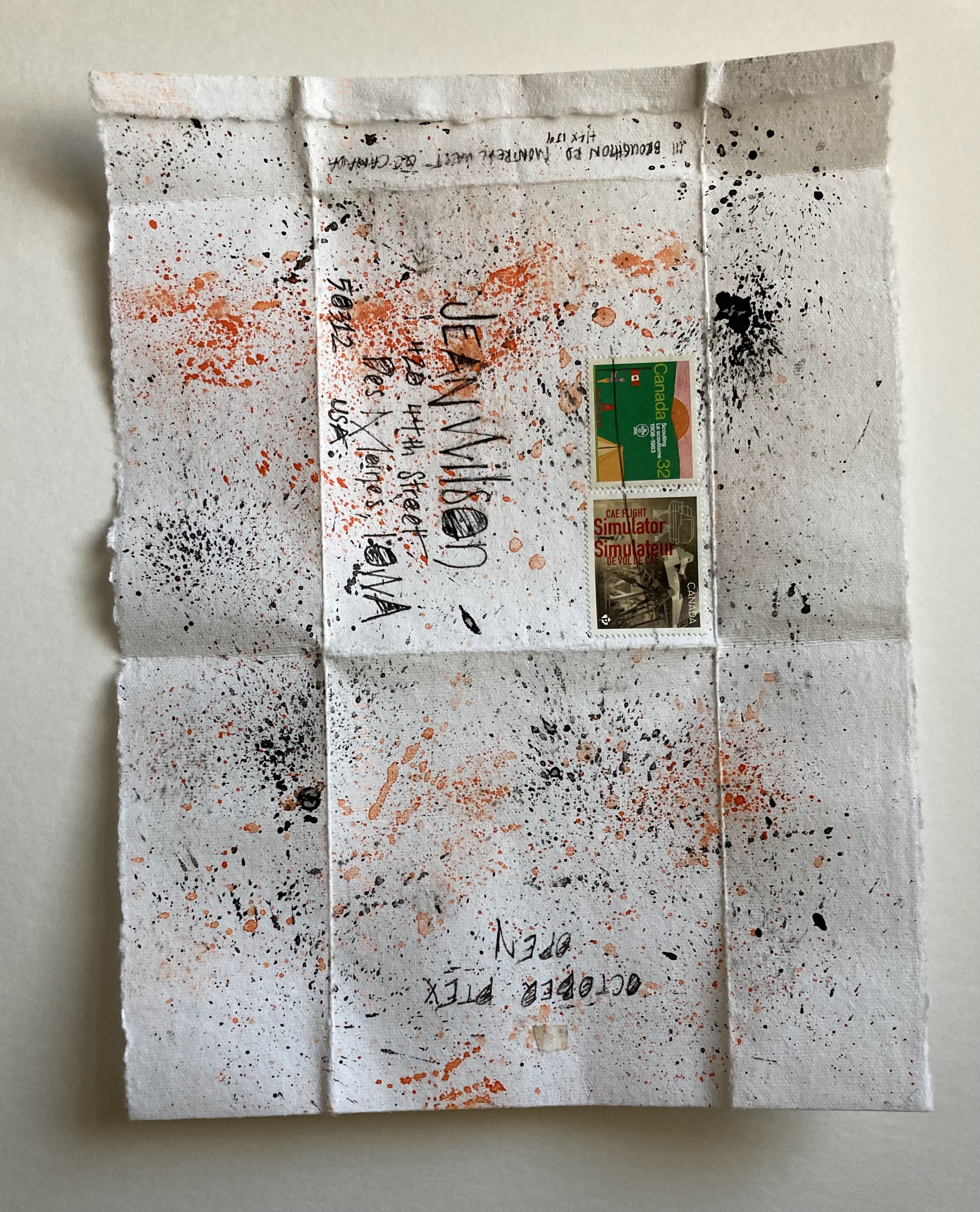
We can assume that Mia had some fun spattering on sheets of paper and then folding them into self-mailers. I think that is what we call things that fold up and perform the same service as an envelope. It went through the mail just fine. This needs to go in a folder that I will not lose - because I have a finite number of envelopes and will run out eventually. There will still be plenty of paper - so I will be doing things like this....eventually. 


Part 2 of the legacy conversation.

After explaining that I had only pipe dreamed about mastering any particular style because mid 40s is not a good time to take up something like calligraphy when you have to maintain order in a house with teenagers and a spouse that was gone most of the time maintaining the steady flow of income to provide  housing, nachos, orthodontics, skates, ice skates, roller blades, speed skates, etc. 

It did not sadden me to know that I would never have the time required to be a master. I busied myself with maintaining an adequate level of skill. It was a stroke of luck (or fate) that Cheryl Adams (my calligraphy teacher) decided to retire from her calligraphy career and home school her offspring - which nudged me into teaching and in so many ways - I felt like my contribution to the community was worth a lot more than honing my own skills just for my own satisfaction.

Still too long - one more day to make my point.


Tuesday, November 28, 2023

From Rachael in Oct - Legacy?


As I write this on Nov 1st, I am thinking about using (stealing) this leafy design on the Nov envelopes that are not done yet. And I need to keep that greeting on the card below where I will find it next year. I love the way Rachael looped the an around to make the t and curled it into the g. How long did it take her to figure that out? I love the lettering - and imagine I will be doing more with it after I get through my riff on Rachael's MishMash that is coming up.

By the way - that is poison ivy - I did steal the idea - and my version will come up down the road.


***

I'm not sure legacy is the right word - so feel free to send me a better one. A month ago I was having an email conversation with an exchanger and mentioned that I had never *mastered* any particular style - and that I considered it a pipe dream - to be a master of anything. 

She responded with a question - wondering what had killed my dream. I clarified that the dream was a pipe dream from the very beginning. There was never a time when I envisioned myself mastering anything - except getting through each day with teenagers.

My calligraphic studies did not begin until I was in my early 40s - and my oldest was hitting her teen years. Then I had at least one teenager for the next 14 years - plus the last one was still a quasi-teenager for another 5 years - not that I am complaining - being *slow* is not a crime. He did become the postal worker which makes his mamma very happy.

So - this is too long. I will finish tomorrow. If any of you are experiencing teenagers, you have my deepest sympathy. 

***

Real time add-on. I need to thank the teen-agers for all the wonderful things I learned from them. Mostly patience. Tolerance. Acceptance. All valuable lessons - and none of them came the easy way.


Monday, November 27, 2023

Skateboards to Kristine and Clover - Handmade items


Kristine and Clover each sent me a fun and interesting article. They are not regular exchangers - but I had that stack of orange envelopes - and figured I would send a snail mail thank you. I luv-luv-luv how Kristine's turned out. It just screams skateboard and graffiti. Sadly - that was the last stamp in that color. Clover's is disappointing - it needs some black on her name - but then it would be too bold for the stamp. I wish I had done her address in white -- that would have been perfect. Or maybe it just needed some bolder white on the name - but where? Grrrr


*** 

As promised, I am not going to keep jabbering about the glyphs - instead we will return to one of my favorite surfing topics - how things are made. And the more tedious and complicated, the better.

This fairly long video features 5 things, made by master-makers - in Japan. The first one is a briefcase and it did not hold my attention - I skipped to the end and it was lovely. I think I lost interest because it hurt my fingers just to watch the process. 

The second item is a tiny little cloisonné vase. I watched the whole thing because I took metal smithing in college and watched more advanced students doing cloisonné and it looked crazy-difficult. Further clicking revealed how many hours it took to make the vase - 600-700 - something like that....

The third item is a calligraphy brush - and I'm warning you -- it is the most tedious process - and the only thing that kept me watching it was that after a certain point - I was curious. I was sure that at some point he would stop with the combing and flipping. But no -- it just kept going --- the link to buy a brush was through Spotify - and I couldn't make it work - but did a search to see how much the best calligraphy brushes cost - $1,000.

The fourth item, a bow, was of no interest whatsoever. And the fifth was a little silver cup - which I enjoyed - because I had seen the same process while in college and it stuck with me that there is a level of patience that I cannot even comprehend. 

The cost for these items - in the thousands - seems high - until you divide it by the number of hours it takes to make the items - and then it seems incredible that they cost so little. 

https://www.youtube.com/watch?v=0itxeMKC3Uc

$3,000 bamboo briefcase.


Sunday, November 26, 2023

From JeanR in Oct - *Old* Italic


JeanR had a lot of patience to adapt the image on the stamp to the name. Very pretty - and Jean does quite a few cards. I know she has told me how many she does each month - seems like it is more than 30 - maybe more than 40? It's a lot. And I think she does a lot with gel plates - which might be a good way to get an assembly line going.


I need to steal the greeting on the inside of the card.


 ***

Did anyone look at any of the writing systems at the link I posted yesterday? In case it did not look like an interesting link, I am going to post an example of what you might find if you decide to do some surfing.

I looked at the chronological listing - and chose *old italic* to see how it compared to what seems like *italic* to me.


There are so many additional glyphs - and why are so many of them mirror images? Imagine the people who have devoted their lives to deciphering and understanding things like this. Don't worry. This is as far as I am going to go -- down this particular rabbit hole.

Saturday, November 25, 2023

From Janet in Oct - Writing systems.


This is Janet's October envelope - a lovely stamp - and so much white space. I need to pester the other people on her list and get images of her other October envelopes. I approve of the USPS friendly address.

Here is another one from Janet that went to Chuck - 


***

Here is a deep dive into other forms of writing. It was surprising to learn how many different systems there are. From time to time, I have pondered how to invent my own *letter* to add to the Latin alphabet - and I never come up with anything that pleases my eye. I'm not sure I am going to go through the entire list - one by one - to find characters/letters that please my eye -- but I'll be bookmarking this in my folder of *worthwhile* surfing.

You may click on each system to see all of the glyphs. I should have used the word glyph instead of letter or character - but I have no idea if glyph is a word that we all use.

https://www.worldswritingsystems.org/index.html

This four colour silkscreen poster presents one typographic reference glyph for all 293 known writing systems in the world, living or historical.