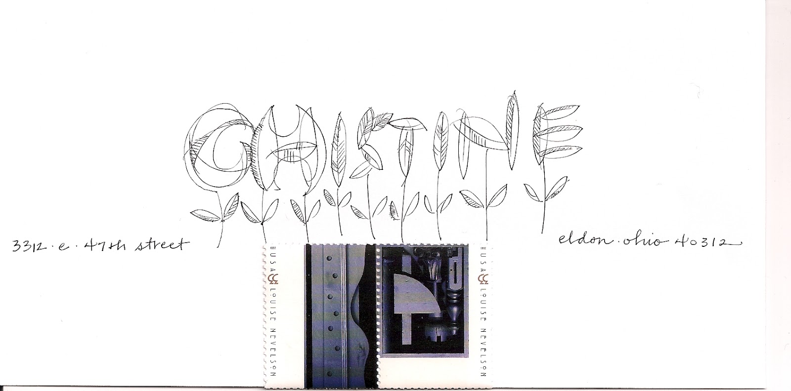
this is similar to the one a couple days ago for tom. but this one shows the address in a straight line. tom's had a bouncy address. do you think one is better than the other?
on both of them, the address is indicated by a pencil line. i will actually drop these in the mail. i do not want to publish people's addresses on the internet.
Saturday, March 31, 2012
Friday, March 30, 2012
ccc - cindy
i was going to finish this one at the workshop, but, it ended up being too hard to talk and write at the same time, so i brought this one home to finish. it is such a nice stamp. the style of lettering is called doodles. you may download it from dafont.com. i do not follow it exactly. i just use the general idea to make some shapes and then, doodle in some details. one thing we learned at the workshop was to take fonts, even fonts that you may not like and morph them into things that you do like. there were other lessons, too. i will be posting some examples.
fri am : now that i see this on the screen, the i in cindy needs to be filled in more. and maybe some of the other sections need to be filled in.
Thursday, March 29, 2012
ccc - tom
this is the first of three that i started after i returned from the workshop in milwaukee. tom helped up out with the exemplars. first i wrote a big loopy name with a pilot ink writer, then i went over it with gouache. the color of gouache is the magical color of masking tape. i like how the gouache made the black bleed just a bit. these bearden stamps came out last year. i have no idea how i missed them. they are L-O-V-E-L-Y.
Wednesday, March 28, 2012
more class work
another one where she did not put a stamp on it and i found this one. the colors are great.
the theme of the workshop was layered. one of the layers had to do with making art and sending it away. so, i appreciate that this person hand-delivered this (and the past two) at the end of the workshop. i am hoping that i see some more mail by people who took the workshop. but, i am a little nervous that they have stage fright. i have a lot of students who are afraid to put their work on the blog. not sure why...
at any rate, thank you so much for these three spectacular examples. tomorrow, it will be back to my stuff....
the theme of the workshop was layered. one of the layers had to do with making art and sending it away. so, i appreciate that this person hand-delivered this (and the past two) at the end of the workshop. i am hoping that i see some more mail by people who took the workshop. but, i am a little nervous that they have stage fright. i have a lot of students who are afraid to put their work on the blog. not sure why...
at any rate, thank you so much for these three spectacular examples. tomorrow, it will be back to my stuff....
Tuesday, March 27, 2012
more class work
same artist as yesterday. she did not put a stamp on this one. so, i found one that i knew wilma would like. she is part swedish and her last name is finnish, so, the stamp covers both of those bases. and that makes me fenno-scandinavian. i am so glad to have an official cultural definition.
exuberant, eh? (that's a little canadian-speak slipping in for no good reason)
Monday, March 26, 2012
class work
here is an envelope done in the workshop i have been talking about for a couple months. we were trying to do fun experimental letters and we were being inspired by stamps. i don't know if this artist wishes to be named... i forgot to ask. if anyone wants to commission some work by this artist, send me an email....
Sunday, March 25, 2012
guest artist
this popped up on facebook and i need to put it here. i would prefer to store it on pinterest, but they do not allow you to pin things off facebook. i do not know anything about it, except that it is lovely.
i also know that my box of envelopes that i took to the workshop in milwaukee is taking a long time to find its way back to iowa. i wonder if someone has intercepted it????
it arrived, whew
it arrived, whew
Saturday, March 24, 2012
ccc - kathy
i don't have any pansy stamps anymore, so this is a picture of the stamp and it is much larger than the stamp was. my idea was to use the shapes of the leaves to form the letters. then, use purple caps on the address because there are purple caps on the stamp. the first letter of her last name is way-off...but, i have run out of time to do a perfect envelope for every single ccc member.
technically, the ccc workshop has come and gone. it was lots of fun and people might have learned a few things. i did not blab on the blog about heading out of town, as that would have been an invitation to break into my studio and steal all my envelopes. now i have to start fixing the ones i messed up.
Friday, March 23, 2012
ccc - donna
i tried to improve on this idea by putting in the people who carry the dragon, but, the dragon looks horrible. it does not have nearly enough movement. it looks like they are waiting for the parade to start. and their arms are too short. maybe i will try one more time.
Thursday, March 22, 2012
steve - hb
i think it is steve's birthday today. i should drop this in the mail. i like to do pointed pen borders. these are not my best. but not the worst either. h.b. steve. and h.b. to dk, too.
Wednesday, March 21, 2012
ccc - jean
you would think i could do a better job on my own name. at first, i was liking the wonky-ness of the J and E, but the A-N does not fit with the J-E. so I should have tossed this one and started over. but, i kept going, thinking it might get better. so, this one goes in the stack to work on when i get to the workshop to demonstrate how to fix problems.
Tuesday, March 20, 2012
ccc - monica
this was a style of lettering i considered for the workshop, but set it aside. i like it a lot, but i am not sure anyone else would like it. i might put it in a stack for people to try on their own if they are not enjoying the choices i made for the whole class.
fun stamps. i have a whole page of them, so i should be coming up with some other ideas....
Monday, March 19, 2012
ccc - beth felix
i need to color in the background of the B and F.
if i have time to scan the finished envelope, i will do that. instead of stars, you can put any shape you like behind the letters. and then add on emore layer behind that. i'm also thinking that the whole initial unit should have been larger.
adorable stamp.
if i have time to scan the finished envelope, i will do that. instead of stars, you can put any shape you like behind the letters. and then add on emore layer behind that. i'm also thinking that the whole initial unit should have been larger.
adorable stamp.
Sunday, March 18, 2012
ccc - diane (maroon)
another metallic envelope, layered with metallic gel markers and regular gel markers. i do not think it is a good match with the stamp. these metallic envelopes are samples and i only have one of each color, so i am not putting much thought into the designs. if i like them, i won't be able to use the idea again, so, these are just experiments with low expectations. but, sometimes, some fun stuff pops up when you least expect it. lesson for the day...take time to just toss out goofy ideas and see what happens.
Saturday, March 17, 2012
www. - coryce
ok, this one came very close to not being posted. i am not happy with the last name. although, i do like the way the city runs up the flagpole. i'd use that idea again. but, other than that, it is a big pile of mistakes and no-nos.
Friday, March 16, 2012
ccc - kelly
and, i don't have a lot to say about this envelope. we will talk about it at the workshop. it is a nice style to use when there are three colors in the stamp, and none of them dominate the other two. but, it is hard to describe in words how to do it. maybe we will get out our video camera and shoot a tutorial.
Thursday, March 15, 2012
ccc melissa (blue)
i would not have posted this one, except i like the way smith turned out. other than that, it is just a whole pile of warnings on what not to do. the melissa is clunky. the size is wrong, the two scripts are bad together. the stamp clashes. i could go on and on and on.....
Wednesday, March 14, 2012
ccc - jan
i would have liked to figure out a better way to show the last name, but i was liking the way the word *flier* was in there, and amelia looked like she was doing her impersonation of the letter I.
Tuesday, March 13, 2012
ccc - karen
work in progress. i would spend a long time adding layers to the name. you can see where i added silver gel pen to the silver gel marker outline to make sharper corners. then i added some of that darker blue and went over the blue with white gel pen. then i went over and tried something different on k-a. the main lettering was done with a pantone marker. they are very bleedy which can be a problem or it can be something that gives some texture to the very first layer...and invites more layers...and ends up eating a half hour or more.
Monday, March 12, 2012
ccc - theresa (brown)
well, the scan is crooked. i hope i have time to fix it. this was one of the clunkers i mentioned. i thought that stamp looked fine on brown...but it does not. and if i had done that name on scratch paper, before i did the envelope, i would have seen that it was not going to work. the only reason i am posting it is because i do like the way the address crosses the name. that is an idea that is worth remembering.
Sunday, March 11, 2012
ccc - rita
this style of lettering has a variation with the crossbars both high and low. it's fun when a name pops up that has a crossbar in every single letter, as her last name does. before you decide to use this style, you really have to look at the letters. sometimes it is just a dreadful combination. although, if it looks really bad, at first, maybe it is an invitation to be creative.
Saturday, March 10, 2012
ccc - jeanne
one of the loose scripty styles we will experiment with during the workshop. i love it with this stamp. it might go with all 8 love stamps. now, we need to find out if they are going to be available for a long time. it is so sad to fall in love with a stamp that has a short shelf life.
Friday, March 9, 2012
ccc - mary
all these white envelopes on the blog bother me when i look at the column of images, so i am putting in some colored envelopes. this is metallic paper with a combination of metallic gel markers, metallic gel pens, and plain gel markers. a couple more layers might be better. or it might be too much. maybe on our lunch break, we will flip some coins and see if we take the risk and add more, or not....
Thursday, March 8, 2012
ccc - tracy
there is a very similar one to this on the blog that was mailed, so i need another example (to bring to the workshop)
homework....think of other things that could be drizzled onto an envelope.
Wednesday, March 7, 2012
ccc alyce
another one that will be finished during the workshop. it does not need a lot more, just some dark lines. markers that are just starting to dry up are so nice. it is obvious that the middle name was written first and then the top name and then the bottom name. but how did i get it to go dark again for the zip? well, i guess you have to come to the workshop and find out. i will post the answer after the workshop. first i have to see if anyone guesses. guesses are accepted here on the blog, too.
Tuesday, March 6, 2012
beth - post it pinwheel
beth sends me some really good challenges. she wants the words *focal point* written around the star.
she has 10 letters and an 8 pointed star. it will be easy to tell the I that he has to either share a space with the o or the n. then two other letters have to share space. do we have any volunteers?
the lower case L is a skinny letter, but i think it is pretty hard to use upper and lowercase and have it be legible when it is in a circle.
maybe we need to flip the ball back into bath's court and ask her why she wants the words in a circle?
i'm being a little bit *uncooperative,* because i have a (quick and easy) solution that i love....but, i don't want to just tell her. i think she might recall one of my mantras....the one that is the solution to this challenge. not that there is only one solution. but, i do like the idea that you can solve every single problem in the universe with a list of 5 solutions. maybe 6 or 7. but, i am a big fan of simplicity. or maybe i am simple. is simple good or bad? can you be too simple? beth will respond to this via traditional email and i will relay her response :-) along with the solution that i hope has just come to her....
p.s. we can see beth's instruction to take the white card off the colorful background, which i did, but then i put it back, because the colors were so pretty.
i also like the way the shapes in my name, Jean, on the envelope are pine-coney and beth did a good job with the greenery. it is inspired by the stamp without being matchy-matchy. and she has the address tucked in. she's been listening to my suggestions :-)))))
she has 10 letters and an 8 pointed star. it will be easy to tell the I that he has to either share a space with the o or the n. then two other letters have to share space. do we have any volunteers?
the lower case L is a skinny letter, but i think it is pretty hard to use upper and lowercase and have it be legible when it is in a circle.
maybe we need to flip the ball back into bath's court and ask her why she wants the words in a circle?
i'm being a little bit *uncooperative,* because i have a (quick and easy) solution that i love....but, i don't want to just tell her. i think she might recall one of my mantras....the one that is the solution to this challenge. not that there is only one solution. but, i do like the idea that you can solve every single problem in the universe with a list of 5 solutions. maybe 6 or 7. but, i am a big fan of simplicity. or maybe i am simple. is simple good or bad? can you be too simple? beth will respond to this via traditional email and i will relay her response :-) along with the solution that i hope has just come to her....
p.s. we can see beth's instruction to take the white card off the colorful background, which i did, but then i put it back, because the colors were so pretty.
i also like the way the shapes in my name, Jean, on the envelope are pine-coney and beth did a good job with the greenery. it is inspired by the stamp without being matchy-matchy. and she has the address tucked in. she's been listening to my suggestions :-)))))
Monday, March 5, 2012
ccc - sue & judy
i was maybe going to cover this style in the workshop, but, i don't think it is versatile, so, this is just an idea that repeats one of my standard design suggestions. BIG NAME, super big, as big as will fit on the envelope. teeny-tiny address.
and, i will add a second envelope because this one is so faint and needs work.
once in a while you find a name with four letters in both the first and last name. so, we could have lots of fun variations with the letters. this is just the first
one that popped into my head.
it is a little pale, needs more oomph.
again, we might add to this at the workshop.
it looks very *quilt-y*
and, i will add a second envelope because this one is so faint and needs work.
once in a while you find a name with four letters in both the first and last name. so, we could have lots of fun variations with the letters. this is just the first
one that popped into my head.
it is a little pale, needs more oomph.
again, we might add to this at the workshop.
it looks very *quilt-y*
Sunday, March 4, 2012
ccc - valerie - jack-in-the-box
wonderful stamp. i would like to do 10 more envelopes with this stamp. but, sadly, it was one of a set of four and i never see them at the stamp store. this is a very tame envelope, but i like white space sometimes.
this is off the topic of envelopes, but it is a charming story, so, you might want to check it out
http://www.list.co.uk/article/40297-anonymous-sculptor-leaves-literary-artworks-around-edinburgh/
this is off the topic of envelopes, but it is a charming story, so, you might want to check it out
http://www.list.co.uk/article/40297-anonymous-sculptor-leaves-literary-artworks-around-edinburgh/
Saturday, March 3, 2012
ccc - jill houses
another favorite stamp. the smoke is too heavy, but, i still like the idea. this came from a font
Pucha Smoke Telegraph, that is available in a free download from DeFont.com. The actual font is much smokier. I tried to lighten it up. What I should have done, was use a dark envelope and do the smoke in white.
Friday, March 2, 2012
ccc - ben
just a fun zig-zag line.
and some stars.
this might be my favorite george washington stamp. i should have used it on a brown envelope.
and some stars.
this might be my favorite george washington stamp. i should have used it on a brown envelope.
Thursday, March 1, 2012
ccc - bridget
i know i drew pencil lines, so i can't figure out how the letters smallerized at the end of bridget's name. this will be a sample for when we talk about outlines. i'll look for a better stamp.
Wednesday, February 29, 2012
ccc - maggie
oops. this post is late today. i thought i had something lined up for the 29th of feb...
i liked the idea of doing the dragon's body, but was too lazy to actually research what those dragons look like. then, i thought of a better idea, which would be: make the street address into the people that are in the parade carrying the dragon. so, this is a homework assignment for the ccc members who want to knock my socks off and show me just how cool this could have been.
Tuesday, February 28, 2012
ccc valerie (zip code)
i started the top on on that very first day when i started the ccc series. and that was the day i used no pencil lines, and the poor results inspired me to turn over a new leaf and be vigilant about penciling some lines. so, the bottom one is the beginning of my redo.
Monday, February 27, 2012
ccc - peggy
this one needs lots more color. but, i wanted the workshop attendees to see it before i add the color. i filled in the peggy using shapes from the boat. but, i did not try to be literal or even follow the shapes exactly. at least half the time, i do not try to follow things exactly...so, hopefully people will pick up on how easy it is to get your ideas from the stamps.
Sunday, February 26, 2012
ccc - yvonn (p.s.)
oops. need to rescan. i did not notice that the scanner did that tippy thing.
i pondered putting the zip in red. still can't decide if that would have looked better.
Saturday, February 25, 2012
ccc - shirley
this is pink galaxy marker, outlined with orange glaze pen. the pink looked pretty good, but the orange is muddy. the colored pencil is also muddy. i was expecting this one to turn out better, but the materials did not go together. i'll do another one for shirley. she has such a good name for the loopty-loos. and these loopties could have been (should have been) loop-ty-er.
Friday, February 24, 2012
ccc - marcy
there might be an earlier envelope that looks like this because this envelope had the grid and the stamp and was in my stack of *fix and use someday.*
i was reviewing my list of ccc members and it jumped out at me that i have written *schneider* many many times (to kathy schneider) and then, i noticed that kathy and marcy share two letters in their first names.
i like the idea of the comment section. this writing is arts and crafts, which i will not be presenting at the workshop, but, i am considering the frank lloyd wright writing, since, he was so fond of wisconsin. decisions decisions.
i was reviewing my list of ccc members and it jumped out at me that i have written *schneider* many many times (to kathy schneider) and then, i noticed that kathy and marcy share two letters in their first names.
i like the idea of the comment section. this writing is arts and crafts, which i will not be presenting at the workshop, but, i am considering the frank lloyd wright writing, since, he was so fond of wisconsin. decisions decisions.
Thursday, February 23, 2012
mimi south dakota
i had zee-row expectations for this green sharpie to look good on the aqua envelope. now i am sad that i do not have 200 envelopes in this color. instead i have 200 envelopes in cobalt and i can't find anything i like on the cobalt. bah-humbug. is that only a seasonal complaint/ or can one *bah-humbug* at any time of the year?
her street is actually pretty long, so it will start over by the j which will improve the layout.
tomorrow starts a string of ccc envelopes. warning, some experimental clunkers will appear, but when i get to the workshop, i will show how to fix clunkers. maybe we can do a live web-inar of the workshop so that y'all can join us....what a good idea...now we just need a camera crew and an internet guru.
her street is actually pretty long, so it will start over by the j which will improve the layout.
tomorrow starts a string of ccc envelopes. warning, some experimental clunkers will appear, but when i get to the workshop, i will show how to fix clunkers. maybe we can do a live web-inar of the workshop so that y'all can join us....what a good idea...now we just need a camera crew and an internet guru.
Wednesday, February 22, 2012
molly
i think i will be addressing a set of envelopes like this. i am testing the different ways to fill all the space. it is fun although a bit challenging. this is walnut ink on a nice william arthur envelope.
we will get back to the ccc envelopes very soon.
Tuesday, February 21, 2012
hb kathy
i'm pretty sure it is kathy's birthday today
happy birthday. i have been sending her envelopes that have such serious problems, they do not get to be on the blog. this one is going to go to milwaukee with me to the workshop and then i will mail it. i was testing to see if the green sharpies had any juice left. then i wrote over the top with a white gel pen.
oh-my-gosh
i have a really good idea...
keep watching
happy birthday. i have been sending her envelopes that have such serious problems, they do not get to be on the blog. this one is going to go to milwaukee with me to the workshop and then i will mail it. i was testing to see if the green sharpies had any juice left. then i wrote over the top with a white gel pen.
oh-my-gosh
i have a really good idea...
keep watching
Monday, February 20, 2012
nice article on paper
http://www.nytimes.com/2012/02/19/magazine/timothy-barrett-papermaker.html?_r=2&ref=magazine
since most of the envelopes are on paper, the link to the article is not seriously off-topic. plus the man is from iowa and he is a kindred spirit in that he has a focal point to his life.
the picture of the mail art has nothing to do with the article. it is just a reminder to google *mail art* once in a while and see what kinds of fun things are out there.
since most of the envelopes are on paper, the link to the article is not seriously off-topic. plus the man is from iowa and he is a kindred spirit in that he has a focal point to his life.
the picture of the mail art has nothing to do with the article. it is just a reminder to google *mail art* once in a while and see what kinds of fun things are out there.
collaboration - magnolia
one last envelope from the collaboration series that was left in line. i am sticking it in here because when i opened the one below, this morning, it bothered me. i might try to fix it and then delete the older version.
one of my favorites from kathy and one of my favorite stamps. i like how the letters are a little bit like ribbon but only slightly. note to self: steal these letters.
the idea behind address placement was using the crossbar of the E as a secret line and running something on either end at that level. then, adding the last line, the width of the stamp, directly under the stamp. again, everything is gridded out, but you don't really see the grid.
the subject matter of the stamp is all very condensed and packed in, so the airy lettering was a nice counterpoint and i added to that by keeping the placement of the address open and airy.
one of my favorites from kathy and one of my favorite stamps. i like how the letters are a little bit like ribbon but only slightly. note to self: steal these letters.
the idea behind address placement was using the crossbar of the E as a secret line and running something on either end at that level. then, adding the last line, the width of the stamp, directly under the stamp. again, everything is gridded out, but you don't really see the grid.
the subject matter of the stamp is all very condensed and packed in, so the airy lettering was a nice counterpoint and i added to that by keeping the placement of the address open and airy.
julia watercolor
i was talking to julia about watercolor and masking fluid. i found an old bottle and it is really thick, so, i could not make very fine lines. i have no idea how to put he address on here. i could only put the stamp down low. it did not look right up in the corner.
the address will be fine at the bottom, but, i have no idea what to use.
suggestions?
the watery background was done with gouache and too much water. i was too lazy to get out my watercolors.
the address will be fine at the bottom, but, i have no idea what to use.
suggestions?
the watery background was done with gouache and too much water. i was too lazy to get out my watercolors.
Sunday, February 19, 2012
stacey's dragon
i'm putting a few non-ccc envelopes in here and there because...i love writing new names, but, i also miss writing names that i have written a lot. i can't stress enough that it can be a very good thing to write one name a hundred different ways. it may seem impossible. but, trust me, if you do, you will come up with a lot of ideas. i am not musical, but, i suspect that the musicians will say they learn a lot by playing their favorite music over and over.
any musicians out there who can comment on the value of playing the same favorite piece many times?
stacey's address is going to go, stacked, over to the left of the S. not sure what color,
any musicians out there who can comment on the value of playing the same favorite piece many times?
stacey's address is going to go, stacked, over to the left of the S. not sure what color,
Saturday, February 18, 2012
patti - blue
i have done two or three for patti. this one is not a keeper because i couldn't find a stamp and the spacing bothers me. but i like the quickness of the idea. the markers are galaxy metallics.
Friday, February 17, 2012
from elizabeth
i covered up her return address. this is a fun stamp with a quill. and she did it during a blizzard. the inside has a couple mistakes and then some very cute comments about making mistakes. i'm glad she went ahead and mailed the mistakes. she attributed one of the mistakes to concentrating on the letterforms. i know that happens to me all the time....
beth lee has this to say on her blog:
The two you see here are — obviously — the remains of a couple of errors. I shouldn’t say “obviously”. You, my readers, may be calligraphers, in which case you most likely looked more carefully at the letter forms than the actual words, a tendency which non-calligrapher friends and spouses find humorous.
beth lee has this to say on her blog:
The two you see here are — obviously — the remains of a couple of errors. I shouldn’t say “obviously”. You, my readers, may be calligraphers, in which case you most likely looked more carefully at the letter forms than the actual words, a tendency which non-calligrapher friends and spouses find humorous.
there are more envelopes on her blog. she is talking about looking at the letterforms...after the fact. but, i imagine some of her errors happen when she is thinking about the letterforms as she is addressing.
Thursday, February 16, 2012
ccc patti
sumiec is all short letters with no ascenders or descenders, so i made it really tall to divide up the page and then filled in the rest of the information and added some dots. i did not have a stamp in mind and i was not sure where to place the stamp. if i get a chance to do this one over, i will put the stamp right in the middle of the envelope. and work the rest of the info around the edges. this is not a favorite, but the idea is worth further exploration.
Wednesday, February 15, 2012
christine - original
this was the original doodle that i thought looked better than the gel pen on navy a couple days ago. it was on a blank piece of paper, so i thought i could convert it into an envelope. i should have penciled in the address, because it ended up too low. so, i had to put some stamps down there in a futile attempt to fix it. i guess the ccc group will get to see a lot of problem solving...which is actually a good thing. i don't want it to give the impression that everything is perfect the minute the pen hits the paper.
Tuesday, February 14, 2012
valentine from jeri
here is my valentine from jeri. love the lavender and red combination. jeri is taking a broad nib class. so she pulled out her uncials. that is a good style for getting back in the broad edge groove.
i am keeping her in stitches with my suggestions of what to wear to an upcoming wedding. a fashion blog is not in my future. no cooking either. i am very one dimensional.
Subscribe to:
Posts (Atom)