Wednesday, December 31, 2014

stella's yearly envelope

so, here is stella's yearly envelope to me. i had given up on hearing from her. she was the *winner* of best envelope for 2013. i figured she just wasn't into mail art....and then this showed up and - it really is one of the best envelopes of 2014. there is a large part of me that does not want to declare any *winner.* mail art is not a competition.
but, a while back, i received an envelope that i wanted to honor. i went ahead and scheduled it to pop up as *best of 2013*
so, i will have to change that post to reflect that i am changing *best*
to one-of-the-best
for the ones that i want to mention.
so
considered yourself honored, stella
this is a beautiful envelope and the vandalism by the post office makes me very very sad.

Tuesday, December 30, 2014

awards season - janet's snowflake

some of you may recall that last year i awarded a *best-of-the-year* award to one of the envelopes that arrived in 2013. you can see it again if you click on the page tab at the top of the blog.

in october, an envelope arrived that knocked my socks off. so i scanned it and scheduled it for jan 1st - as the best envelope of the year.

then in november, another one arrived that deserved an award, so i scanned that one and posted it - for dec 31st

then this one arrived a couple days after i posted here, asking for someone to send me an envelope addressed like this. so, janet, needs to be on the list of honored penpals for taking time to indulge me in my crazy ideas....

thanks janet - i love the card, too.

- everyone else who has written or emailed deserves to be honored. even if you just check the blog regularly, i'm honored - and i honor you back. thanks for a year of fun mail. i hope this isn't getting too mushy. i'm not the mushy type.

Monday, December 29, 2014

snowman for the exchange exchange

here is the idea i came up with for the snowman stamps. the first one i did was susan's. i thought the scarves were a little clunky, so i used a different marker on the other three, but i am not sure i like the lighter weight scarves. i have a huge issue with how the hats sit on the heads. i know i could solve that problem, but, i do not have any more stamps and i have turned over a new leaf. i am not going to buy any more stamps. well, that is an absurd statement. i might. but, sometimes i can be pretty rigid and inflexible. maybe dr. finnbadger will explain how i can be both rigid and inflexible and also weak and helpless at trying to get my stamp addiction under control? i hope you have malpractice insurance, dr. finnbadger. my family is starting to lose their patience with me. and there is a lawyer amongst them. perhaps you should turn this case over to nurse ratchet. (actually i have 2 nurse ratchets here in des moines who keep me in line.)
oops. coffee was too strong this morning.

Sunday, December 28, 2014

cardinal exchange envelopes

here are some more envelopes for the december exchange. i had a few cardinal stamps left. they have some green dots and gifts on them, so, i am trying to decide if i am going to add any green to the envelope. my gut tells me no. so, these 5 people will have a surprise in their mailbox, unless i actually mail them promptly. i am writing this blurb on thanksgiving morning, so, in theory, i could dispense with my obsessing and just finish them and mail them.

dec 26th p.s. - i'm pretty sure i added green and liked them a lot better, but i did not take another photo. the camera/phone/scanner/computer gods have been ganging up on me - so, i'm just lucky to get anything posted. lucky for me, i am content to just toss out random-garbled-fuzzy-mish-mash.

Saturday, December 27, 2014

winter exchange - karen

this is resist with watercolor, from karen to jan for the exchange. once again, i never met a polka dot i didn't like.

alert reader jeri sent me an email wondering if i have ever heard of the artist, yayoi kusama. yes, i have seen articles...
you will want to google her...if you have ever liked polka dots.


Friday, December 26, 2014

winter exchange envelopes

here are three of the envelopes i made for the winter envelope exchange. i had four of these stamps left and while this idea has appeared on the blog previously, i decided it was OK to rerun it.
the addresses will be in just a tiny little line that runs across the bottom. not sure how close to the lettering.

the address could also be stacked, tiny and hug the left margin. i like to conform to really traditional format, but then push to the extreme...in this case, the first letter of each line would run off the left side of the envelope.

Thursday, December 25, 2014

karen's batmen

comics are full of graphicly enhanced words indicating violence. i think i need to change that nasty p.o. blot on the zip code into a comic-inspired element.

i love the layout of this
and
it is my understanding that when you put an envelope and stamp in portrait orientation, you need to put 70-cents on it. so, they were kind to let it go through with just the forever stamp.

thank you karen

Wednesday, December 24, 2014

finn's chef

finn and smash and i have a bird-on-the-head series going. finn morphed it into the head-on-a-bird series. the p.o. decided to vandalize our work of art. dang.

but part of me wants to turn the black line into a fun polka dot bow tie. i could do that using Post-It tape. they sell rolls of Post-It tape which is white, and about an inch wide - and it is great stuff for temporary add-ons.

thanks, finn. i ran out and bought a sheet of chef stamps. i'm looking forward to some free time to see what kinds of ideas i come up with.


Tuesday, December 23, 2014

from elizabeth

woo hoo

i love this stamp and i had a blast making similar letters on a return envelope to elizabeth.

i wonder what janis would think of her stamp?

Monday, December 22, 2014

susan's holiday envelope

 susan k (not to be confused with susan-smash) sent this recently. the ornament is made of two perfect intersecting circles. the photo distorts the shape and makes it look like a pear, which is actually a good idea - make one of these in a pear shape. the words are:
feel some joy
find some peace
share some love
live your dreams

i love the sentiment as well as the delightful, contemporary lettering.

thank you, susan

Sunday, December 21, 2014

flower favorites

oh.....what a trip down memory lane. flowers are always welcome on stamps. these were favorites, back in the day of 37-cents.

the watercolor (i am guessing) is a nice way to tie the lettering to the stamps and those little details are stealworthy.

thank you smash.

Saturday, December 20, 2014

thank you from tom

tom is very good at pointed pen work. he texted me one day asking if i knew of a place that would do a rush framing order. i think he needed a mat with 7 openings. luckily, i have a very good relationship with a framing shop and had just done an emergency job for them.

the owner of the business next door to their frame shop had let an important wedding anniversary go until the last minute. he had half a good idea and the framer, being acquainted with my work suggested that he pull the idea together by having me write some meaning full words on the mat. in this case, the meaningful words were just the names and dates....

i like doing these types of jobs in pencil. the photos were just snap shots....so it was not super formal. the writing was casual and cheerful. i was very pleased with the results.
i guess i should do another example of what i am talking about and post it....

anyhow, it was very nice of tom to send a thank you.
for anyone who is local...the shop is tandem brick on ingersoll. very nice framers...and sometimes, they can work small miracles with rush jobs.

Friday, December 19, 2014

hi, kilroy

my dear penpal, Legend, sent me a scan of this envelope. i believe that it is a self portrait peeping over the fence. maybe not. Legend said he didn't think his graffiti was the best, but the nature of graffiti is to be a little rough. the only way for graffiti to be less than perfect would be to make it perfect...so, this is perfect. it's a wonderful envelope and i really appreciate that he shared it with us. it definitely makes the stealworthy file.

good stamp choices and nice colors.
and i love tacos, too.

Thursday, December 18, 2014

miss munster and stu

miss munster collaborated with stuart davis on this one. once again, i am flattered that she shared one of my favorite stamps. i have a couple sheets of these and i still can't make myself use them.

maybe i can make a doll house and use the stamps as the artwork. or make an mini art gallery and hang all my favorite stamps... one more item on my to-do-in-my-dreams list....

and speaking of dreams, the highlights on the letters are D-R-E-A-M-Y

thanks, karen

Wednesday, December 17, 2014

from chuck

sadly, the scanner will not interpret the neon orange on my name. the neon just makes the whole envelope. i guess i should try a phone shot, but all y'all know how i can't get phone shots to appear in the correct orientations.

this lettering was inspired by the jethro tull poster border from the filmore west poster. chuck used the Pitt artist brushes.

thanks chuck :-)

i guess the secret to making phone photos work is to have a little online conversation with my phone and ask it to be nice. i'm sorry about that background....i suspect if i try to fix it, the phone will cease cooperating. 
so, we will just move along to the next envelope.

Tuesday, December 16, 2014

inkling of an idea

i'm fine with this concept. but i'll need to spend some time thinking of ways to make it more interesting. i don't care for the gold gel pen with the yellow on the stamp. but i really like these stamps on colored envelopes. i think i need to drag myself to the other room and get some black envelopes. could i get any lazier?

the response to that question is....people who post daily for 5 years and never miss a day are not lazy. the 5th year anniversary is coming up....how shall we celebrate?

don't miss the post below. it is new today. i accidentally scheduled two for today.

snail mail

how cute is this?
from miss munster.
i can see a whole series of snails...

plus, she sent me one of the stamps that i have been hoarding.


and i love white space.

Monday, December 15, 2014

from elena

this one is from elena who signed up for the sept-oct exchange. she has an etsy shop:

https://www.etsy.com/shop/elenaprikhodkoknapp

i like her mandalas. i have made a few and should put them on the to-do list for envelopes as they would be an envelope friendly design.

thanks, elena

i like elena's flowers. and i am guessing they were made with this brush available at John Neal Books [and a whole lot more]
maybe not...if this is not the tool she used, maybe she'll leave a comment.

www.johnnealbooks.com/ 

BR50. Miracle Wedge 7900 Brush #8
Miracle Wedge 7900 Brush #8.

Pat Blair uses this brush for simple, easy-to-create flowers. The flowers are quick and used to ornament her pointed pen work. Short handle, golden Talkon bristles, unique wedge shape, seamless ferrule. These long-lasting, better quality synthetic brushes have excellent snap, fine points and sharp edges. For watercolor and acrylics. Only one size available.


Sunday, December 14, 2014

miss munster - ears

this is a good example of  how nice *simple* can be.
of course, having only 4 letters in the name might contribute to the loveliness. it would be fun to have her try a whole bunch of names.

and the way the J is very ear-like makes it particularly suitable for names starting with J.

thanks miss munster

interesting way the p.o. added their design element....

Saturday, December 13, 2014

finn's security envelope

here is a new twist - finnbadger received this envelope in another exchange, found the most perfect stamp and sent it along to me. it is made out of the security pattern from the inside of security envelopes. i have managed to resist the temptation to recycle security envelopes, although there are some really beautiful things made from them.

nice one, grasshopper.

Friday, December 12, 2014

miss munster's elephant

miss munster had a note in one of her envelopes that made a reference to her local post office announcing that they would no longer hand cancel....and she somehow convinced them otherwise. i would really like to hear the whole story. i've received many nice envelopes from karen...and really appreciate all of them. i have many questions for karen...i suppose i could send a questionnaire....

this is from her series done with a cola pen.

you can google cola pen and see what they are. you make them yourself. lots of fun, but i think they are something you need to experience in person. i don't think a video would be enough to launch a beginner on the process.

thanks karen.  stamp placement is so cool.

there is a post below that is an extra post, full of off-topic topics.
ignore it if you have important things to get done.
read it if you want to avoid what you should be doing.

don't fall down - extra post

this is an extra post being wedged in between the regularly scheduled posts - to cover some non-envelope topics.

number one:
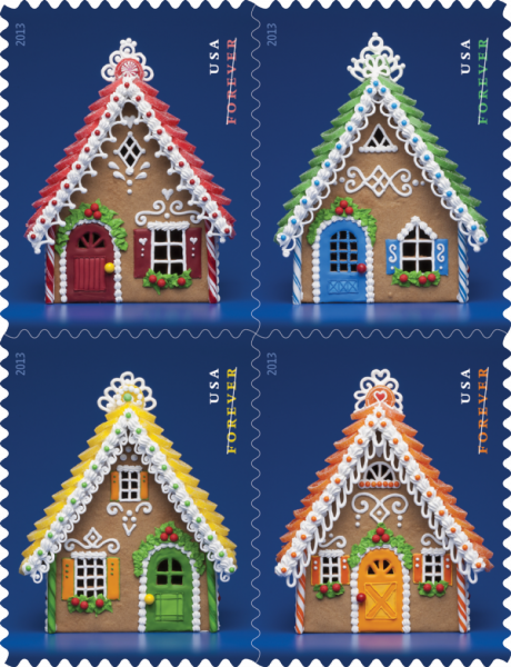
https://www.yahoo.com/food/the-woman-behind-the-post-offices-gingerbread-104784842991.html

an article about the lady who created these stamps, which i love, and i will resist the temptation to babble on about all the years i spent making gingerbread houses with my kids and how it might have been the most fun i ever had (outside of envelopes)

The Woman Behind the Post Office’s Gingerbread Stamps

number two:
mail from the exchange has been pouring in. i am currently scanning and they will appear in my january posts. there is some really great stuff on the way.

number two-and-a-half: one person was excited to find me on the list. i always exchange with everyone. so, if there are others out there who just want to exchange with me, it's easy, you send me an envelope and then i send one back. be sure to use the current address for me which appears on any envelope posted in 2014 (except the ones where people did not write my address correctly, but those still got to me - maybe we should have an exchange where we see how far off you can be with my address and still have it get to me - will someone please send me an envelope that says:
Jean Wilson
400 block of 44th Street
Red brick house that gets all the pretty mail
The carrier on that route will know which one
I know this is asking a lot, but people like us are keeping you in business
so it will be really nice if you go to the trouble of figuring it out.
Thanks. It is the third house on the west side of the street, south of Grand.
Des Moines, Iowa 50312

number three:
if you live in an area with ice and snow, please be careful. so far this winter, (and technically it is not even winter yet) i have had two friends slip and fall on the ice resulting in one broken leg and one arm broken both above and below the elbow. so please be extra careful - and then there is ashley brilliant who fell on a patch of ice, and broke an arm.... ashleigh is not exactly a *friend* but he did come to iowa on a speaking engagement and he did contact me and we did have lunch and he did ask me to write with a dip pen while he watched because he had never seen anyone do that before and i did spell his name *ashley* and he did speak up and i did write it over and mrs guss was my english teacher and i did always get As in her class and i do know that a run-on sentence is not kosher -but- i do drink coffee and i do feel like busting a few rules every once in a while and i do think all y'all look to me for permission to break rules once in a while and this is my official permission to you at this overloaded time of year to just bust some rules if you feel overloaded. period.

number four:
yes, brother, one person is enjoying our conversation about the projects that we are discussing. i might as well clarify that one of my side hobbies is trying to see what i can trick my brother into doing. brace yourself, brother, now that we have an audience, i might have to take this to the next level.

Thursday, December 11, 2014

mary katherine's exchange envelope

mary katherine created a little scene with a poster hanging on the wall in the clown's tent. i'm flattered that i am designated as*greatest.* i'd be lucky to make the top 100. as i always say, it's not a contest. if we calculated *greatest* based on how much fun a particular person had...i'd surely make top ten.

adorable.
thanks mary catherine.

Wednesday, December 10, 2014

(8th) 10th of the month

this is the last of the 8th of the month blogs about mail art links.

this is a very nice blog with some good examples. not a lot of english. but great techniques...like this pin-prick image.

http://www.fishmailart.com/

i think i have posted some work from this site previously....but, they keep adding new work, so it's nice to go back.

Tuesday, December 9, 2014

christy's exchange envelope

christy's been honing her skill with the pointed pen. i really like the moon in the background.

coloring the counters of the letters with a touch of green is very nice.

and the bonus...a fun card was enclosed. thanks so much, christy.

Monday, December 8, 2014

alyce's exchange envelope

i really like the way the flower is touching the top and bottom edge. and the scale of the lettering is just perfect.

design lesson....scale is size and proportion is relative size. in this case, the size of the nib she used on the name is perfect with the amount of black in the stamp and then the super light weight pen she used on the rest of the lettering is perfect. if she would have used the same pen she used on the flower for the address, there would have been too much black. and if the flower was drawn with the super light weight pen, it would have been too wimpy. so the three weights are perfect.

how do you learn how to balance things like the various weights and sizes of elements (your lines and shapes)? by studying the elements and principles of design. the class i taught in design was bar-none, my favorite class to teach. once students learned that they had built in preferences, they were able to use those preferences to arrange the elements on their envelope (or any other work of art) and achieve compositions that were more pleasing to their eye. understanding design is what gives you your own personal point of view.
just ask tim gunn. or rather...just listen to him....pretty much everything he says is a lesson you would hear in my design class...or any other design class.

Sunday, December 7, 2014

miss munster - batman

see that upstroke on the J...
you don't make strokes like that without a lot of practice. this is making me want to get out my ink and BIG NIBS. sadly, since i moved my studio back to my house, i hardly ever (never) get out the big nibs because i don't want to make a mess. maybe next spring i can fix up a work space in the garage. i do have a desk out there that is the kind you hang on a wall. i think my brother reads my blog...so he can be thinking of excuses for not helping me mount the desk on the wall....i probably have some good threats to use to get him to do it....

Saturday, December 6, 2014

miss munster batman

Holy Barcode, Batman!!!!

this is the first time the UGLY barcode actually added to the envelope. i only noticed it when i saw the tiny thumnail size image on the computer. the barcode looked like a little shadow under the lettering, which made the name look 3D, like it was sitting on a landscape. such a wonderful detail.

design lesson for the day.
well, i just wrote a paragraph, but it was too complicated so i deleted it.
design is how you arrange all the elements on your envelope. in this case....karen arranged them beautifully....and someday, when i have time, i will try to prepare a thoughtful and sequential approach to how to arrange your elements on your envelopes....or anywhere else. karen does not need any lessons....but, for those of you who are sometimes stuck on how to arrange things, i can probably come up with some tried and true tips.

Friday, December 5, 2014

miss munster earthscape

thisis the beginning of a mini-series by miss munster. she pulled out her cola pen and made a series of envelopes. i had mentioned in an earlier post that her lettering looked like carl rohrs and she wasn't sure she saw the influence. since i made the comment, i have decided that she probably studied with so many of the rock-star scribes that it would be hard to pin any of her work on the influence of just one scribe.

this is dreamy....all i can say is this...you can have a ton of fun just lettering on your own. a few things are IMHO impossible to learn unless you see someone doing the lettering in person. i don't know if a video would be enough.  i will look for a video of this style of lettering and let you know if i find one.

Thursday, December 4, 2014

from finnbadger

i am so proud of finnbadger for working on his lettering. it is nice and neat and tidy.

i can see that he is paying attention to the simple geometric regularity of any font or style of printing. the letter S appears three times and two of them are just perfect. the cap S on St is a little bottom heavy. but other than that...he did a great job. he didn't ask for a critique, but i figured i'd put in my 2-cents.


 as always, he has a natural design sense and his addition of stamp and address is very complimentary to the found-design on the hand made envelope.

very pretty - thank you!

Wednesday, December 3, 2014

stealworthy from smash-girl

there are previous envelopes on the blog that have a portion of a letter enclosed by a border. this is an uber-stealworthy variation by smash.

she dovetailed the spiral from the stamp and added polka dots because who doesn't love polka dots.

and she knows how to center :-)
always worth the extra time. maybe she can do it by eyeball. i always have to write the line once in pencil, to find the center.

and the cliff hanger from the sunday post....
in a nutshell, thanks to my loyal readers
i have had enough feedbag (hahaha - i love that typo) feedback, that i have figured out how to resolve all my *issues.*
1. am able (happy) to let go of beloved stamps
2. have new *filing system* whereby we will all know everything that i know and we will be able to access it
3. i forgot number three - but i am sure it will come to me.

implementation will be as follows:
1. new improved nibs and ink blog to include every single handout and exemplar in my stash so that we can all find them when we need them.
2. new blog called Art for the Intimidated - which will cover all the other lessons that are not specific to lettering
3. yoga for calligraphers - sadly, publishers clearing house never comes to my house...but a nice yoga instructor did happen to stop by looking for penmanship lessons and voila, we are now trading secrets. i tossed out the idea of us co-teaching penmanship and yoga to resolve all the ailments of too much time at your desk. she didn't recoil in horror....so, that project is on the drawing board and we will keep you posted if it seems feasible.

Tuesday, December 2, 2014

miss munster - houses

i keep making up nicknames for my penpals. karen ness gets to be miss munster. i recently found out that miss munster is a scribe-of-note who has won the purchase prize in the newberry library exhibit in chicago. that is a big deal. it does not surprise me one bit. i could tell from this envelope that she is classically trained.

here are just 2 of many features that separate the classically trained ballerinas from the hokey-pokey dancers.

her capital letters are just a smidgen taller than her lower case letters. her l, in wilson is taller than the W. if you are trying to learn italics from a book, be sure you are looking at a book that has these features. there are plenty of exemplars out there where the caps are just too tall. It is such a small detail, but IMHO, it completely separates the sheep from the goats.

i say sheep and goats so you know that i'm not saying that classically trained is *better* than completely untrained, naive and wonky lettering. i'm just saying that if you looked at this envelope and thought to yourself, "dang, that's really good, i could never write like that"  - i'm here to tell you that you CAN write like that. it is not rocket science. it is doable if you can hold a pen. but there are some subtle little details that you need to know and you need to be studying from the right book. The Speedball Textbook has a proper exemplar. if you reeeeeeeally want to get serious, the book for you is:

B.2769 Sheila Waters' Foundations of Calligraphy
http://www.johnnealbooks.com/prod_detail_list/23

and you get lots more than just italics....it is a treasure trove of the best instruction.
it's the holiday season. if you don't have it - put it on your list.

Monday, December 1, 2014

h.b. jan

tomorrow is jan's birthday. if you have her address on the exhange list, you might drop a bonus belated b-day envelope in the mail.

i added some white highlight to the snail and it looked awful. this was after the stamp was adhered. so i went over the white lines with a ZIG marker and it looks fine. whew.

i'm not crazy about the position of the little envelopes. i thought i needed to pull some of that orange from the stamp.

as always, colored envelopes are challenging.part of me thinks i should add more envelopes in the sky...but then i would be doing that fill-up-the-space thing that doesn't work out very well for me.

Sunday, November 30, 2014

exchange envelopes are done

i finished my envelopes for the exchange and they will go in the mail tomorrow. this one is going to france, so i used an international stamp. the green was a tombo and the white gel pen worked nicely over the top. the red was a tombo, too, but the white seemed to dissolve the red and turned pink. so, i don't know what's up with that.
i added gold dots and thought it looked festive.
the other envelopes used the winter theme stamps which i LOVE. and a few people will get roadsters.
it feels good to have them all done. now on to the uber-chore....the sifting and purging of the studio. all y'all must be ten times as sick of hearing about the sift-purge as i am of talking about it, so the only way to resolve that is to complete the task. i have a new level of resolve to actually finish..... because....cliff hanger....big news.....stay tuned.....

warhol's firecracker

oh, finnbadger. you came really close to having your envelope moved to the section for things i won't post on the regular blog. but, the firecrackers and the firecracker stamp are just perfect.

one suggestion on my address...it is fine to abbreviate Des Moines to DM or DSM. that would make the third line shorter which would be nice.

look at cathy's envelope from yesterday and you'll see what i mean.

on some envelopes, not this one, you could also spell out des moines and then drop the zip code to a 4th line. that would make a nice boxy shape.

interesting how it went through the machine upside-down...

Saturday, November 29, 2014

cathy batman WOW

crazy excited to get some time to steal this idea....

thanks miss cathy!!

Friday, November 28, 2014

from smash

jan and i both ooohed and ahhhed over this one. we can't tell exactly how it was done. it looks a little like a *blotted* image. maybe not. but it is very pretty in person. smash uses high quality paper and ink/paint which makes a difference.

i use a lot of junky cheap stuff...and the results are usually fun, but the fun stuff isn't quite a dreamy as the fine art stuff. but, i do like them equally. the only time i don't like the cheap stuff is when i've put a ton of time into something and realize that it would have been dreamy, if only the materials had been of a better quality.

Thursday, November 27, 2014

snow angel exchange

i did one like this for my son, skip, and those letters are perfect for snow angels. then i tried janet and stella. much harder letters. i really love the idea and wish i had more time to work on this idea, but sadly, i am swamped with matters that are completely out of my control.

another book from austin kleon

some of you may recall that one of my favorite books is *steal like an artist* by austin kleon. we were cut off the same bolt. and somehow, i managed to stumble across his blog and discovered that he has written another book called *show your work*

it's all about sharing and not keeping all your work under wraps. i am so proud of the people who found my blog and then sent an envelope to me. i should ask austin for permission to re-post this from his blog, but i suspect it is just fine with him. he is still young and has many years ahead - to pursue his career. i'm old and just trying to tidy up my desk before i keel over. so, maybe he'll let me post this without going through the whole permission thing.

here it is, an excerpt from his post about his book:

In ten tight chapters, I lay out ways to think about your work as a never-ending process, how to build an audience by sharing that process, and how to deal with the ups and downs of putting yourself and your work out in the world:
  1. You don’t have to be a genius.
  2. Think process, not product.
  3. Share something small every day.
  4. Open up your cabinet of curiosities.
  5. Tell good stories.
  6. Teach what you know.
  7. Don’t turn into human spam.
  8. Learn to take a punch.
  9. Sell out.
  10. Stick around.
This book is not just for “creatives”! Whether you’re an artist or an entrepreneur, a student or a teacher, a hobbyist or a professional, it’s time to stop worrying and start sharing.

end of excerpt.
i was pretty happy to see his list.
i sorta think i've done all those things.
all the punches have been metaphorical. i assume he wasn't asking me to go to the gym.

http://austinkleon.com/show-your-work/

i need an image for this post.... the left part is from dear, sweet grasshopper-finn, it's a postcard he made for a 29-faces exchange (faces/clock face - get it?) and the right side is from karen - who wrote about using envelopes to occupy herself while she was doing time in some waiting rooms.  thanks to both finn and karen and all my other envelope buddies :-)

Wednesday, November 26, 2014

amy's critters

i need amy to do some amateur head-shrinking on me. i keep trying to use up the stamps in my stash, but i flip through them and i just can't. i know that she has a stash, too. maybe because she has the affliction, she can easily identify the origin of my addiction and then i can be fixed. or if anyone else has ever solved their addiction to stamps and would like to share with me how they did it, i'm all ears.

these letters happened when i was very tired and gave myself a reward of surf-time and i found something that looked like this but i did not record the source. actually, i am sure that i recorded the source, but i don't know where i filed the record. i (seriously - i really do) have a big binder that is labeled WTHIAMS. (Where The Heck Is All My Stuff)  there is only one item in it. i can't figure out how to remember to add items. i think there is a similar file on my phone...but, i always forget that it's there .

Tuesday, November 25, 2014

chuck's exchange

once again, chuck wins the prize for the most patience. every single line is drawn by hand. i need to get some scans of some of his other artwork that is made up of a gazillion little lines. and he does some remarkable celtic knot work too.

thanks chuck :-)

i like the hangy-down s
and all the other letters too.

Monday, November 24, 2014

exchange envelope

i'm not sure if this person wishes to be identified. i am really intrigued with the style of writing on the address. it's fun to see unique styles of penmanship and i always wonder how they evolved. were they her own invention or did she see examples of other penmanship and incorporate ideas that she saw into her own penmanship????

thanks for participating in the exchange.

notice the bar code at the top that would normally be at the bottom.

Sunday, November 23, 2014

a new game

i have a new game i play. i do a search for envelopes on pinterest. then i find one i have never seen before and see who pinned it. then i go to that person's pin board to see if they have anything off my blog. so far....i have yet to find anyone with 100 or more envelopes who does not have one from this blog.

here is the link to this one

http://www.pinterest.com/pin/550213279447715105/

and here is the link to the board where i found it
there are 487 more

http://www.pinterest.com/sapphirequill/envelope-envy/


need numbers

here is the alphabet.
i need to add a Q.
the L can be just plain.
i need to add numbers.
this is from the collection that i can no longer find, but, i bet it will turn up somewhere.....

miss cathy

miss cathy - is this sgraffito?
or something else. she mentioned that she used black crayon to layer over colored crayon and it made a mess.

i appreciate that you made a mess -- just to send me a fun envelope. the patriotic military stamps seem rather serious. so this lettering is in keeping with the seriousness. i have not tried to use one of these stamps. i'm inclined to do something wild and crazy.

Saturday, November 22, 2014

more than three - from smash

someday when i have more time i will have more to say about this envelope. i usually have just 3 things going on with a design. it's a tried and true formula. not etched in stone, just something that works for me. this one clearly has more than three things going on and yet, there is a reason that it is not a hot mess. but, it would take time for me to figure out how to talk about it in a way that would be helpful to anyone who wants to try this style. if anyone wants to submit a guest post, i will be happy to insert another post about it.

having guest posts is a really good idea. i hope i get some takers on this idea....i suspect there are some closet teachers out there. send your comments to me at my email if you wish to remain anonymous. jmwilson411 [at] yahoo [dot] com

if you just want to say you like it....go ahead an put that in the comments :-)

Friday, November 21, 2014

jimi-janis birthday

because i had a square card, i needed extra postage and wondered if i could successfully combine these two stamps. they do not share any colors, so the idea i came up with was to use one color from each stamp and then add a color that was not in either stamp and while the lettering is a little fuzzy because of the paper, i like the way it turned out.

i am tempted to put the address under the name - but, i know that will annoy the postal workers, so maybe i should be cooperative and put it in the space to the right of janis.

p.s. orange-green-purple is a nice combo because those are the secondary colors. (red-blue-yellow are the primary colors - when working with crayons, paint and markers...i have to say that because at this moment, my brother, who faithfully reads my blog every day is saying something about the 3 primary colors being red-blue-green -- which is true somewhere else -- like maybe cathode ray tubes??? - i don't remember - something like that)