Saturday, September 30, 2023

From Amy and Grace in Aug


Here is an adorable idea for back-to-school season. I have a sheet of those stamps. I should use them on mail to my grandkids. They requested more mail - so I am trying to send mail 2 or 3 times a week. I keep forgetting to take pictures of it. 


Inside the envelope was a note from Amy and she included a couple photos - she had left a note for her carrier - and in return - the carrier left a thank you. My son has moved from the main post office to a branch location - and he has requested a set of envelopes for all the people who work at his stations. Usually, when he requests envelopes for fellow postal workers it is a rush job. This time - there is no deadline - so maybe they will turn out better. He knows how much I enjoy little thank you envelopes for postal workers -- most of them have never seen mail art.

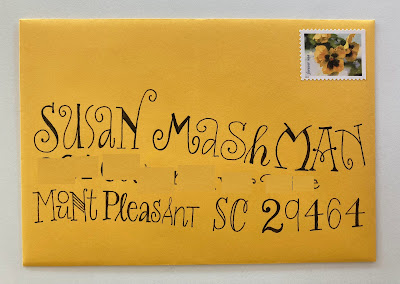
This might be a repeat - zen-dangles from Grace.  Somehow, I can never keep all of one month's envelopes together..... every time I see zen-dangling letters I think about how I should try them.


Friday, September 29, 2023

From Kristine and Jessica in Aug - wall of postcards


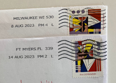
Kristine and Jessica both used the Lichtenstein stamp. I've been making it too complicated to figure out something to go with this stamp. I need to just make a design and then address the envelope. Do you think I can remember to do that?

It's also fun to note that this stamp looks good in both orientations.


This is from the Instagram account for The Old Post Office that I ran yesterday. It's a wall of postcards. I don't have any trips to Chicago planned - but - I'd sure like to visit The Old Post Office. I should do some research and find out where this wall is within the building. I wonder if they give tours.

I wonder if I have enough A7 envelopes to fill a wall like this at my house. Although the effect would be different because of the extreme differences in colors. All the postcards have a neutral tinge to them. 


Thursday, September 28, 2023

From Maggie in Aug - The Old Post Office in Chicago


Maggie did not realize that the rates had gone up to 66-cents until after she dropped this in the mail. She emailed to let me know - and I was happy to report that it arrived just fine -- without any kind of cancel. Her flowers are so pretty and coordinate with the flowers on the stamps. Or perhaps she chose the colors of the flowers after choosing the stamps. It would make sense to do it that way - right?

I can't remember if I ever posted a link to The Old Post Office. The Old Post Office is in Chicago. I've driven past the building many times. It's HUGE. It's GINORMOUS. After building a newer building it sat there empty for a while. Eventually it was renovated and I discovered the website. I really need to visit it sometime.

Here are links to their website as well as the Instagram account that has mostly photos of events that are held there. Every single space looks very cool. The rooftop is lovely - and large. In some of my reading, I recall the building being a *skyscraper lying on it's side.* Companies can enjoy having everyone on the same floor instead of a stack of offices. 

I'd love to see videos of the meetings where it was decided what to call the building - The Old Post Office is so clear and direct. It seems like it would have been a hard sell. Or maybe it was the world's shortest meeting. 

Person 1: What should we call this new gazillion dollar renovation?

Person 2: The Old Post Office?

Person 3: Sounds good to me. I move we call it The Old Post Office.

Person 4: I second that.

Voted, passed, and everyone went out to celebrate.


The name on the website -  post433.com - seems like it might refer to the address? I'm glad they didn't just stick that name on it.

https://post433.com

LINK to The Old Post Office IG


This was at the StyleMePretty website.


Wednesday, September 27, 2023

From Mary in Aug and photos of her studio


Mary does not strike me as a slothy person. This is really cute and she did a good job of fitting everything in. Thank you to the USPS for sending the envelope through in the right direction - only once - and for not doing angry scribbles or slashes over the energy stamps. I love those stamps.

Mary kindly sent these photos of her studio. I think I might cross-post studio photos to a page - just for fun. That might be a project for this winter. Mary's space is very tidy. Her email included this comment:
"Here is my creative space when it's organized,  but it usually is much more messy."


Tuesday, September 26, 2023

From Lynne in Aug - American Gothic house


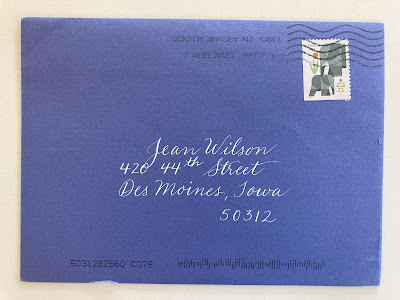
This is a beautiful shade of blue. It looks great with the elephant stamp - and I love the white ink. Blue and white is such a nice combination. As previously mentioned - blue is by far and away the most popular color - according to polls. It's sky and water and a whole lot more. While the photo below does not have any puffy white clouds - the little white house looks so nice with the blue sky.


This might be the first in a series that does not have a title, yet. While I was born in Montana and spent the K-12 years in Minnesota - I ended up in Iowa for my adult years and have a love/hate relationship with this state. Here I am in my golden years and it seems like a good time to reflect on the things I have truly enjoyed about Iowa. 

The fact that the American Gothic house is still standing makes me so happy. I visited the location back in the 80s or 90s when it was just a rental house with renters who put up with random tourists knocking on their front door. I know I took pictures - but somehow - they have disappeared.

Then - it was in danger of being lost - but the good citizens of Iowa pulled together and raised funds to preserve it. There is also a visitor's center. So, I am very happy that Iowa has enough good citizens to save something like the American Gothic house. And it's free. You just drive up and there it is. 

https://americangothichouse.org 

It's $5 to visit the visitors center. A bargain, by any standard. I remember when there was a deadline to raise funds to preserve it - and I think was Dec 31. At the time, I was freelancing and I told all my December clients that I was donating all of my Dec earnings to the American Gothic House - with the hopes that they, too, would donate. I was sooooo relieved that the funds were raised by the deadline. I feel like I have written about this already - and I searched - but did not find a previous post about it.
 

Monday, September 25, 2023

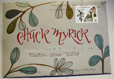
From Chuck in July and Aug -- another game/puzzle


I'm not sure if I already posted the July gnome from Chuck. Here is the August one. I've seen some of the upcoming designs. Are we going to think of another series for Chuck to do in 2024? Now that he has all those cool markers - maybe we can come up with some ideas that utilize lots of colors - like mandalas. 


***

From time to time we have shared our favorite games/puzzles that we play. We talked about Wordle when it came out. The NYTimes launched a new one (in July, maybe) and I tried it in August -- and I really like it. 

You start with 16 words and you must divide them into 4 categories. It's pretty self explanatory. 


If you saw MARY JANE and WEED, you might include POT and then look for another slang term for cannabis - like BUD or HERB. When you submitted those words - you would find out that you had one or two wrong. And you would try again. Maybe you would see that CROCK, SKILLET and WOK needed POT - and if you submitted that - you'd be right.

The shoe category was easy.
By then - BUD looked like something that would go with CHUM, MATE, PAL

This one was pretty easy - some of them are tricky. Sometimes the last 4 words make no sense - and I can't see the connection until I submit them. There was one that was 4 kinds of cake - CARROT, SPONGE, POUND and I do not recall the other one - but none of them made me think of cake - of course, once you see *cake* it's so obvious.


As you can see - they thought that the FRIEND category was the easiest - but - I started with cookware. I'll be curious to see if I ever get a TRICKY category first. Probably not.


You do not need a subscription.

***
Update - yes - one time I did spot the tricky category first - but I forgot to record it.


Sunday, September 24, 2023

To Smash in Aug/Sept - Grannie perspective

Thank you to Inta for posting a comment yesterday - and pointing out that the stamp clearly says Netherlands (not Belgium). And it is a penguin. 


Here is another one of Rachael's ideas that is on my chart so that eventually everyone will get one. I know for sure that Rachael's original envelope had wavy lines. Most of mine have been on straight lines. But, I figured I could try a modest amount of waving. I kept the street fairly legible. This one won't be mailed until Sept - so I hope I don't forget and re-photograph it and re-run it. 


***


Quite a few of us are grannies - some have lots of grandkids and have had them for years. Others are brand new. This little cartoon sums up my perspective on how I approach the experience. The cartoon does not quantify the portions - and you can't really quantify things like this. But, it does help me explain to my grandkids when I have to disappoint them in the *crime* category. They remember that one time I took them for donuts. And the place had ice cream - and I said OK to ice cream after they finished their donuts and then - they spotted the candy and I said OK. The owner of the shop questioned my sanity. So now the grandkids and I know that it was a one time event - and will never happen again - but we sure enjoy the memory of that one time.


Saturday, September 23, 2023

From Inta in Aug - Ed Emberley's hoard reduction


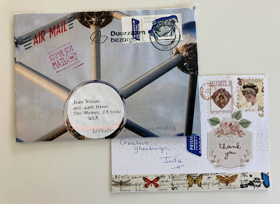
This is a handmade envelope from Inta who lives in Belgium. I could not figure out what the image was on the stamp so I Googled - and found a site that has many images of current stamps from Belgium. I did not find this one - but I did notice something interesting. They have some holiday stamps with snow globes on them. The USPS is coming out with snow globe stamps for the 2023 holiday season. They also had a sheet with several images that are microscopic enlargements - which is another theme currently being sold by the USPS. Is this a coincidence? Or do all the stamp designers hang out together and come up with ideas that everyone can put their own spin on?

Here is the link if you want to see some Belgian stamps
https://www.stampworld.com/en/stamps/Belgium/Postage%20stamps/2020-2023?year=2021

***

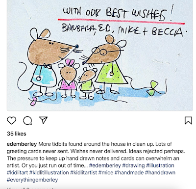
We are in good company. If you are joining me in the clearing out of the excess stuff that has accumulated - you might enjoy knowing that Ed Emberley is in the same boat. He's 11 years older than I am - but he is also a more prolific artist - so he probably has a ton more stuff to deal with than I do.

He posted this on his IG account:


Friday, September 22, 2023

To Kate and Grace in Aug - Art Nouveau album


Here are two reasons why I am glad that I now have a chart to keep track of who's gotten what. I've done this style from time to time - and I think I loved a couple of the early ones - and now, every time I try it - it's disappointing - so I think it is time to retire it. I have no idea if Kate and Grace already received envelopes with this style - my apologies if you have. If I put it on the chart (or retire it) you probably won't get it again.


***

Chuck sent this link - lots of very pretty fonts that might be hand lettered. 

https://www.flickr.com/photos/69184488@N06/sets/72157636362161535/page1

Here's the blurb about the whole collection

In the late nineteenth century, lithographers began to use mass-produced zinc plates rather than stones in their printing process. This innovation allowed them to prepare multiple plates, each with a different color ink, and to print these with close registration on the same sheet of paper. Posters in a range of colors and variety of sizes could now be produced quickly, at modest cost. Skilled illustrators and graphic designers – such as Alphonse Mucha, Jules Chéret, Eugène Grasset, and Henri de Toulouse-Lautrec -- quickly began to exploit this new technology; the “Golden Age of the Poster” (1890s through the First World War) was the spectacular result.

This collection of over two hundred digital images of historic posters from the Belle Époque and early twentieth century was originally compiled to support the teaching of Design History and Graphic Design courses at the Minneapolis College of Art & Design. Many of the artists who designed posters during this period were already well-known in other media, such as painting and architecture. Their creative success helped to bridge the gap between “high art” and popular visual culture, and to introduce even those who never visited museums or galleries to examples of innovative modern design. Today, these striking posters are highly regarded as being among the most distinctive examples of fin-de-siecle styles such as Art Nouveau.

 I chose a cat and a dog -- and they are not really good representations of the whole album. I encourage you to look at the album. There are tons of floral designs and images inspired by nature.


Thursday, September 21, 2023

To Sharon and Rachael in Aug - Ohuhu markers


Here is that style I appropriated from Rachael. I also put it on my chart so that everyone will get a sample of it. The photo looks pretty blah. In real life it was better. I used colored pencil for the shading.

I couldn't remember if I had done one for Rachael using her idea - so I did this one. I have mixed feelings about it. The important part is that I really enjoy doing this style and encourage others to give it a try. I'd love to see some others try it - to illustrate how personalized each one will be. I never did get one that looked a lot like Rachael's.


Chuck sent me an email a while back telling me about some new alcohol markers - made by Ohuhu - that he bought and liked. Then I ran across this video with a guy who had compared them with Copic, previously - and the only reason he decided Copic was *better* was because they had more colors. But now Ohuhu has added colors and they have more - so he did another comparison and has declared Ohuhu better than Copic. Of course I am tempted - and I might treat (reward) myself to some new markers after I get my hoard handled. I've made a lot of progress this summer. Maybe the lure of these markers will help me get to the finish line.

Here is the video if you are interested - there was a set on Amazon that was 50-cents per marker -- when I wrote this on Aug 16th. 

https://www.youtube.com/watch?v=qcvULj_DPvU&t=182s

Here are Chuck's:


Wednesday, September 20, 2023

Bonus post - scroll down for today's regular envelope

 On Saturday, I signed up for a workshop with Sharyn Sowell - offered by the Society for Calligraphers. A recording of the program is posted online and will be available for 2 months. When I was teaching, I often included medieval designs - so it was fun to revisit them. 

Here is the link:

https://societyforcalligraphy.org/event-5357103


I am including the work I did during the workshop to give a rough idea of what kinds of things are included. It's the first time I have ever done a Zoom class. At some point in the future - I will be posting some other mail that was based on the instructor's IG images that I pondered while I was doing my September exchange envelopes. I think I did 8 envelopes that I just mailed on Monday. They will be posted in October (I think). If I ever finish these - they might end up as exchange mailings - but they are all postcards - I had a box of 75 Medioevalis postcards that are very nice for watercolor. I'm not sure anyone really wants postcards.


These are the only two that are finished. The top one helped me realize that if I am going to love doing filigree work, I need to come up with a system for filling that is not just a crazy hodgepodge. I like the part on the upper right better than the part that is filled in. Medieval manuscripts are all portrait and envelopes are mostly landscape - so I have to resolve that whole situation.

Below was done very fast without thinking. Then it was hard to find a stamp. The shape of the bunny ear is a nice repeat of the leaf shape - so that works.


As I pondered the portrait/landscape issue - I thought of dividing the landscape up like this - but finding the right stamp will be hard. It needs to be square - and larger than the coffee stamp.  I was going to put an initial in the rectangle to the left. The oak leaves and acorns are too heavy. Some of the flowers need petals. Way too many problems to solve today - this will go in the *maybe never* pile.


The one below stills needs some work. Needs some darks. The strawberries turned into raspberries - and I have no idea what raspberry leaves look like. Not that it matters.


All the rest are unfinished - and going in the maybe never pile. If I leave them out, I will just spend hours upon hours trying to figure out solutions - and that seems like something to save for January.


Maybe in January I will revisit these and come up with some ideas on how to fill the space that has some rhyme and reason to it. I'm not opposed to just doodling and letting things grow without any planning - until I fill up the space - and then my Knolling DNA kicks in - and I don't care for the overall effect.

I do know one thing for sure - there are two wildly different approaches to all kinds of things. One is where you work on the entire space and move around and the whole piece evolves together. The other way is to start at one point and progress with finished work in one place while the rest is blank and then little by little the space is filled - but there is very little jumping around. I suppose there is a third way - where you combine the two - but, IMHO you need to have a feel for which way works for you - and don't get yourself confused by people who insist the other way is better. It may be better for them - but it may not be better for you. 


From Mary - butterfly visitor


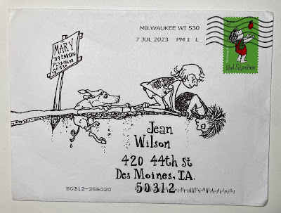
I can't tell if Mary re-drew this from the book - or maybe she has a way of printing on the envelope - either way - it's sooooo cute. I just noticed that the Shel Silverstein stamps are red and green which makes me want to think of an out-of-the-box idea for the red/green holiday that's coming up. Halloween stuff started showing up in July - so, I'm expecting the holiday items to be on the shelves in September.

***
I'm writing this on Aug 16 - it's one of those days where the weather is so perfect that I was enjoying my daily weed pulling. I had an area staked out - and a monarch butterfly landed right in the middle of the spot. I worked on one side for a while - then I moved over to the other side - and it stayed put for at least a half hour. Finally, I just left and worked somewhere else - but I kept checking back - and it never moved. Eventually, I had to go indoors to collect some supplies - and when I came back, it was gone. What struck me was that it has been ages since I have seen any kind of butterfly - and certainly no monarchs - and the whole point of helping my son with his yard is to morph it into a pollinator friendly environment. So, I figured Mother Nature had noticed how much work we were putting in and sent the butterfly to acknowledge that we are on the right track and to keep it up. Nothing like a little orange visitor to keep the wheels of progress moving. Or is it *regress* that we are working on? 
 

Tuesday, September 19, 2023

From Janet - Ohuhu markers


All y'all already know how much I love this envelope - the *white space* - which isn't white - but it's the unfilled space - the clever lettering - the stamp - the colors - the very perfect cancel. A postal worker made a nasty grease pencil slash across the stamp which erased easily. A little bit came off the envelope. I wonder if this was Janet's variation of my variation of Rachael's lettering that fit between two lines? I need to give that style a name - or maybe Rachael can provide one. It was nice of her to give the name *Mish Mash* to the one that is a mish mash. Now I need to try variations of this one ---

***
Copic vs Ohuhu markers - I had never heard of Ohuhu markers - and ran across this video - has anyone else ever heard of them? They are a lot cheaper....and the guy who tested them really likes them. He tested them a while ago and chose Copic as just slightly better - even though they cost up to 5-times as much. Now he's switched - prefers Oahu.


Then I remembered that Chuck had mentioned some new markers and I emailed him. Yes - he had told me about Ohuhu markers a while ago. I mentioned them back in mid August - so maybe some of you have already done your research and ordering.....feel free to send us your thoughts.
 

Also -- Chuck and I have both noticed a lot of ads for products through Temu at unbelievable prices and we have both read articles warning people that it is a scam company - with counterfeit products. Sometimes nothing shows up. Maybe everyone already knows about this - but if not -- now you do. I won't even get into the part about how information is being gathered....

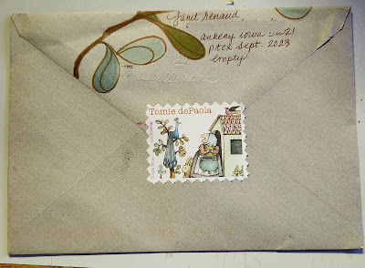
And here is Janet's Sept envelope to chuck - front and back. 
Steal worthy.


Monday, September 18, 2023

To Hannah in Aug


Hannah joined the exchange in August. Her mom had joined in July and Hannah (who is 7 years old) was pretty excited about the fun mail that arrived. Her mom emailed and asked if we ever included kids in the exchange. There was no way I was going to disappoint Hannah - so I suggested that Hannah and her mom do a team project. Hannah could do the outer envelope and her mom could make something to put on the inside that looks like an envelope. Since it will not go through the mail - she can be wildly creative about the address - and she doesn't need to use actual postage - she can design her own stamp - or use a sticker - or ??? maybe she has another idea. 

I like the idea of welcoming kids to the exchange - so if anyone else wants to team up with a kid - just let me know. At some point I will need to find a protege to take over the blog - so - maybe it will be Hannah. She could be the one to hop on over to all the other social media - and turn this into a career - just by getting enough clicks. That still boggles my mind that people can get paid for clicks. 

Scroll down to see what Hannah's team sent.

From Hannah, Sarah and Juliana in Aug.

This is a team project from a talented mom and two daughters.

Hannah (age 7) created the outer envelope - with some lovely cursive.

Inside Hannah's envelope was this one from Sarah (age 11):


I love Sarah's tiny pencil printing on the return address - as well as the fancy lettering on my name.

And then - inside Sarah's envelope was a steal worthy envelope from Juliana, the mom.


I love the way she did the return address in the little box - as well as everything else. I would not recommend this for something that the PO needs to read. It does illustrate how much fun it is to make creative mail that doesn't have to conform to postal needs.

But wait - there's more ----


Yes - nesting dolls need a baby - so there is the cutest little baby book mark. Sooo clever.

I've already sent Juliana a return envelope - with a very loose interpretation of her design - in white on gray. I have a feeling I will be doing some more appropriation of this idea.

****
I goofed up yesterday and posted Patty's Sept envelope instead of scheduling it for later.....
so scroll down --- if you would like to see it.

Sunday, September 17, 2023

To Patty in Sept


Patty's August envelope was my inspiration for my Sept envelope to her. I should have done a better pencil guideline for both her first and last name - and I should have done a photograph without glare. Here is a photo of the two envelopes together.

It's probably a good idea for me to show envelopes side-by-side when I am stealing ideas. There are soooooo many details to look at. The colors, obviously - but even the weight of the lines and how much space is left for stars (I did not leave enough). Patty's is better with an all-cap first name and script last name. Why didn't I do that? Because I hardly ever look at all the details until after I do mine and see if I've done things that I like - or if mine is off, and then I try to make mine closer to the original.

I thought I did another envelope like this - but I sure can't find it - so --- I'll probably do some more like this. If you received one that looks like this - please send me a photo of it to jog my memory.