Sunday, May 31, 2015

bonus post - elizabeth's pueblo

another version of the pueblo letters that cathy liked. alyce also left a comment. once again, looking for the right tool for the huge stack of free envelopes. i tried ballpoint pen. loved the feel, but -oops- ended up with one of those nasty smears. solution: just make a lot more smears. i like how they are almost becoming clouds and if i had time, i would make lots more clouds at the top. so nice with the airplanes.....love this.
thanks to cathy for encouraging me to do more with this style - which is not ripped off from anyone. but, i am sure that there is something very similar somewhere.

1874 writing

sent by chuck.
hope to try it.
not exactly an envelope,
but it will be when i do my version.

Saturday, May 30, 2015

current - new - forget-me-nots

i bumped today's post to bring you something very current. the new forget-me-not stamps. i made mine with a layering of dotta-riffic (blue, then redishpink) and colored pencil. nothing too special about this design. i should try it using some other kinds of markers.

the envelope yesterday - that had some rave reviews in the comments - was incorrectly attributed to cathy.  it was actually done by jo miller. jan participated in an exchange that was not one of the pushing-the-envelope exchanges.

Friday, May 29, 2015

jo's cartouche to jan

a cartouche is an element that wraps around something else. more elaborate than a border or frame. i guess some are simple. no time to delve into the specifics. just going to say:
s.t.e.a.l.w.o.r.t.h.y

this envelope was done by jo miller.

Thursday, May 28, 2015

new stamp

i don't have details, just wanted to post is because i am looking forward to making some names out of peacock feathers. who wants the first envelope?
OK, i have 4 people who will be getting peacock envelopes. carol: to receive your envelope, just email your snail mail address to me at the address that is posted in the blurb with with my photo in the *about me* section (to the right). pamela, i think i have your address, but you might want to send me an email, just to be sure i have the right pamela. heather and susan, i have yours :-). anyone else, sorry you missed out this time, but, if you send me a heart-wrenching essay about how meaningful peacocks are to you i will consider doing more.

finn's stickers

the F, B, A, O, O, and L were stuck on the envelope for a long time and buried in an pile of unfinished ideas. the me2u stamp was perfect to finish it. not a brilliant idea, but a fun one. in case you have not bought the me-to-you stamps, they come with extra stickers, and a note on the back telling you that you should not place the stickers directly on the stamps.

Wednesday, May 27, 2015

nancy's forget-me-not

followed my own suggestion to use the minor color in the stamp for the major color in the design.

cocoiro marker for the branches. pigma micron 005 for the name and address. not sure where i will put the street. daydreaming during the planning phase.

bonus post - special olympics

shout out to cathy. she sent the bottom one and said, "the fluorescent markers overwhelmed the orange in the stamp." so, rather than learn from her learning experience, i went ahead and started to color things in and mine were also overwhelming. so i switched to texture. i went over the too heavy blue with white gel pen to create texture. much better. i like her big circles a lot and will probably be stealing them.

at some point there will be more lettering like the cathy. i sent her something that i thought was so ugly, i did not even scan it and then she said she liked it, so i went back and tried to do some more of it to see if i could get a version i liked and it's coming along.

thanks, cathy

julie wildman's skaters to jan

this is so pretty. even though it isn't winter here, i could see this idea working beautifully with any stamp that had some soft colors.
love this lettering
love the little red diamond

i had attributed this to karen. she posted a comment telling me it is the work of julie wildman. you may see more of her work at the links below

julie's blog
http://www.wildmandesigns.blogspot.com/

julie's website
http://wildmandesigns.com/Julie_Wildman_Home.html

Tuesday, May 26, 2015

karen's ramirez arches

so, i'm having no luck getting good ideas inspired by these stamps. this lettering has been sitting on my desk for a couple weeks and i did not have a stamp in mind. then, i realized the ramirez arches looked pretty good. i doubt anyone is having fun with this style. maybe if i keep gushing about how much fun it is someone will try it.

Monday, May 25, 2015

6.5 minute video + ms munster's sleighs

https://www.youtube.com/watch?v=oeX1H7ajOvQ

if you have 6.5 minutes, i think you will really enjoy this video.

the video is about letters and there was a letter of sorts in this envelope. ms munster had a very interesting critique of the envelope, techniques, stamps, etc.

i'm not sure how it will look on a screen. in person it is really cool. and then the red of the cancel is a nice addition.

thanks for the letter, ms munster

Sunday, May 24, 2015

bonus post

http://www.deseretnews.com/article/865592517/US-Postal-Service-Remote-Encoding-Center-a-last-resort-for-unreadable-mail.html?pg=all

an article about the people who figure out the addresses when they are hard to read.

regular post for today is right below this one.

elizabeth's peony (rose)


when i did the lettering, i had the curly red forever stamp in mind. but after i bought these peony stamps, i morphed into a black and white thing. the address will be extra tiny in the space above the zip code. i can't decide whether to sprinkle some little red hearts around.

i realized that this is a rose, not a peony. i should have looked at the leaf.

Saturday, May 23, 2015

2 bonus posts today

Pinterest just sent this to me. A link to 13 exemplars showing all kinds of fun, beginner-friendly techniques for markers. As I have said before, ZIG markers were the gateway drug for my addiction.

http://www.kuretake.co.uk/Craftingwithkuretake/Pentechniques/letteringideas.aspx

below is a a post about one of my fellow pushers who lured a whole class of elementary students into the den.

and then below that...a couple fellow addicts.


bonus post - morning sun class - sneak peek

penpal-christy was inspired to try teaching a class and it was very well received. the students entered their envelopes in the Graceful Envelope exhibit. i'm guessing there will be more than one of these to show up on the winners list. they each deserve to be a *winner.*

i will post each one individually. right now, i am well into june, maybe even july, in scheduling the posts. but, i was so excited about this group of envelopes that i wanted to post a sneak peek.

today's regularly scheduled post is below this one.

Dear Data

alert reader, jean's brother, sent the link to this article that blew me away. it is so beautiful on so many levels....i won't even try to describe it, you just have to read it yourself. or, not. there will be no quiz.

http://www.brainpickings.org/2015/03/19/dear-data-giorgia-lupi-stefanie-posavec/

and one more reminder that if you ever need to surf, brain pickings.com is a good place to start.


Thursday, May 21, 2015

bonus post - christi payne

yesterday's lettering reminded elizabeth of her friend christi payne who does contemporary versions of medieval lettering. i'm pretty sure all y'all will love the examples on her website.

https://ewoandchristi.wordpress.com/


the new envelope for today is right below this post


photo dots from ms munster

i liked ms munster's note on the back of this envelope. she had leftover gouache in her nib and addressed the envelope starting with the bottom line. she knew she would not have enough gouache for *des moines* so left it out, and it looks just fine without a city. the p.o. does not need it when they have such a clear street and zip.

thanks, ms munster

of course, we all love the multiple types of dots.

Wednesday, May 20, 2015

4:30 bedtime (kathy's ramirez)

4:30 pm used to be my supper time. now it looks like i should just go to bed at 4:30. i was trying to address something to cathy o'rear. upon spelling her name wrong, i switched to kathy schneider. but i think it is -ei- in schneider. this is one of those fonts i printed off and i do not know if it is hand lettering or type. the original is much more refined than this.
if anyone thinks this style has possibilities, leave a comment and i will do some more experimenting. time permitting.

Tuesday, May 19, 2015

chef from smash

this is so cool. highly annoyed with myself that i didn't do this first. probably because i already know i will have trouble finding S shaped kitchen tools. stay tuned to see what i do. (fingers crossed that i find time)

Monday, May 18, 2015

from michala + 4 from jean

this arrived from the czech republic and i was AMAZED that the heart-balloons were intact. they were only glued in the middle.

michala participated in the exchange, for the first time, so...welcome michala. if you have a blog, let us know.

thanks, michala


and here are the last 4 from the mar-apr exchange. the top two are a circus style where you really need to see the whole address. and the one to carroll shows how i started coloring in the counters on that *wilt* style. and the bottom one to jan was posted when it was just black. i started adding things and then figured i was getting close to ruining it, so quickly tossed it in the mail.

Sunday, May 17, 2015

charlie russell

as a native of montana, i was exposed to the art of charlie russell during my childhood. i recall visiting his home and studio when i was 10-11-12(?) it left quite an impression on me and i remember vividly the examples of his decorated envelopes and letters that were on display. i am also very fond of his art because it reminds me of the lovely visits to my grandparent's ranch. i don't think i have mentioned him in any blog posts. if you like western art, google him and you can see lots more.
the envelope is from this site
http://www.my-west.com/painting-and-sculpture/2011/11/4/painting-of-the-day-november-4-2011.html

Saturday, May 16, 2015

ann-margret (bold coco)

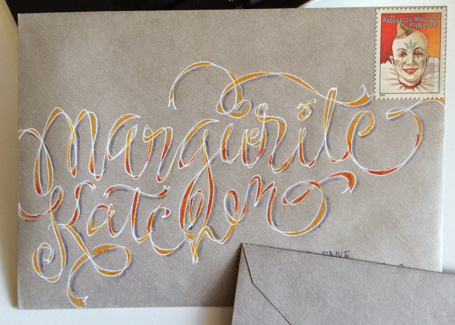
this is the one i mentioned on april 10th as one that wowed me. all i did was the same-old-same-old stuff that i had been doing with the Cocoiros, but i used a 1.2 mm ZIG writer. then, i added details with a 01 pigma, which included squaring off the end of every single stroke. that took more time than the lettering. i am getting better at fitting letters. as always, if you spend 10,000 hours doing something, you get better. that's what malcolm gladwell says. although, recently someone disputed his theory. finn will research this and submit a full report.

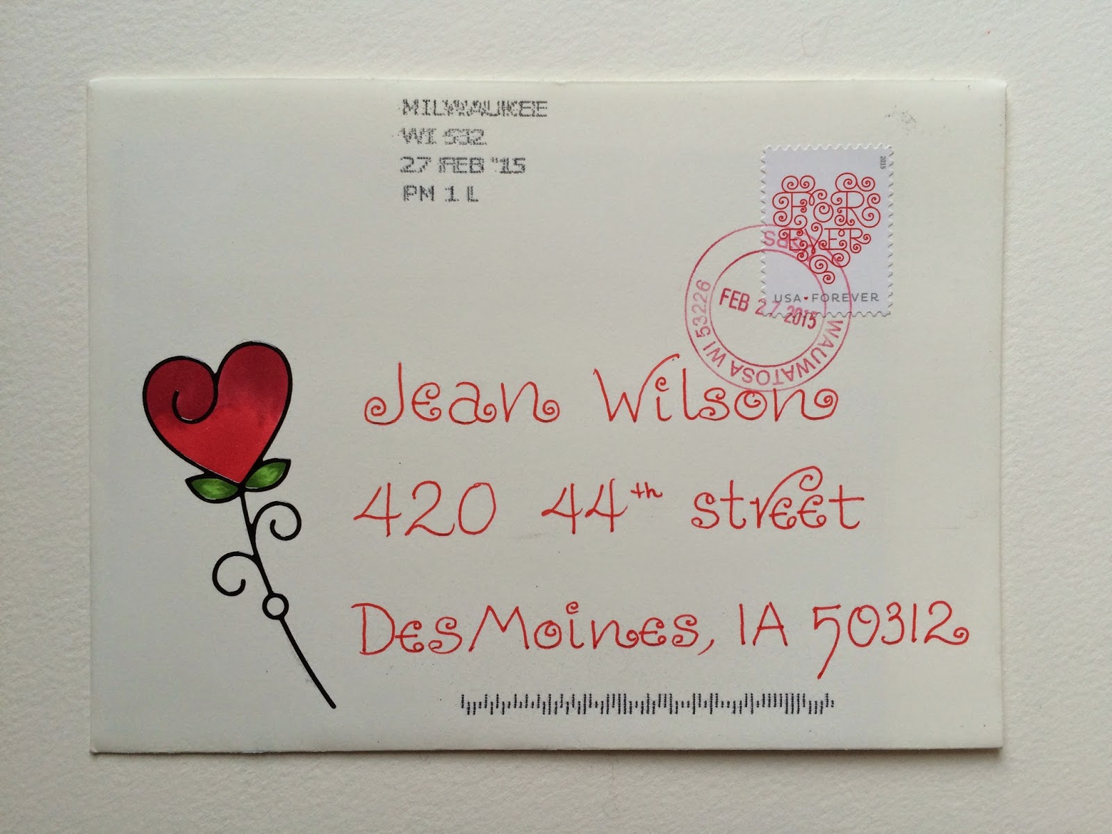
the address will be in small clear lettering in the white space at the bottom.
extra postage is because it is going to canada.


there was a question on the last envelope from christy - asking how the P.O. feels about stamps that are not in the upper right corner....this was my reply:

there are some postal workers who will tell you that the stamp has to be in the upper left corner, but if you put a stamp on it, they pretty much have to deliver it. they can tack on a surcharge if the address is not level with the landscape orientation of the envelope. a non-conforming stamp position may delay the envelope. the machine may kick it out and it may have to wait for a human to OK it. some postal workers love mail art and welcome all the variety.

maybe cathy, our resident postal worker, will add to or correct that comment.


Friday, May 15, 2015

from smash - jimi

this one is really pretty in person. any reproduction will not do it justice. i had to go with photos rather than scans for a bunch of envelopes.

the jimi stamp is so brown, i never thought of putting it on black - and it looks great. i always like seeing things that i never would have done- or even tried. it reminds me to be more experimental.

thanks, smash

Thursday, May 14, 2015

Pigma Calligrapher

This is the marker I used on the Wilt lettering. I also used a regular Pigma Micron on the very thin strokes.

jill's cream-style

jill left a comment on one of the cream-style envelopes and legend said he did the cream-style in green for st. patrick's day. so, i tried some color variation on the cream-style. and the branchy-ness got away from me. not sure where to go with this one. seems like it has potential. what i really need to do is contact the designer. i need someone to ghost write the letter for me. any volunteers?

Wednesday, May 13, 2015

from christy

whenever i get an envelope from christy, i feel like i should spend more time on my envelopes. she clearly puts a lot of time into her envelopes. i used to, but i have too many irons in the fire these days. i have met christy and in one conversation, she mentioned a multitude of activities - so, i know she is one of those people who packs about five times as much into each day as i do. if you know someone like that...don't feel jealous or intimidated. i have no idea what makes some people so much more productive. that's just the way it is.
i also knows she has an art background (degree) and i am pretty sure she has not taken many formal lettering classes. so, this lovely envelope shows how she has integrated lessons from other creative activities into envelopes. i really like this one - and i recommend lifting as many ideas as you can :-)

thanks, christy

and a HUGE thank you to the p.o. for not putting nasty sharpie marks on the stamp.

Tuesday, May 12, 2015

finn's wilt

i wasn't going to blog this one, but maybe it would give someone an idea. it does resolve the problem of making things fit perfectly. another option would be to letter on a sheet of paper and then fold the envelope afterwards.

the second row of address is because the first one (that is right-side-up) was rather clunky and i just wanted to show that i can do better than that.

slow and clunky or fast and sloppy.
the only two options i have these days.

Monday, May 11, 2015

from smash-girl

smash has a way with birds. this is a nice stylized version of the one on the stamp. the cancel lines are pretty cool, too - running off the opposite end of the envelope.

thanks, smash

Sunday, May 10, 2015

skip's wilt

i should have found someone who had a better set of letters in their name for this idea. the gray is a prismacolor marker and i love them, but the fumes make me a bit queasy, so, i'm not going to make any more of these. plus it is too hard to make the letters come out just right. there is one i did before this one, that i didn't like but, now i think i will add it to the roster.

Saturday, May 9, 2015

from alyce

this is a fun curly style of lettering to go with the hische stamp. the flower looks like it was a rubber stamp - stamped with black and embossing powder, because it is raised and it looks like it is colored in with copics. lucky alyce, to own copics.

thank you :-)

and i owe alyce a few Ns. i kept leaving them off her envelopes when i sent mail to her....

the cancel looks so nice.

Friday, May 8, 2015

jan's wilt

i am calling this style of lettering *wilt* even when i don't use the wilt stamps.

i thought i was going to make one last envelope with this style and then be done with it. but, i messed up the D in hardt, so i had to experiment with making a middle weight stroke, instead of just thick and thin. then i thought of putting in those diamond shapes and i really liked them. i do not like the double strokes and i made a complete mess of the IA, but then i put a stamp on it, so i will go ahead and mail it to jan as a thank you for running the exchanges. but i will request that she compost this one.

thanks, jan, for running the envelope exchanges for us.

BY THE WAY
if you participate in exchanges
and if you ever come up short - and do not receive the number of envelopes that you were expecting
please send an email to Jan and let her know
thanks
or, you may email me and i will forward to jan

Thursday, May 7, 2015

from jadi

a bonus envelope from a new penpal. those wintery cardinals look great on valentines.

there are three tiny hearts on the flap on the back with her return address. it's a very nice touch

thanks, jadi

Wednesday, May 6, 2015

marguerite's circus ribbon

i've done ribbon writing before. but this is white gel pen and colored pencil which might be a new variation.

apologies for spelling the name wrong, but that's something that happens and this blog is about embracing your mistakes.

i wish i could buy a whole sheet of that clown.

Tuesday, May 5, 2015

jeri's donuts


this just makes me want to go buy a donut. jeri said she *stole the idea from paper source.* i'm not sure what that means. it looks like she used a page from their catalog....
at any rate....it is quite lovely and her tiny printing is so *sweet* to go with the donuts

thank you, jeri

Monday, May 4, 2015

circus lettering - rehj

i hope i don't get obsessed with this style because i do not have the patience to do a good job. but, i like the puzzle part - fitting everything together.

white gel pen and colored pencil.

Sunday, May 3, 2015

florence's heart with dots

i saw someone add the border to this stamp by using the border that comes on the sheet of stamps. so it has a straight edge rather than the zig-zag stamp edge.

this is a repeat alphabet, but it might be the first one where i added white gel pen dots.

finn's wave

this is lovely.

oops - technical difficulties with the posting of this - margins are all goofed up.
more later, if i can figure out the problem

Saturday, May 2, 2015

cathy's fade

i set this one to appear really small because i think it is uber-ugly. after doing a couple versions of the stealworthy envelope i received, i thought i should at least try to branch out from red. but, i chose an envelope that is too large and then i chose cathy's name. i am not that good at C and O - and i'm especially incompetent when they are large. so i tried to fix it with a Pentel Brush Pen. not a magic fix. then i wondered if i could save it with a good stamp. the tennis balls are rather fun. i still give it a D-minus, but it gets to stay in the series in case i learn something valuable.

the next day, i came close to tossing this one in the waste bin and deleting this post. but i decided to try one more technique - little white lines - and now i don't dislike it quite as much. you can see i was careful with the lines, then lapsed into lazy zigzags and then returned to some more careful lines.

final product

Friday, May 1, 2015

finn's latest

another pox on the p.o.

although, the double stroke echos the two chairs with double lines. maybe the sharpie-fiend is actually drawn to the mail art and his or her inner artist is being drawn out.

finn should go down to his local p.o. and offer to do a lunch-and-learn.

also....my address is 420 - not 440