Tuesday, February 7, 2017

To Eric in October + add-on stamps on the entire exchange

This is probably the last one in the October exchange series. I debated about using 3 stamps from the series that included the frog, but then I thought the cowboys looked better. It was really hard to part with the cowboys. I love them dearly. But, I have made a note-to-self that Eric appreciates stamps. So, I will now feel better about sending the ones that have a deep hankering to stay at the 420.

This one might have run earlier, with just the frog stamp. And I might have said that I was not going to re-photograph all the envelopes after I added enough postage to the 39-cent stamps. And then, I forgot to stop at the PO so the envelopes ended up back at the 420 and I went ahead and photographed all but one - because it hid. And now I have to decide how compulsive I am. Can I let it go? It had a cute twist. The number of deadlines hanging over me are scary.

Here are the rest of them.

The gem stamps were better on the sparkle envelope than the other stamps.

That stamp with Sidney would have been fun with a thought bubble.

The 13-cent, tiny stamps fit between the first and last names, but, I'm not happy with how distracting they are.

Ho-hum but not wretched.

The Indian head penny looks great with the buffalo and the color of the envelope.

Three more where the add-on stamp ended up in the bottom right corner.

The rest of them except for Troy's. His Y in Troy looked like a martini glass and I put the ZIP code stamp, tipped, in the martini glass. Cute, but distracting.


Monday, February 6, 2017

Exchangers Eric, Alison, and Carol

To top one is from Eric - I can't steal your ideas becauseI don't do any digital art.

The middle one is from Alison - I can and will be stealing that idea.

The bottom one is from Carol Cramer. Maps make wonderful envelopes.


Sunday, February 5, 2017

Feb Exchange Sign-Up Deadline

Bonus post - off topic. Just wanted to remind you that today is deadline to sign up for the Feb exchange.

Also, I ran across this photo of a tree at the White House from 2016. The preamble of the constitution is written on the banner. The leafy *rope* is also cool, instead of the standard velvet rope.

One year our guild decorated a tree for our local Festival of Trees. Maybe someday I will run across some photos of it. We had a ton of cool paper stuff. I worked on the skirt which was Redi-Shades and Christmas carols were written on the folds.

I should make a valentine tree. Or spring tree.

Regular post of the day is right below.

Guest artist - Mateusz Witczak (deadine for Feb Exchange)

Let's all paint on our walls.

https://www.instagram.com/mateuszwitczakdesigns/

Lots of yummy lettering on his IG page. The link to a website did not work for me.

Last day to sign up for the February exchange

Saturday, February 4, 2017

Bonus post

Reminder that the Graceful Envelope contest has been announced. Google it for details. I doubt I'll have time or attention span to enter. This is from the 2005 contest by someone with Davis as last name. Sorry, no time to do full research. Just had to insert a bonus post to big whiny rant about Pinterest. I'm addicted to Pinterest and it has started messing with me. I'll sit down to pin all 3,000 envelopes on the blog to boards so that readers can do easier searches - and -poof- the pin option is gone. Pinterest does have a really good help page with a whole list of suggestions for how to fix it - but it tells me to empty my cache, and all kinds of other things that might as well be telling me to repair my car or furnace all by myself.  
I really like this use of leftover stamps - plus, the shading to make the stamps look like they are floating is stealworthy. And penguins. Who doesn't love penguins, eh?

Re-run - extra postage dilemma

This re-run is worth re-mentioning because sometimes the need for extra postage creates a problem.

Forever stamps have made it less of a problem. But some of us have way too many old stamps to use up. Of course, this worked better on a no. 10 envelope. And we won't talk about the actual design of the envelope. It is a complete dog. The original post babbled about how bad it is. I have not changed my mind. Maybe it got better after I put the address on it.

Friday, February 3, 2017

Roses from Exchanger Rehj

This is a clever digital design from Rehj. On the flap, there was an instruction to lift the flap and unfold.
I had some of those rose stamps a while back. They are perfect on this envelope.

Thursday, February 2, 2017

Exchanger's Chuck and Rachael


Two more from the Sept exchange. Top one is from Chuck and bottom one is from Rachael.

If you signed up for the February exchange and want to be on the international list, please send me an email. I will be putting all the non-US addresses on one list which means the US participants will have to put $1.15 in postage on 2 or 3 envelopes. I can't guarantee you will be on the international list, I am just looking for people who are interested and don't care about the extra postage.
Thanks.
Send email to me at
jmwilson411 -at- yahoo -com-

Wednesday, February 1, 2017

Miss Cathy's Miro Lettering


 Miss Cathy sent this for the Sept exchange and included Sister Corita Kent's *rules* because I had sent her an envelope with the Sister Corita Love stamp. I love-love-love the rules. The Sister and Jean were cut off the same bolt.

And I love-love-love the Miro lettering. Love-love-love the address. An abundance of stealworthy ideas.

Tuesday, January 31, 2017

Monday, January 30, 2017

Final Layers of the Cathy Star Trek Envelopes

These ran in early January - but were unfinished and stampless. I did not have stamps in mind - then Cathy sent me some Star Trek stamps and I thought they might be fun. That upper left envelope was trying to be sugar cookies with sprinkles, but was not working out.

Below are the final ones with a few subtle additions. Bolder red dots. They always look better when the address is on. I might need to figure out a way to always use fake addresses for the blog and then cover them up with something to send them in the mail. There is removable adhesive tape. Maybe I'll give it a try.


I just sent the ones without the stamps as they were - enclosed in the cookie envelope. Didn't feel like finishing them.


Sunday, January 29, 2017

2010 Re-run Valentine

It took forever to figure out a way to organize all the envelopes so that there would be a logical system for people to look up ideas.

It's not surprising that Pinterest provided the solution. I just finished putting 365 envelopes on a new Pinterest account. I actually had 432 posts in 2010 and the first one was on February 17, so it was just a fluke that after I had posted everything, and skipped a few because they did not have any actual ideas, the number that popped up for how many pins - was 365.

I will not post the name of the new account until I have all 7 years pinned. But you are welcome to search for it and let me know if you find it.... :-)

I just need to say this one more time....I love Pinterest and I love the service it has provided to those of us who are technologically challenged.

This envelope is a rerun from 2010. I would love to find another sheet of those stamps. Last week I drove right past the vintage stamp store. Sometimes my self control amazes me.

Saturday, January 28, 2017

Re-run kumquats

While surfing for things that I think are worthy to re-run, most of my favorites are super simple. I can't remember if I am re-running just my envelopes or if I am re-running mail from other people. Maybe the point of re-runs should be to find ideas that could be used with current stamps.

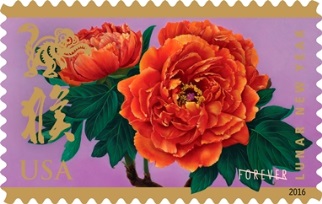
This was the 2016 stamp in this series. I guess you could put red peonies in place of the kumquats.

Friday, January 27, 2017

Most Wonderful Ornament (Bonus Post)

How could we have missed this? It's a little silly, but amazing that someone would even think of this much less produce it an offer it for sale.

You get an ornament that will track your package and also tell you when the package is opened.

I hope they are working on phase two, where it cleans house and folds laundry before walking out to the recycle bin.

I do give the USPS A+ on their designs.

https://sendcheer.com

On a more practical note, the USPS has some new shipping boxes that have built in cushioning for fragile contents.

https://store.usps.com/store/browse/productDetailSingleSku.jsp?&productId=P_FRB1PC2

Today's regular post is below.

Art Shanty Project

Way back in 2010, the year I started the blog, I posted this envelope. It was a response to a call for mail art. Some local artists had an idea to start another winter event. Of course, I had to participate. I have so many fond memories of the St. Paul Winter Carnival from my childhood.

I was curious if this group still had a mail art exhibit and went to their site:

http://www.artshantyprojects.org/

I did not see a mail art project this year. However, they now have snow blower ballet which seems like a really good idea. The winter festivals seem to be doing very well in the Twin Cities. 

http://icecastles.com/stillwater/

Thursday, January 26, 2017

Happy Birthday Alyce

Another one done in the style I appropriated from Florence.
My variation allows for a sketchier line on the basic strokes. Sketchier or am I lazy?

I'm pretty happy with the stamp.

Today is Alyce's birthday and this envelope might arrive late. Just wanted you to know it was on it's way. Hope you have a great day.

Florence's style had some overlap in the letters. I'm not sure the double overlap on the l is quite right, but, it's not a complete *arf.*

Wednesday, January 25, 2017

Bonus Post

This popped up on Eric's blog. It is from Finnbadger and I just love it. Finn is not the first person to construct a tree out of rectangles, but he might be the first to do it with the removable code stickers that the PO sometimes gives to us as little presents to show us how much they appreciate our business. In a perfect world I would have endless space and time to hoard every scrap of everything and then use it to make fun stuff like this.

So simple, but so easy.
Need a quick valentine?
Turn it upside down and cut the trunk into to parts that will make the two top parts of the heart.
Voila.
And don't over think it and make angles or curves. It's very happy being simple rectangles.
Of course the placement of the actual bar code requires a little thought. Study where the bar codes are and admire the skillful arrangement.

Kudos, grasshopper.

Oct Exchange - 2nd Layer - Phillip, Chuck, Eric

These are fun. I liked the yellow and had fun with the stamps. I could put two more stamps from the sheet on Eric's. Have not decided. I liked using the F in Frog on the stamp - on the F in France - although I could have done better at matching and I'm not crazy about the tilting on the baseline of the word France. It should have more tilt or no tilt.. as always, everything would be better if I did some penciling ahead of the game...eh?

Tuesday, January 24, 2017

Oct Exchange - 2nd Layer - Thomas & Shana

I only had one green envelope and one blue envelope so I wasn't sure if I would choke or do something nice. So far, just *OK* on these two. The addresses will have to have something fun to really make the envelopes pleasing to my eye.

There is also the issue of these being 37-cent stamps. I need to add some postage which will mess them up entirely. But, that's the way it goes. Jean is a lot less compulsive these days.

Monday, January 23, 2017

Bonus Post - Magic Notebook

When I woke up this morning and checked the blog, I cringed. The 4 envelopes in the daily post offend my eyeballs. I might have to remove them. I went out surfing to see what I would find to make today a good-post-day and -yowza- this looks like fun.

https://www.indiegogo.com/projects/the-everlast-notebook-cloud#/

and then I found the Rocketbook Wave - similar to Everlast

https://getrocketbook.com/

The following comment is from the website:

Erase and Reuse

When you use Pilot FriXion pens with the Wave notebook, you can erase your notes using your microwave oven and reuse your notebook. Seriously.
[Back to my comments]
Seriously??? I already have Pilot FriXion pens. The microwave? I don't know---it's all so space age.

I do not have time to read all about these two items. They seem cooler-than-heck. Maybe I can get one as my reward for when I successfully complete the big mission.*

Anyhow - squint when you look at the daily blog post so that those envelopes don't hurt your eyes or give you aesthetic nightmares. 

*Progress report. Yesterday I managed to arrange the closet in my new improved mini-studio so that all of the *stuff* is visible. Previously, the *stuff* was arranged two-deep so that it was a struggle to access the things in the back. There is one file box, on the floor, in front of the others - but it is the master file of all my exemplars which I am hoping to convert to entirely electronic and store in enough electronic places that I will be assured of not losing them. The BHB [BigHelpfulBrother] should be preparing to advise me on where exactly I should store my electronic files. Lemon meringue pie will be provided as a thank you.

ARF - Oct Exchange - 2nd Layer - Karen, Florence, Hester, Maggie

I had 5 of these pink envelopes left over. The paper was different and a little bleedy. Also, switching to something other than the white PITT set me back. So, I have nothing to say about these and am adding ARF to the title, so that I can add something wonderful as a bonus post, spontaneously. Sometimes I regret that I have to schedule my posts so far into the future. But, it is also like a diary for me. In January, when I check to see what I wrote 3 months ago - it's an interesting reminder of the olden days. P.S. Blogger is free and also annoying. It won't let me arrange the page today. 

The answer to the earlier question about how long I would sustain the good stuff - is- not very long. I peaked - then crashed. Some days are like that....I don't let it bother me as I know too many people who have far greater problems than arfy envelopes.


Sunday, January 22, 2017

Guest Artist - Amy Cox

Amy Cox, of Falmouth, United Kingdom has this free font available at Behance.
https://www.behance.net/gallery/42351939/Land-Free-Font

And if you surf around, there is at least one other free font.

I should send her a thank you note for being the guest artist. Amy and Cox are both nice 3 letter names. I could have a ton of fun with envelopes to Amy.


Saturday, January 21, 2017

Re-run green stamps

The green stamps were a fun set of stamps. If you go to the labels, you can click [green stamps] and make all of them come up in one list. The group ran in 2011, a memorable year. It was the year my daughter got married and I spent a lot of time creating mailings for the guests. Reading old posts is a very strange trip for me. I can hear myself talking. Mostly I sound like a broken record. Sorry. My old goal was to get organized. My new goal is to just say one random thing every day. With age comes wisdom. With wisdom comes insight. With insight comes the courage to set really simple goals. Or maybe not even bother with goals.

Friday, January 20, 2017

Oct Exchange - 2nd layer - Lynne, NancyL, Susan, CathyO


In using up a stack of leftover envelopes, after navy, red and teal, I had to switch to these shimmer silver and they intimidated me. I should have done some testing on the back, but, I am forever forgetting my own best tips. So these are ho-hum and I am not sure if I will go for layer 3 or just send them on their way.

Thursday, January 19, 2017

Oct Exchange - 2nd Layer - Jannie & Alison

These are the 7the and 8th in the series and they are favorites from the series. So, it took 6 to warm up. Can I stay in a groove that I like, or do I eventually go too far and lose my balance and fall off my rocker?


Wednesday, January 18, 2017

Oct Exchange - 2nd Layer - NancyD & Troy

I am showing the second layers in the order in which they were done. It will show my progression from more restrained, controlled layers - to loosening up.

I did some outlining on Nancy's - with the first layer, this is where I was bored with block lettering and started to mix it up. By this time on the second layer, I was bored with filling in level colored pencil lines and started to go every which way.

Then on Troy's I was tired of outlining so I tried just dots. I feel like his needs one more detail. Probably some black.

Tuesday, January 17, 2017

Birthday Club - another opportunity to exchange

Yes, those are Christmas presents. Just use a different stamp and make them other colors and they will be birthday presents.

One of the regular exchangers asked about exchanging birthday cards. This was exactly one day after I was thinking about adding a birthday feature to the exchanges.

So, I am going to offer two opportunities for observing birthdays.

BIRTHDAY CLUB LIST
The first way is to sign up for the OPTIONAL birthday list. Send me your name and address along with the month and day of your birthday and I will email a list to people who are interested in exchanging birthday cards. It will be an honor system. I will not follow up to see if people are actually doing it. If you feel like you do not get as many as you send, just ask to be removed from the list. You have to be a recognized person from past exchanges for me to put you on the list. If you are new to exchanging you have to sign up for a regular exchange and show that you can meet a deadline before I put you on the birthday list. Not that anyone would sign up to get birthday mail with no intention of sending any. I know none of you would do that - but - I am the empress of envelopes and I get to set the rules.

The second way to get birthday mail will be to tell me the month and date of your birthday and I will add it to the regular exchange lists that go out. If you want to mention that you will be hitting a BIG ONE, you may do so. For example, I am hitting 65 on April 11, so, I might put that on the April exchange list and anyone who wants to add candles and Medicare to my exchange envelope may do so.

Again, it will be optional to turn your exchange envelopes into birthday greetings on the regular exchanges. In general, everyone gets all their mailings done on time. So, I do not want to complicate the process - just add a simple option.

If anyone has any additional  suggestions, let me know.

Otherwise, to be on the BIRTHDAY CLUB LIST - which is a new way to exchange - send me:

In the subject line of the email, please put:
BIRTHDAY CLUB
In the body of the email, please put:
Name
Address
City/State/Zip
Country
Email
Birthday - Month/Date (add the Year, only if you care to)

I will send out the list by the end of the month and update it as necessary.

If you just want to add your birthday to the regular exchanges
DO NOT send that info now - just wait for the regular sign-ups.
I will have a reminder when the February exchange sign-up rolls around.


Oct Exchange - 2nd Layer - Faye & CarolC

Not much to say about these. They were pretty quick and easy and the colors were nice, so I thought I should quit while I was ahead. When I do 23 envelopes in one sitting, it is really easy to over-do the experimenting.

I guess there is one more thing to talk about. The two yesterday were just straight lettering with the white PITT marker. On this one, I added some outlining with a gel pen.

Monday, January 16, 2017

Oct Exchange - 2nd layer - Anne & Rachael


After the first layer with the white FC PITT marker I added colored pencil. There are various ways to choose which spaces you color in. Because some letters take up space, but others do not, you have to think about where you are going to fill in spaces.

Or, you can just fill in all the spaces as I did on the bottom one. It really depends on the letters involved and how compulsive you are about having a system.

I normally do not like the M when the two center strokes are short - but in this case, it works well to use up less space and that M complements the way the R-A-H-E are all high-waisted. On Anne's you can see how the crossbars are low waisted. I tend to be consistent, but it is fine to mix it up.

The dots between first and last name could tie in with the stamp. On the top one, the oval shape could be used instead of just a dot.

The addresses will be tiny white gel pen right under the names.

Sunday, January 15, 2017

A Dream Car - well, at least the idea is dreamy

The best part is that the artist has photos and tells how he approached the project. I guess I would do something more subtle. But, it is lovely.

https://www.behance.net/gallery/42336583/Calligraphy-on-ZAZ-Zaporozhets-966

Guest artist:
Viktor Pushkarev

Maybe I would like a faux-mail truck. The PO would not allow it to be too close to an actual postal vehicle. Way back in the 70's, I knew a hippie couple who bought a used mail van to turn into a camper. The PO required them to paint it in such a way that it was clearly not a mail truck. So they painted the red stripe - yellow - which was a fairly minor change. It was obviously an old mail truck. They removed all the postal wording - and off they went - camping and touring the country. When they got home, they said it was pretty funny in camp grounds when other campers would come knocking on their door with postcards to mail. There was enough of the original look that some people assumed it was still a USPS vehicle.

Saturday, January 14, 2017

Re-run - Change holiday

I wonder if I can take this concept and morph it into a different holiday?

That odd border was to disguise the fact that I had not penciled in a base line. I still like the idea of drawing an envelope on top of an envelope.

And...I wish I could get more of those stamps.

Friday, January 13, 2017

October Exchange Envelopes from Jean - First Layer

 For the October exchange, I decided to choose one design and apply it to all the envelopes. Using a stack of colored envelopes and the Faber Castell PITT Artist Pen, which is a marker - and Post-It tape to mask off the bottom and give me a guide line on the top, I started writing names in my go-to-caps. Sadly, I did not take my own good advice to write each name once to figure out my spacing. I just winged it. You may call me Icarus. Although, Cathy had just sent me a very cool list of how to approach life/art and it's OK to just wing it and give yourself some drama to resolve. These are pictured in the exact order in which they were done. I only did three before I lost interest in caps and went to script. Then I reigned myself in and went back to caps.

Later on I had a couple more lapses into scripts. And halfway through, I got out colored pencils to see what I was going to do with the base lettering. I just chose random colors. I knew I was going to box myself in, so I figured I better dig out some stamps. The page of stamps - Wonders of America - Land of Superlatives was going to be perfect. After I chose stamps for the ones that were already lettered and the few that had colored pencil, I chose colors and styles of lettering that would go with the stamps. As usual, I think I do better when I know what stamp I am going to use from the very beginning. Over the next few days, I will show how these envelopes turned out - and if time permits, I will shoot a video about how to do this kind of lettering.


Thursday, January 12, 2017

Final Details on Pitt Marker Dots

After trying both white and black for addresses, the white seems better. The bottom one has the addition of black shadow, which is nice. The top one was the last one, where I was getting looser. Fun.

The right stamps would make or break these envelopes. They are just demos with fake addresses, so I do not need to stress over the stamps. I'm actually writing these posts at the end of September when I am also having conversations with more than one reader about how to do really loose, wonky lettering and still make them fun. I hope they illustrate that you do not have to be a serious lettering artist to make very nice envelopes.

Wednesday, January 11, 2017

Even More Pitt Markers - to Mimi

Another example of the Pitt markers. Love the dots. Don't really have to say more than that. The three envelopes show the progression from really inept lettering, to outlines, to dots.

Her address will probably be in white on the pink lines. It might be a little hard to read. But, I think white will look better than black. If I have time, I could do white and put in a black drop shadow with a very tiny line.

Tuesday, January 10, 2017

More Pitt Markers - to Sara Rodgers

Another set to show how really dull and boring and inept you can be with the first layer and then how much more fun it is with a black outline. I just barely started the white detail. There will probably be a lot more of it.

Sara does not have an H in her name, so I will have to find stamps that fit to cover up the error. We'll have to see if there is a lot of improvement due to the happy accident of my bad spelling. I guess in this case it is bad memory more than bad spelling.

If I were the empress of the universe, I would command that there is only one spelling option for each name. Or, better yet - rid the universe of spelling consistency. Why exactly do we need it? I guess we need accuracy in our names for identity reasons. I'll never forget the time I called the lab to get the results of a pregnancy test, back in the days when it was not DIY. The nurse gave me some random info about my kidney. I explained that I was not being tested for kidney issues. She said, "Oooops. There are two Jean Wilsons with results today. The other one is 57. I guess she doesn't want to find out that she is pregnant. Congratulations.. You are pregnant." Best surprise ever. Well, I guess it didn't strike me as best-news-ever on that day...as I was 35 and thinking that the boy and the girl were a perfect number and variety of kidlets...but 29 years later, his two older siblings agree that he's clearly the primo offspring. When asked if I have children, I always say, "Yup. A girl, a boy, and a surprise."

SaveSave