Sunday, April 6, 2014

jeri's orange butterflies

of course, this will look better when her address is filled in. how lucky that 4 of these stamps adds up to enough to send it.

the white is just gel pen. someday i hope to do a video on how to fit any wording into any space. there are a few tricks. stacking is the most obvious one. maybe i should make a list before i do the video.

jeri sent me this image of how it looked after it arrived

Saturday, April 5, 2014

art nouveau

here is my version. i should have done some penciling to arrange the flowers a little better. i just scribbled it all very fast.

and i think the stems on the flowers are too thick. but, it was lots of fun and i hope i find time to do more art nouveau lettering.

Friday, April 4, 2014

trolling for ideas

robert genn's current letter talks about a fund raiser in NYC where 287 artists were asked to decorate an egg. his daughter did one.
i scanned through, looking for one with postage stamps or an envelope. this was a close as i could get.

but out of 287, i could probably find about 100 that would inspire an envelope.

if you want to see all the eggs, they are here:

https://paddle8.com/work/sara-genn/28741-my-happiness

and the article is here

http://clicks.robertgenn.com/eggstraordinary.php


my va-ca mail - chuck

this arrived while i was gone. chuck knows i love art nouveau. i do not recall ever doing any lettering like this, so i thought i would try something quick with markers.

my attempt will appear tomorrow.

thanks, chuck.

Thursday, April 3, 2014

jumping jack call for entries

this just in.
a call for jumping jack mail art

in honor of our resident jack, i hope we have many entries. the deadline is dec 31, 2014
so that gives us a lot of time

http://jumpingjackmailart.blogspot.com/

if you go to her profile page, she has many blogs. i am resisting the temptation to surf around and see what her other stuff looks like. i will probably look at a few things before i decide to send her something. i'd like to make one and mail it in a transparent envelope. or translucent.
too many ideas, too little time.

congratulations, carol

carol dubosch was the winner of the paper and ink envelope contest. black-white-red, one of my favorite color combinations. that stamp is a favorite...it's no surprise that she won.
thanks so much for sharing, carol. did you enter the graceful envelope contest???

carol has several winning envelopes in the graceful envelope. if you click on the label to the right [graceful envelope] i think they will pop up.

and the subject matter...the alphabet...another favorite of mine.

Wednesday, April 2, 2014

christy's thank you

this is a thank you envelope to christy. she found my blog and sent a nice envelope and valentine. she used real ink, so i owe her one using real ink. this one has been done during my frantic cleaning binge.

zig markers - and i was hoping i had one of those flower stamps left. if i do, i will find it after i drop this one in the mail.


there are some faint pencil lines showing that i will tuck the address in on some wavy lines over on the right.

Monday, March 31, 2014

paint pens

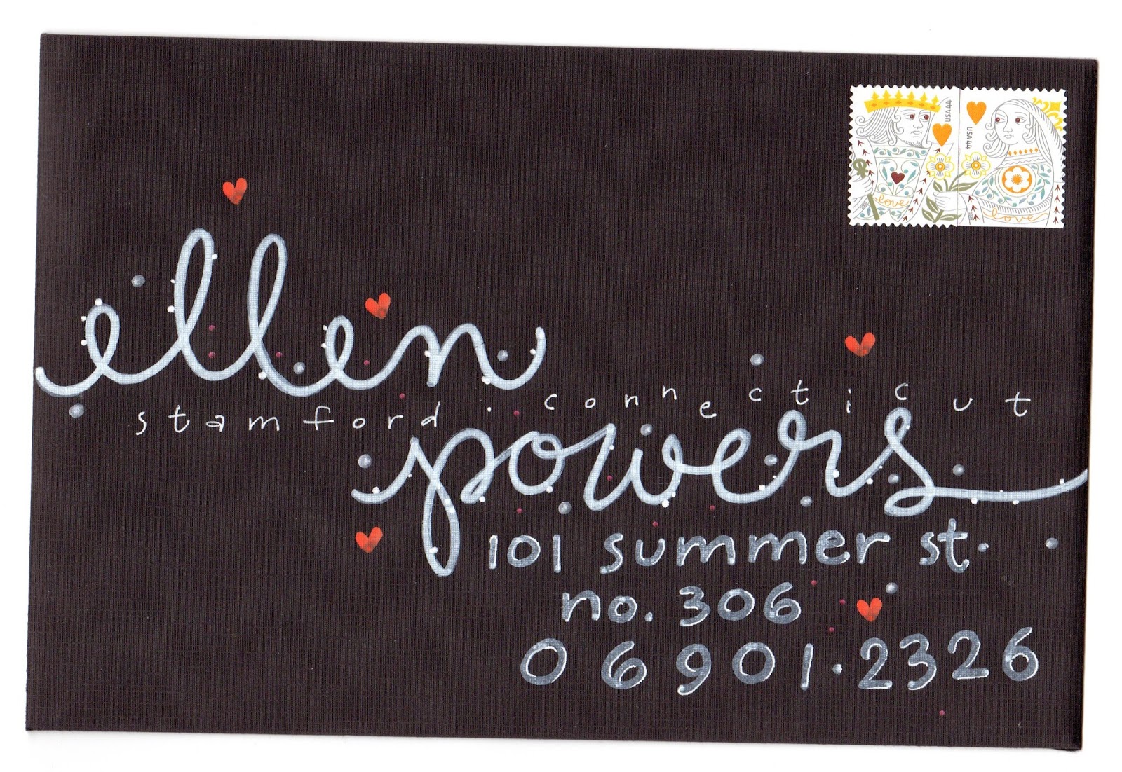
i had some leftover paint pens. i did not plan anything. i wasn't even going to post this. i was just using up stuff because i had to forward some mail to her. after i wrote ellen, i did not have room for powers
so i put it on a lower line then i did the street and realized i did not have room for the city and state. so i sprinkled them in between the names. and i ended up fulfilling the *requirement* for three elements or three sizes. then i added the hearts and dots with galaxy markers. and it ended up being blog worthy. not the greatest, but a good example of not-planning > which makes a mess > which gives you an opportunity to think of something to fix the mess > which sometimes ends up being just fine. i compare it to wandering.
remember, not all who wander are lost.
sometimes you find good stuff while wandering.
not always.

Sunday, March 30, 2014

figured out jeri

i found a stamp that i like for this envelope. i think i will put the street address above the stamp and hope that the p.o. does not send it through a cancelling machine and blur it. i will also put her address as the return address so it will get there, either way.

Saturday, March 29, 2014

playtime / clear out

while clearing out files and finding things like the name elizabeth, in pencil and nothing else, i decided to finish up every random idea that i find. i was in a grassy mood (this was before the fern stamps arrived) so i added grass, then used polka dots to fill up the pencil line. i had a box of old bleedy design markers. i was checking to see if any were dried up. multi-tasking.

the stamps and address are not *real* - this is just an example of how i like to arrange elements.

as i find envelopes to mail, i will start inserting things like this. so, if you get odd inserts in your envelopes from me, this explains it.

Friday, March 28, 2014

smash - birdcages

the blue lovebird stamps were favorites of mine. they did not go over well with brides. very few brides choose navy and yellow for their weddings. if you do a search, you can find navy and yellow themed weddings and they are beautiful. i wonder if there are any brides who have chosen their colors based on the stamp they want to use.

thank you, smash, for sharing this one that you mailed to yourself. 

Thursday, March 27, 2014

my va-ca mail - 2 from finnbadger

finnbadger is making his own faux postage stamps.
you may see more about them on his blog.

and the lower postcard features the font he designed.

i love graph paper - and anything based on grids.

i am also a big fan of the *rule* of 3, which means i would have colored in one more square. maybe the A in the bottom row or the left square in the I. i am guessing that it would bother finn to be inconsistent. and there really aren't any rules....so, that is part of the fun of making things. making decisions. there are so many possibilities with this font - it's easy to butt in with opinions. i think we can download the font. maybe finnbadger will tell us where we can download it in the comment section.

Wednesday, March 26, 2014

egg art call for entries

i meant to post this earlier. it is a call for entries. egg art
to be sent to hungary. deadline is mar 31

http://mailartprojects.blogspot.com/2014/03/egg-project-hungary.html

there are a bunch more calls for entries at this blog
in case you have time to fill.

smash series

here is one that smash sent to herself. as you may recall, she was going to send 365 envelope to herself in 2013. i wonder how many she actually sent. she shared many scans with me and they will be popping up over the course of 2014. this is a highly stealworthy idea.

Tuesday, March 25, 2014

more ferns

two more fern ideas. on the top one i did the leaves with a brush marker. on the bottom one, i did the leaves with  the .5 end of a ZIG Writer.

on the top one, i added a layer of gray. the stamp clearly has black and i will probably try doing one with black rather than gray.

on the bottom one, the stem has a little reddish-brownish cast to it, so i used colored pencil.

trust me, they both needed that second color. they were really blah when they were just plain green and if you don't have an assortment of colored pencils, etc, just adding some plain lead pencil would have been enough to fix the blah-ness of the plain green.

lidian is one of those adventurous people who stumbles across the blog and then writes to me. thanks, lidian.

Monday, March 24, 2014

usps article

this is from an article posted online by the usps about mail art.

i like the way it is photographed with the shadow.
i suppose the address is on the other side.
i'm glad the p.o. is warming up to mail art.
maybe my dream, to have my own little work station at the p.o. where i address envelopes for customers, will come true.

http://uspsstamps.com/stories/postal-moderns

Sunday, March 23, 2014

susan gilman jokelson


ok...there are 3,700+ photos on her photo stream -and- there is one envelope on pinterest. i don't see any other envelopes. but, this one is so cool, i just had to post it.

there are some postcards, but nothing with addresses. i don't think she does much mail art. but, it was fun to see her art and then see what she did on an envelope and her choice of stamps.


http://www.flickr.com/photos/26576892@N07/

this is the pin board where i found this envelope. it is fun to scroll through all the envelopes she pinned and see how many of them are from my blog

http://www.pinterest.com/kitwhite32/going-postal/

Saturday, March 22, 2014

jan- twinkle - eames

i'm guessing the twinkles won't show up. these are the black and 3 metallic colors of the Wink of Stellas that i mentioned yesterday
and
this is a way to treat the address where it is not in a block. i let it wander randomly to echo the random dots on the stamp.

i don't always put the info in the order requested. i figure the machine won't read it, so the postal workers who get to read un-machinable mail can have a little change of pace. or maybe they have a voodoo doll with my face on it and a bushel basket of pins.

Friday, March 21, 2014

jan - twinkle markers

after my trip, when we re-started the group that meets on wednesdays, jan had some new markers. they are called
ZIG Wink of Stella Glitter Markers.

we really couldn't see the sparkle under fluorescent lights, the kind you would have in a classroom.
but, at home, under a halogen light, they are very twinkly and very pretty. i love them.

then, we had a discussion about arranging the elements on an envelope. i always like to fit things into a rectangle. a lot of people put the zip a little lower and a little to the right which is good for the p.o. and their scanning machines
but, i tend to keep all the address info in a rectangle when the name is big and splashy.
in this case, i penciled a rectangle that is the same size as the stamp.
then, it is a fun puzzle to figure out how to fit the address into the rectangle. the main name was done with a ZIG scroll & brush marker, using the brush tip.

Thursday, March 20, 2014

google spring

i added this one today. it is a screen shot of what you will see if you click on google this morning. you have to click on the little guy and then you watch the flowers grow. i thought it applied because i have several examples of flowery lettering on the blog and this is a good example of how the letters do not have to be very exact for them to still be readable. Google can do a G and then add two short items, a mid sized item, a tall skinny item and then one more short item and we all see the *Google.* you can be just as loose on your names on envelopes - especially if you are going to have the last name and the address in a pretty clear block of legible writing for the p.o.

stella - peace bridge

this was done on the road, on my lap.
i need more postage, although, i am thinking of just using up all my vintage stamps, one at a time, and putting them in larger envelopes with forevers.

the street address will go on the pencil horizon line.

such a pretty stamp.
it's from back in the day when they used the process of engraving to print stamps, so they have the raised-ink feel that money has.