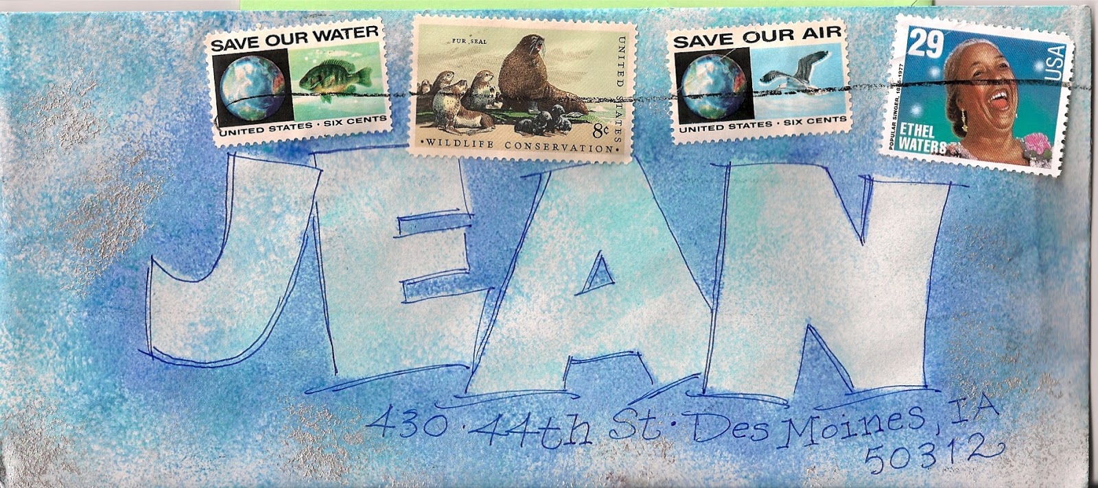
i lumped these two together because they are not wildly inventive. also, they suffer from being done too fast - with no pencil lines. but, they are happy and fit in with the group of 15. i sent them all in a larger envelope and they don't actually have stamps on them. i just cut out the pictures of the stamps from the catalog that the p.o. sends. if you do not receive it, just ask them to send it and then order from it once in a while.
Friday, August 16, 2013
Thursday, August 15, 2013
smash - owl on head
i would be very interested in the story behind this one. i could ramble on about all the things i see. but, instead, i will just leave it to the viewers to do your own pondering.
Wednesday, August 14, 2013
ellen - series of 15
mixing it up - santa with a flag. i should have found a flag stamp, but this was the 15-envelopes-in-an-hour challenge, so, i just had to fling some blue on the envelope. love seeing santa in blue - should have added a few gold dots.
Tuesday, August 13, 2013
loopy stella, nancy, ruth
three more rough ideas i was pondering before i started my non-adult class. by the time this appears, the class will be over and i hope to have some fun samples from the non-adults. these show the sequence of layering. i hope i am not the only person who loves to layer.top one is the first layer....i would never mail it looking like this. second one shows how to add the second layer with a fine pen. the third one shows that two layers was enough for this one. it also shows that i did not use a ruler or any guide lines. i just winged it. which turned out ok. this is another idea that i suspect would yield some good stuff....if only i had more time.
Monday, August 12, 2013
jefferson's notepads
these are not envelopes, but this is so cool, i just had to post it. chuck found it while surfing and kindly forwarded it to me. you can read more at the link. thanks chuck...it's like you knew i was trying really hard to stay on task this morning....aaaarrrrgggghhh :-)
http://www.monticello.org/site/jefferson/i-rise-sun
faber-castell
another faber-castell big brush experiment. this isn't a favorite. the name is LENA, but i don't have enough As. it looks like LEN.
and i would have liked 3 of the energy stamps...
but, i like the idea of all this layering.
and i would have liked 3 of the energy stamps...
but, i like the idea of all this layering.
Sunday, August 11, 2013
sunday guest artist
from the flugge collection
David McKee's characters have achieved international fame - from fancy-dress wearing businessman Mr Benn, to Elmer The Patchwork Elephant.
and this just in
an article from the NYT
if you don't read the whole thing, just read the last suggestion at the end of the article....
http://www.nytimes.com/2013/08/10/opinion/collins-playing-post-office.html?_r=0
and, if you like to surf on sunday mornings, click on the mr benn link above.
there are a series of illustrations each begging to be an envelope idea....
Saturday, August 10, 2013
ellen - series of 15
these are my two least favorite from the 15 done in an hour. so, i'll get them out of the way.
jan and i have discussed how to buy markers if you are not going to buy the whole set. we agreed that it is nice to have groupings of colors, not one of each color. the pink and purple is o.k. but you can see on the green in the lower one, it would have been nice to have a darker green. that green is a little light for the flowers. of course, if i had allowed myself a little more time, i could have darkened the green with colored pencils.
and a ruler might have been a good idea.
Friday, August 9, 2013
ellen - series of 15
this is the first one of a series of 15 i did for ellen. i will lump them together because some of them aren't that good. i needed to do 15 in an hour, which i was able to do. as far as new ideas, i use dots all the time. on this one, i liked how the dots don't stay in the lines. that looks rather new, to me. maybe it isn't. i always loved this series of santas because of the non-traditional colors.
Thursday, August 8, 2013
guest artist - smash
very clever...having the name written with the broken string. once again, smash, your comment that your names do not integrate with the design does not apply to this one....
Wednesday, August 7, 2013
jay's ants
another one from the picnic series. the colorful lettering was done with the faber-castell big brush markers. that stamp bothered me and when i filled in the address and mailed it, i found two stamps that were pre-forever, one was blue and the other was pink, and now i can't remember which ones they were, but they looked soooooo much better.
Tuesday, August 6, 2013
phillip tall black stripes
another one done with
a copic chisel marker. this one feels rather unfinished...but there are sooooooo many directions to go from here....i feel like i would have to have a month devoted to this idea...maybe someday.....
Monday, August 5, 2013
from guest artist walsh - blue
i don't know how she does these.i think she might have a bunch of letters cut out that she can use over and over. they might have something like Post-It adhesive on the back, so they stick to the envelope and then she does a layer of color with sponges and then removes the stencil.
the p.o. didn't cancel the stamps, so somebody took their ballpoint pen to it. sad.
Sunday, August 4, 2013
jan's tim-markers
jan brought some tim holmes markers called distress markers. the colors are muted tones. plus they are water based so after you write with them, you can blend them with water. once again, i thanked jan for alerting me to an exciting new art supply, but told her i could never allow myself to have them because then i would do nothing but sit and play with them. jan just laughs at me.
Saturday, August 3, 2013
smash apple green
smash kindly sent me scans of envelopes addressed to herself. i swapped out some fonts and fake addresses for her real address.
it's cool how the cancellation mark ties the two elements together.
and the idea to take a shape off the stamp and use it, in reverse, with not many details is so stealworthy. i wouldn't even calling it stealing. you are simply seeing something and incorporating it into your design.
it's cool how the cancellation mark ties the two elements together.
and the idea to take a shape off the stamp and use it, in reverse, with not many details is so stealworthy. i wouldn't even calling it stealing. you are simply seeing something and incorporating it into your design.
Friday, August 2, 2013
picnic ideas
oh that nutty scanner. it would not scan jan's envelope. kept cropping and tilting.
so, i tried jean's and it scanned fine. then i put the two of them together
and that seemed to work.
these are from the day a group of us sat around and pondered picnics.
so, i tried jean's and it scanned fine. then i put the two of them together
and that seemed to work.
these are from the day a group of us sat around and pondered picnics.
Thursday, August 1, 2013
mail in the freezer + smash robot
13. If you have already sealed an envelope and realized you forgot to
put something in it, place the envelope in the freezer for a couple
hours. It will pop right open so you don't have to get another envelope.
that was tip 13 on a long list of household tips that i found on Pinterest.
14. get your robot to do all your work so you have more time for envelopes
Smash-girl really has a knack for robots.
that was tip 13 on a long list of household tips that i found on Pinterest.
14. get your robot to do all your work so you have more time for envelopes
Smash-girl really has a knack for robots.
Wednesday, July 31, 2013
lacy gray border
another one from the day a group of us were brainstorming picnic ideas. i also bought 9 gray pens to try to find good grays for one bride who wanted gray ink. i found one that worked. now i have a lot of gray pens to use up. it is hard to decide when to stop with some of these layering projects. i think this one needs a couple more layers. but, if i need to send an envelope - and did not have time to start from scratch- i would use this one and consider it good-enough. i'd probably go with a forever stamp....i don't think this envelope would look good with multiple stamps. it would be too busy for me.
Tuesday, July 30, 2013
smash - pushing the envelopes
really beautiful stamps. i ran through mine so fast. and this is probably done with the parallel pen. soooo tempting.
nice bounce to the letters and very skillful at a design that fills up a lot of space. i am seldom successful at filling the space. but, i like it when i see it.
Monday, July 29, 2013
jan's copic white
another one done the day that jan brought her copic white stuff. i don't know whether to call it paint or ink. it is thick and needs to be thinned with water to use it like ink. i need to research and find out if there is a technical difference between ink and paint. or maybe an alert reader can tell us in the comment section.
Sunday, July 28, 2013
sunday guest artist
from the british museum, by artist edward burne-jones.
stealworthy - i need more time.
sorry to be a broken record.
stealworthy - i need more time.
sorry to be a broken record.
Saturday, July 27, 2013
phil copic white
this was done with jan's black copic marker. it has a chisel edge, which means it is slanted, not square, and offers a different look to the ends. although, i did square these off and then added the copic white ink over the top, using a Nikko G nib. i could doodle white over black all day. maybe. i never tried it. i just know i have to tear myself away when i start it. i did not have any stamp in mind, but rather like the way these two look. but, need another 7-cents if i am going to actually mail this one.
Friday, July 26, 2013
robot on silver tape
this idea came from jan the junkie (do you like your new nickname, jan?) she is an art supply junkie. i had a blast when she brought these alcohol inks to play with. but i am vigilant about not getting into any new mediums.
i did not have this stamp in mind. but isn't it wonderful?
n.m.t.
(need more time)
the tape is silver tape from the hardware store that might be for taping metal ductwork or something. the hardware store has as much enticing stuff as the art supply store.
i did not have this stamp in mind. but isn't it wonderful?
n.m.t.
(need more time)
the tape is silver tape from the hardware store that might be for taping metal ductwork or something. the hardware store has as much enticing stuff as the art supply store.
smash - purple robot
smash put extra postage on this envelope but it doesn't equal the amount you need for non-conforming addressing. some postal workers would charge extra because the lines are not parallel with the bottom edge of the envelope.
but, it is certainly easy to read.
and it is fun...very stealworthy.
but, it is certainly easy to read.
and it is fun...very stealworthy.
Thursday, July 25, 2013
skips red plaid border
this was done during the picnic series. i love that stamp (with the pen and razor) and i hope skip remembers my favorite story about shaving. i asked him why he did not shave more often. he said "because it hurts."
i found out that nobody had told him to use water and shaving cream. he was just scraping the whiskers off with a razor. ouch. nothing much to say about this idea...except that it does not bother me at all to make plaids without any planning whatsoever. see...i am not compulsive.
Wednesday, July 24, 2013
smash - think pink
this is an excellent way to do a very pretty envelope when you are in a hurry. of course, you need to have spent a few years learning how to write pretty :-)
and you need a pile of vintage stamps.
i like smash's stretched out script on the address.
and you need a pile of vintage stamps.
i like smash's stretched out script on the address.
Tuesday, July 23, 2013
skip's lake tahoe birthday
dang, i wish i could have delivered some of these birthday cards in person. although the place is crawling with people in july. so maybe i can kidnap myself and end up in tahoe in september. that would be nice. the lake looks just like that, only bluer. watercolor pencils, G-tecs...and channeling my inner kid-artist.
Monday, July 22, 2013
upcoming loopy series
i was pondering ways to make practice fun. these are two layered names. reading from top down is e-l-l-e-n and over the top of those five letters i layered c-o-l-i-n.
i think the pattern has potential.
it would be nice if you had the exact colors in the stamp and chose the stamp first. on this one, i just used a few of the 17 markers from jan and then went looking for a stamp.
the address would be tiny
flush left, hugging the left edge of the envelope.
i might add some g-tec layers and rescan this one if it is an improvement.
the quality of the actual lettering is supposed to be child-like. after a 5+ year haitus from teaching a summer class (5 days in a row) for non-adults, i agreed to do so this year. i am fully expecting that the kids will have some great stealworthy ideas.
Sunday, July 21, 2013
bonus post
my morning surf led me to this envelope, which led me to the website of kim white
and
oh-my-gosh
lots of funny cartoons.
kim is not kimberly
kim is a guy
so there is some locker room humor
just warning you....if you have delicate sensibilities.
http://www.kimwhite.com/cartoons3.html
and
oh-my-gosh
lots of funny cartoons.
kim is not kimberly
kim is a guy
so there is some locker room humor
just warning you....if you have delicate sensibilities.
http://www.kimwhite.com/cartoons3.html
sunday guest artist
this is from grosvenorauctions.com.
they have a ton of illustrated envelopes.
this one downloaded, but the rest would not, so, you'll just have to surf on over and check them out. they list information about the envelopes as well as the prices realized.
this one went for 500 pounds, i believe....
they have a ton of illustrated envelopes.
this one downloaded, but the rest would not, so, you'll just have to surf on over and check them out. they list information about the envelopes as well as the prices realized.
this one went for 500 pounds, i believe....
Saturday, July 20, 2013
miss cathy
i have a new penpal, cathy from mississippi. you can't imagine how excited i am to send some envelopes to mississippi. cathy is the 4th person to find my blog and boldly send mail. smash was first, then finnbadger and there is a third person who did not leave a return address so i am not able to send mail. i think that person is from texas. so, my new goal is to have a penpal from every state.
wisconsin, you are overflowing with talented mail artists.
other states that are taken are, iowa, ohio, washington, new mexico, connecticut and california.
i suppose i could go through the archive [banker's boxs] and find a bunch more. do they count if i have not heard from them recently?
the address is pencil, but the zip had a layer of ink. i wonder if cathy did that or maybe someone in the postal system wanted to beef it up.
smash - domino
this is postmarked april . remember last spring when smash was doing all the fun postal code mailing? this was in the series. the numbers on the dominos correspond to my zip + 4 and my house number.
very fun...
it would be fun to do a whole series of envelopes based on games.
very fun...
it would be fun to do a whole series of envelopes based on games.
Friday, July 19, 2013
this just in
http://vimeo.com/69450259#
a nice little video with great comments making art [learning] - i don't want to spoil the punchline...just watch it.
his name is Peter Han.
you may google him and see lots more work.
a nice little video with great comments making art [learning] - i don't want to spoil the punchline...just watch it.
his name is Peter Han.
you may google him and see lots more work.
smash - unscannable
every now and then, the scanner will refuse to scan an image. it is usually something with black and white stripes. i don't know why. but i tried 3 or 4 times and then i just gave up. it's a very pretty envelope. although the bird is a little *mutant* with an osprey head and dove-ish body. but who doesn't love a good mutant every now and then? the body reminds me of matisse flowers.
bonus post
this one appeared earlier when i was making a test page of all 17 markers from jan. i was wondering if writing her name over the top would tie it all together. it isn't awful, but it is not really a keeper, yet. i will try confetti and see if that works. people who know me, know i attempt to solve every problem with dots, but there are so many squares in this, i think it needs to be square dots, or confetti, rather than round dots. or maybe round dots would offer visual relief from all the squares. shall we vote? square or dots? or both? or something else?
Thursday, July 18, 2013
nancy-ka-bob
another one from the picnic series. the items on the kabob should be larger.
i have not finished the grill.
still pondering this whole idea.
i need to surf around and find some better images of kabobs.
wow, this one is really close.
that grill is perfect.
the asterisks with dots on the end are nice, too.
i L-O-V-E doing searches on Google Images for
anything and everything....
remember, you don't click and paste and print
you just look at the image and draw your own. or you may print them off if you need to trace the image.
remember, you may only do this for enjoyment, you may not do it to start a business.
Wednesday, July 17, 2013
skip - blue swirly
just messing around. first i used a watercolor pencil, then i did some layers of gouache. it was really awful. so i did the white gel pen railroad track over the top and now i love it. i will put his p.o. box in the center of the dot over the i - and his zip, and it should get to him just fine.
technically, i drew the railroad ties. the lines are the track.
[ a week later]
when i was looking for a stamp, the round one seemed nice in the circle so i change my plan.that is the forever stamp for send 1-oz anywhere in the world. it costs $1.10. that is the rate for a postcard or a 1-oz letter. and since they are now selling them as forever stamps...i wonder if this will be the only choice for a long time.
this stamp will also be enough for up to 2-oz on a letter going to canada - according to my newest penpal...stay tuned for a very fun piece of mail :-)
Tuesday, July 16, 2013
skip - *cute*
i'm always looking at the trends for wedding invitations. this style is trendy right now. although none of my brides will do anything this far out. so, i did the border, then, the only birthday that i could think of that was coming up was skip's (my 29 year old son) he'll probably be scratching his head over this one. or maybe he won't bat an eye. rugged mountain men are hard to predict. a garden of love stamp will look nice. i know i have some of the doves left.
i drew the design with a very pale marker, then outlined with G-Tecs.
Monday, July 15, 2013
smash pink plate
and i had to post something else...because my posts pop up on other peopl.s blogs
and i did not want the *BAD DESIGN* to be a representation of my blog....
isn't this gorgeous?
smash girl shared some images of her envelopes with us.
thank you!!
and i did not want the *BAD DESIGN* to be a representation of my blog....
isn't this gorgeous?
smash girl shared some images of her envelopes with us.
thank you!!
more about diagonals
there were two posts today
and while i discussed diagonals in finnbadger's...
an alert reader mentioned the diagonals in the one below.
yes...there are two elements that are tilted...
but, i would not say that it is a layout based on the diagonal.
we do tend to put stamps in corners
so the other element had to be somewhere to the left and lower.
and in some ways...that leads the eyes to the corners
but, the the whimsical tilting keeps the eye moving around.
it's hard to find good examples of the kinds of diagonals that i think
*don't work*
i suspect there is more going on that is hard to explain in words
and
as always...it is my opinion
so
i googled bad design
and -oh, dear- lots of examples.
this one popped out
there is a funny story
and this person wanted to illustrate *bad design*
so they put the big red header on a diagonal
so...there is at least one person who agrees with me.
full story here
http://812studio.com/who-butchered-my-designs/
Subscribe to:
Posts (Atom)