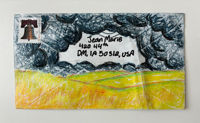
This is from Geo - not my husband Geo, AKA MrWilson. I'm curious about envelope Geo. I'm curious about this design. I've been feeling this way. It looks a little ominous - but - I'm not a Pollyanna type of person. If I were to steal this idea I would do the exact same thing on the front and then I'd do sunshine and a rainbow on the back. I'm OK with the stamp - but one of those black moon ones would have been great.
Speaking of Geo-people - the Geo-husband asked me to look at a layout he had before he ordered it. He's retired and his main activity is working at a couple food pantries. One is in a public school. He doesn't' know how to avoid extra work and took on the task of making a sign for Teacher Appreciation Day - which is fine - although - technically the food pantry has nothing to do with the teachers.
Even though he did not want to ask me to make him a sign - he must have had some weird intuition that if he showed me his *layout* - I would take pity on him.
Here it is. This is his idea for a 6 ft x 3 ft sign. He was going to spend $45 for a sign that looked like this.
I deserve some kind of award for maintaining my composure when he showed it to me. I said in a very gentle voice, "Well, it's a little industrial. I'd be happy to make something more colorful. Would that be OK?" He said, "Sure. I didn't want to bother you." I said it was fine - I'd be happy to do it. And I did it as fast as I could.
I have one deep regret. Make that two. I was not fond of the wording - but I didn't know if someone else had given the words to him - so I didn't want to propose different words and put him in an awkward position. Or if he had come up with those words, I didn't want to insult him. His undergraduate degree was in English and mine was not. In fact, I got my undergraduate degree and the only *paper* I wrote in those 4 years was 3-page, handwritten book report. Maybe I should share the whole story someday.
The second regret is the placement of the tag line - I really wish I had lettered it between two wavy lines and done a font that was short and fat - to fill that space better. Just a flourish on the h would have been so much better. And I would have made the YAY smaller and the TEACHERS a little larger. But, I really did just chalk it out in 3 minutes and paint it in less than half an hour.
Third regret - I wish I had used a much larger brush for the border. It's wimpy.
Fourth regret - bees. Why didn't I add some bees. Grrrrr
If you ever want to make a sign - start with colored paper - it's so much easier to make things pop - although you have to use paint. Markers would have been muddy.
***
Update - MrWilson shared with me all the comments that the sign received. Positive comments. I just roll my eyes. It's so easy to impress people - all you have to do is something by hand....


I think your idea for Geo's envelope is grand! Would you mind if I tried it? Am I understanding correctly that Mr. W's name is also Geo? Is it short for George, because that sounds more like what would be paired with Wilson.
ReplyDeleteI also love the way his sign turned out. I like the boarder small because it doesn't take away from the words, and the yay seems to be what they wanted to stand out, so YAY! I do agree that bees would have been a nice touch. You are right, it is easy to impress people by just making something homemade!
Of course you may try the idea - I'll probably forget to do it. Yes, MrWilson is George Wilson - the same name as Dennis the Menace's neighbor. Yes - Geo is short for George. Although, our exchanger Geo Olson only sent that name - so perhaps that Geo is a Geo. Geo, Hadley and Riley all signed up at the same time and are all from the DC area. I finally emailed one of them to see if they know each other and I have deduced that at least one of them recently graduated from high school. It is nice to have youngsters join the exchange.
DeleteYes! I'm glad to have them in the exchange as well!
Delete