Monday, March 31, 2014

paint pens

i had some leftover paint pens. i did not plan anything. i wasn't even going to post this. i was just using up stuff because i had to forward some mail to her. after i wrote ellen, i did not have room for powers
so i put it on a lower line then i did the street and realized i did not have room for the city and state. so i sprinkled them in between the names. and i ended up fulfilling the *requirement* for three elements or three sizes. then i added the hearts and dots with galaxy markers. and it ended up being blog worthy. not the greatest, but a good example of not-planning > which makes a mess > which gives you an opportunity to think of something to fix the mess > which sometimes ends up being just fine. i compare it to wandering.
remember, not all who wander are lost.
sometimes you find good stuff while wandering.
not always.

Sunday, March 30, 2014

figured out jeri

i found a stamp that i like for this envelope. i think i will put the street address above the stamp and hope that the p.o. does not send it through a cancelling machine and blur it. i will also put her address as the return address so it will get there, either way.

Saturday, March 29, 2014

playtime / clear out

while clearing out files and finding things like the name elizabeth, in pencil and nothing else, i decided to finish up every random idea that i find. i was in a grassy mood (this was before the fern stamps arrived) so i added grass, then used polka dots to fill up the pencil line. i had a box of old bleedy design markers. i was checking to see if any were dried up. multi-tasking.

the stamps and address are not *real* - this is just an example of how i like to arrange elements.

as i find envelopes to mail, i will start inserting things like this. so, if you get odd inserts in your envelopes from me, this explains it.

Friday, March 28, 2014

smash - birdcages

the blue lovebird stamps were favorites of mine. they did not go over well with brides. very few brides choose navy and yellow for their weddings. if you do a search, you can find navy and yellow themed weddings and they are beautiful. i wonder if there are any brides who have chosen their colors based on the stamp they want to use.

thank you, smash, for sharing this one that you mailed to yourself. 

Thursday, March 27, 2014

my va-ca mail - 2 from finnbadger

finnbadger is making his own faux postage stamps.
you may see more about them on his blog.

and the lower postcard features the font he designed.

i love graph paper - and anything based on grids.

i am also a big fan of the *rule* of 3, which means i would have colored in one more square. maybe the A in the bottom row or the left square in the I. i am guessing that it would bother finn to be inconsistent. and there really aren't any rules....so, that is part of the fun of making things. making decisions. there are so many possibilities with this font - it's easy to butt in with opinions. i think we can download the font. maybe finnbadger will tell us where we can download it in the comment section.

Wednesday, March 26, 2014

egg art call for entries

i meant to post this earlier. it is a call for entries. egg art
to be sent to hungary. deadline is mar 31

http://mailartprojects.blogspot.com/2014/03/egg-project-hungary.html

there are a bunch more calls for entries at this blog
in case you have time to fill.

smash series

here is one that smash sent to herself. as you may recall, she was going to send 365 envelope to herself in 2013. i wonder how many she actually sent. she shared many scans with me and they will be popping up over the course of 2014. this is a highly stealworthy idea.

Tuesday, March 25, 2014

more ferns

two more fern ideas. on the top one i did the leaves with a brush marker. on the bottom one, i did the leaves with  the .5 end of a ZIG Writer.

on the top one, i added a layer of gray. the stamp clearly has black and i will probably try doing one with black rather than gray.

on the bottom one, the stem has a little reddish-brownish cast to it, so i used colored pencil.

trust me, they both needed that second color. they were really blah when they were just plain green and if you don't have an assortment of colored pencils, etc, just adding some plain lead pencil would have been enough to fix the blah-ness of the plain green.

lidian is one of those adventurous people who stumbles across the blog and then writes to me. thanks, lidian.

Monday, March 24, 2014

usps article

this is from an article posted online by the usps about mail art.

i like the way it is photographed with the shadow.
i suppose the address is on the other side.
i'm glad the p.o. is warming up to mail art.
maybe my dream, to have my own little work station at the p.o. where i address envelopes for customers, will come true.

http://uspsstamps.com/stories/postal-moderns

Sunday, March 23, 2014

susan gilman jokelson


ok...there are 3,700+ photos on her photo stream -and- there is one envelope on pinterest. i don't see any other envelopes. but, this one is so cool, i just had to post it.

there are some postcards, but nothing with addresses. i don't think she does much mail art. but, it was fun to see her art and then see what she did on an envelope and her choice of stamps.


http://www.flickr.com/photos/26576892@N07/

this is the pin board where i found this envelope. it is fun to scroll through all the envelopes she pinned and see how many of them are from my blog

http://www.pinterest.com/kitwhite32/going-postal/

Saturday, March 22, 2014

jan- twinkle - eames

i'm guessing the twinkles won't show up. these are the black and 3 metallic colors of the Wink of Stellas that i mentioned yesterday
and
this is a way to treat the address where it is not in a block. i let it wander randomly to echo the random dots on the stamp.

i don't always put the info in the order requested. i figure the machine won't read it, so the postal workers who get to read un-machinable mail can have a little change of pace. or maybe they have a voodoo doll with my face on it and a bushel basket of pins.

Friday, March 21, 2014

jan - twinkle markers

after my trip, when we re-started the group that meets on wednesdays, jan had some new markers. they are called
ZIG Wink of Stella Glitter Markers.

we really couldn't see the sparkle under fluorescent lights, the kind you would have in a classroom.
but, at home, under a halogen light, they are very twinkly and very pretty. i love them.

then, we had a discussion about arranging the elements on an envelope. i always like to fit things into a rectangle. a lot of people put the zip a little lower and a little to the right which is good for the p.o. and their scanning machines
but, i tend to keep all the address info in a rectangle when the name is big and splashy.
in this case, i penciled a rectangle that is the same size as the stamp.
then, it is a fun puzzle to figure out how to fit the address into the rectangle. the main name was done with a ZIG scroll & brush marker, using the brush tip.

Thursday, March 20, 2014

google spring

i added this one today. it is a screen shot of what you will see if you click on google this morning. you have to click on the little guy and then you watch the flowers grow. i thought it applied because i have several examples of flowery lettering on the blog and this is a good example of how the letters do not have to be very exact for them to still be readable. Google can do a G and then add two short items, a mid sized item, a tall skinny item and then one more short item and we all see the *Google.* you can be just as loose on your names on envelopes - especially if you are going to have the last name and the address in a pretty clear block of legible writing for the p.o.

stella - peace bridge

this was done on the road, on my lap.
i need more postage, although, i am thinking of just using up all my vintage stamps, one at a time, and putting them in larger envelopes with forevers.

the street address will go on the pencil horizon line.

such a pretty stamp.
it's from back in the day when they used the process of engraving to print stamps, so they have the raised-ink feel that money has.

Wednesday, March 19, 2014

video no. 2


i added my next video to the video section, located on the [video] tab at the top of the blog. it shows me outlining a name that is blue and green. i ended up mailing the envelope without scanning it, so i just did this quickly to have something to illustrate this post.

or you may just click this link
and you will need the password
envelope
to view the video

https://vimeo.com/89397303

password  -- envelope

there is no blog post for video no. 1.
i just added it to a post about an envelope. it is about outlining.
thank you to the people who posted comments.
i am way behind on responding to comments because i am uber-distracted with my new distraction, making videos.

coming soon:
polka dots
ferns

any other requests?

this is an image from the first video. go to the video tab above to get the link to it.

Tuesday, March 18, 2014

my va-ca mail - smash

i am seriously annoyed with the person who put that grease pencil mark on the envelope. the address is very clearly written.
BTW, smash....
i see the alphabet in the layers of the squarish rectangle...but wonder if there are words? or a pattern to the letters?
just curious.


i love this envelope and the way the cancel is right over the wand.
so pretty.
maybe i can figure out a way to remove the grease pencil.
any suggestions?

Monday, March 17, 2014

something green for my irish friends

this is my first envelope using the fern stamps. you have to buy them through USPS.com because they are 49-cents. they come in rolls of 10,000 for bulk mailing machines. but they do sell strips of 10 for people like us. this was done very quickly. i will have some more detailed ones. and i might do a video if i can twist jan's arm and get her to come hold the camera again. does anyone want to see how to make fern letters?
the street address will go above billings, in one line

Sunday, March 16, 2014

warning

i have a shelf over my desk. i pulled that stamp off the backing and then decided to wait and do a new envelope. i thought i would get it done promptly, but the stamp ended up sitting on the shelf for at least 6 weeks. just a tiny portion of the corner was adhered to the shelf. in the photo, it is being held by a piece of double face tape. the adhesive on the stamp is dried up and it will no longer adhere to anything. so, if you are not going to use a stamp, put it back on the backing.

i tried out my new phone camera and the smallest setting for file size to see how this photo looks on the blog.

my va-ca mail - smash

smash wrote lyrics from ray charles songs on the paper when it was flat and then folded it into an envelope.

i mentioned a while ago that i would try to do a tutorial on how to make envelopes. i am having trouble getting around to that...so, you might google, how to make an envelope. you will find lots of tutorials.

i will include the link to one that shows up at the top of the list.
be sure to check out some of the others.


http://www.wikihow.com/Make-an-Envelope

Saturday, March 15, 2014

my mail - jeri

this arrived recently from jeri. she made the envelope from a piece of printed paper that has been in her stash for a while.

i included her note because she has perfect little printing. my daughter took a photography class and was taking notes in all caps. the instructor scolded her for *yelling* in her notes. these were her own notes for her own use. i agree that typing in all caps is yelling...but good grief...how could this charming tiny cap writing be mistaken for yelling.

so pretty.
thank you jeri :-)

Friday, March 14, 2014

my va-ca mail - smash

this one, from smash is a wonderful example of uber-scribbling. she uses real nibs and ink or gouache. but, if you only have markers, you could get a similar look using bumpy paper. that's the layman's term for cold press watercolor paper. it's bumpy, not smooth like the hot press paper which is smooth, from being *ironed* with a *hot* iron.

my new favorite markers are
sakura pigma calligrapher markers
available from john neal
so far, the nibs have not mushed down.

Thursday, March 13, 2014

my va-ca mail - finnbadger

thank you finnbadger for sending this envelope to me. i loved it when i saw it on your blog.
and i am really excited about the response image i found to send to you.
it is a famous phillip.
care to guess which one?

finnbadger does all his work on the computer. so, anyone who is not a scribe or artist, feel free to join in the fun using your computers. they are a valid tool.

note the way a postal worker took a sharpie to the stamp. aarrgghh. he/she could have at least drawn a cute hat.

Wednesday, March 12, 2014

my va-ca mail - christy

anyone who was reading the comments over the past 6 weeks would know that i headed out for a 2 week va-ca in january and due to weather, etc, it turned into a month or more. when i finally got home and you do not want me to detail the actual final trip that got me to DM....there was a huge stack of mail....including this one from a brand new penpal. it reminded me of jan 2013 when i was gone for a month and came home and found the first letter from smash which was a huge shot-in-the-arm for the blog, which led to tim-texas and finnbadger and cathy and candy and hester and betty and the other people that i might be forgetting this morning.

if today were international gratitude day, i would say THANK YOU in all caps :-)
christy clearly knows her way around with nibs and ink.
i will be posting a huge stack of mail over the next two weeks and little by little, i will also include my mail responses.


and.....to show my gratitude, i added a page and a video. if you look up above today's post, there  is a row of tabs [wedding envelopes] - [award winners] - [videos]
click on [videos] if you want my tips on how to outline. sorry about the mumbling. i will try to learn how to put it subtitles.

Tuesday, March 11, 2014

experimental

i jotted down the idea for letters like this. i think they were on white paper and all the spaces were filled in with a variety of colors. they look like simplified bernd letters.

google bernd letters and you will see a bunch.

i do not like the s in evans, so i might have to just mail this one inside an improved envelope, solving my problem of never having anything interesting to put inside envelopes.

Monday, March 10, 2014

jan - loopy dotty

another one from the day i was loopy. and i guess i am dotty every day. i don't know what it means to be dotty.
anyhow, i like that stamp. i'll need another one if i decide to mail this.

Sunday, March 9, 2014

cartridge pens

i found a box with 3 osmiroid sets, 1 platignum, 1 waterman, 1 shaeffer, and 1 parker
and
a brand new, never been used
size 1 Koh-I-Noor Rapidograph.

if anyone is interested in any of these pens, let me know. some of them are selling for quite a bit on eBay. not sure i will get around to selling on eBay, but if anyone wants to make me an offer...
jmwilson411 (at) yahoo.com

where did they come from? people used to give them to me. i never used them...so most are in nearly new condition.

i have a whopperplate, too, but not sure i want to part with it yet. they are becoming quite sought after.

g-tec layering

this is from the desk cleaning in january. i found a whole stack of these radial layered scripts and rows of layered script. you could do the same thing with any kind of pen or marker. i found this stamp after the fact. it is probably better to choose your stamp first and then layer the colors you already see in the stamp.

i don't think my scanner likes to scan white paper. these look muddy. *sigh* scanners are so difficult or complicated.

Saturday, March 8, 2014

8 of the month - 2 moms

so this is the third month in a row that i found an article about mail art. this seems to be two moms who use mail art to carve out a bit of time to be creative. they do collages.

you can see more of their work at the link below.

it looks like they blogged from 2009 to 2011.

i started feb 2010 and here it is mar 2014. they look like they try to do a lot of different things. i will attribute my success at sticking with this for so long to my lack of interest in other things. i do not recommend being so *narrow.* just observing.

http://museumofmotherhood.wordpress.com/2011/03/01/mamablogger365-special-10-week-online-exhibit-featuring-fe-mail-art/

Friday, March 7, 2014

bonus - undone

i took a stack of envelopes on my trip and thought i might make a few while sitting in airports. at one airport, there was a very cool desk set up in a long hallway. i am so mad that i did not take a photo of it. it would have been perfect to set up shop. it was outside of another office that was TSA. so, i suppose they would not have let me use the desk that was just sitting there....but maybe they would have. they swabbed my hands for explosives. i can't imagine why i looked like i had been packaging explosives....but, i passed the test.
anyhow....
this is what happens when i don't have a desk. i wanted to do something very fun with the stamp, dotting the i
but, after spending about 15 minutes searching through my stamps, the only one i liked was the forever globe
and i don't want to waste $1+ on this envelope.
i suppose something will eventually show up that will *go*
any suggestions?

ginger - leonardo

i thought i should take a break from the paint pen and tried some colored pencils. it was easy to start drawing like a four year old.  then i put in the name and address. and when i added gold uniball dots to the galaxy marker names....i had a new technique and wished i had more time to explore variations. but i was doing this back in december when i was on the futile attempt to get organized. now that i have ditched that goal, i will -no doubt- have time to come up with some fun layered galaxy and uniball ideas. why don't the pen and marker companies hire me?

Thursday, March 6, 2014

my va-ca mail - smash

here are two more from smash. she was on a va-ca at the same time i was. she had the good sense to go to a warm spot. i actually ended up about a half hour from her snowy home.

i like the abstract swoop-dee-doos on the top one.
and on the bottom one, those are interesting flourishes on the h and l.
i don't recall ever seeing any like that.
and i like the - non-straight- base lines

thank you :-)

my va-ca mail

i love this one. the sender was not sure if i should blog it since it is an idea that she saw and *appropriated.*
i really don't think that this is a copywritable idea. the lesson books for learning to write in the Spencerian style show crossdrills which are pages of writing one letter at a time in rows that cross like this.
it's an idea...but, i just don't see it as something so unique that anyone could claim ownership. it reminds me of the brouhaha over zentangles. maria thomas gave the name to the concept of careful-exacting doodling. later someone confronted her with the work of a previous artist who had given a different name to the same concept. she pretty much shrugged it off as - yup, it's doodling. and went on her merry way. so....i think the idea of writing in rows - up/down/back/forth/kittycorner/cattycorner - is just writing. and...i can think of about 10 variations off the top of my head...so, let's see how many variations we can come up with. i know finnbadger is racing to his computer at this moment (cursing me for interrupting his day when he had other things to do that will not be getting done)

uh...*thanks* PO for the ugly red addition /:-(

ray's variations

i liked cathy's idea for the ray charles stamp so much, i didn't think i could come up with any idea that i liked as much. my usual way of coming up with ideas is to look at something on the stamp that i can repeat on the envelope. the most obvious thing was the black and orange stacked name. so, i tried the top one and was pretty happy with it. then i tried it in white. it's ok. not spectacular, but ok. the letters in *hills* are all so tall and skinny that they might look better shoved all the way to the left and no wider than the n-a.

Wednesday, March 5, 2014

jeri's orange series

this was my first copy of cathy's design that i posted back in feb. i found a dozen orange envelopes, so i hope to do one a month for jeri because she is a big fan of orange.

Tuesday, March 4, 2014

peggy - loopy-no dots

 these were the first ones in the loopy/dotty series. this is a favorite style of mine. but, i don't know if anyone else likes it. i guess i don't have much to say about it. it would be fun to see examples done by other people. i always enjoy seeing how people tweak ideas. and as always, the stamps that feature artwork are very complimentary to artsy writing.

Monday, March 3, 2014

variations

stella's is a variation on the gingerbread house lettering. it is also the first one where i tried the finnbadger suggestion to cut up stamps to make more interesting design elements. he's trying to see how wasteful i can get. not very. the only ones i can cut up so far are the italian ones that do not even have adhesive on them. but i am sure i will succumb to the temptation to slice-dice-waste perfectly good u.s. stamps. and the one to pam is my first Dubosch JUBILEE Script where i started to ignore the carefully ruled lines.

Sunday, March 2, 2014

finnbadger's mail

this was on finnbadgers blog back in january. i get a lot of good responses from the guest artists. this one is sooooooooooo pretty. as i have said many times, i LOVE polka dots. i don't know how many of you follow finnbadger's blog. i have a link to it over there on the right. this is from miss cathy from mississippi, our resident postal worker. i think the p.o. should feature her in some of their philatelic promotional pieces. this is advanced level lettering, but even if your lettering was not advance, the layout and dots is a very stealworthy idea.

Saturday, March 1, 2014

graceful envelope


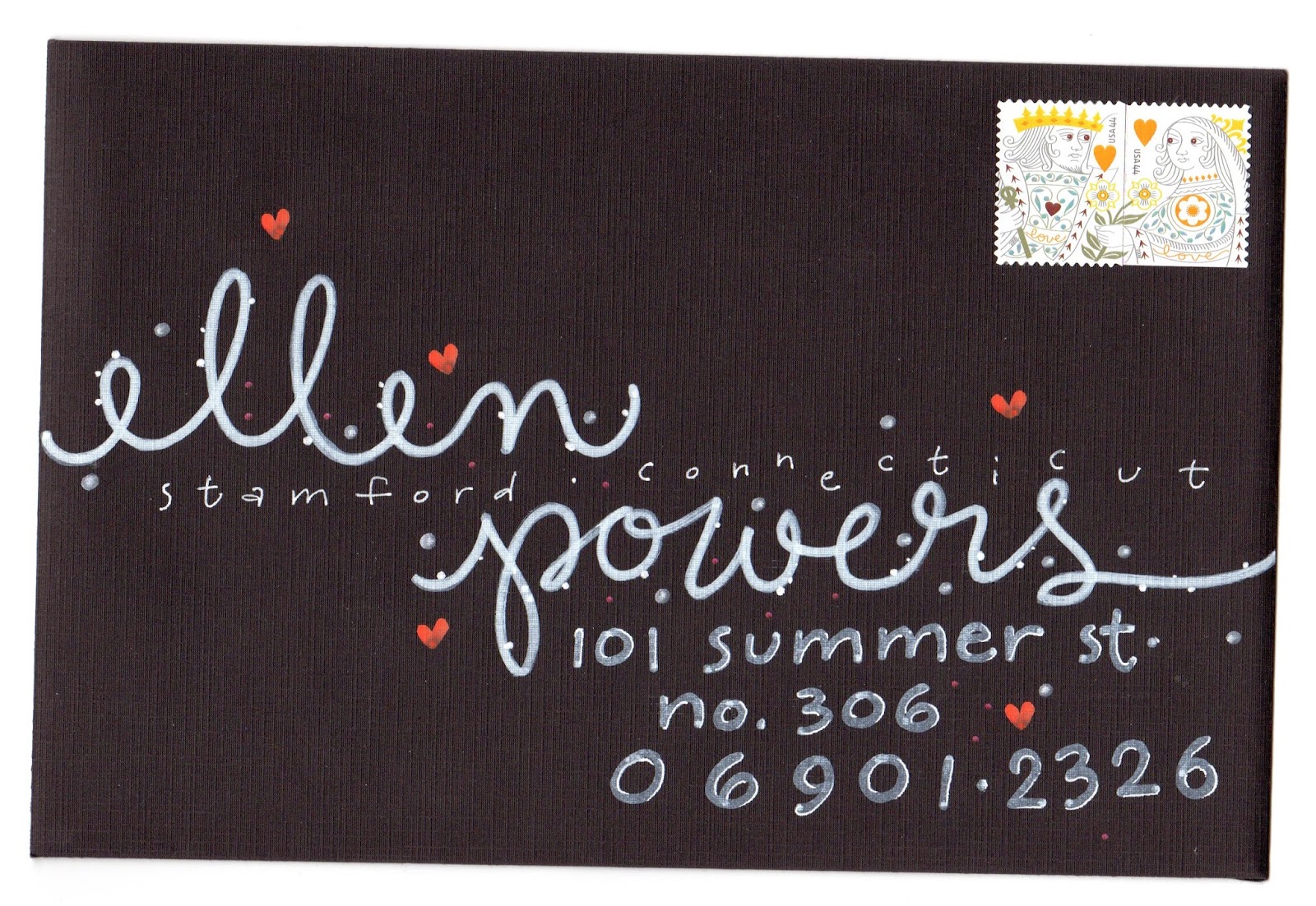
This was Best in Show last year.
Below is the post with details about how to enter. I've had 8-10 envelopes accepted over the years. I probably don'thave time to enter this year. But, I like to remind others to enter. The link below is also a great place to troll for ideas.


Ssssssssss.. . that's the sound of time slipping away as the deadline
approaches for your entries in the 2014 Graceful Envelope Contest.

This year's theme -- The Superlative Letter "S" -- allows you to show your
style and spirit by symbolizing some sentiment starting with S. So set
aside some time, since all envelopes must be postmarked by March 24, 2014.

Winners will be chosen based on artistic hand lettering, creative
interpretation of the theme and effective use of color and design,
including incorporation of postage stamp(s). There is no entry fee.

For rules and galleries of winning envelopes from past years, visit
http://calligraphersguild.org/envelope.html

The Graceful Envelope Contest is conducted by the Washington (DC)
Calligraphers Guild and the National Association of Letter Carriers. The
contest is open to all ages, with separate categories for children.

Send your entry through the mail to:
The Graceful Envelope Contest
100 Indiana Ave, NW
Washington, DC 20001

krafty hannah

i think i have 10 kraft envelopes lined up that will appear on the first of each month. black marker, outlines, white details with the white gel pen.