Nanski's blog
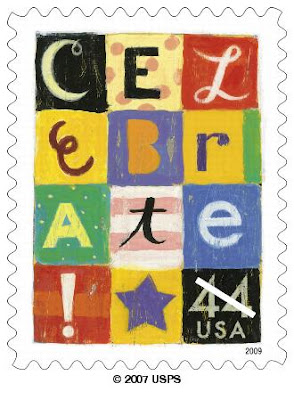
Then...yesterday... Nanski left a comment suggesting that the celebrate stamp would be good for the wacky envelopes and I left a comment saying that the forever celebrate stamp would have been nice -color-wise- but I get queasy looking at that stamp because it looks like 5 yellow worms. Plus....the 42-cent celebrate stamp was one of my all-time favorites and I get sad every time I am reminded that there is a better design that isn't being used. It's really nice to have these kinds of emotional issues to focus on. It puts the rest of the world in perspective. That was a joke - in case anyone is reading my blog for the first time and has not learned that my morning coffee is usually too strong.
Anyhow, I will let all y'all weigh in.
Is there anyone who thinks that the neon celebrate is better than the patchwork celebrate?
 |
| I love the lettering and the spirals and the sparkles. It's just the worms that make no sense and offend my eyes. |

Yes, the worms are nonsensical: even if there is(are) a twirly thing(s) ejected from a fireworks shell, the path they leave will be straight -- physics 101.
ReplyDeleteScientific validation. It does not get any better than that. Thank you, oh wise and knowledgeable big helpful brother. KNBHB.
DeleteI had never thought about the squiggles...will now look at the stamp in a whole new light. I do like the various font/type styles on the 2007 version.
ReplyDelete