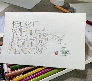
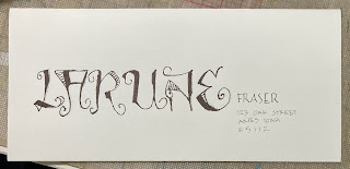
I like that style of lettering and hope I remember to try some more. I lost any info on whose style that might be.
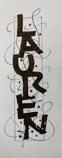
I've also lost the name of the person who deserves some credit for the style below - maybe Mike Gold? If anyone knows, let me know. It is another style that deserves some more attention.
And ta-da - today (Dec 21) the filling of this post concludes the filling of 2022 - plus we know that Jan 2023 is full.
Sorry about the lack of continuity in the block printing lessons. I will recap these 6 letters when we get started again in February. It seems odd to add U to the group of least complicated letters - but it relates a bit to the E and the L.
You start with a vertical stroke and then turn the corner and head across the bottom. It can be a sharp turn or it can have some curve. If you want to keep things in a style that reminds us of how architects write - be sure to do a very slight curve on the bottom - not a big U-shape. just enough so that when you pull the final stroke - from top to bottom - it will leave a tiny space that gives the U it's you-ish-ness. That's a phonetical word. I wasn't sure if u-ish-ness would make sense.
And maybe I should mention that the alphabet is a series of symbols. There are many ways to make them and some of us are endlessly amused at different ways to present the symbols that are perfectly clear - although you might have to work at it.
Again - I apologize that this block printing lesson is going to have a 4 week gap - but we just have to roll with the chaos and maintain a semblance of ...of ...of what? Peace of mind? It is now 4 pm - no more coffee until 5 am - so - we are in the *dull* time of day. Night-night.


No comments:
Post a Comment