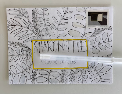
Sharon does some really nice illustrations on her envelopes and I thought I should spend a little extra time on hers and see if I could nudge myself into something more illustration-ish. I was OK with the border - but chickened out when it came to doing much of a wash. Then I couldn't find a good stamp. I thought this yellow border would be enough to tie them together - but - they aren't harmonizing because the border is organic and the stamp is too un-organic.
I like the way the name came out. The envelope looked better than the photo does. I think I might have been able to tie the two together if I had done white lettering on a black rectangle (or even a gray rectangle) -- but that would have been a complicated path to take. It was unlikely that I could accomplish it on the first try - and I had so much time invested in the border - that I wasn't going to risk messing it up.
Maybe I can try again - if I have more of those stamps.
I actually remembered to take a photo of the pencil. It's a Derwent Sketching Pencil - Medium wash. I don't know anything about them - maybe there are levels of wash that are less or more than Medium. What would they be called? Light and Dark? Yup - I Googled -- that's what they are.
Then I switched to just putting colored tape on all my stuff. Too bad washi tape had not been invented yet.


No comments:
Post a Comment