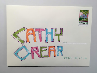
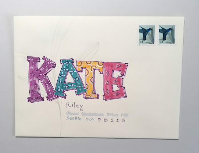
After I did Chuck's using Lynn's lettering, I tried Kate's (below) and it was too stiff - So I switched to something mindless for Cathy. By mindless, I mean a C that I do not have to struggle with. And all the other letters are just units - with no thought to proportions or harmony.
Ooops, I forgot to pull out stamps. There were none of the remaining vintage stamps that worked with this one - but the WPA stamp looked great and gave me the design element to add the white lines. So, I ended up loving it - and the only mistake is the age old problem I have of not drawing guidelines.
I might have done a better job on Kate's if I had had some guidelines. The way the TE has a perfect line across the top is cringeworthy. The E should have popped up a tiny bit. The stamp choice is not stellar - but not cringeworthy. Just ho-hum. I did a few gray leafy swoops inspired by the stamp. Ho-hum.
Happy Trails to the remaining orphans.


No comments:
Post a Comment