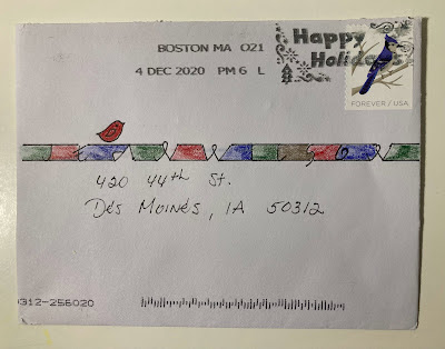
Back in Aug and Sept I posted some examples of Clothesline Caps. The top envelope is the inspiration one from CJ. I had a lot of fun doing my own variations. Eventually, I pulled out CJs and did a version that was closer to hers. I also decided to track down Carol Pallesen and ask her how that style got its name - and clarify where the style (and the name) came from.
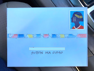
Apologies for the poor quality of this photo. As you can see, I forgot to photograph it at home and shot it in the car at the post office. In real life it was white. And the lettering is on paper inside a translucent vellum envelope which is why the lettering seems a little blurry.
Thank you, Carol, for sharing the history of this very fun style. As with so many styles - people morph it in many different directions - which is exactly what Carol recommends.
*** the following is from Carol Pallesen:
I heard through the grapevine that people are wondering about Clothesline Caps. Please allow me to share with you a little history:
At the 2001 calligraphy conference called Odyssey in Massachusetts, Michael Jacobs and I taught a new class, Tiny Books Tiny Writing. It was a great success and joy (both for us and the participants). So we decided we’d like to teach it again jointly and separately. My “half” is Tiny Writing. In this weekend workshop, I teach three monoline alphabets and projects to go with each. The three hands are Italic, Clothesline Caps, and Willow by Hand.
Each hand is based on my experiences as a calligrapher: Italic on the teachings of Lloyd Reynolds in Cannon Beach, Oregon during the summer of 1977; Clothesline Caps on a multitude of things; and Willow by Hand on some lettering Michael showed me which lead me to study the work of Charles Rennie Mackintosh, a Scottish architect and watercolor artist.
Clothesline Caps inspirations include:
—When I took Lloyd’s class, as a teaching aid about letter spacing, he suggested we use colored pencils to color in similar counter spaces in the letters. It was helpful to see if we were getting regular shapes and areas, but I thought it had a visually pleasing look as well.
—Many years ago, I went to Offenbach, Germany to see the Klingspor, a book and typography museum which houses many great works of calligraphy by Rudolf Koch, Karlgeorg Hoefer, Rudo Speman and many, many other fine lettering artists. Several pieces by Koch had words which had paint in between the letters. I loved the way they looked!
—Since childhood, I’ve been a “museum maniac” and always wanted to find the work of Paul Klee. Several of his paintings have words with paint between and within the letters.
—Also years ago I went to Dublin, Ireland to see the Book of Kells at the Library of Trinity College. Again, I saw words with paint between the letters!
—The work of many contemporary calligraphers contain words with painted letters. One of the finest is Sherri Kissel. She taught a workshop in Red Deer, Alberta, Canada.
I had a Lettering Arts Guild newsletter (issue 46) which contained a write-up of Sherri’s Contemporary Decorated Letters and a monoline alphabet to accompany those letters. Lines were drawn top and bottom of her lovely letters, and color was applied. I called Sherri and told her about my inspirations and the alphabet I wanted to teach, and she gave me her blessing.
My alphabet is based on Roman proportions first, then “tweaked.” And if they so desire, I encourage students to alter the letters further and make them their own. A waterproof ink with a Speedball B-series nib or waterproof pens such as Sakura Pigma pens are used for the letters and the lines. Then lines are drawn top and bottom of the inter-letter spaces and watercolor pencils are used for the color, with small flat brushes dipped in water to spread the color.
And why, you ask, are they called clothesline? Well, the letters almost “look like” they’re hanging from a clothesline (the top line) to the ground (the bottom line). And they are majuscule or capital letters only (no minuscules). And my initials are CAP! So there you go. They’re 21 years old now. Thanks for reading and letting me reminisce.
Happy holidays!
With all best wishes, Carol Pallesen
***
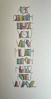
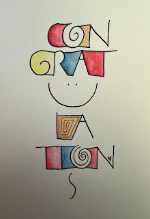
Here are some examples from Carol:




Thanks for sharing where the Clothesline Caps came from. As I told you, I learned the writing after taking the decorated initial workshop with Sherrie Kiesal. I didn't know about Carol Pallesen's connection.
ReplyDelete