Tuesday, August 31, 2010

more from my penpal


i keep asking people to send things to post. so far...no takers. thank you to my penpal who brought these over yesterday. i don't think she really wanted to have me post them, so i would appreciate it if some of you would post comments on how much fun it is to see a variety of work on this blog.

i think we all tend to go towards happy flowers and light hearted designs. so, it is fun to see something a little different.

thanks, penpal, for letting me share these.

keith 14/50


yikes. this one really needs some more layers. this is like a naked skeleton. maybe i should print off copies and finish them. what a great idea. i'll just run finish all my other chores and get right on it. hahaha.

kathy..great stamp choice and placement. sometimes that upper right corner is the right place to be....love that stamp

Monday, August 30, 2010

pen pal in person


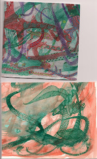
one of my penpals stopped over today. she had a fun design on an envelope. the first row of wavy lines reminded her of flower pots, so she added flowers.

then she had some watercolors that were too dark and murky, so she started to see weird dragons and eels and doodled some over the top of the murky watercolor. it is a good example of looking for something different than what you intended in your experiments.

there is a second one that has more layers that i will post tomorrow.

keith13/50


this style is sometimes called legende, after a font. seems like there are other names. it looks a little like some of the carolingians, which were the first styles to have upper and lower case. although back then they did not have upper and lower cases. that is a term from type setting. the old terms were majuscule and minuscule. and i do not know how to spell majuscule and spell check does not offer any help. i know i could go look it up in sheila waters' book and i might do that later.

Sunday, August 29, 2010

keith 12/50


does this one jump out as not mine? it does to me. did it jump out at you kathy? it's hard to explain the little differences, but, i am pretty sure you did not turn the envelope when you did your outlining. do you remember doing this one?

Saturday, August 28, 2010

keith 11/50


'splain yourself kathy, what's with the upsidedown? and i think i intended for you to do a lot more than just slap a stamp on there. i was thinking you'd fill in the address. but, you did make a card for each one. i already returned these to keith. i should get them back and finish them...
...i must say, i do like your stamp placement very much. collaborative projects are so much fun. we should talk about that cut paper one we did.

Friday, August 27, 2010

keith10/50


kathy has a thing for putting the stamp on upsidedown. this one would have been fun to finish. some of the letters are just fine, others are not so fine...one of these days we need an uncial lesson. how are people doing on their neulands? i thought we needed a break from endless neuland. i never know what i will find when i pop open the next keith envelope.

Thursday, August 26, 2010

keith 9/50


this is akim with a big fat monoline pen. weird. really clashes with the stamp. that stamp has rows and rows of lettering in the background. i imagine it has been used in some really spectacular examples on the graceful envelope. speaking of the GE, Jackie is a winner this year. check it out at their website (google graceful envelope 2010 winners) and Geri, who has some envelopes posted on my blog is an honorable mention. she should have been a winner, too. but, she was best in show last year.

Wednesday, August 25, 2010

keith 8/50


taking a little break from the name CHRISTY. i have hers sorted so that we will look at all the neuland first. KEITH is not sorted according to anything. I was hoping for some relief from the blocky letters. but no such luck. maybe tomorrow. i have to post his in numerical order or i will never know which one to post next.

Tuesday, August 24, 2010

christy 11/60


one way to fit two names on top of each other and have some variation. when you are fitting things, you can always pencil them in first. if you know what colors of markers you are going to use, then use those colors in colored pencils and you will probably not have to erase.

this one should have more fun details from the stamp.

Monday, August 23, 2010

christy 9/60


a thick thin variation of neuland. it's fun to swoop one name across the other in a loose script. leave the caps off the second name. a cap can be distracting.

the way i used two different methods for putting in the thin marks is distracting. don't do that.

Sunday, August 22, 2010

christy 8/60


neuland done with a brush marker. you can also make this style with the cheap kids markers. just hold the marker very flat against the paper so you make as wide a strike as possible. you'll have to twist and turn your hand, your arm and the paper to make these letters.

Saturday, August 21, 2010

christy 10/60


i'm going to stick this one in today because the past couple days have been a little boring. the next two will be variations on this theme. this is blue vellum envelope. i like monochromatic and i like the metallic gel pens on vellum.

christy 7/20

Friday, August 20, 2010

christy 6/60


sloppy. colored pencil shading, which is a nice technique, but pretty ho-hum here. i'll try to post something fun later today to make up for this one. i'm torn about posting all 60, but, it's easier to sit down and post a week at a time, so, you'll just have to put up with a clunker here and there. actually, i find that some of the ones that are clunky to me do a perfectly good job of giving other people good ideas.

i frequently see samples of things where people have one of my handouts and they have done something wildly different that is really pretty. i think everyone who gets an idea off this blog should post their new ideas. just send me a scan and i will post it.

Thursday, August 19, 2010

christy 5/60


love love love the stamp. the C mimics the wave in the stamp. other details from the stamp are used. picking up details from the stamp does not have to be literal or exact. just take a general idea and see where it goes.

the envelope is one of those vellum ones, the translucent paper.

if i were doing this one over, i would make the fleming shorter and wider so that its over all width came out to the same width as CHRISTY

Wednesday, August 18, 2010

christy 4/60


couple things about this one. as i went along, i started to exaggerate the height of the letters to mimic the flag. nice effect, should have redone the whole thing, but blogs did not exists back then so i had no idea i would be hanging these out on the largest virtual wall for the entire universe to peruse.

to add those little spots of color, as you are pulling a stroke, just stop once in a while and jump over a space. go back and fill it in with lines and blocks of colors. or...anything else.

i also like when the letters touch. look at the shadow. to the right and dropped down a bit. the sun is coming from the upper left corner of the envelope. i almost always do my shadows from that angle.

this one has a color balance that is similar to the stamp. sometimes i take a minor color in the stamp and feature it as the primary color in the name. this time, i did not. i'll have to cross reference my color choices after i get all the envelopes scanned. (if i live that long)

Tuesday, August 17, 2010

christy 3/60


that c is not spectacular. but, i do like the decorations on the letters inspired by the design on the stamp. happy colors. not really compulsive about translating the pattern in the dome onto the stamp. it would be hard to define exactly when to be compulsive and when to relax a bit. it is zen-like, i think. i remember the person who tried to teach me how to hold a ping pong paddle. he said, don't hold it too tight, but don't hold it too loose. then i think he mentioned the three musketeers and holding your sword not too tight and not too loose. same with holding a live bird. not too tight, not too loose. ok. listing all those comparisons will not really teach you what you need to know about the fine art of putting little dots on envelopes. i'll just have to book a zen retreat in santa fe and we'll all go practice our dots and achieve blissful states. until we go to the p.o. jumpin'jiminy. it used to be about $2 to send a letter priority. it is now $5. and priority does not really mean that it will get there any faster. but, i digress.

Monday, August 16, 2010

christy 2/60


dry marker and then outlining. the CH&R are really bad. the spacing is bad, the shape of the H is bad. but...this is really old work. it is what it is... at least i do not have the nasty crescent moon shapes at the ends of any of the letters.

...and christy's mom had to put a sticker over my address because christy moved...so that is not my tiny little printing

Sunday, August 15, 2010

christy 1/60


the christy series is the series that launched my obsession. i had taken enough classes to feel comfortable and was looking for excuses to address envelopes. i had a couple friends to send mail to, but, even back then, i didn't really have much to say. all i wanted to do was make envelopes. so i thought of making them for my niece, who was in college and giving them to her mother to send to her. allison, the mother, was happy to have envelopes as she sometimes had newspaper clippings or messages that she wanted to drop in the mail. it did not take long before i heard from christy that she loved getting the envelopes. then i heard that her friends would stop in at her dorm room to see if she had received any new envelopes. she stuck them on her wall to decorate her room. i believe she even said that once in a while someone would offer to buy one. she kept them all and when i asked her to loan them to me for scanning, she mentioned that she regretted that she did not use a letter opened on them. but...hers will always be highly collectible, even in their raggedy state, because they were the inspiration for the complete obsession with decorated envelopes. she should insure them for a lot. hahaha

i am going to post all the neuland examples first. this one is a lot like others. it has the stacking trick that i use when i see that i am running out of room. i usually stack two letters before i get to the end, so it doesn't scream *boo-boo.* but, i do not like to stack an i, so i stacked the last two letters. it really doesn't bother me that much.

there are tricks to bouncing letters. too. they look better when the first and last letter bounce a little high. and too much bounce is too much. most people raise them too high and sink them too low. it only takes a tiny bit of bounce to say playful.

i'm pretty compulsive about confetti, too. note to self...discuss confetti in a future post

Saturday, August 14, 2010

cecilia sharpley - link to site

ALL CAPS, TO TRY TO GET YOUR ATTENTION. ANYONE WHO WOULD LIKE TO OVERDOSE ON ENVELOPES MAY DO SO AT THIS SITE. BE SURE TO CLICK ON ALL THREE OPTIONS.

http://www.cecilia-letteringart.com/mailartgallery/mailartgallery.html

and then, if you want to surf a while longer, cecilia has other artwork, etc on her site. you probably have to copy and paste that address into that space at the top of the screen. i don't know how to create a link within a posting. maybe someday i will learn how

keith 7/50


i like blue. this is such a pretty stamp. i think i thought kathy would fill in the addresses. something tiny would have been just fine. i think i will switch for a while and put up a bunch of christy envelopes. i borrowed hers and have 60 to share.

Friday, August 13, 2010

Testing

keith 6/50


this is just kooky. i don't even know what to say about it. i guess sitting down to do 50 envelopes all at once would send a person into the kooky-zone. my favorite part is spelling his name wrong meAndering...and the whole cowboy theme. i like the *i* sitting over the head of the cowboy. the lettering is inspired by akim. one of these days i should do tutorials on akim. it is fun style.

Thursday, August 12, 2010

keith 5/50


this is done with a scroll tip. a new one that is not mushed down. i rather like it. could have been a little better, but not too bad considering how fast i was probably going at the end. love the stamp, kathy.

Wednesday, August 11, 2010

keith 4/50


this is not a favorite, but it's not a complete dud. kathy helped it along with her placement of stamps. now, the question is, shoudl i try to make it a good one by adding the address, or leave it alone. i would run the risk of ruining it.

Tuesday, August 10, 2010

keith 3/50


clearly, as i got to the end of the 50, i turned to scribbling. stick with me for the next 47 days, as there are some good ones coming up.

Monday, August 9, 2010

keith 2/50


there are several where i just did the names and kathy did the stamps and then nobody did the address. we sent them to him in a box, so they did not go through the mail.

Sunday, August 8, 2010

keith


this is the first in a series of a collaborative project. kathy and i made 50 cards and envelopes and sent them to keith when he turned 50. then we did not hear from him for a really long time. this is a random one out of the middle of the stack. i did the lettering and kathy chose stamps. i have never seen all of them with their stamps. care to comment kathy?

Saturday, August 7, 2010

my mailbox


wow...thanks kathy, this is gorgeous. beautiful subtle lettering in the background. the style is called the Button alphabet. designed by peter thornton, taught by louie lemoines. nice vintage stamps. very welcome on this rainy muggy day.

Friday, August 6, 2010

neuland lesson 8


numbers are hard. i highly recommend the book Uncommon Numbers available from John Neal. There is a gorgeous set of numbers in there courtesy of Carl Rohrs. in heaven, we all write just like Carl.

here, we make clunky letters and then scribble all over them. but, our friends are happy, because Carl never sends them any mail at all. I like the second 2 and 4 better. I like the top 5 better. the &'s are tricky...

ok...go address envelopes and mail them. post comments if you are having trouble. or email me directly...
jmwilson411 @ yahoo.com

Thursday, August 5, 2010

karen - embellished


a couple days ago, i had three started. this is one way to doodle around neuland. and i never met a dot i didn't like. not the most perfect stamp, but, i didn't have time to really dig through the stamps. and since this is not going in the mail, it doesn't really matter. it's more for lettering ideas. my mom was bothered by the lack of last names on the three i started i explained that the p.o. could care less about the name. i reminded her that they would even deliver things addressed to occupant. so now she wants me to start addressing some fun mail to occupant.

Wednesday, August 4, 2010

neuland lesson 7


1. just one way to do the Q, i prefer to make the tail narrower than the rest of the letter. 2 and 3 show choices on the G, either flat topped and bottomed, or at an angle.

4 is the D which you have already seen,, but refresh your memory on how it is fat at the ends, no crescents and the curve is not built on a circle, it is an arc, straight-curve-straight. 5 shows how the P's bowl is just short enough to make it a P. 6 shows the bowl on the R coming in lower than the center. 7 shows the bowl and leg formed with an S curve, rather than a sharp point that hits the straight stem. 8 is one of the more angular options. 9 is a kooky variation where the top bowl is too small, but, you can have fun and kick a leg out here and there.

10 B has two fairly symmetrical bowls. the point is not too sharp and may or may not touch the stem. 11, midpoint, visually in the middle, actually a little high. sharp point. 12 what i call the rickrack B. i like the curving in and out. 13 has a high midpoint and 14 has low. these would have to fit in with the other letters. i would not mix and match all these variations. 15 is angular.

16. on the U, you do not leave that space in the first stroke. i left it so you could see when it happens. most beginners try to make that curve after they are too close to the bottom. and you want to stop, with the nib leaving an angle, so that you have a little wedge of white space at the bottom. the second straight stroke on the U should have landed square at the bottom. 17. Z - i left some wedges so you could see the construction.
i think that covers them all.
bad idea


bad idea. thought i would do all of the stamps in this series and write all the info that was on the back of the stamp. could create a whole category of ideas that were going to use every stamp in the series and then after i did two, lost interest.

it is worth looking at the skinny large lettering. it is similar to the shapes made with a skinny pen at the bottom of the last neuland lesson.

Tuesday, August 3, 2010

neuland


this was a favorite. it is neuland-y. outlined with gel pens and the little triangles of color are more gel pen.

Monday, August 2, 2010

first layer


i actually found a marker that looks like i've never used it, so it is pretty crisp. here are three envelopes at stage one. we need to be sure to spend time on numbers, since they are an essential part of envelopes.

not sure what i will do with these. my first impression of Lejla's is to put her last name in the line under her first name
and her city state in the line under the address.

bree's is my favorite at this point. i like simple and straight forward. from here, it could just be easy to finish. or i could try something new and send it into the oh-no-need-a-brilliant-fix arena

karen's had the idea of coming in with a line off the top
then i thought of exiting off the bottom. this one needs a good idea to save it.
when in doubt, scribble.

neuland lesson 6


hopefully you are getting comfortable with the letters built from straight strokes. you've started some subtle curves with the J and S. now, you can work on the ( ) strokes and make OCD. the first O, on the top line, is a little droopy. the C is OK and the D is fine. the O number 1 is very sad because rather than have a nice fat beginning and ending, it has the pitiful crescent shapes. same pitiful thing happening with 2 and 3. and then poor number 4. the beginning and end is flat and fat, but the droopy midpoint is enough to poison any work of art or envelope. watch those midpoints. it was OK to have the weight of the E and F dropped, but you may not do it on the D (or the B or R, but those come later)

i will never forget peter thornton describing how unfortunate it is when the weight in italics is too low. he described the look of a droopy small, italic *a* as looking like a full diaper. that is a mental picture that is easy to remember and kept me from ever making full diaper italics.

my visual for the droopy neuland is a saggy bosom. yuck. so, lets keep the midpoint of any curve at the center or if you can't hit the center, make sure it is a little bit high. if anyone has a sample of beautiful Neuland with saggy middles, please send me a copy. maybe it cam be done....but until someone can show me a sample, i'm going to be emphatic about placing the widest point of any curved stroke at or above the center of the letter.

the second detail to note is no. 5. as you start down at an angle, you are pulling rather straight and then you make most of the curve in the middle third and then you head rather straight towards the baseline as you make the bottom third of the stroke.

6 and 7 show how you can do the variation where you start at an angle and end at an angle.

happy lettering

Sunday, August 1, 2010

sweet 16


this is the envelope i am not sending. i wrote nina 16 times. then i added doodles in sets of 16. somehow, this one just never came together. but, i still like the idea of filling a section of the envelope with the name in a random pattern. i think i'm still hankering to do more oskar designs. star pupil carrie shared a scan of one of her envelopes and it's wonderful. maybe i need new stamps.