Here is the envelope from Janet - inspired by an envelope from Rachael - that I posted a couple days ago. It's been in my stack for a while and when I got the new Sharpie markers that are like paint pens, I decided to give the design a whirl.
I do not have any of those stamps - and I also knew that I would want to make the address easier to read. Little did I know that leaving more space around the address would botch the whole idea - but, not enough to discourage me from making several attempts. The easy solution would have been to draw an outline of a label so that it looked like I stuck a label over a flower. Such a simple solution - but it didn't come to me until August when I sat down to fill in the blurbs and the envelopes were long gone.
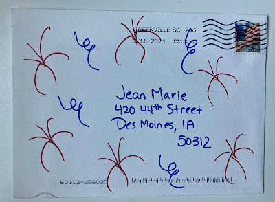
This was the first try. The marker colors did not correspond very well to the colors on the stamp. It doesn't bother me that the petals are not colored in carefully. I don't mind the sketchiness. The address is a little clumsy - but sadly, the second attempt (below) is no improvement.
That missing petal is so unpleasant. I'm happy with the monochromatic colors - but the overall style of the flower clashes with the raven. I did a better job on the lettering.
Then I realized it was a perfect design to go with a round international stamp. But - that missing petal is still unfortunate.
If you go back and look at Janet's - you'll see that her center circle is much larger and the petals have a much different shape - so I need to go in that direction - and maybe only do addresses that are short.
GRRRRRRR - hardly anyone has a short address.......
And then I thought - gee - I should send a thank you to Rachael for the design idea - so I made the center bigger - but the petal situation is still unresolved.
And one more -- something done quickly - where the address problem is less problematic.
The lettering is cringe-worthy - but - I might revisit this idea and see if I can take it in a better direction. Or maybe I need to stick with the version that Janet sent.
One of the best parts of Janet's is the border on the very edge of the envelope which seemed to escape my observation which really makes me question my cognitive skills.


