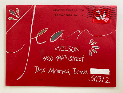
It's no surprise that I love this one from Rachael and will be stealing the idea. She did a second one - below - and mentioned that it was not 100% pleasing. Her note indicated that she had considered adding a couple more colors from the left stamp. I'm glad she didn't - I think that would have been distracting.
Maybe the stamp on the right wants to be in a landscape orientation and then maybe add some white somewhere. The stacked Jean Marie might want to be closer to the J. These kinds of envelopes are so hard because once you write on the envelope you can't just move things around.
It can be hard to fit three things together when they are visually, carrying the same weight. (stamps/J/JeanMarie) It can be done - but, it's tricky. That's why the concept of a hierarchy is useful. A big focal point - a medium something - and a small detail (or a few small details) and if you look at the top envelope - that is exactly what is going on.
And making 2 stamps work together can be tricky. There are no easy answers to any of these issues - but it's a lot of fun to ponder.
 |
| This is from Simone in Letzebuerg (Luxembourg) Fun design. Air mail borders are so charming. |
 |
| This is from Susan and I'm glad this one (as well as the others in this group) didn't get the dog post mark. |
Troy enclosed a very fun letter -- the greeting at the top included *the Gande Dame of Envelopes* - then he described a trip to Houston and a guild meeting. He reminisced about first hearing about what he calls *the Maven of Mail* at that guild in 2006. I get a kick out of his nicknames for me. I suppose I should come up with one for him.....


No comments:
Post a Comment