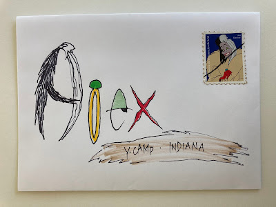
Last of the camp mail -- not a favorite -- but OK for camp.
Chapter 2 of Denny's sign.
We decided on a size of 30-inches wide and 15-inches tall. I did a rough draft and he loved it. Sadly, I tossed the rough draft, I would have liked to show the progression. Denny wanted to match the sign to the garden pole. As long as I was not charging him anything, I had no qualms about trying to replicate the style.
We talked about getting a wood burner and doing it exactly as the PaintedPeace lady does them - but, I knew it was going to be pretty challenging to get the painting to match - and then there was the issue of making it weather proof.
My solution was to show Denny a sample of a colored pencil original. I explained that we could do artwork at a smaller size and then have it enlarged and printed on metal which would have been about $75. I thought it was the best way to get the colors right and also weatherproof. So we headed off in that direction. Before I left for my 2 weeks in Chicago (the first 2 weeks in June) I came up with a final drawing to be colored in by Denny while I was gone.
I loaned him my colored pencils and showed him how to blend the colors to replicate the colors and blended texture that we could see on his garden pole. Denny was excited to do the colored pencil part himself.
To be continued....
For anyone who likes too many details about a project:
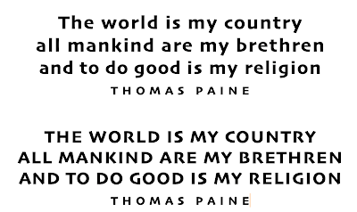
Here's my process for getting the lettering laid out as easily as possible. I use the font Skia and typed it in all caps and also upper and lower case. I like Skia because it is a lot like Neuland - but not quite as chunky.
The Painted Peace style mixes caps and lower case - so I went through and changed the letters that needed to be in all caps. I also adjusted the spacing between the letters so that it was quite a bit wider than the default setting. I did not trace these letters exactly (see below) - just used them for the actual line lengths - and let them get quirky.
I put even more space between the letters in THOMAS PAINE. One of my favorite ways to treat the author's name is to stretch it way out - to become a design element. I also wanted the center line to be a little longer. In the examples above - the 2nd and 3rd lines are too close in length. I added a little more letter spacing to the middle line to get it longer.
All the Ns are caps - but not the N in the word religion - because the 2nd and 3rd lines would have both ended in N and I thought it looked better to have two different Ns so close together.
Denny had written the quote with quotation marks and had punctuation when he gave it to me - just written on a piece of paper. I do not like to put quote marks on quotes that will be signs or framed art because I think it is clear that any time a person's name is included - that person is the author. Luckily, Denny was persuaded to go along with my preferences. But, if you get into dealing with clients - be prepared for people who are intent on choices that might be inconsistent with your own preferences. I can see why artists get such bad reputations for being too rigid in their preferences. I've known a few artists who won't back down from certain preferences - I tend to let people have what they want - since they will live with it. But, that's just me.


No comments:
Post a Comment