Pages

Wednesday, July 31, 2024

April from Janet - penny postcard


Excellent birthday greeting from Janet. That's a steal worthy idea on the envelope - and I love, love, love the banana reference. Somewhere in my stash - there is a painting of a bunch of banana's gathered at a party and the one who is old is in a wheel chair ... I hope I can find it someday.... it's very cute.


Janet has lots of goodies at her house that she puts in her envelopes - like this birthday postcard from way back when - 1909 to be exact - back in the day of the *penny postcard.*


Tuesday, July 30, 2024

April from Grace - Beth Lee / Bach quote


Grace, our professional envelope addresser sent some flamboyant script with some bubbly background. Very celebratory.

*** 


Ten days ago I posted the portfolio that Beth Lee had re-issued. Then I surfed around on her IG and found this:


I'm coming to the very end of the print version of *How to Be in the World*, my abecedarian portfolios of verbs. Only 7 left. 

Hmm, what to do next? Haha, only kidding. I'm like Bach, who is purported to have said, in response to a query about where he got his ideas, "My dear, the difficulty is to avoid stepping on them when I get out of bed in the morning."


Yup - that's how I often feel. Although - a lot of my ideas come from things I get in the mail or see during my morning surf.

Monday, July 29, 2024

April from Christy - French illustration


Christy's envelope reminds me of a style that is associated with French designs from the mid 20th century - especially the lettering.

Google search for French illustration didn't offer much - but a Pinterest search hit the jackpot. I chose this one for Grace - I'm pretty sure she has dachshunds - but I could be waaaay off on that.


I just discovered that I only have 6 posts ready to go - so we might be back to short posts.....


Sunday, July 28, 2024

April from Amy - Denny's sign (3)


Somehow, I didn't get the April envelopes posted. April is my birthday month so there are some lovely birthday themed envelopes coming up. This one makes me long for cake. There is a local cake that is very popular, Pink Champagne Cake. I wonder if it's just a Des Moines thing.  <pause> Nope. It's a real thing - and the photos on Google do it justice. All the recipes I checked online are highly suspect because they are soooo different from one another. Seems like if you make a pink cake you can just call it Pink Champagne Cake.

***

When I got back to Des Moines, I figured Denny would be finished with the sign - and set up a time for him to bring it over. We met up - and has done nothing and told me that he waited to tell me in person that he actually wanted to go back to the original idea of painting on wood - and he really wanted to do the painting. He was concerned that I was not going to be happy about this turn of events.

I assured him that I was actually VERY happy that he was taking the reins. Nothing makes me happier than people who have a vision and want to see it through. So, I sent him out to buy the wood and paint the background color and then I transferred the design onto the wood. 

It was fun to collaborate. Most of the time when someone asks me to help them with a project - they start to back off and just want me to do the whole thing. That can work out fine. But, in this case - it was going to be a ton of work to paint it in - so I was very happy that Denny really wanted to do all the painting himself. 


Here is the finished sign - hanging on a privacy fence - in a narrow space at the side of his house. Most of the garden is in the front and back yard. The fence is probably 7 feet high - and that is a little garden bench on the left. We agreed that he needs to figure out a way to add some plants around it. The other side of the fence faces south - so he needs to find things that will grow in 100% shade. I should have taken some photos of the rest of his yard. It is very colorful.

Here are two more shots that show the process.


Above - the lettering using the computer font for spacing on 11x17 paper - enlarged and with my suggestions on color. It's trimmed to 8 inches high. We had to just imagine the turquoise background and I knew it needed some white flowers. Denny agreed with me. He likes very colorful flowers in his garden but always includes some white flowers. It's nice to note that principles in art and design show up everywhere.

I don't have a photo of the next step which was to trace the one above and even out the lettering so that the capitalized letters fit in with the lower case - and I had a nice black and white outline of the vines.

Below - for the final - which was 30" x 15" - I enlarged the final tracing in 3 parts and spliced it together. The lettering was a little too high and close to the flowers, so I lowered it and then used Saral transfer paper to transfer this to the wood.


This shows the outline. Painted Peace originals are outlined with a wood burning tool. Denny and I talked about that at the very beginning - but then it didn't come up again - until he was done painting. He actually painted right up to edge of the outline which made it look a little bit like the wood burned version. Saral transfer paper left a dark line. And it was even indented a bit because I was pressing pretty hard when I did the outlining.

Of course, when my son saw the sign - he said he wants one for his garden - so I'm guessing at some point I will make one for him. 


Saturday, July 27, 2024

Last of the camp mail. Denny's sign (2)


Last of the camp mail -- not a favorite -- but OK for camp.

Chapter 2 of Denny's sign.
We decided on a size of 30-inches wide and 15-inches tall. I did a rough draft and he loved it. Sadly, I tossed the rough draft, I would have liked to show the progression. Denny wanted to match the sign to the garden pole. As long as I was not charging him anything, I had no qualms about trying to replicate the style.

We talked about getting a wood burner and doing it exactly as the PaintedPeace lady does them - but, I knew it was going to be pretty challenging to get the painting to match - and then there was the issue of making it weather proof. 

My solution was to show Denny a sample of a colored pencil original. I explained that we could do artwork at a smaller size and then have it enlarged and printed on metal which would have been about $75. I thought it was the best way to get the colors right and also weatherproof. So we headed off in that direction. Before I left for my 2 weeks in Chicago (the first 2 weeks in June) I came up with a final drawing to be colored in by Denny while I was gone.

I loaned him my colored pencils and showed him how to blend the colors to replicate the colors and blended texture that we could see on his garden pole. Denny was excited to do the colored pencil part himself.


To be continued....

For anyone who likes too many details about a project:

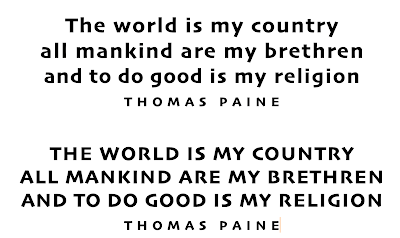
Here's my process for getting the lettering laid out as easily as possible. I use the font Skia and typed it in all caps and also upper and lower case. I like Skia because it is a lot like Neuland - but not quite as chunky.


The Painted Peace style mixes caps and lower case - so I went through and changed the letters that needed to be in all caps. I also adjusted the spacing between the letters so that it was quite a bit wider than the default setting. I did not trace these letters exactly  (see below) - just used them for the actual line lengths - and let them get quirky.

I put even more space between the letters in THOMAS PAINE. One of my favorite ways to treat the author's name is to stretch it way out - to become a design element. I also wanted the center line to be a little longer. In the examples above - the 2nd and 3rd lines are too close in length. I added a little more letter spacing to the middle line to get it longer.

All the Ns are caps - but not the N in the word religion - because the 2nd and 3rd lines would have both ended in N and I thought it looked better to have two different Ns so close together.

Denny had written the quote with quotation marks and had punctuation when he gave it to me - just written on a piece of paper. I do not like to put quote marks on quotes that will be signs or framed art  because I think it is clear that any time a person's name is included - that person is the author. Luckily, Denny was persuaded to go along with my preferences. But, if you get into dealing with clients - be prepared for people who are intent on choices that might be inconsistent with your own preferences. I can see why artists get such bad reputations for being too rigid in their preferences. I've known a few artists who won't back down from certain preferences - I tend to let people have what they want - since they will live with it. But, that's just me.


Friday, July 26, 2024

Camp mail & Denny's sign (1)


More foreshadowing of another project. 


Really bad flowers.

***
Well, I guess I could be starting the story of that project I have mentioned - to fill up the rest of the July posts. Here's how it started. Hunter, my local son, asked me if I would be willing to help Denny with a sign for his garden. Denny is the dad of one of Hunter's best friends and Hunter has been welcome at sooo many meals at Denny's house since the boys were in high school. The boys never ate at our house - probably because I gave up on having actual meals - I just had food in the house - and everyone ended up on their own schedule. I was happy to provide whatever Denny had in mind as a thank you for the very generous feeding of my kid.

Denny's garden is beautiful - and someone had given him a Painted Peace garden pole. I'm sure you've seen them. A nice lady in Bellingham, WA started painting on some scrap wood in 2009 - and I imagine she is a billionaire by now - because they are e.v.e.r.y.w.h.e.r.e    They are not wood. They seem to be fiberglass with some kind of digital image. The original art is still wood burned outlining that is then painted. 

To be continued........


That is an art pole above.
Below is a metal sign
and you can clearly see the influence it had on that envelope at the top/


Thursday, July 25, 2024

Camp mail (could use more)


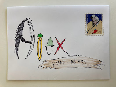
I started flipping though old posts on the blog for ideas and this was fun to do again. I wonder if she will even realize that the scribbles are the letters in her name.


This style came from an envelope from Janet. I know I've seen it somewhere - maybe Pinterest - my version is pretty rough. 

***

What does (could use more) in the title - mean?

That note to self yesterday and today - was supposed to alert me to add on something interesting - and I've been forgetting to do a final edit on the blog posts. 

Sadly - I have turned into Leiningen vs the Weeds. That is my version of Leiningen vs the Ants - a story from when I was a kid. I need to revisit it to see why it has stuck with me all these years. I do not recall anything specific - except a guy and a hoard of ants. Apparently my brain was imprinted with information about doing battle with things.... and some battles are futile. Although I have no idea if he lost his battle.

At what point do you figure out that you can't win.

But, do we stop. No - we keep going. 

Current battle - a patch of those nasty day lilies that are technically an invasive weed. Then Virginia Creeper AND Creeping Charlie invaded from the neighbors - and I am not sure what direction this battle is going to go. Part of me is thinking about black plastic and bricks. I'm pretty sure that plastic wins.

To be continued.


Wednesday, July 24, 2024

Camp mail (could use more)


 I like this idea - and fully intended to use in on the July exchange envelopes and then forgot - the flowers are foreshadowing of a style that I did end up using. 

And here are a couple more very so-so envelopes for Ben. Not even worth posting - maybe things will come up that I can swap out for these - as it gets closer to the date that they will pop up.


Tuesday, July 23, 2024

Camp mail


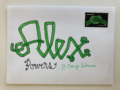
This one is fun enough that I wish I had a whole page of these stamps. I'm pretty sure I could make any name look good. And I like the last name, too, the way it's like the green strand that curls around. I started with Ben's envelopes and they were very so-so. I did a lot better on Alex's - probably because I'm better with flowery things - and figured Ben would not want to be opening flowery mail in a cabin with a bunch of guys. I should have used some of the monster stamps - but I only put used stamps on camp mail.


We are back to short posts - because it's July 4th - and I need to fill the blog up for the rest of the month.


Monday, July 22, 2024

May from Jessica and Carolyn and Elizabeth - marker testing camp mail


Once again - I am at the end of a stack - and end of some chunks of writing - and tidying up - by ganging some envelopes. As previously mentioned - my organizational system was hit by a solar flare or a virus or who knows what. Bear with me for a few days as I tidy up.

***


I decided to test markers and throw away the dry ones. These are all kids markers - still fun to play with - 
but not good enough to use on exchange envelopes --- but, I can imagine using this idea to test my good markers....maybe.


Sunday, July 21, 2024

May to Jean from Kristine and Mary - Tolstoy quote

These two are so fun together - Kristine's envelopes often have lots of patiently done dots/dashes/lines/shapes. Mary's has a corresponding amount of careful detailed filling in of the lines - and the details from the stamp. This is another idea that I'd be stealing -- if only I had some of those stamps....  


The add-on today is a Tolstoy quote that our friend Zivio posted on his IG.
Wherever it says *man* -- just switch it to *people* or *person*
Oh - what the heck - I'll just change it and put my edited words in all caps - so you know where it's changed.

“One of the commonest and most generally accepted delusions is that every PERSON can be qualified in some particular way-said to be kind, wicked, stupid, energetic, apathetic and so on. People are not like that. We may say of a PERSON that THEY ARE more often kind than cruel, more often wise than stupid, more often energetic than apathetic or vice versa; but it could never be true to say of A PERSON that THEY ARE kind or wise, and of another that THEY ARE wicked or stupid. Yet we are always classifying PEOPLE in this way. And it is wrong. Human beings are like rivers; the water is one and the same in all of them but every river is narrow in some places, flows swifter in others; here it is broad, there still, or clear, or cold, or muddy or warm. It is the same with PEOPLE. Every PERSON bears within THEMSELF the germs of every human quality, and now manifests one, now another, and frequently THEY ARE  quite unlike THEMSELF, while still remaining the same PERSON."


Saturday, July 20, 2024

Bonus post - art by Beth Lee

Scroll down for today's regular post.

***

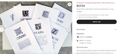
 I don't think I have ever promoted anything on the blog - but this is so pretty - if you are into calligraphy. Beth Lee has been around for as long as I have been a part of the scribal world. This is something she made a few years ago and it sold out - and she had plenty of requests for another run. 


You made read details at her Etsy shop - and order through Etsy - or directly through her website.
There are more photos of individual pages on Etsy


Beth's website

At her website - you can email her and pay via Venmo - if you like Venmo.

And - here is here Instagram

May to JeanW from JeanR - dog sledding & camp mail


This is from JeanR and I just remembered that Jean and her family used to spend their summer vacations in fire lookout towers in forests in the west. I need to pester Jean for some more details - like exactly where they were and what all was involved. And for sure -- fire lookout gets added to the list of careers that I started last month. Jean's card has a woodsy feel to it. She is still fond of camping.

***

This is an odd add on - it started when an article about Alvar Aalto caught my eye. He was a Finnish architect and designer who designed this stool. A classic from 1933, still made today.

The article sent me off on street view looking at an Aalto building where one can stay in Finland. From there, I wandered up to see some of the dead ends that the Google car had visited. I checked out the border crossing into Russia. And then I clicked on a word that had *nomad* in it. A couple, one from Germany and one from Switzerland  have moved to Finland to live a more sustainable life, to rescue sled dogs and to run a camp where people can come hang out with sled dogs or do some dog sledding and wilderness adventuring. 

I guess it was their writing that kept me interested. It's always fun to find people who are wildly excited about their *thing* - she said as she returned to addressing pre-written daily letters for her grandkids to receive while they are at camp. The parents are invited to drop off mail when they drop off the kids - and I want my grandkids' mail to be up to snuff. 


While this one is a little rough - it actually makes me wish I had more of these stamps..... I don't think I had thought of this option when I was in the Lichtenstein phase. 


Friday, July 19, 2024

May to Jean from Janet


I usually spot Janet's envelopes at first glance. This one seemed more like the shapes that come from JeanR - but, it's Janet. Love the border - love the bold cancel in the lower left.

*** I guess some of these posts are filled up - so I don't have to write short posts***

I'm slogging though the stack of emails - and sharing things that I parked in emails to myself. It is possible that I already posted this. I re-watched it to see why I would have thought it was worth posting - and it's the postcards. You can fast forward (to the 2 minute mark) if you are not interested in the things she talks about - her 7 favorite things.


She mostly designs bags - and parts of her home are very cluttered - but the walls are not - which is a design lesson. Sometimes you need some visual relief.


Thursday, July 18, 2024

May to Jean from Irene - the healing power of stamps


This is just spectacular --- Irene put it in a clear envelope which I knew would not photograph very well - so I positioned the stamp, stuck on it's corner - in the upper right - which is why it is up-side-down. The lettering is filled in with some kind of glittery paint or ink - so pretty. It's always fun to see that the inspiration that I get from people gets passed on to others. From JeanR to JeanW to Irene -- I've already forgotten the name of the designer of this style - Wes Wilson? I think that's right. You'd think if the name is Wilson, I'd be able to remember that....

and Irene's mail often comes with an extra... 

***
Clover sent this a year ago - and I am just now discovering where I parked it to add to the blog. And I added this prior to getting into my *short blog post* warning mode.

It is from Ben Joravsky - I have no idea who he is - looks like someone who jabbers on the internet - but is a better writer than I am -- but, I bet my envelopes are better than his.... :-) OK - I Googled him and figured out who he is --- he writes for a living....


Feeling a little down because of the smoky skies from Canadian forest fires, I stopped into a post office I passed along the way.


It was empty. Not a soul in sight.


Hello,” I called.


Silence.


Anyone here?


“Hold on, I’m coming . . .” Out from the back walked a clerk. “What can I do for you?” she asked.


I need some stamps.”


“Well, you came to the right place.”


She opened a drawer and pulled out some sheets.


Got any Elvis?” I asked.


“Not in years.”


I miss Elvis . . .”


“You and everyone else.”


How about the Marvin Gaye?


“Nope.”


Jimi Hendrix?


“Sorry.”


Paul Newman?


“No. But this is what I do have,” she said as she rifled through the sheets, calling stamps out as she went.


“Roy Lichtenstein . . .”


One of my wife’s favorites. I’ll take it.”


“Pony cars . . .”


Love those cars. One day, I’m gonna drive across the country in a ’65 Mustang—you watch.


Like she’d be around to see it.


“Toni Morrison . . .”


Just reread Song of Solomon. Even better the second time. I’ll take it.


“Pete Seeger . . .”


Little pink houses.


She looked up, confused.


Wait,” I said. “Wrong song. That’s Mellencamp. The Pete Seeger one is little boxes made of ticky tacky.”


She asked, “You want the stamp or not?”


Absolutely…


Back she went to the other stamps. “Ernest J. Gaines . . .”


Suddenly, I felt overwhelmed by a need to connect the dots.


“Yes! The Autobiography of Miss Jean Pittman. Not to be confused with The Prime of Miss Jean Brodie. Which was not written by Ernest Gaines. I can’t remember who wrote Brodie. But Maggie Smith was in the movie. Cicely Tyson was in Pittman. Got any of her stamps?”


“Who?”


“Cicely Tyson.”


“Nope, but how about Nancy Reagan?”


Are you kidding me? Do I look like a Reagan voter?


“Can’t give these stamps away . . .”


Everyone just says no?


I got a little chuckle out of her on that one. And wound up buying two more sheets of stamps: women rowing and Eugenie Clark. That’s the great scuba diver, people. She was known as “the shark lady”.


Walked out with over $76 worth of stamps. And feeling a little better. Not sure why.


Maybe it’s the healing power of stamps—or maybe it’s because I got that clerk to laugh.