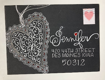
When you see the 3 hearts - that's what's known as hierarchy. It's a design principle that is used all the time, everywhere. You see it a lot in interior design. In mixing fabrics - designers will choose a small scale print or stripe or plaid - with a medium scale print/stripe/plaid and a large scale print/stripe/plaid - and the rest will be solid. I'm not saying this is a rule -- it's just an option.
Here's a detail to note: She spelled out IOWA so that the two address lines are the same length. It's a minor thing - but it is something I usually contemplate with addresses. I also like how she bumped up the point size of the zip code. It would be fine if it were the same size and tighter with the street and city/state. She chose to make the zip a little bigger - and drop it down a bit.
Either way would have been just fine -- the one thing that -for my eyes- would have been distracting - would have been if the zip code was not centered. With all the other elements on this envelope - I really like the consistency of the name/address/zip being centered.


No comments:
Post a Comment