Pages

Wednesday, August 31, 2022

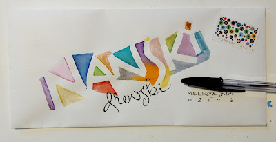
From Leslie to Nanski - Illumination related article

My *rats* comment yesterday was not directed at the envelope from SMASH - it was directed at my lack of organization.


Leslie outlined the letters and filled in with watercolor - by hand - without using any masking tape or masking fluid. Shout out to Nanski - I haven't heard from her in a while. I hope all is well. Of course, I have to refrain from thinking about tracking down everyone who was ever a regular exchanger -- as that would take a fair amount of time.

Nice combo of geometric shapes and the script last name.

***
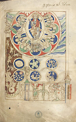
 Some of my readers might be on Flourish Forum - which is where I read this. It's pretty interesting on a few levels. Interesting how hard it was to figure out what the blue stuff was. Interesting to know a little more about the women who worked on illuminate manuscripts. It has been assumed (by some) that all that work was only done by men - but there were clearly women working in scriptoriums. Note to self: follow that link and see if the entire book is digitized.

https://getpocket.com/explore/item/why-a-medieval-woman-had-lapis-lazuli-hidden-in-her-teeth


An illuminated page from the Scivias, a 12th-century book written by the nun Hildegard of Bingen and painted by two anonymous artists. The blue pigment comes from lapis lazuli. Photo from the Heidelberg University Library / Cod. Sal. X,16 / page 2r.


Tuesday, August 30, 2022

Peppermint Patty - Smash Eames chair


As I recall, the Peanuts characters often said, "Rats!" which is what I said when I found this image in my folder of July mail. It's along story -- and I already have a long story for this post -- and I am writing this on Aug 29 - as I just discovered that there was no envelope today. So, you will have to wait for the longer SMASHMAN story.


Peppermint Patty alert - especially for the envelope exchangers - because you are going to want to save at least one of the Peppermint Patty stamps for Patty. I wish I could get everyone to buy a sheet and sent the Patty stamps to Patty - unused - so that she has a nice supply of them for her own correspondence. There are two on each sheet - so we could use one of them on the envelope that we send to Patty - and she would  have a very fun collection.

The closest I ever got to my own Jean stamp were the blue *jeans* on the Celebrate the Century stamp with the saddle shoes - and I have painful memories of being forced to wear saddle shoes. Yuk. 

I have not found the date of issuing for these stamps. I'm also curious about how popular Peanuts is these days. With all the advancements in animation, it seems like they are going to fade away for lack of flashiness. My favorite was always Pigpen.

I couldn't remember Linus's little sister's name (Sally) and found a list of other characters that I had forgotten - Rerun was another little brother to Linus and Lucy.

  • Spike – First appeared August 13, 1975. Snoopy's brother who lives in a desert outside Needles, California. 
  • Belle – First appeared June 28, 1976. She is Snoopy’s sister and has an unnamed teenage son.
  • Marbles – First appeared September 28, 1982. 
  • Olaf- First appeared January 24, 1989. 
  • Andy – First appeared February 14, 1994.

None of these people (animals?) are on the Wiki list - maybe they are animals -- and there are many characters on Wiki that I've never heard of - including Peggy Jean - "Charlie's girlfriend in later years" -- which caused me to have another caffeine induced idea -- some kind of book/film/play - with all those characters (grown up and aging) stuck in the same retirement facility. 

Monday, August 29, 2022

Six florals from Leslie (Technical question at the end) Ronde for Lucie

Leslie has been so generous - sending me several groups of envelopes - and I normally put just one or two envelopes in each post - but it was so much fun looking at these and comparing the different types of flowers - the level of legibility on the names, the coordinating stamps.


I like the style of the flowers with the *dotty* heart stamp and felt this one was in the midrange on legibility.


The butterfly is perfect with the flowers.


This one is almost entirely abstract and I have no idea if that is a name or just artistic scribbling.


This one made we wonder whatever happened to Nanski.


Another fun coordinating stamp.


And I thought this one was to someone in the Powers family - which is my daughter's married name - but I did not recall putting any of them on the list in quite a while -- and then I figured out that it says flowers.

Thanks again, Leslie, for sharing these -- and letting me splurge - by using them all up in one post.

***
Does anyone know what's going on with the option to subscribe to this blog?
Someone who had been subscribed - but is no longer getting the daily email - asked me what happened
It says on the [Layout] page - that the *gadget* is still connected.
I can see in the web-view - in upper right corner - there is a place to [Subscribe to]
however - it has some options that I do not understand. Obviously, I do not subscribe to my own blog. So - if anyone can explain this to me - please email me directly - ptenvelopes-at-aol-dot-com

Or - if you are getting a daily alert - please drop me an email and tell me how you have signed up.
Thank you.
***

For Lucie Y - I used a scroll tip -
Ignore the address part - the paper was very bleedy - and I needed a different nib --
but just went ahead - since this is just a rough idea.


Sunday, August 28, 2022

From CathyO in July - Yesterday's glitch


 This lovely envelope arrived in July. It is currently in the stack that is hiding from me. I will refrain from jabbering about how things hide from me. I thought there was a pretty card that went with it - but, it's hiding, too. And I won't go on and on about the glitch yesterday - when I had forgotten to schedule a post for Aug 27. Big thank you to ChuckM for emailing me promptly to see what was up - so that I could quickly insert this one. No matter how thorough I am at checking that things are in order - it seems like this happens from time to time. Maybe I need a pen pal in Europe who will alert me a little earlier in the day so that I find out about it by 5 am.

And and even bigger, bolder thank you to Chuck for sharing his envelopes that he gets done ahead of time. I f.i.n.a.l.l.y got around to starting 20 envelopes for the September exchange. At first I thought they were ho hum. I had dovetailed the assignment to include - grabbing the first 20 envelopes in that box of leftovers - and make them work. 

I have some clotheslines - and some Mary Engelbreit flowers - half done and waiting for names. Yee-ha!

Design tip for the day: feel free to steal layout ideas from CathyO. This one is lovely because of the strong contrast in size of name - compared to address. Not to mention that white ink is really pretty.

Saturday, August 27, 2022

Mary's rainbow - Jelly gouache

Ooops - forgot to schedule a post for today -- so this one is late.


Another very clever idea from Mary that she shared with us - from her series that she sends to a little buddy. I'm not sure where the name and address will go. Maybe in the cloud. Or it would be fun to put it along the bottom edge. Although that's not USPS scanner friendly.  Only 3 more days for me to fill up August and it is Aug 2nd as I write this. Fingers crossed that the good feelings about getting started on my exchange envelopes are not those tricky feelings that ditch me when I actually sit down at the desk.

***

I just spent an hour on YouTube watching videos about *jelly gouache.* It would be impossible to direct you to any specific video. In a weird way, my favorite one was by a very meticulous person showing how they cleaned up their palette. Many of the people who make these videos seem a bit quirky - she said - as if she was unaware that she's a quirk-meister herself.

Regular gouache is opaque watercolor and comes in a tube. You may thin it with water and make it look like watercolor, but it is usually applied in thicker coats and reminds some people of poster paints because of the consistency and coverage, but it is a higher quality paint. 

Regular gouache has to be thinned before you use it. The more expensive brands are definitely better. Apparently, someone thought it would be fun to try a version that is already thinned to a consistency where you could just dip your brush and paint - without having to thin it first.

They called this new consistency - jelly gouache - because it comes in little containers that look exactly like the individual servings of jelly used in restaurants. You can get sets of 18, 24 or 56 colors

Several of the people in the YouTube videos mention how cheap it is - which make me suspicious. They don't always like it at first, but it seems to grow on them after they get used to the consistency and ease of dipping. Obviously, it is easy to contaminate the colors if you accidentally dip a brush with one color on it - into another color.

I also saw some large containers that looked like a fruit drink pouch (Capri Sun) with a screw top on the corner. You can refill your small tubs from these large containers. 

I will not be sampling this product - but if any of you are art supply junkies - I bet you could have a ton of fun. If anyone tries it - I would welcome a review for the blog. 

a bunch of jelly gouache videos

Friday, August 26, 2022

Maggie's floral design from July


 Here is Maggie's pointed pen floral design for July. Her lettering is a pointed pen version of uncials. I just noticed that she has 33 and 29-cent stamps - and that made me think of looking at 20-cent stamps. Three 20-cent stamps would be a good option to cover the current 60-cent cost.

*** 2 minutes later.

I'm glad I looked. Three of my all-time favorite stamps were 20-cents.


And there is another special delivery stamp for 20-cents with an old fashioned mail truck that is a nice stamp. A lot of the 20-cent stamps are the ones that are engraved- so they have a nice feel to them. Or maybe all of them. Something else to investigate - when did they switch to other printing processes? And obviously all of them are old school perforated and moisture activated adhesive.


Thursday, August 25, 2022

Kitty env from April


 This is fun - and it was filled with goodies. I'm 99% sure this is from April. If not, please let me know. My stack of July mail is hiding from me and I've learned to spend less time searching and just wait for things to pop up - because they always do.

And there were goodies inside - a card as well as some cut-outs that I can use on some cards.


***
My friend Jan and I went on our outing to the local stamp seller. He used to be in a shop with his son and they sold Coins 'n' Stamps 'n' Stuff. That was literally the name of the shop. He is now in an office space with just the stamps so it is much nicer for us than the shop where we had to mingle with the coin-people. He has chairs and we can just sit and talk stamps. I'm sure he doesn't care if he ever sees us again. His preferred customers are people who buy huge quantities to resell. But, Jan and I had fun. I was mostly interested in getting some 3 and 4-cent stamps to put on envelopes that go inside envelopes that I'm not happy with - when I think I can do a better alternative - but don't want to spend 60-cents to compensate for my poor design choices. I now have a whole sheet of the coffee pot stamps. Nice fall colors.

Wednesday, August 24, 2022

Leslie's croquet to MrW


 Here's the same stamp we saw yesterday - using the colors as well as the subject matter. In a perfect world, we would have multiple examples of how to have fun with every stamp. But, it is not a perfect world. We're all just forging ahead through X, Y, and Z. Maybe even a few Ps and Qs, too.

A fun mail opportunity came up a couple weeks ago. My granddaughter was a week away from leaving for her first time at sleep-away camp. My daughter alerted me that the camp would hand out mail, if parents brought it with the kids. Everyone realizes that it's not logical to mail things from home that might arrive after the camper has gone home. I was thrilled to find out about this in time to prepare some mail and send it to Chicago before she left for camp. 

While I had only one day to get it done and in the mail - I had to decide how much to send. The looney part of me wanted to send about 20 things -- but, I decided to just sent 5 - and labeled them Day 1, etc. I don't know how they hand out mail. Maybe they just give everyone all their mail on Wednesday. I'll be curious to find out.

In one letter, I asked my granddaughter if she was interested in going to Penmanship Camp with Nanna - next year. I'm pondering the idea of taking her to IAMPETH with me. I suppose it will depend on where it is being held. I hope she loves camp and becomes one of those kids who loves camp so much she ends up being a counselor. But, I will not be disappointed if she is not a camp-kid. There are other ways to enrich a kid during the off-season.


Tuesday, August 23, 2022

Rachael - she's on a roll


 Rachael must have a thing about making sure that every single envelope she sends gets my *stealworthy* designation. I'm not going to be drawing any humming birds - but you know I'm going to be doing flowery letters with polka dots. I'm writing this on Aug 2 - two more days of collecting names for the Aug exchange - but, I could start my own envelopes. This would be my only chance to beat ChuckM - because his envelopes are all done and he's just waiting for the names....

Design comment - the colors of the stamp directed the colors she used. Her design has nothing to do with croquet. This is a good reminder that any stamp can offer up a nice color palette. Does anyone think that there are any colors that absolutely do not go together? IMHO - the neon colors can clash with the subdued organic colors - but having said that, I'll be on the lookout for examples where they work well together.

And here is an off-topic blurb about flowers - I'd be tempted to try this, but, I'm on a very restricted schedule. It's going in my *Maybe Never* folder.


There are more photos and details about the artist here


Monday, August 22, 2022

Chuck's July gnome + adaptive skateboarding


 This is so cute - and Bugs Bunny is a fun stamp. I like the way he did my name and the city/state in the more decorative style of lettering, but kept the street and zip more scanner friendly.

You probably thought you had heard the last of my early-bird visit to the Dew Tour skateboard competition. It's been too hot to do anything outside so I had to *surf* a bit in between the indoor chores. I figured that the Dew Tour would have some videos on YouTube and I was right.

I didn't watch all of them, but when I saw *adaptive* in the title of one of them - I was curious. It's heart warming to see that skateboarders have included a division for people with prosthetic limbs, no limbs, and on crutches.  

If you have any interest - here is the link to all of the videos. They keep adding more, so it's hard to find the Des Moines ones. 

all the Dew Tour videos

Here is the Des Moines video - Women's adaptive division. I'm not sure what the first woman has. The second woman has no legs and the third is the one on crutches. 

DSM women's adaptive winners


Sunday, August 21, 2022

From Faye in July


 Here is another use of the design principle - repetition - from Faye. It also reminded me that Sam and I had a discussion about running designs off the edge and I've noticed that I tend to run things off three edges. Faye ran off four edges - but the top edge only has that tiny bit in the upper left corner. She left some white space rather than making it an overall pattern.

The two flowers that run off the two left corners have a slight difference. And the red one in the lower right is different from the two on the left. Did she consciously make that decision? Or was it an innate design sense guiding her? Or both?

IMHO - when you are using repetition, you can be super rigid about it - or you can make a point of having some variation. There's no right or wrong way to make that decision. It's just a decision. Making any kind of art/design is an endless array of decisions. In some ways, it boggles the mind. 

Of course, you can just let your gut guide you and flip a coin whenever you have to make a decision. But, even that is making a decision. OK, I have to stop. I don't even know if I am making sense any more.

Saturday, August 20, 2022

Extras in the international mail

 These were the ones I inserted into the two that ran yesterday. For the first time in a very long time, I got out some actual nibs and ink, although it was actually watercolor. It was fun, even though I'm rusty. The little scroll tip nibs are so much fun. These were envelopes that I had rubber stamped at Jan's a while back. I used my exciting new/old stamps that I bought from Stamp King. 

Alessandra and Mia have one long name and one short name. Writing names that have a lot of contrast in length using a fairly small point size and keeping them on one line to minimize the contrast is one way to deal with names like that. You need to be more creative if you are going to do one name a lot larger than the other. Someday I should wander through the archive and pull out some of my favorite ways to combine super long and super short names.


Above are the tiny envelopes - they were joined by these medium sized envelopes that went in the outer envelopes - which were posted yesterday. Neither of them are brilliant - but they were both fun to do. The polka dot stamp is recycled - since it was not going through the mail. The coffee pot is one I have been hoarding - and it is on my list of stamps that hopefully I can get more of - when Jan and I go to the stamp dealer.

I was not happy with the colored pencil on Alessandra's and wish I had not added it. I think the little Y in Germany is cute. Did anyone notice how I spelled Germany in the top one? There is a mistake in her street address in the one below. It takes a lot of concentration for me to write words or names that are unfamiliar.  I've been reading another book on how memory works and it's really interesting - they keep figuring out more about how things work. Not so much on how to repair.


Friday, August 19, 2022

J's July to Alessandra and Mia


Chapter 2 - Jean appropriates another idea from somewhere. I didn't capture the source for this and I didn't follow it very closely. I just needed a reference for some flowers along the side. I was very late sending these for the July exchange. When I'm late with international addresses, I usually tuck a second envelope inside - a bonus for being patient and it also gives me a chance to do things that are not postal scanner friendly.

Here is the inspiration: 

I don't even like the actual line drawings - but I won't go into detail about why - it's just a matter of taste. I do think the weight of the lines harmonizes with the chunks of color. I knew I would not have huge chunks of color. I just needed an arrangement with some variety in shapes - and I did not want to deal with stems. I did Alessandra's first -and started with the large orange flower. Then added three tulips and then a smattering of smaller flowers and finally the polka dots.

My first mistake was leaving too much space between the items. But, I forged ahead and did all the colors, then went back and did the outlines. I like the blue-green color on the ferns in the inspiration piece - but didn't like that color on mine. So, when I had to do a second outer envelope for Mia, I tried a different green. I don't like it any better. 

On the second one, I also tried outlining in brown, because the stamp had so much brown. And then put in just a bit of black. It's rare that I don't put any black in. That worked out fine, but these two barely made it into the so-so range. The fun ideas that I did for the inserts were a little better. 

My main issue with my version is that it is overworked. I like my marker flowers to be a bit wispy and these are scrubby. I did a Google search image and nothing came up - so, apologies to the person who did this. If you want to. contact me, I will be happy to add an attribution.

I had a heck of a time coming up with the word attribution just now and weirdly - the word that came to mind was attrubition. Such a weird flipping of syllables - and at first it sounded just right to altered-Jean. Spell-check offered the correction. Apologies to spell check over that other very weird incident and my rant.


Thursday, August 18, 2022

Jean's pink ugh-mo to Mia

At first glance, it might not seem ugh-mo. The colors are fine - and they go with the stamp. It's only ugh-mo when you see what I was using for inspiration. It's on this IG account: carla's IG


I should not have tried to do something similar on such a large envelope. The proportion of any focal point to the overall size of the work is important. Then, I should have known that the hot pink lines for the plaid would be too bold. They might not look that bad - and that's because I spent time covering them up with a white gel pen. That was not a good use of time - but I did not know that until it was done. It might have been cool. I'm also highly annoyed with myself for not extending the crossbar on the A over both strokes.  The address is too big and bold. If the plaid had been softer, I could have drawn all the lines and then lettered the address over the top. I should have done it in pale colored pencil.

It might have worked to double stroke the letters in her name - to make the name the same proportion as Carla's. And the crossbar should have tilted upwards. I know that. When there is only one horizontal thing, tipped, it needs to tip up to the right to look happy. Downward tipping is the universal symbol for *dismal.* OK, that's an over-statement. But there are perky directions and somber directions.

And for the final blast - what kind of looney-toon would try this on that stupid ribbed paper? That was guaranteed to mess things up. I knew that going into the whole thing - but, chose to be stupid. Why? No excuse, sir. .

Many thanks to everyone who resisted the temptation to tell me that mine is just fine. It's not and I appreciate that all y'all agree with me.


Wednesday, August 17, 2022

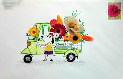
Mary's cute little truck full of flowers


Here is a second one from Mary using the flower stickers. She had a cute dog, too - and created this darling scene - with the lovely white space. The stamp is perfect, too. And if we want to dissect the work some more - the red-green with some yellow is a nice color combination. Red and green (complimentary colors) spice things up. Yellow showed up in the flowers and that made a yellow shirted dog look good. It would not be nearly as cute if the dog was wearing a blue shirt. And then black is a welcome addition to all kinds of compositions. The black wheels echo the centers of the flowers, the dogs nose and eyes. 

People who are good at putting things together don't always think about these things specifically. They scan their options and choose things based on their gut feelings. But the gut feelings may have been born with a natural design sense. Or they might have taken some classes. It would not be polite to post examples of clumsy color choices - unless I find examples of my own clumsiness. 

I will do that tomorrow. However, when I criticize my own work, I don't want anyone defending it. I'm not being hard on myself. I'm just being honest about decisions. It's been a while since I posted something of my own and then blasted it. So, brace yourselves. And remember -- you may not tell me that I am mistaken. 

***
My exchange envelopes went in the mail on Monday. Apologies to all -- very few of them pleased me. But, I am going to try the ChuckM system - and start my Sept envelopes now - so that they are ready to go and all I have to do is fill in names. 
 

Tuesday, August 16, 2022

Kitty on books from Mary - Stamp King / opium den

I really hope I remember to put some stamps in thought bubbles. It's probably cutest when the stamp features an item that one would dream about. The flowers are stickers and tomorrow there will be another one from Mary, using those stickers. Very clever. The stack of books is clever. 

 ***

So one of my alert readers spotted an article about the very last shop in Chicago that sells stamps - old stamps for stamp collectors. She knew I ventured into Chicago once in a while and as luck would have it, I had a short trip coming up. Mr Wilson and I were going to drive in on a Wednesday to hang with the grandkids while their parents had a long weekend getaway with friends - and then we'd head home on Monday. 

I checked the address of the stamp shop and it was literally one block off of the interstate - so it was going to be really easy to pop in. There are no words to describe how much stuff was packed into the shop. Multiply this photo by about 6. Six times that much stuff. 

There was space to walk between the stacks that were at least 5-feet high - but, it had to be single file and it would have been challenging if two people needed to switch places. I should have had MrW stand next to a pile so you could see that they were at least 5-6 feet high.

The name of the shop is Stamp King. Mr King invited me to sit down at his desk and he cleared a space that was about 24" x 24" and asked me what I was interested in. I wondered what the process would be if I asked for something that was in the bottom box in a stack of 6 banker's boxes. I took a chance and asked him if he had any stamps that he sold for less than face value.

I lucked out, because he was able to quickly retrieve a fairly small box (about a third of a banker's box) and I was able to choose some. He was disappointed that I was on a tight schedule and only had 20 minutes to shop. Unfortunately, it was like shooting heroin again after being straight for a few years. 

Since the price has gone up to 60-cents, I started wondering if any of the 30-cent stamps were old favorites. There were no 30-cent stamps. They jumped from 29 to 32. So, I searched 32-cent stamps and what I found has launched me into a really precarious place.

Stamps were 32-cents from Jan 1995 through Jan 1999. 1995 was the exact year I got seriously hooked on stamps. All I know is that I went a little bonkers when I saw all the 32-cent stamps. Like crack. It took me back to the euphoria of the early days.

On top of it -- I have the ongoing greeting card project with someone who has been as smitten as I am with postage and we've decided to revisit our local stamp dealer. I had stopped going a while ago. She stopped going because of covid.  Our dealer has moved -- so, we're going to venture out to his new space and see if we can get some stamps for less than face value. 

There's a longer story - but, I'll save the rest of it for when I report the outcome of Jean and Jan's Excellent Adventure.
Monday, August 15, 2022

Janet's July envelope - Quordle


Another stealworthy idea from Janet. It's nest-y with the chicken stamp - but it could easily be wreath-y and wreaths can be any season - or any occasion. The cancel looks really nice over the top part of the stamp. I imagine her mail goes to our main station. I wonder if I could get my son to put all my mail in the machine that does this particular cancel. I might need to lure him over with a tasty meal and see what he knows about the various cancels.

***

 I wrote about Wordle a while back and I've written about some of the other puzzles I've done. Mostly, I've lost interest in all but Wordle, and I noticed that there was an option to play Dordle, Quordle, and Octordle - where you try to figure out 2 words at the same time - or 4 - or 8. I tried the 2 and 4 a few times and it seemed way too hard. But, I kept coming back - and eventually - I got good at 4. I've never even tried 8 and somehow 2 at a time wasn't fun. 

Somewhere I saw the option to play Wordle with 6 letter words which I tried, but, I lost the link. Anyhow, as with most new games, it takes a while to get the hang of them - but, if you like games, you might want to give them a try. Scroll down on the link to find the options.

https://wordlegame.org

Here are two of my winning games.


Sunday, August 14, 2022

To Cathy in July - Drivel to be replaced (or not)


There was an envelope to Cathy posted earlier with that little label thing - 5 of them. I liked this little label envelope better but decided it was too hard for the PO to read so I put both of them inside that larger envelope which is a dud. I held onto it for quite a while - thinking I could add to it - and then ended up mailing it like that. That ridged paper is not friendly with all styles of lettering. It is like writing on corduroy.

***
I need to qualify the statement I made yesterday - that sports and art light up the same part of your brain. I have no business saying anything about how brains work. There's so much research on brain activity - but not everyone agrees - so whatever I read and then relate is just one opinion filtered through me and my own opinions which are based on nothing - which is not to say that I am right or wrong. It's possible that I am right.

All I know for sure is that I set a deadline to fill up Aug 1st through the 15th before I have my breakfast. So today and tomorrow are going to be complete drivel. Or maybe just today. I can write about Quordle tomorrow - which is only semi-drivel. 

And -- there is always the option to come back and replace this drivel with something new and interesting and more art related. I can put *drivel* in the title -- and hopefully something comes up over the next two weeks. 


Saturday, August 13, 2022

To Leslie in July - *Sports* report


Leslie's name fits in so nicely - but I never came up with a good idea for finishing it - so this is what she got. The pitiful navy dud (below) was inside - another idea that didn't work out. I was *grrrr-ing* at myself - and as I write this on July 31st, I've been puttering at my desk and I think I might be turning a corner. Although I will probably regret even saying that.


****

Yup. Farm/Weather/Sports - we are continuing with my faux-reports. I wondered how the skateboarders were doing at the competition that I attended before it actually started. Sky Brown won again in the women's division. No word on if she's going to join the Air Force. My older son did the fly-through-the-air-on ramps skating on in-line skates, not a skateboard. And I spent a couple summers (in the 90's) driving him around the midwest to little competitions in parking lots. It was a very strange time - hanging with teenaged boys. I'm happy to see that the *sport* has opened up to girls/women. The part where she is not wearing elbow pads or wrist guards is concerning. 


Once again - if you have to put up with offspring who are into sports and not arts - don't despair - the parts of your brain that light up when you make art are the same parts that light up when you play sports.

And if you want to kill a little more time before you get yourself back to something productive - here is the play-by-play of Sky's winning run. I always wondered how the tricks got their names. 

Brown’s best run, which scored an 89.66, started off with a crowd (and announcer) favorite frontside 360, then went into frontside stalefish air, alley-oop transfer over the hip, backside tailslide through the corner, backside lipslide, melon air over the box jump, tuck-knee invert, backside Smith grind, frontside ollie, frontside nosegrind, frontside 540, and backside noseblunt Indy.


Friday, August 12, 2022

To Rachael in July - *Weather* report


This is one of the better results with the clothesline caps. It's nice to leave plenty of space between letters for the colored pencil and that stamp is ideal if you like to use many colors but you don't want to agonize over which colors or how many.

 ***

After the farm report - it seems like we should have a weather report. In Aug of 2020, a derecho blew through Des Moines and surrounding areas (states) causing as much damage as a tornado. Most of us had never heard of a derecho and we hope it was a once a millennium event. I just saw a report of a haboob in NW Iowa. I've never heard of a haboob - and neither has spell-check. This is very concerning. Google has heard of it - its a desert sandstorm. Not that we have deserts in NW Iowa, but we have dirt - and between derechos and haboobs - we're talking Dust Bowls. 

I'm not going to delve any further into ominous weather. I'm going to switch to the way I use those dash marks instead of commas. I extend my most sincere apologies to any punctuation specialists who read the blog. 

I had to check the spelling of derecho - and stumbled across this weather map. I don't even know how to *read* weather maps - I just know that those are some really big hunks of weather covering a lot of territory. And here is how you pronounce it: də-rā′chō (duh-raitch-oh)


Thursday, August 11, 2022

From Leslie to Bridget - PO deciphering process video


I found some emails from Leslie - that she sent in Oct of last year - with all kinds of fun mail. This is a magazine page inside a translucent envelope. It's perfect with the international stamp. Bridget has so many letters that lend themselves to swoopy script. The back of the envelope is fun, too. Leslie puts the recipient's address on the back - so that the postal workers only have one option on where to send it. I've done that from time to time - but usually forget....


***

Here is an 8 minute video for those of us who love learning about the inner workings of the post office. It is an in-depth look at what happens when the scanners cannot read the penmanship on the mail. There are many people - trained to look at the images and see if they can figure it out. 

It answers some of our questions about the scanners - and reinforces my decision to make my envelopes scanner-friendly. Don't miss the big chart on the wall that shows them what *cursive* looks like. They only have one style. If I ever find their actual address - I should send them some wall charts on other styles - like copperplate and Spencerian.

https://www.youtube.com/watch?v=XxCha4Kez9c


Wednesday, August 10, 2022

Kate's splendid Title IX - USAF recruiting


I mentioned this one a couple times when I ran my own ideas that used this stamp. It has multiple ideas that I need to steal. The positioning of the stamp is so perfect for the cancel - because it doesn't obliterate the stamp - just nicks the top. The tiny writing is so nice. And repeating the motif from the stamp, and making it larger, covers two of our design principles - repetition (one of the most useful tools) and scale - playing around with the relative size of an element. 

Karl and I have launched a discussion on the elements and principles of design. The topic has come up previously. It will keep popping up in a chaotic order because Karl and I are letting chaos be our guide. 

***


 Even though I missed out on the actual skater festival - I did take this one shot of the big promotional mobile unit that the USAirForce had brought in. I'd sure like to know what kind of conversation led to them putting actual service people into a mobile unit and telling them to go recruit skaters and skate boarders. I'd reeeeeeeeeally like to know how many people they sign up at skater events. On the bell curve of people who are going to be compatible with a military life style, I'd have to put skaters way out at the very far end of probably not good candidates.

Or, maybe the mobile unit just has to find places to stop along the way and they do some of these random events because they have time to kill between the logical events (like state fairs).  I was so tempted to go back and talk to the recruiters to see what kind of info I could get out of them. 

Last year's winners here in DSM. Apparently our skate park is one of the biggest -- so they came back this year.


And a photo of pony express riders because it was in a folder that I am clearing out - and they look like they would have been good skateboarders. I think the skateboarders are modern versions of pony express guys.