Thursday, April 30, 2015

smash - fade

so much better than alyce's. toothier paper made all the difference in the world. i'd like to do a bunch more of these, but, all y'all would get bored and storm my studio with your pitchforks. did anyone hear the big controversy about the 3 pronged pitchfork in the painting, Americn Gothic? gosh, i love a good pitchfork debate.

as usual, i started adding dots.

Wednesday, April 29, 2015

kathy's ramirez flowers

coulda-shoulda-woulda spent more time on the red flowers, but more interested in cleaning desk. tried a few ways to shade the leaves. started on the left but don't really think any of them are quite right. like the concept and would be interested in trying another version of this - time permitting.

white gel pen and colored pencil.

the rest of the info will float above the flowers in tiny black lettering.

Tuesday, April 28, 2015

alyce - fade

i named this style *fade* because of the way the red fades out. the last two envelopes i sent to alyce had her last name spelled incorrectly., i was finished with this one when i realized that i had forgotten the l in alyce. so i stuck it in. the paper was too smooth and the S is too wide and the S should have a curl on the top...but, the point is to toss out ideas the readers might use. hopefully you look at some of my doggy-er envelopes and think, "Jeesh, I could do better than that." and then you pick up pens and markers and do so.

Pigma microns for the black and Cocoiro for the red - or anything else you might have on hand.

Monday, April 27, 2015

new n.c. penpal

i never know if people want to be identified on the blog. this is such a cool font. i shall be working on a version of it.

stealworthy detail: the border around the top stamp.

a pox on the p.o. for the nasty black marks.

thanks to my new penpal, feel free to leave a comment if you want everyone to know who you are.

Sunday, April 26, 2015

kathy's wilt

this will probably be the last one in the series. i finally did one where i penciled and planned so that there was better interlocking of letters. i was tired of the wilt stamp. but now that i look at it, the shape is so round, i guess i will use the wilt stamp when i mail it. this also looks like the cliche *western* lettering. so any cowboy stamp would look good. and johnny cash would be perfect.

OT - upcoming stamps

http://www.michaeldoret.com/blog/?p=3270


off topic today, although stamps are 33% of this blog.
nice article about the design process behind these stamps.

Summer Harvest Booklet

surfing around Michael Doret's site, it was fun to find that he has posted free guides for how to use his fonts. lots of valuable information.

http://illoz.com/doret/?section=downloads

my personal favorite tip, because i have mentioned it a few times, usually when i have *broken* the rule - and whenever i break the rule, it looks dreadful.

Saturday, April 25, 2015

2 ho-hum ramirez ideas

still not finding any ideas i like that go with these stamps. but enjoying the idea of posting via email. this is an email from my computer, not from the phone, so it is not inserting caps for me.

ms munster

ms munster and i have never met in person, but i feel like we were college roommates. we like a lot of the same things, like red and black and contrast in size and drop shadows. so pretty.

thank you


i decided to add another one from ms munster - her envelopes are inspirational on many levels. if you are a beginner, look at the arrangement of the elements. to write like ms munster, you are going to have to take a bunch of workshops with rock star scribes.


bonus post

a second attempt
not spectacular.
maybe i should start drawing the train

Friday, April 24, 2015

Test

I just discovered that I could post to the blog from my phone. This is a test to see if it works. It is my latest lettering and little drawings to appear in Midwest Living magazine.

http://www.midwestliving.com/food/desserts/cakes-cupcakes/six-mini-cake-recipes/

they put the recipes online in a format that works for the internet. it does not include the artwork that is in the magazine. i also have the inside scoop on the Midwest Living recipes. they are not the quick and easy ones, but they are super yummy. the name of the article is baby cakes, so they are small in size. if you want a regular size cake, they have more recipes on the website.

smash's wilt

here is the solution to the problem of too linear and not enough interlocking. i also did one that was all dots and that is a very nice option, too. i'll only show that option if i have requests. i suspect this will not be a popular style.

Thursday, April 23, 2015

next envelope exchange SIGN UP

it looks like everyone got their last exchange envelopes in the mail, so, jan and i decided to do another exchange.

please send her the info by Friday, May 1
lists will be sent out promptly
mail your envelopes by May 25

decorate the envelopes
no theme
calligraphy optional
computer art is fine
beginners are most welcome
envelope may be empty (enclosures optional)

each person will get a list of 5 people to mail to.
each person will receive 5 envelopes, but not necessarily from the same 5 you send to.

send your info to
janhardt  (at) mchsi.com

name
address
city/state
country
email

there is a new envelope in the post below

ramirez arch for alex

sometimes when i am in the middle of a big envelope job, i stop and surf. and sometimes i see something that is so cute, i just have to do my own version. the original had rain and also a spiral shooting up, which was lovely...but, after i did this much, i thought it was enough. i did not have any stamp in mind - but like this one. the street address would go under the line. the buildings were made with a prismacolor marker. the details are g-tecs, pigmas and a white gelly roll.
it would be fun to do some actual skylines of actual cities.

my envelope is a kindred spirit with finnbadger's envelope.
finn has some good examples of pairings on his blog.
you know how there are *wine pairings*? well, we have invented the *envelope pairing.*
we're so *on trend.*

Wednesday, April 22, 2015

wilt - hester and chuck

hester's looks better because the letters pop up and down and do more interlocking. but, i figured out another layer that resolves the problem of too-linear. this style is meant to interlock, but i would have to pencil and plan for that to happen and i'm lazy.

bonus post

https://www.pinterest.com/dinnerat8/lovely-letters-mail/

this lettering drew me into the board above which has an amazing collection of vintage envelopes. i could fill my blog with vintage mail art, but i have no idea if anyone else likes it. i was also pretty happy to see two of my own envelopes on the board. they are my stick figures wearing stamps and a clothesline. it is comforting to see that other people like my quick-and-silly as much as i do.

now i have to decide if i am even going to try to write something like this. i wish i could follow the link and find out the origin. i guess i have to open a tumbler account to search.

Tuesday, April 21, 2015

from elizabeth

another one from the february exchange. hearts are not restricted to one holiday. they are appropriate all year.

i see a texture on the lettering and wonder if she has a set of letters cut out and stamps them. maybe she will tell us.

thank you elizabeth


Monday, April 20, 2015

tiger iron - jack & cathy

melding of the tiger and wrought iron lettering. i like the little toothy detail. not sure how to do the address on jack's. i used white on cathy's and it was a little blah. i hope i don't mess it up when i try a color. either red or purple.

Sunday, April 19, 2015

bonus post - ramirez for finn and don

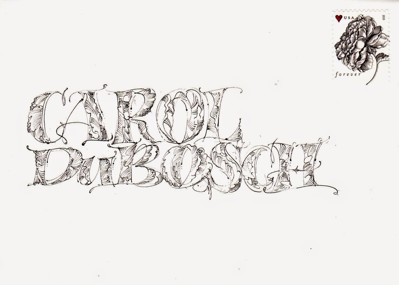
 today's regularly scheduled post is below this one. finn was curious about the ideas i might have to go with the ramirez stamps. i have several ho-hum ideas scheduled to appear in june. this one is really awful. i haven't mastered primitive lettering, yet. i think it just needs some horizontal lines.

the second idea is an attempt to show donald that you can do a fun envelope with no lettering aptitude and no fancy pens. he was going to return the birthday card that i sent to him - to me on my birthday. but, he said that he did not know how to decorate the envelope. i told him i would post an example of something fun and decorative that did not require skill or special pens or markers.

 i used a pencil and rather than making a specific style of lettering, i made a series of ovals and scribbles that when put together create symbols that are letters that make two names. so, DK, i would like you to try making some ovals and some scribbles and see if you can make some letters that are fun.

the only other concept to notice and apply is the spacing between the letters. there is probably more space than what most people would do. *space* is equally as important as everything else. no matter which art you study, you learn that in the 101 class. and, as a mathematical-scientist, DK, maybe you can relate to the importance of understanding space as being equal to matter. maybe this is the portal to your new career as a visual artist.

the s is just a slightly curvy line. it does not fit with the other letters, but, that's OK. it provides visual interest. things do not have to be matchy-matchy.

stamp stacking

this is one of the most frequently pinned envelopes on pinterest. i hope this is the original site:

http://hiroko-yoshimoto.tumblr.com/post/62894128777

hiroko was born in 1977 and there aren't many words in english to share with you. her style is so simple and charming. maybe it will inspire you to make some drawings. if time permits, i might do my own stick figure version of this. it would certainly be a way to use up all my stamps.

below is one of two envelopes from my blog that i see the most often on pinterest. i need to dig further to find the other one. or just surf a little more, but today is d-day. discipline-day. i really am going to hit some deadlines.

pinterest has a new feature where they toss in suggested pins that they think you might like. i have soooooo many of my blog envelopes circulating around the boards, that every morning, they are pitching my own envelopes to me.


Saturday, April 18, 2015

powers cocoiro heart

i tried this heart with the cocoiro and it was lots of fun. i won't be mailing it to canada. i have heard that the canadian postal system frowns on mail art.

it would be a good way to create an envelope in the US. the essential information is very clear.

i never plan any of these heart ideas. it would be interesting to see what happened if i actually took the time to rough out the way the letters fit together.....

Friday, April 17, 2015

cathy's ramirez flower + flap

this is my version of the florence-style flap...which is coming up in a few weeks.

one idea inspired very loosely by the ramirez stamp. i like the white scallops, but that lettering really doesn't go with the stamp. so far, my ramirez series is very ho-hum.

Thursday, April 16, 2015

postcard + graceful envelope

this was on pinterest with no way of tracing origin. it is an altered book cover -turned into a postcard. altered book covers are where you take a book cover and alter it. i guess that's obvious. the *wait for the postman* lettering is what is added. the postage and address is on the flip side. it cracked me up. so, i decided to stick it in with an actual envelope.

i ignored the graceful envelope contest this year. just too busy. but this one from some other year is fun.
kathy barker is the artist. she did a good job of layering the stamps and the border.

can't wait to find out if jeri hobart gets in again. she's been uber successful with her entries. i don't even remember what the theme was this year.


Wednesday, April 15, 2015

carol's peony - and more

carol left a nice comment on the first peony versal, so this is a thank you to her. i used a nicer envelope and spent a little more time on it. it's mesmerizing to make random flowery patterns.

then i saw this lady on Pinterest and i can see myself heading in that direction. a couple other photos may be viewed here.

http://www.folklorweb.cz/clanky/20070521.php

if you checked the blog early yesterday, you might have missed my bonus post (below this one) and the photo of all the great mail that i received over the past few days. thanks again to my penpals.

Tuesday, April 14, 2015

bonus post - my mail

bumper crop of mail in my mail box. it seems like i get a lot of mail this time of year. just wanted to let everyone know that your mail arrived (even if you do not spot it in this shot)

these will be popping up in the june posts.

i really enjoy the ones that have a self-critique of the lettering or design. it shows that people actually read and apply some of the things i talk about. and several people have provided some nice stealworthy ideas. 

thanks.

back to the drawing board.
and don't miss today's regularly scheduled post right below.

alex's forks

this is a first. smash sent me an adorable envelope with my name spelled out in kitchen utensils. it is way cuter than this. but, my posse has been so good about sending me mail, that the envelope from smash is scheduled to appear in may. i have to just fill the blog in a linear fashion, for efficiency sake. i have been alternating between received mail and sent mail. and the received mail exceeded the sent mail. so, sometimes my *stealing* of ideas will appear before the actual idea. my complaint department is open 24/7. if my method of posting stolen ideas prior to posting the original idea is upsetting, please vent your spleen right down there in the comment section. our staff of calm and sensible people (you know who you are) will offer insight and suggestions for coping.

Monday, April 13, 2015

cathy's tulips

these are from cathy o'rear. some of my penpals are very accomplished calligraphers. these two make me want to pull out the ink and nibs and get serious. that's not going to happen. but if you read the blog and you are young...you might consider taking some actual classes.

my question for cathy (a postal worker) why did the top one get a bar code and the other one did not?

so pretty. thanks for participating in the last exchange.

Sunday, April 12, 2015

kathleen's janis

i am running out of janis stamps and will really miss them. these letters might have looked better filled in, but i rather like them outlines. kathleen sent me the postcard - with the very specific instructions on the back. i'm pretty sure i will have to test the p.o. and see if they will deliver it even if i ignore the rules.

i don't have a full font of these letters, i just built them off the janis promo material that went with the stamp.

Saturday, April 11, 2015

pablo dugaz

this image jumped out at me. i googled the name -pablo dugaz- and the only thing that came up in english was a PDF from john neal. by the way, if you have a budget for magazines, you should subscribe to Letter Arts Review as well as Bound and Lettered

here is the link to the PDF. scroll down and you will see more images of pablo's work. also, if you google his name, you will see many more images.

http://cdn.johnnealbooks.com/downloads/BL10-3pgs.pdf

i like the lettering as well as the layout. plus he does cut paper work, which i used to do, but i blew out my elbow and had to retire.

Friday, April 10, 2015

ann-margret & debbie (coco)

these two readers left comments so, i used their names on some envelopes. ann-margret simply said WOW, so i figured i would WOW her in person. then, assuming the readers are pretty tired of hearts, i thought i would try putting the curly coco into a straight line. it didn't wow me. but right after this, i did have an idea that is a complete WOW. it will be showing up in the middle of may. trust me, it's pretty spectacular. OK, it's just more curly lettering. but, it certainly elevated me out of my current state of blah.

and as i look at this in the preview, i know how to make the bottom one better. choose a longer name. i'm thinking stella.papadopoulas will be spectacular. sadly, stella and ann-margret live in canada, so it's pretty expensive to mail to them.

Thursday, April 9, 2015

bonus post - from/to stamp

 i wanted to bump in front of the scheduled posts because i like this new stamp so much. ms miss used one of those stamp pads that has 5 colors - and just stamped the pad directly on the envelope to give herself a design element that is perfect for the stamp.

purger-jean no longer has her 5 color stamp pad, so i just stacked the words using approx the same colors. this was super quick and easy (because i actually needed to mail something to jan)

i see a series of stacking in our future

today's post is below this one.

i decided to add a drop shadow
not sure that i like it better.
it might have been better without.


from miss munster - paste paper

this was from the february exchange. it is paste paper. if you don't know what pate paper is, google it and you will see tons of examples. making paste paper takes up a lot of space and is best done in an area where you can drip and splatter and those are two activities that are banned from my residence. so, i will just appreciate the paste paper that shows up in my mailbox.

thank you miss munster.

the idea of three lines, in a grid, alternated is highly stealworthy.

Wednesday, April 8, 2015

bonus post - york scribes

the York Scribes are celebrating their 25th Anniversary.

they are inviting anyone who shares their love of lettering to send a greeting (card or decorated envelope) to the address below.
they need to arrive by May 25th for their celebration.

here is the address:

York Scribes
20 New Forge Court
Haxby
York
YO32 3YA

they are about 3 hours north of London

i forgot to put the tail on the y in anniversary, so it is rather clumsy. but....it's better than no mail.

CKBOSS on pinterest


as i have mentioned a couple times, if i allow myself to surf on pinterest, i find some boards with really cool mail art. and sometimes, if a board is really fantastic, i check to see who created the board. this board was fabulous. i was not expecting to see any of my own work. there were 2,853 images. as i scrolled along, i saw that she had pinned my all time favorite envelope, done by the lovely nancy hills. (see below) so then, i had to keep scrolling, to see if she had any more from my blog. i was pretty happy to see that she had this one - one of mine...


and, then i got curious about the person, so i googled her and she was a designer for ralph lauren for over 20 years. it was fun to read about her. she is now on her own. all the rest of her boards are full of nice images, too. they make me want to go back and edit my own. but, that's not going to happen. besides, my *look* is truly hodge-podge. anyhow, i was flattered that she found my stick figures *pin-worthy.*

this is the one by nancy that was on her blog. i never get tired of looking at it.


Tuesday, April 7, 2015

elizabeth's versal peony

these versals were going to be something else. after i had the preony stamps in hand, and could feel the cool ridges that feel like real engraving, i thought it would be fun to put engraving details on the versals, but the envelope is super cheap, so i am not going to spend a lot of time on this envelope and hope to make a better version on a really nice 100% cotton envelope.

i thought the ramirez stamps would be my new favorites, but i think the peony stamp might be in the lead at the moment.

from jan - spilled ink

oh-my-gosh is right. spilled ink is a nightmare. the enclosed booklet is fantastic. i am tempted to scan the whole thing - or maybe devote one month to the history of the alphabet. decisions decisions.

thank you jan


center page spread from the book


Monday, April 6, 2015

t.y. jan (peony)

this is a multiple thank you to jan.
first, she left a comment a couple days ago when i tried to turn over a new leaf and use caps. she said that i should stick with my own personal style, which is clearly something i lifted from e.e.cummings. and how ironic that today, (i am writing this on sunday to appear on monday) there was a review of a book about e.e.cummings on my favorite internet source for everything that has words (not just pictures)
and it was inspiring to read just the review - so here it is for anyone who is interested.

http://www.brainpickings.org/2015/03/30/enormous-smallness-e-e-cummings-matthew-burgess/?mc_cid=eb6acb519f&mc_eid=4fc6ee0682

and second thank you to jan - for helping me get a mailing out on friday. i nearly blew out my wrist. it is sore today. i hope jan is OK. warning to any of you who think you want to do mailings of custom lined envelopes....be very careful of repetitive motions.

this envelope needs one more heart. i wish i had left more room to the left of the j.

Sunday, April 5, 2015

herbert a. franke - multi stamps

this was on pinterest and it jumped out at me as a perfect way to tie together two stamps. or three or four. you wouldn't even need the birds, just the banner. i hope i have time to explore this idea.

i like the way the ships are down in towards the horizon.

and that dangling leaf is also stealworthy.


the penmanship is also worth noting. very interesting - i might have to try it out. it looks like bent wire. those Ms are beyond steal-worthy.

this pin allowed me to go to the source and they were very specific about requesting attribution when re-posting, so i hope i have included everything they requested.

Credit this photo: State Archives of Florida, Florida Memory, http://floridamemory.com/items/show/258092
(please include photographer's name when noted).

Looks to me like the photographer is Herbert A. Franke.

Here is the link:
https://www.floridamemory.com/items/show/258092

Saturday, April 4, 2015

String Font

If you go to myfonts.com and look at the font named String, you will see an A that is prettier than this one. I hope I find time to look at all of the String caps. I loved this A, even though I did not do a very good impersonation of it. I had to double stroke to disguise the fact that the gel pen is not working and I might have to toss it. Gel pens are frustrating....if you ever need to do a bunch of envelopes with gel pens, just order some online. Don't bother buying them in a store because you never know if someone has tested one. Once the cap is taken off, they can go bad. I guess you can buy them off the shelf if they are in a bubble package.
Uniball and Gelly Roll are the two brands that tend to work best for me.

Note to Jan - following the break