
Friday, October 31, 2014
happy halloween
Thursday, October 30, 2014
from smash

one thing i do, when i am doing designs along these lines --- is to use all lower case. there is something about all lower case that sets up the whole design to be a little out of whack. so if there are other minor defects...they don't really bother the eye, because all lower case sets the stage for *anything goes* which includes jiggles...which means.....i can't wait to appropriate this idea :-)
Wednesday, October 29, 2014
from sandy

i know i will struggle with my envelope to sandy because she has an address with one of those really long street addresses. i'm curious to know how she would have addressed this envelope if it was going to her address?
thanks, sandy
Tuesday, October 28, 2014
betsey dunlap knock off

even though none of the stamps have teal, i am ok with how they look on this envelope.
Monday, October 27, 2014
happy autumn

sadly, jan did not jump on my offer to organize all my images. maybe she is out of town and will be getting back to me shortly.
p.s. this whole article won the top award at the art directors yearly awards event. Tara Okerstrom-Bauer and Hannah Agran deserve 66% of the credit. or more....they come up with the words and concept. i just figure out a way to fit things together and choose styles of lettering that work.
scroll down to the post below to see today's envelope. this post is an extra one - not in the pre-scheduled group.
from hester

thanks, hester :-)
Sunday, October 26, 2014
nibs and ink blog - update

to the right is a sample page from Erica McPhee. i met Erica (online) many years ago. she has started The Flourish Forum which is a fast growing internet group for penmanship and calligraphy. you can cruise around and read all kinds of information and check out the tutorials. and you can join the group and participate in conversations and ask questions.
there may be Fourish Forum members who are finding my blog for the first time...so *HI* to anyone who has just found my blog. i have posted one new envelope every day for nearly 5 years. i have over 50 new envelopes lined up and ready to go. so if you enjoy mail art, this is a fun place to snag some ideas. sadly, nothing is organized. but, maybe i will find a volunteer to organize them into categories (i'm lookin' at you, jan - she has a PhD in organization)
the new envelope for today is in the post below this one - so scroll down :-)
here is the link to Erica's website:
http://paperwhitestudio.com/
and here is the link to The Flourish Forum
http://theflourishforum.com/ click on the teal button that says Enter the FORUM, on the right
from karen

thanks, karen :-)
i like the stamp in the landscape orientation. it looks nice to rotate your stamps so that the rectangles of the envelope and name and stamp all echo each other.
Saturday, October 25, 2014
from eric in france

thanks eric!
eric's blog
http://mymailartworld.blogspot.com/
Friday, October 24, 2014
*swat*

Thursday, October 23, 2014
this just in from ruth

the card folds into a 6-pointed star. the upsidedown cancel on the envelopes is pretty funny. the hand, that is turning off a light switch is a little spooky. the tree looks like it is looking down at the spooky hand which is in a grave.
love the drawings. they look like they were inspired by ed emberly (?) i have to go back and look in the archives....
thanks ruth!!!

Wednesday, October 22, 2014
from karen

i'll have to pay attention and see if i can figure out why that it. my first guess is that waiting zones are usually full of distractions.
thank you karen for the mail. everyone enjoys seeing examples from other artists.
oh...i like how she had a nice hand cancel....and *boo* to the p.o. for sending it through the machine. we didn't need that extra wave pattern at the top. although it is not as bad as some of those wacky tire tread cancels they apply once in a while.
Tuesday, October 21, 2014
the rest of the exchange envelopes

i am still hooked on the wrought iron lettering and it is getting looser and looser.
i dropped them in the mail yesterday. i think the deadline to mail the exchange envelopes was the end of october. you still have a few days to go.
thanks again to jan for doing all the work. i have been lining up (queuing up - for my international readers) posts and am all the way up to the end of november, so it will be a while before you see all the fun envelopes that i received. thanks to everyone who participated.
today's post is below. this is an extra post.
guest artists every day - for a while

or, i will add a bonus post on days that i have something to share in addition to the post of the day.
this artist did not say whether or not it was OK to post the name, so, i will leave it anonymous for now. he or she can always leave a comment :-)
a very fun sharpie design, lovingly outlined. the address was on the flip side with the stamp.
it takes a lot of self control for me to keep at the chores and not take a vacation day to do sharpie and outline designs...
speaking of markers, ruth asked me to discuss markers.
i never met a marker i didn't like. i remember the very first Magic Marker that my dad brought home. a little glass bottle with a felt wick. i only got to use it once in a while. most of the time, i had to satisfy my addiction to lettering at my chalk board. i'm sure chalk was cheaper than the marker.
but i digress. click to see the rest of the comments on markers. i didn't want this post to be too long.
Monday, October 20, 2014
from jan

it is very 3D - layered and makes me want to take a trip.
Sunday, October 19, 2014
repeat?

exchange update
%2B%2Bedit.jpg)
i will mail the exchange envelopes today. thanks to everyone who participated and big thanks to jan for organizing it. :-)
on a side note, i will be doing a blog post on flourishing that will be on the nibs and ink blog. maybe that will jolt me out of my wrought iron rut.
Saturday, October 18, 2014
from smash

design lesson:
grids rock
Friday, October 17, 2014
pastel janis

Thursday, October 16, 2014
karen's carlish tan

love that notecard. wonder what kind of tool she used?
thank you, karen.
Wednesday, October 15, 2014
neon janis for cathy

so, i'm ok with that portion of the idea. maybe one day i will redo the idea and make it more lovable.
Tuesday, October 14, 2014
karen carlish

perfect with the stamp.
thank you , karen.
Monday, October 13, 2014
new stamps
be sure to check out all the fun new stamps at
usps.com https://store.usps.com/store/browse/category.jsp?categoryId=buy-stamps
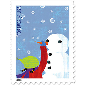
one of 4 winter designs
there is an envelope below - in the daily post. this is an extra post for today.
usps.com https://store.usps.com/store/browse/category.jsp?categoryId=buy-stamps
one of 4 winter designs
there is an envelope below - in the daily post. this is an extra post for today.
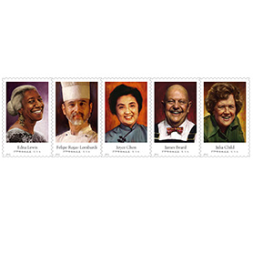
potter rant no. 4

the bottom one...i could rant about how ugly it is (because the creature is some kind of mutant)...but we can just look on the bright side...i only have 6 harry potter stamps left.
maybe i will have some crazy wonderful brainstorm.
or maybe i can find something heavy to mail to miss cathy ... anybody have any good ideas?
p.s. i pondered several ways to make these two into envelopes that i would just love. since i had left the street addresses as the last element to add, i had basically painted myself into a corner. sometimes, i love the challenge of being in the corner and figuring out a solution. with these two, and with the knowledge that there are 6 to go, i decided to just leave them very simple. there is nothing wrong with simple. and then i pondered how the whole set will look together. my gut tells me that if cathy ever decides to put all of them in a grid - and make a pleasing arrangement of the entire group, these two will have a purpose. somehow they will fit in with all their siblings. they will be the two quiet ones that offer some visual relief. i will refrain from pontificating about the value of having a variety of personalities in any given family or group. (unless someone really wants to hear it - hahaha)
Sunday, October 12, 2014
smash's cherry blossoms

i'm thinking she dipped an ear of corn in her ink or paint to make those very cool marks.
love it.
thank you smash-girl :-)
Saturday, October 11, 2014
potter rant no. 3

p.s. since i am on a roll with the design tips, i will mention that on this one, i used contrast in size to tuck the address in - under the stamp - and it looked very nice. very tiny white lettering that became the third element.
i only used contrast in size. i knew that i would not like to include contrast in color. the stamp has contrast in color.
and...
i want to make it perfectly clear that i am not suggesting that the ways i chose to make my design decisions are in a any way the only choices or the best choices. there is no right or wrong or cookie cutter formula. things like contrast are simply vocabulary words that you utilize when you make decisions about where you are going with your composition. i frequently put 3 elements on an envelope. but not always. looking at this again, i can see that a big bold black address (rather than tiny and white) could have worked out just fine.
Friday, October 10, 2014
miss cathy's spectacles

but this is so perfect. i might have to do some more spectacle envelopes. the i in wilson is so much fun.
of the people currently exchanging mail with me...finnbadger phil and elizabeth are the only two who have an i in their name
amy, jan, cathy, karen, jack, alex, - none of you have an i --- although a double cracked x for alex would be fun. i shall be stealing this idea. thank you very much.
i have been LOVING the janis joplin stamps. once again, they did not appeal to me at first glance, but they evolved into favorites. (yes, jeri, i just remembered that you are a frequent exchanger with an i in your name :-)
Thursday, October 9, 2014
potter rant no. 2

i have no idea where i am going to put the street address.....
p.s. once again, i used *contrast* to solve my problem and i was very pleased with the results. i used a tiny .25 G-Tec pen and stacked the number and name of her street, flush right, up against the stamp. the witch looked like she was staring at the address, which was just the element that made me very satisfied with the results.
Wednesday, October 8, 2014
8th of the month - folon envelopes
http://sharonkaycreech.blogspot.com/2011/05/illustrated-envelopes-and-cards.html

this blog has 4 images from the best envelope book ever. quite a while ago, i posted an image from this book.
kathy actually has the book...and i forgot all about the blog post. the blog above only has 4 images
but if you google
Jean-Michel Folon Lettres a Giorgio
you will see a bunch more
sometimes when i google that, i see items from my blog, too....not sure why, but i am delighted to be lumped in with him.
Tuesday, October 7, 2014
potter rant no. 1

p.s. as you know, i write these posts a few weeks in advance and have them scheduled to pop up every morning. when i filled in the space with the rest of the address, i actually liked it a lot better. i actually *fixed* it. so the tip for today is to pick out one thing that does not bother you, ask what you like about it and then use that answer to insert more of what you like. in this case, i liked the contrast of the x-height of the lettering, so i used that contrast to finish the envelope - instead of trying to add another element. peter thornton teaches a whole weekend workshop on contrast. if you ever have a chance to take that workshop you will probably find it chock full of very useful information.
Monday, October 6, 2014
karen's elephant

Sunday, October 5, 2014
neon janis for smash and alex

after i did the chunky easy blocky lettering, i did some outlining with gel pens.
i don't think the scans do a very good job of capturing the neon-bright quality of the ink.
the brand of highlighter is zazzle. they are very old. i remember buying them back when i did travel teaching gigs. wow, that was a long time ago.

i added a navy shade to the top one and then took a phone photo to see if i could get a better impression of the color. the navy shade helps. it is still a little blah, but might get sent just to keep up my de-clutter-momentum.
[several days later - i put two more stamps on the envelope to smash-girl and like it so much better. wish the scanner did a better job with the colors]
also, there is a new post on the other blog
for anyone who is trying the nibs and ink
http://nibsandink.blogspot.com/


Saturday, October 4, 2014
smash - ode to ingmire

thank you, smash ---
Friday, October 3, 2014
elizabeth inspired

thanks elizabeth
Thursday, October 2, 2014
karen's mosaic

thank you, karen :-)
bah - to the post office for sending it through a second machine. you didn't need to do that.
Wednesday, October 1, 2014
mail art

not doggy enough to ditch.
INK AND NIB LESSONS:
there are some new posts at the other blog that will have lessons on writing with nibs and ink.
be sure to check out the books and decide which one you want.
http://nibsandink.blogspot.com/
Subscribe to:
Posts (Atom)