
Tuesday, May 31, 2011
love vine kathy - first version
Monday, May 30, 2011
black & white

this one is not finished. i will put a bold black letter in each box to spell out his name. not sure how the address will go, probably in one line along the bottom. you probably need to click on the image to enlarge it to even see the little square. i finally took my own advice and used a pencil. i was disciplined for a while, filling in the little lines, then, it started to get too *labored*, so i busted out of the lines.
anyone wishing to exchange envelopes with other people who love to decorate and send envelopes can sign up by joining the yahoo group calligraphy exchange. i'm the person who comes up with themes. i take requests, too. each month i collect names of people who want to participate and then send out addresses and people send mail back and forth to complete strangers. it's fun. beginners are welcome. sometimes you send one envelope and receive one. other times, you send two and receive two.
here is the address if you would like to join
http://groups.yahoo.com/group/calligraphyexchange/
the group does not post very often, it is mostly a clearing house for exchanges. but, if you have questions, it is a good place to ask.
Sunday, May 29, 2011
flower and vine - garden of love

Saturday, May 28, 2011
strawberry & butterfly - garden of love

again, it was tricky getting the colors right. i also went back and forth using white colored pencils and then white gel pens. they each have their advantages and disadvantages.
this was the first envelope i did so the colors are off. i got better as i did 10 of them....but now i don't have time to scan all of them. i'll try taking some photos.
Friday, May 27, 2011
little blue flowers - garden of love

it is somewhat tricky getting colors to look right when using them on a darker paper. i like the way they pop, and i do not have every single color, so i have to try to blend. these will take some time to get right. by then i will be out of the gravel colored envelopes.
Thursday, May 26, 2011
red flower - garden of love

second idea was a casual placement of stamps. i've not tried doing those doves. after i do the five versions, i have to make myself come up with a design for each individual stamp. i already know that i am a lot more creative when i have 70 or 80 envelopes to do...rather than coming up with one good idea at a time.
Wednesday, May 25, 2011
pink heart - garden of love

these are the first two stamps on the garden of love set. i'll show a variety of ways to use these stamps. i just did about 80 envelopes and sent 40 of them without taking any photos. drat.
the first idea was to stack two stamps.
Tuesday, May 24, 2011
needs contrast

the two previous envelopes have been sitting on my desk asking to be fixed. i was not happy with them and figured they needed some darks. so, i went in with marker on tracy. i'm still not happy with it, but will probably mail it. on sara beth's, i added some of that furry collar which helped a little but not enough. at the same time these two were begging to be fixed, i had 70 others to do, so i worked out garden of love ideas. they will be popping up over the next week. gorgeous stamp. i blogged a few days ago about wanting to be first in line at the post office. i did go in fairly early and bought what i needed. later in the day, i went to a branch post office and handed them a stack of 12. they exclaimed, "oh, you have the new stamps. where did you get them?" as if postal workers think there are places that sell stamps...other than the p.o. i guess they just wondered which p.o. had them.
everybody seems to think they will sell out really fast...so, if you like them go get them right away. or order them online from usps.com i thought they always kept the love stamps in stock, but maybe not. there is a hohum white rose stamp that will probably be the one that they keep in stock. i really hope not, as these are very nice.
sarabeth colored pencil

using the tip, starting with lighter colors and gradually going to darker colors. needs something else...
Monday, May 23, 2011
tracy colored pencil

went back to doing a soft, broad stroke of colored pencil using the side of the pencil. layered a few colors. added some darks. not that happy with it yet. might find some time to layer something else over the top
Sunday, May 22, 2011
garden of love stamps

these stamps are supposed to be on sale on may 23. will there be a big line at the p.o. tomorrow? alert followers probably see that the zip is an iowa zip. this one is a reject from a set i am doing for my daughter and her husband. they are the thank you notes they are sending for wedding gifts. my mom thinks that it is *wrong* for me to address the envelopes. i suppose i should send another mailing, explaining that the couple could address the envelopes on their own, but they prefer to use the services of a calligrapher. i am putting two stamps on the envelopes to cover the surcharge for squareness.the drawing is done with colored pencil.
Saturday, May 21, 2011
sarabeth pencil

and here is the sarabeth-pencil-layout envelope. coming up will be attempts with colored pencil after doing these.
Friday, May 20, 2011
tracy pencil

Thursday, May 19, 2011
tracy

i used a g-tec for the last name. it is the aqua blue. the set of ten colored g-tecs has a darker blue, which is what i used for the address lines. if you compare the two kaiser envelopes, yesterday and today, you will see that i like to put a wide band across the middle of the envelope from west coast to east coast. then i like to create another band from top to bottom. this leaves some white space over on the west side. you have to be careful when you plan on putting the address over to the east. it can be a problem if you run out of room. it is easier to put all the lettering flush west, but, that sets up a diagonal from northeast to southwest....and it can be pleasing or not.
it is also worth mentioning that with the five letters T-R-A-C-Y...two are angular, two are curved and one has both. it is a good idea to think about the mix. on this name, i don't think it would have looked as good to have a round a. that would have left T all alone as the only letter without a curve. i just did this without thinking. but, if you are new to lettering, you might want to experiment with a name before you start the envelope. try different styles of each letter and make combinations to see which one you like best.
Wednesday, May 18, 2011
sarabeth

my last class asked for more lessons on flowers.
the fastest ones happen like this. write the name in blue, fade off at the bottom. turn the name upsidedown, pull some green into the blue. add some green stems and leaves. add yellow dots for flower centers. the petals on the flowers are not usually touching and many of them do not have a complete circle of petals. i finished it off with colored pencil.
it sat on my desk for a couple days and right before i mailed it, i took a fine purple g-tec and did a few outlines around the petals. then, i forgot to scan it again. the address was scattered along those fine green lines.
Tuesday, May 17, 2011
bird fishing w hook

stealing stealing stealing
that's all i seem to do any more, is think about stealing kathy's ideas.
honestly kathy...did you even remember all these ideas? are you stealing from yourself?
Monday, May 16, 2011
from kathy

very pretty. nice way to take a part of the design from the stamp and pull it into the addressing
Sunday, May 15, 2011
more verticals

here are a couple more of those vertical ones that may or may not be ok with the p.o. if i am rested up, i'll do another post today. this is being written on apr 28th, in anticipation of the out-of-town wedding and i am scheduling a couple weeks of posts ahead of time so i don't miss a day. i keep wondering if i will ever run out of envelopes....i just hope i can find a system to catalog these and re-label them so they are more useful for teaching.
main thing to learn from these...go buy some non-white envelopes and white ink.
Saturday, May 14, 2011
pencil w triangles

this has an actual pencil adhered to the postcard. it did not go through the mail.
nice use of the torn edge
Friday, May 13, 2011
need photo- jungle envelope
if you click on ???
you can see the jungle envelope
in that post, i asked elizabeth to tell us how she made it
and here is her response:
As for the "Jungle Envelope" that Jean posted, it's a pattern I learned years ago from Mary Worthington, Seattle artist who had a self-published book entitled "Calligraphy Crafts" with lots of envelopes, cards, bags, boxes and wraps that one could incorporate calligraphy onto. This pattern was the A-6 Envelope.
An A-6 envelope can be made from an 8-1/2" square. Decorative paper such as giftwrap (in which case the jungle artwork is from) or slick magazine pages or old calendars can be cut 1/2" smaller (8" square) and bonded to the outside of the 8-1/2" square. For bonding the smaller square, you can use gluestick, SprayMount, or double-stick tape. Once folded into the envelope shape, a 1/4" border adds interest to the back portion of the envelope. I didn't want the edges of the smaller square to get caught in a mail processing machine, so I taped them down. (I was feeling lazy that day and the tape was handy). Will send you a pattern!
Jean also asked what the thin sticker strips were that I used for her address, and they are from CD labels for the spine labeling to appear on the side of the jewel case. The brand I've used is Fellowes "NEATO" CD Labels, with their computer design software for making round labels to adhere to CD/DVD. Now that everyone has gone to iPods, I didn't see these labels on the www.fellowes.com website, but you can probably find other brands.
Thursday, May 12, 2011

Wednesday, May 11, 2011
teddy bear

this one does not show up very well in the scan. i like the white gel pens on anything other than white paper. and dots...can't go wrong with dots.
maybe it's time to mention again, for any new followers, if you click on the envelope, you will see it enlarged, and this one looks lots better enlarged. i imagine that the type of screen you have may also affect the image.
Tuesday, May 10, 2011
from kathy
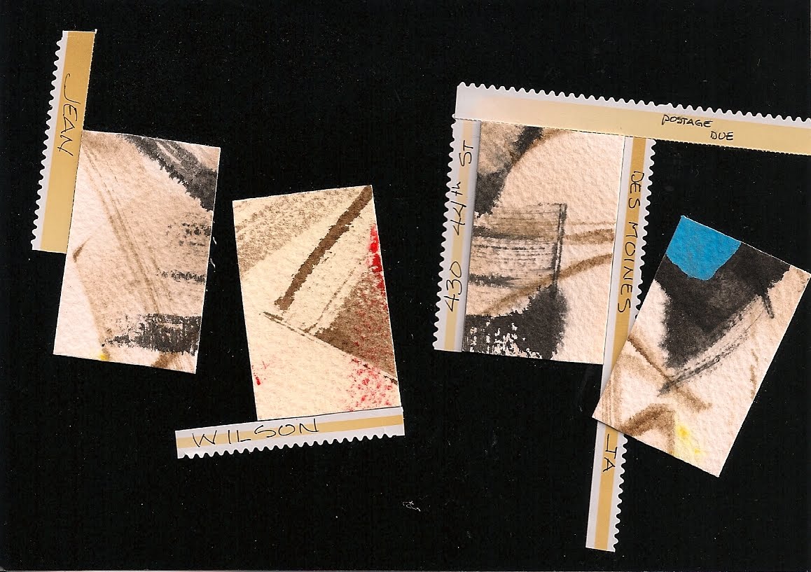
another source of inspiration. lots of artists cut up artwork that has not progressed as planned. i suspect that's what the large rectangles are. the little pieces are the edges from the pages of stamps. i used to keep all the backing paper from stamps and use the scraps in designs. in my effort to scale back on the amount of STUFF i have, i have thrown a lot of them away. i get a little sad when i see those scraps put to such good use. we could talk a lot about hoarding. maybe when i get around to organizing my international mail art conference, here in beautiful des moines, we can create one huge piece of art out of all the stuff that we have hoarded, but want to let go.
Monday, May 9, 2011
purple celebrate

Sunday, May 8, 2011
from kathy

great stamp. i would put the address really tiny, under the stamp. kathy...do you remember what you used to write the name? looks like a dry marker.
Saturday, May 7, 2011
lace stamps

somewhere i have a beautiful blue envelope addressed in white from someone who is a master at pointed pen. these stamps would look great on a blue envelope...and i should send some to jeri. she's really good with centered addresses. she puts stamps in the middle. i think if you look on the left, there are some emvelopes that are tagged jeri, so you can get the idea. maybe she'll comment and tell us how she centers. does she write everything once, for practice, and to find the center?
Friday, May 6, 2011
ellen's mommy

if you've not heard of a triptych before, here's the wiki definition. there will be quiz next tuesday.
A triptych (pronounced /ˈtrɪptɪk/ TRIP-tik, from the Greek τρίπτυχο, from tri- "three" + ptychē "fold") is a work of art (usually a panel painting) which is divided into three sections, or three carved panels which are hinged together and folded. It is therefore a type of polyptych, the term for all multi-panel works. The middle panel is typically the largest and it is flanked by two smaller related works, although there are triptychs of equal-sized panels.
anyone wishing to earn their degree from the university of the absurd, submit your application to enroll in this institution of higher education by sending a SASE to me at the address that is plastered all over the blog. majors include, P.O.ology and Caffinology. pHds in penmanship for those who already have their undergraduate work completed.
Thursday, May 5, 2011
where's the *b*

forget about doing anything else today. grab a magazine and find an alphabet within the photos. i love this exercise. if you've never done it, you need to do it. today. right now. or, after you finish your coffee.
Wednesday, May 4, 2011
white gel pen

yesterday i showed a colored envelope that had some white highlights, so i thought it would work to do a bunch of white on this envelope. this one is a slick sparkle paper, so the ink didn't pop quite as much and i ended up doing a lot of layering to make it show up better. hiding the address with another envelope is pretty distracting. i switched to little bits of paper on the rest of these. i think there are 13 in the series.
Tuesday, May 3, 2011
floral love stamp

Monday, May 2, 2011
girl in hat

Sunday, May 1, 2011
blue spirals - celebrate stamp

one idea to go with the celebrate stamp. spirals and fireworks. two *doodles* that i have been using for years. i need to dig through the markers and find the gel markers. they look really cool on black paper. if mine are not all dried up, i'll try to post a second envelope today.
Subscribe to:
Posts (Atom)